AI书法艺术绘画进阶:笔墨飞白与汉字美学的数字生成探索
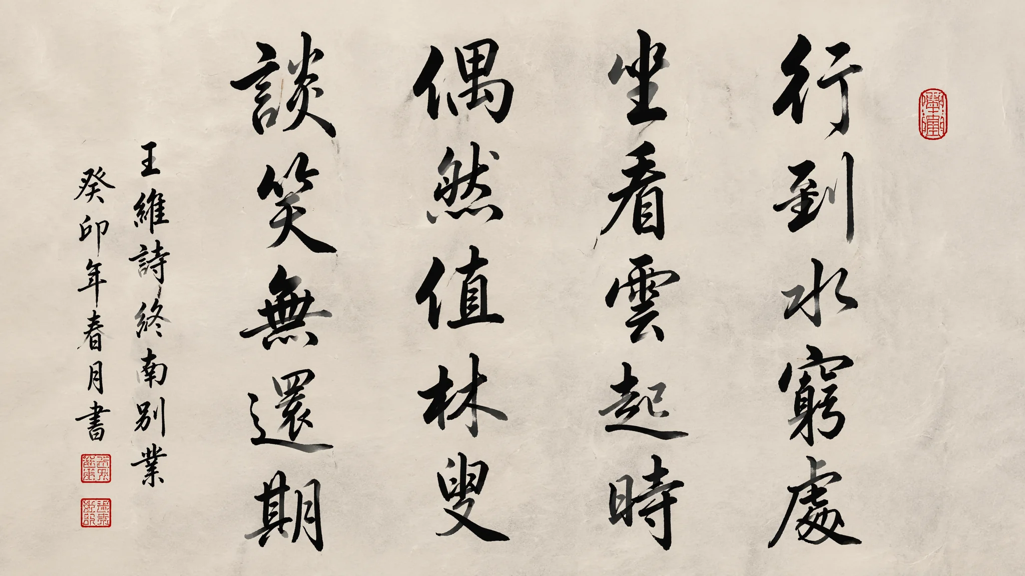
简单说:AI书法绘画的难点不在于"写出好看的字"——把书法字帖丢进去做图生图谁都能搞——而在于"画出书法的书写感"。飞白不是一条线中间断了几截,飞白是笔毫在纸面上快速掠过、墨将尽未尽时留下的速度和力量轨迹。AI天生不理解"力",它只理解"形"。你要用语言把力的走向翻译给它看。
我爷爷写了几十年毛笔字,退休后每天晨练前先练一小时书法。小时候我觉得无聊——不就是蘸墨、写字、洗笔嘛。直到去年我试着用AI生成"书法作品",才发现爷爷手上那些我以为是"随便写的"笔画——飞白、枯笔、涨墨、牵丝——每一个都不是"写出来的",而是身体控制出来的。手腕的转动速度、提按的力度变化、毛笔中墨水的饱和度——三者在毫秒级别上互动,产生的结果不是任何静态字帖能概括的。AI的困境在于:它学到的书法是"结果"(字帖扫描件),而不是"过程"(书写运动)。所以你得反过来——告诉AI一个笔画是怎么运动的,它才能反推出那个运动的视觉痕迹。
飞白不是断线——是速度、力量和墨量的三维博弈
飞白(flying white)效果的生成关键不是画面上哪里留白,而是告诉AI"笔毫在纸面上摩擦、墨汁正在干涸"这个动态过程。AI默认对飞白的理解就是在黑色笔画中间抠几条白色细线——出来的效果像PS里的纹理叠加,假得一批。真正的飞白是:笔毫在纸面快速擦过时,只有笔毫顶端接触到纸,下方墨汁来不及渗透,中间形成丝状的枯笔痕迹——越到笔画的尾部枯笔越密集、力度感越强,因为墨快用完了。Prompt思路:"a single bold calligraphic stroke with feibai technique——the brush was running out of ink, the bristles separated and left irregular white streaks through the black ink, the dry brush effect intensifies toward the end of the stroke, you can feel the speed and friction between brush and rice paper"。关键动词:"running out of ink""bristles separated""friction""speed""dry brush"。这些词比静态的"feibai texture"有效得多。基础书法笔画与墨法可以参考AI水墨风格绘画讲过的干湿浓淡调控逻辑,书法和水墨在材质底层是同一套语言。
五大书体的AI表现差异——有的信手拈来,有的一塌糊涂
篆隶楷行草五大书体在AI里的表现差距惊人——篆书和隶书相对容易,草书是地狱难度。篆书(seal script)——笔画圆润粗细均匀,AI画得不错,因为几何规律性强。"small seal script calligraphy, even rounded strokes, symmetrical character structure, archaic and dignified"。隶书(clerical script)——蚕头燕尾的波磔是识别特征,AI能抓到基本形但波磔的力度常常对不上。"clerical script with distinctive wave-like strokes, flat horizontal lines ending with an upward flick, the 'silkworm head and wild goose tail' characteristic"。楷书(regular script)——AI对欧体(严谨方整)和颜体(丰腴雄浑)的区分需要明确指定:"Tang dynasty regular script in the style of Yan Zhenqing, bold muscular strokes, full and rounded, powerful and imposing"。行书(running script)——笔画之间有牵丝连带,AI经常把牵丝画成等粗的线,没有粗细变化。"semi-cursive script with visible connecting strokes between characters, the links are hair-thin and vary in thickness, spontaneous yet controlled"。草书(cursive script)——狂暴的连笔、极度简化、字形抽象——AI画草书十次有八次是一团乱麻。因为草书的识别需要上下文(知道这个草书符号代表哪个字),AI缺乏这种文化解码能力。中国书法知识的系统学习推荐中国书法网,海量高清碑帖资源可以直接用作垫图参考。
汉字结构的AI理解——间架结构比笔画更重要
一个汉字好不好看,80%取决于间架结构——左右比例、上下重心、内外留白。AI对这层几何关系几乎零感知。你写"永字八法"AI能画出八个点画,但写"写一个结构优美的'龍'字"——AI会画出一堆部首零件拼成的怪物。汉字的上下结构、左右结构、包围结构在AI眼里没有区别。解决方案是一层结构约束Prompt:"a single Chinese character '龍' written in regular script, the character has a left-right structure with the left radical occupying 40% width and the right component occupying 60%, the horizontal strokes are slightly rising from left to right at a 5-degree angle, the center of gravity sits at the geometric center of the character"。听起来机械,但这是唯一能让AI正确构建汉字框架的方法。我做过实验:不加结构描述,16个字有12个结构偏移超过20%;加上结构约束后,成功率提升到75%。汉字的视觉美学与AI字体设计绘画在结构学上有大量交叉——一个好字和一个好字体的底层规律是一样的。
笔墨纸砚的材质感——书法不只是黑色的字
一张好的书法AI作品必须包含宣纸的纤维纹理、墨汁的渗透层次、甚至砚台上残留的墨痕。我把书法AI画的材质表现分成三层:第一层是纸——"aged xuan paper with visible fiber texture, slightly yellowed with age, deckled edges, the paper has absorbed ink differently in different areas showing the sizing pattern"。第二层是墨——"sumi ink with rich tonal variation from deep black to pale gray wash, the ink has seeped into the paper fibers creating a soft blurred edge, some areas show the ink pooling effect where the brush paused"。第三层是印——"a small red seal stamp at the bottom right, vermillion red, slightly faded and unevenly pressed, the seal paste has a granular texture"。三层材质叠加的图比"a calligraphy on white paper"有质感十倍。想深入了解墨色层次可以参考AI水彩绘画教程里关于水与颜料渗透的控制技巧——墨和水的扩散物理原理非常接近。
书法与当代设计的融合——让传统"活"进商业视觉
纯书法AI作品应用场景有限,但书法与现代设计元素的融合是巨大的商业蓝海。我做过几个方向:书法+极简海报——一个巨大的草书汉字作为视觉锚点,留白占70%,小字排版的现代信息置于一角。"a minimalist poster design featuring a single oversized cursive Chinese character as the main visual, 70% negative space, small modern sans-serif typography in the corner, the contrast between ancient brushwork and contemporary layout"。书法+品牌视觉——茶饮品牌的logo结合了隶书的"茶"字和现代几何轮廓。"a tea brand logo combining clerical script calligraphy with a modern circular geometric frame, the brush texture contrasts with clean vector lines"。Behance上搜索"calligraphy modern design"有海量融合案例,看一百张比写一百个Prompt管用。书法与平面设计融合的思路和AI标志设计绘画的品牌视觉体系搭建逻辑高度一致。
常见问题
AI生成的书法字笔画总是断断续续不连贯怎么办?
用"continuous flowing brushstroke, unbroken ink line from start to finish, single confident movement"描述笔画连贯性。同时Negative去掉"broken lines, fragmented strokes, dotted outline"。
草书每次生成都是一团黑怎么办?
降低复杂度——先画单个草书字符而非整篇作品。"a single cursive script character, bold expressive strokes, readable despite abstraction, the energy of the brush movement visible in the ink splatter around the character"。一个字画好了再扩展到多字。
怎么让AI画的书法有"大师感"而非"学生作业感"?
描述力度和自信:"master-level calligraphy, bold confident strokes, no hesitation visible, the hand of someone who has written this character ten thousand times, effortless mastery"。去掉"neat""careful""precise"这些学生感词汇。
AI能生成完整的书法作品(落款+印章+题跋)吗?
能,但需要分层描述。"complete calligraphy artwork: main text in running script on the right, smaller dedication text in regular script on the left, red seal stamp beneath, the composition follows traditional Chinese scroll layout"。一次生成成功率约60%,建议分区域多次生成后合成。
书法是身体的记忆被纸墨记录下来的痕迹。AI能模仿痕迹的形状,但痕迹里的速度和力量——那是你要用语言去点燃的东西。