AI绘画书法艺术:从行草篆隶到汉字涂鸦的水墨文字Prompt指南
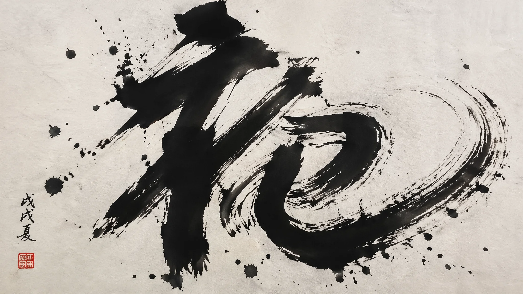
AI画书法——一个残酷的真相——AI "永远" 画不对汉字。不是暂时的技术限制——是AI对文字的理解方式从原理上就无法生成"正确的汉字"——它只知道"一个汉字大概长这样"——但写出来永远是缺笔画或多笔画的乱码。所以AI书法绘画的核心不是"让AI写出正确的字"——是"让AI画出书法的美但不依赖具体的字"。
AI 画书法有一个残酷的事实:AI 几乎“永远”画不对汉字。这不是暂时的技术限制,而是 AI 生成的原理决定的——它对汉字的理解是模糊图形而非字形结构,所以写出来永远是缺笔画或多笔画的乱码。所以做书法 AI 绘画,正确的姿势不是让 AI 写字,而是让 AI 画出书法的“气”,把具体的字交给矢量软件或真实手写。
三条实战策略:抽象墨迹(不写字只画势)、书画同源(画留题字位)、真手写 + AI 风格化(img2img)。想同时把控中式美学,可以叠着AI国画入门指南一起看。
三种策略的Prompt公式
策略一:抽象墨迹(不写字)。“abstract Chinese calligraphy strokes, bold sweeping black ink marks on textured rice paper, the energy of the brush visible in every stroke, splattered ink drops, dry brush 'flying white' effect on edges, pure gesture without specific characters, single vertical stroke down the center, negative space around”。“without specific characters + pure gesture”是让 AI 停止乱码的关键。
策略二:书画同源(留题字位)。“a Chinese ink painting of a single bamboo branch in the lower left, empty vertical space on the right for calligraphy inscription, upper right corner reserved for red seal stamp, subtle grey ink washes, rice paper texture, minimalist composition, traditional literati painting”。让 AI 只画画,题字位置留空,事后补矢量文字。
策略三:img2img 风格化。先自己写一个汉字(毛笔实拍或矢量),上传作为参考图,Prompt:“stylize this calligraphy character with Chinese ink wash background, add subtle bamboo shadow behind, rice paper texture, red seal stamp at bottom left, preserve character structure exactly”。Denoising Strength 建议 0.25-0.4,保结构不变。
让“书法气息”对味的四个变量
飞白(Flying White)。“dry brush texture where the ink runs thin, showing the paper's fibers through the stroke edges”。浓淡墨色。“ink gradient from wet black at the stroke start to dry grey at the stroke tail”。宣纸质感。“handmade rice paper texture, subtle fiber grain visible”。印章。“single red vermilion seal stamp with worn traditional carved characters, placed in lower left”。这四点堆好,AI 就能画出“书法感”而不需要真的写字。
不同书体的抽象势
行书:“flowing continuous strokes, semi-cursive fluid energy, characters connected by ghost strokes”。草书:“wild cursive script, dramatic sweeping motion, extreme dry brush, ink splatter around”。篆书:“seal script style, uniform thickness strokes, ancient formal balanced composition”。隶书:“Han dynasty clerical script, horizontal emphasis, thick even strokes with silkworm head sword tail”。楷书:“regular kaishu, rigid grid-based structure, each stroke deliberate”。用书体名 + 抽象势 = 出对气息。
常见问题
AI画的“中文书法”总是乱码,能不能通过更多描述让它写对?
不能。AI 生成机制决定它对汉字只能模仿形状不能保证结构。唯一稳定的做法:书法本体用矢量或真手写,AI 只负责宣纸、墨迹、印章、背景。想把这两步合到一张图,用 img2img 输入真书法参考图。
用 AI 做书法作品有没有版权风险?
“书法风格”本身无版权。但若你的字来源是某位当代书法家的原作 + AI 直接风格化,可能有作品复制风险。做原创手写字 + AI 加氛围,最安全。
怎么让 AI 画的宣纸看起来像真的?
“handmade rice paper texture with visible fibers, natural cream color slightly warm, subtle uneven grain, aged patina at the edges, no glossy finish”。加否定“no smooth modern paper, no digital texture”。
做“书法 + 现代设计”比如 logo 或海报,用什么组合最好?
三层:底层用 AI 生成的“宣纸 + 墨迹抽象势”背景;中层放矢量书法主字;上层放红印章和现代设计元素。这套组合能兼具书法气息和商用可控性。参考AI标志设计绘画里的中西融合方案。
AI 写不了你的名字,但 AI 能画出你写名字时那一笔飞白里藏着的力量。让书法的“气”留给 AI,让书法的“字”留给自己。
觉得有用的话分享给爱书法的朋友吧。