AI重云绘画教程:原神纯阳方士的冰蓝色调与少年气质角色创作
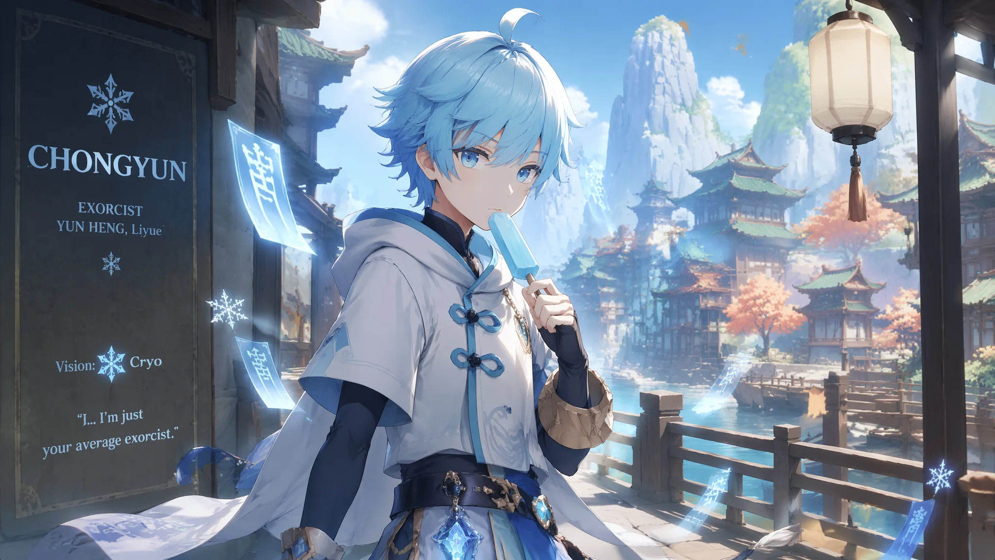
我侄子是原神重度玩家,去年过生日的时候拉着我说"舅舅你不是会用AI画画吗,给我画一张重云呗。"我当时还不知道重云是谁——搜了一下发现是个蓝白配色、冰元素、拿着大剑的少年方士。心想二次元角色AI画起来应该不难,毕竟训练数据管够。结果第一张出来——把重云画成了三十岁的肌肉猛男,大剑倒是很还原,但那个少年感彻底蒸发了。侄子看了说"舅舅你这是画的钟离吧"。第二张更离谱,冰蓝色变成了荧光蓝,重云像个在夜店里开大招的DJ。后来我发现画二次元游戏角色的关键不是"角色名字"——AI对单个角色名的训练非常不稳定——而是"角色的视觉特征集合"。把视觉特征拆开逐一描述比直接写"Chongyun from Genshin Impact"出片率高三倍。
用AI画特定游戏角色有一个反直觉的事实:越有名的角色越难画好。因为AI见过的同人画风太多了——Q版、厚涂、水墨风、像素风——这些风格在训练数据里互相污染。你写"Chongyun"AI会从海量同人图中随机抽取视觉权重,结果画风、年龄、比例全是随机的。解决方案是放弃角色名,用"视觉特征描述法"——把角色的外形拆成五个维度(体型、发型、服装、配色、道具)逐一写Prompt。这套方法不只适用于重云——画任何二次元角色都可以套用。关于二次元角色AI绘画的基础原理,AI角色设计教程里有从体型到表情的完整体系。
重云的少年体型——AI最容易画成成年人的三个陷阱
重云的官方设定是少年体型——肩宽较窄、面部线条柔和、身高大约在少年到青年过渡期。AI的默认倾向是把所有男性画成肩宽腰窄的成年人体型。控制少年体型的核心Prompt:"a young male character with a lean adolescent build—narrow shoulders, slender neck, soft jawline without prominent bone structure, the facial features retaining a boyish roundness especially in the cheeks, a physique suggesting someone in their mid-teens rather than an adult, the overall impression one of youthful energy rather than mature strength"。面部锚定词:"round youthful face with large expressive eyes, a gentle innocent expression, no facial hair, soft skin texture without harsh shadows, features that suggest earnestness and a slightly serious demeanor"。如果模型仍然往成年人方向偏,加负面约束:"not muscular, not broad-shouldered, not adult male physique, not mature facial structure"——但注意负面约束的权重不要超过正面描述的30%,否则会影响画面整体质量。关于男性角色的年龄表现,AI成年男性角色绘画有不同年龄段的体型比例参考。
冰蓝色调的颜色管理——从"荧光蓝灾难"到"清冷方士蓝"
重云的标志性配色是冰蓝色+白色+少量深蓝——这种配色在AI里极容易翻成两种灾难:一种是荧光蓝(饱和度爆炸),一种是灰蓝色(饱和度不够像褪色)。控制冰蓝的正确色号描述:"the character's clothing uses a subdued ice-blue color palette—a pale cool cyan with just a hint of grey undertone, like the color of glacial ice under overcast sky, not neon blue or electric cyan but a calm frosty blue-white, the saturation low to moderate creating an elegant restrained atmosphere"。服装配色分布:"a white undershirt with frost-blue trim, a sleeveless blue-white outer jacket with darker navy accents at the collar and cuffs, the blue elements resembling the color of frozen lakes rather than summer sky, the white elements a cool snow-white rather than warm cream"。材质对颜色的影响:"the blue fabric has a slight satin sheen that catches light with silvery-blue highlights, the white fabric is matte cotton showing subtle cool shadows"。我做了个色板——把重云的蓝色从"荧光蓝"到"海军蓝"做了六个色阶的Prompt对照,发现"glacial ice blue"这个描述的稳定性和还原度最高。在AI绘画色彩理论应用指南里有更多关于色温和饱和度的控制技巧。
方士服饰的细节还原——从外褂形制到符咒配饰
重云的服装是一套改良版的东方方士装束——白色内衬+蓝白外褂+腰带+护腕+长裤+靴子。AI经常把外褂画成普通夹克或者干脆简化成一片色块。外褂形制:"a sleeveless outer coat with wide armholes and a standing mandarin collar, the coat split at the sides with a flowing back panel that extends past the hips, the hem of the coat decorated with subtle geometric trim patterns in dark blue"。腰带和挂饰:"a wide dark blue sash cinched at the waist, from which hangs a tassel ornament and a small cylindrical charm case, the accessories swaying slightly as if caught in a gentle breeze"。符咒元素:"a few paper talismans with faintly glowing blue calligraphy tucked into the belt, the paper edges slightly worn suggesting frequent use"。护腕和手套:"dark fingerless gloves extending to the mid-forearm, secured with crisscross straps, the gloves showing subtle wear and creasing at the knuckles"。把所有服装部件拆开写比写"exorcist outfit"准确十倍——因为"exorcist"在AI的训练数据里关联了世界各地的驱魔人形象,从日本阴阳师到西方神父全混在一起。参考HoYoWiki的角色立绘细节描述是还原服装最可靠的参考来源。
冰元素大剑与特效——武器的视觉重量和元素能量的融合
重云的大剑是冰蓝色调的双手巨剑——AI画武器最大的问题是比例失控:要么剑比人还大像《怪物猎人》武器,要么剑小得像把水果刀。武器比例控制:"a large claymore nearly as tall as the wielder, the blade broad and heavy with a straight double-edged design, the weapon held in a ready stance with both hands on the long grip, the blade showing subtle engraved frost patterns that glow faintly with pale blue light"。元素特效附着:"a thin layer of frost forming on the blade surface, tiny ice crystals materializing in the air around the weapon, a cold mist curling off the metal as if the blade itself is a source of freezing temperatures, the elemental energy manifesting as delicate snowflake-shaped particle effects that drift around the character"。武器和角色动作的协调:"the character holding the massive blade with practiced ease, the weight of the weapon evident in the subtle tension of the forearms and the planted stance, but the posture suggesting someone who has trained extensively with this specific weapon"——不要让角色看起来像被武器的重量压垮,而应该是"掌控着这个重量"。在ArtStation搜"claymore character design"能学习到职业设计师怎么处理重型武器的视觉重量分配。
常见问题
写了"Chongyun Genshin Impact"出来的图完全不像重云怎么办?
不要写角色名。改用视觉特征描述:冰蓝色头发+蓝白方士装+少年体型+大剑+冰元素。角色名在AI里触发的是同人图集合——风格和质量方差极大。特征描述触发的是视觉概念——出图一致性远高于角色名。
重云的气质总是画得太冷酷——原版应该是外表冷静内心热忱的少年?
加表情约束:"a gentle determined expression—the eyes focused but not cold, a subtle warmth behind the serious demeanor, the mouth set in a slight firm line but softened by the youthful roundness of the cheeks, the overall impression someone who takes their duty seriously but retains an earnest boyish charm"。
冰蓝色在暗光环境下总是变成灰白色——怎么保持冰蓝的辨识度?
让冰蓝"自发光":"the ice-blue elements of the outfit emit a faint cool luminescence in the dim lighting, the blue appearing to glow softly from within the fabric as if charged with cryo energy, maintaining their blue identity even in shadow"。
画完重云之后我侄子的反应很有意思——他说"舅舅你这张图里的重云比我游戏里看到的还帅"。我知道这是AI的美化滤镜在起作用,但这句话点破了一个事实:AI画二次元角色的优势不在"还原"——论还原你永远还原不过官方立绘——而在于"以官方设定为起点进行合理的视觉升级"。你把服装材质从游戏贴图升级到电影级渲染、把光影从均匀平光升级到戏剧性侧光、把背景从空白升级到有叙事感的场景——这些升级叠加在一起,出来的效果可能比原版更有"完成度"。这不等于"超越原作",而更像是"用高配显卡重跑了一遍自己最喜欢的角色"。