AI电影级绘画教程:大片质感的构图光影与色彩调色秘籍
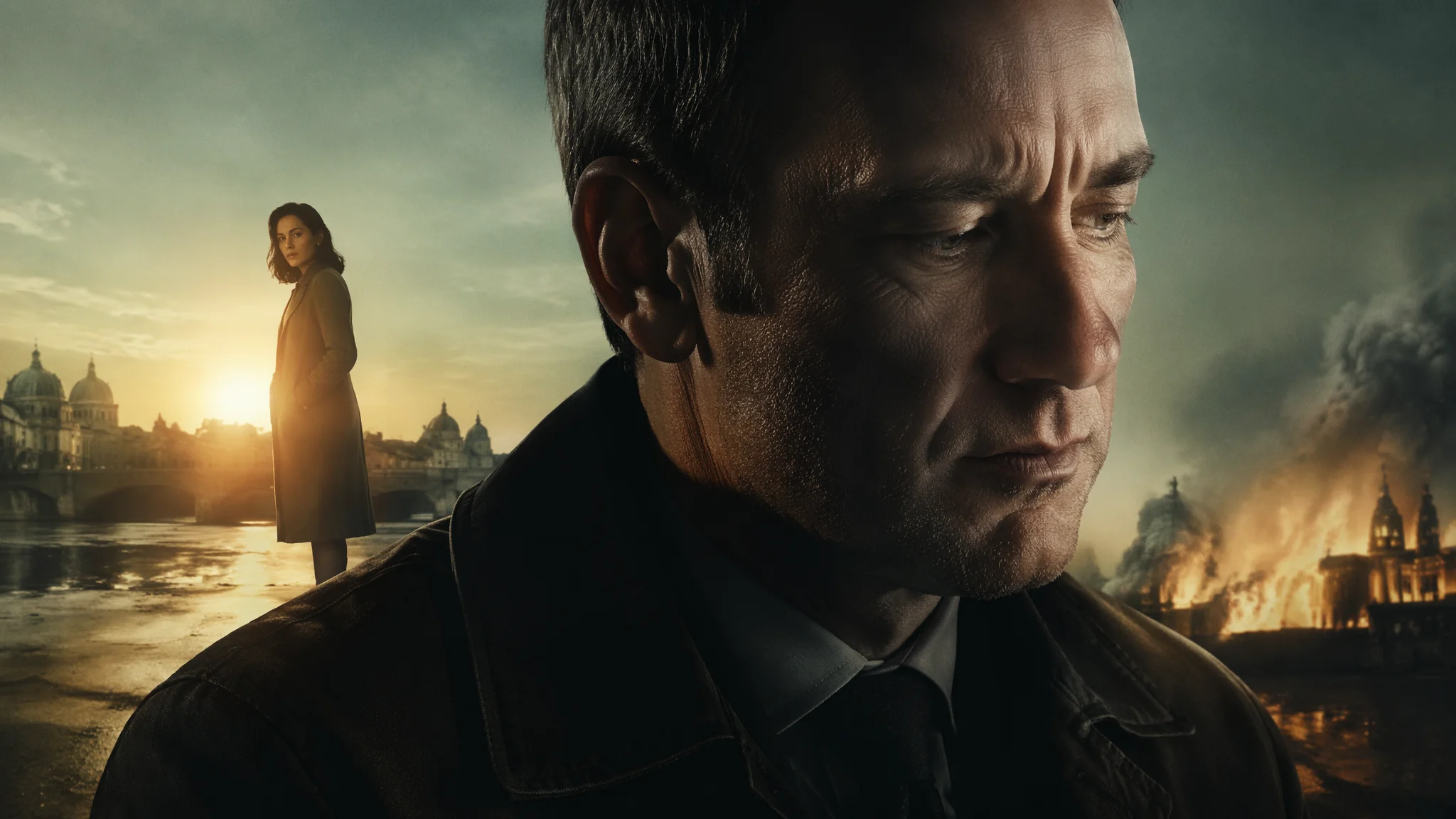
简单说:AI画出电影感的关键不是"画得更细致",而是"像摄影师一样思考"——宽银幕画幅、三分法构图、戏剧性逆光、电影级调色。你不需要学会拍电影,但你需要知道一个电影摄影师在按下快门之前脑子里过了哪些东西。把这些东西翻译成提示词,画面质感立刻从"爱好者水平"跳到"能当海报"。
我认识一个做独立短片的朋友,他有一次吐槽预算不够请不起好摄影师,问我能不用AI帮他出几张关键帧概念图。我花了整整一个周末研究"电影感"到底是怎么构成的。看了几十篇ASC(美国电影摄影师协会)的博客文章,把Roger Deakins的构图习惯拆了一遍,跑了一百多组对比图。结论是:电影感不是玄学——它是画幅比例、布光逻辑、色彩科学和镜头选择的组合拳。每一拳都可以在AI提示词里精确再现。
画幅与构图:电影感的第一道门槛
你随便点开一部电影按下暂停键,画面大概率是2.35:1的宽银幕比例——这个比例本身就在大脑里触发了"这是电影"的条件反射。在MJ里用--ar 21:9或者--ar 2.35:1,在SD里直接设宽画幅。光有比例不够,还得配合电影级构图。三分法关键词:"rule of thirds composition with subject positioned at left third intersection, negative space on the right two thirds, cinematic framing"。引导线关键词:"strong leading lines drawing eye to distant focal point, road or railway or corridor converging to vanishing point, deep perspective composition"。框架式构图:"character framed by doorway or window or archway, frame within a frame technique, voyeuristic cinematic perspective"。Dutch angle(倾斜构图):"slightly tilted dutch angle shot creating unease, off-kilter camera perspective, psychological tension through composition"。构图这块AI绘画构图技巧与视觉引导里有非常完整的体系,我每次出图前都会对着那篇过一遍构图清单。
布光逻辑:从三点布光到表现主义光影
电影布光不是在"照亮场景"——每个光源都有叙事意图。主光塑造人物、辅光控制反差、轮廓光分离背景、环境光建立氛围。经典好莱坞三点布光:"classic three-point lighting setup, key light creating dramatic modeling on face, fill light softening shadows from opposite side, rim light separating subject from dark background, 1940s Hollywood noir aesthetic"。表现主义强侧光:"single harsh side light casting long dramatic shadows across face, film noir chiaroscuro, blind shutters creating striped light pattern, high contrast black and white cinematography"。逆光剪影:"subject as dark silhouette against blazing backlight, god rays streaming through atmospheric haze, mystery and anonymity through concealed features"。柔光文艺片:"soft wraparound natural light, overcast sky diffusion through large window, gentle modeling with almost invisible shadows, Terrence Malick golden hour aesthetic"。一个实用技巧:在提示词里直接引用你喜欢的摄影师名字——"lit by Roger Deakins""cinematography by Emmanuel Lubezki"——AI对他们的布光风格有相当准确的理解。我试过把同一个场景分别用Deakins、Lubezki和Bradford Young三种风格生成,出来的画面氛围完全不同——Deakins偏冷峻克制、Lubezki偏自然诗意、Young偏暗沉厚重。这种对比实验本身就是一堂免费的电影布光课。光影进阶看AI绘画光影技法深度解析。
色彩调色:电影LUT与色彩科学的提示词翻译
不同电影类型的调色方案是高度公式化的——橙青色调(动作片)、冷蓝紫色(科幻)、暖黄琥珀(年代片)、去饱和暗绿(战争片)。橙青调(最通用的电影色):"teal and orange color grading, cool shadows with warm skin tones, blockbuster film color palette, cyan-blue ambient light contrasting with amber practical lights"。冷蓝紫科幻调:"cool blue and purple color palette, desaturated neon tones, Blade Runner style color grading, cyan shadows and magenta highlights, futuristic dystopian atmosphere"。暖黄年代调:"warm golden amber color grading throughout, slight desaturation for vintage film look, cream highlights and brown shadows, 1970s period film aesthetic"。低饱和战争调:"desaturated military green and grey color palette, muted earth tones, Saving Private Ryan style bleach bypass processing, gritty documentary color treatment"。在MJ里还可以加"--style cinematic"来强化电影感,在SD里可以用专门的电影LUT LoRA来锁定色调。色彩理论参考AI绘画色彩理论应用指南。真正理解电影色彩科学的话,建议去StudioBinder看看他们的色彩理论系列文章,讲得特别透彻而且免费。
镜头语言:景深、焦段与镜头光晕
电影的"电影感"很大程度上来自镜头的光学特性——浅景深、特定焦段的透视、以及镜头光晕带来的物理真实感。浅景深:"shallow depth of field with creamy bokeh background, subject in razor sharp focus while everything else melts into soft blur, large aperture cinematography, full frame sensor look"。长焦压缩:"telephoto lens compression flattening distance between foreground and background, 200mm cinematic shot, isolated subject against compressed city backdrop"。广角沉浸:"wide angle lens creating immersive perspective, foreground elements large and dramatic, deep focus showing entire scene from near to far, 24mm cinematic"。变形宽银幕(最电影感的光学特性):"anamorphic lens characteristic, horizontal blue lens flares stretching across frame, oval bokeh shapes, widescreen cinematic distortion, authentic film aesthetic"。变形宽银幕镜头的光学缺陷——横向拉丝光晕和椭圆形散景——恰好是观众潜意识里判断"这是电影"的视觉线索。把"anamorphic lens"写进去,画面质感立刻提升。镜头焦段的选择本身就有叙事含义——长焦拍特写让人物与世隔绝、广角拍全景让人物被环境吞没。在写提示词的时候顺便想一下"这个镜头想表达什么情绪",出来的画面会比单纯堆砌技术参数有灵魂得多。电影镜头知识可以去ASC美国电影摄影师协会的博客获取一手资料。
六大电影类型的提示词模板
科幻、黑色、战争、文艺、恐怖、动作——六大类型各有模板化的视觉配方。科幻史诗:"epic sci-fi landscape, colossal spacecraft hovering over alien city, anamorphic widescreen, teal and orange color grading, volumetric haze, cinematic lighting by Denis Villeneuve"。黑色电影:"rain-slicked city street at night, fedora-wearing detective under flickering neon sign, venetian blind shadows across face, black and white film noir, high contrast chiaroscuro"。战争片:"soldiers in trench during WWII, handheld camera feel, desaturated color palette, film grain and dirt on lens, gritty documentary war cinematography"。文艺片:"two lovers silhouetted against sunset on empty beach, natural light only, handheld intimate camera work, Kodak Portra film stock colors, whisper of romance in the air"。恐怖片:"dark corridor lit only by flickering fluorescent light at far end, something barely visible in the shadows, found footage aesthetic, VHS distortion, creeping dread"。动作片:"car chase through neon-lit Tokyo streets at night, motion blur on speeding vehicles, dynamic low angle tracking shot, sparks flying, adrenaline-fueled cinematography"。更多风格探索参考AI绘画风格迁移实战教程。
常见问题
电影级AI绘画的常见问题涵盖画幅设置、风格一致性和工具选择。怎么让AI生成的画面有"胶片颗粒感"?
加"film grain""Kodak Portra 400 film stock""35mm film photography aesthetic""analog film texture with subtle grain and soft contrast"。在SD里还可以用专门的胶片模拟LoRA,效果非常逼真。MJ的--style raw参数也能降低AI过度的"数字平滑感",让画面更接近模拟胶片的质感。
电影级绘画需要每次都写很长的提示词吗?
不需要——建立模板体系之后每次只需要替换场景描述。我的做法是把电影感的"基础设施"(画幅、布光、调色、镜头)做成一个固定后缀,比如"anamorphic widescreen, teal and orange grading, shallow depth of field, cinematic lighting, film grain"——这个后缀适用80%的场景。每次出图只需要写前20%的场景描述,后面接上固定后缀就行。
MJ和SD哪个更适合电影感绘画?
MJ在宽画幅构图、氛围统一和风格化表现上略胜一筹。SD在精确控制方面更强——你可以用ControlNet固定构图骨架,用IP-Adapter锁定参考图的色调,用LoRA加载特定电影的风格。如果你追求的是"每一张都像电影截图"的精确性,SD的可控性更适合你。
觉得有用的话分享给朋友吧。