AI绘画甜甜圈美食:从巧克力淋面到糖霜装饰的甜品Prompt全攻略
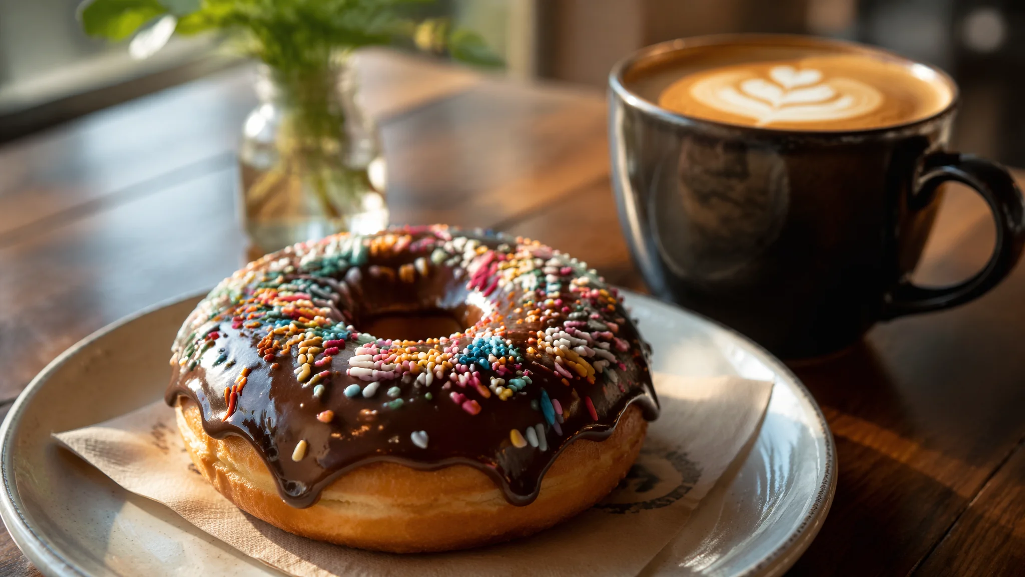
甜品是AI美食绘画里"出片率最高"的子类——因为甜品的视觉本身就是经过设计的——它的颜色、形状、光泽都是为了让人类产生"想吃"的冲动。"食欲感"=暖色调+微距浅景深+食物表面的光泽反光——这三个Prompt要素合力触发观众的本能。
甜品是 AI 美食绘画里“出片率最高”的子类。因为甜品的视觉本身就是被设计过的——颜色、形状、光泽都在勾引食欲。这也意味着甜品图对 Prompt 的容错率很高,但真正做出能上电商详情页、外卖菜单、烘焙工作室 IG 主页那种“一眼想吃”的图,还是要靠三条底层法则:暖色调、微距浅景深、食物表面的镜面反光。
常见的六种甜品方向:甜甜圈(镜面淋面)、马卡龙(裙边+夹心)、奶油蛋糕(裱花+切面)、塔类/派(酥皮+馅料)、冰淇淋(融化感)、手冲咖啡搭配甜点(生活方式)。前 3 种最考验 Prompt 精确度,后 3 种更靠光线氛围。想同时把控产品级质感,可以顺着AI画食物实测那套“真实感食物摄影”的技法用。
三类甜品Prompt模板
甜甜圈(Donut)。“a glazed donut with glossy chocolate icing and colorful sprinkles, the glaze has a mirror-like shine reflecting soft studio light, subtle drips running down the sides, soft pillowy dough beneath, a bite taken revealing the airy interior, coffee cup blurred in the background, macro food photography, 45 degree overhead angle”。核心:“mirror-like shine reflecting soft studio light”,让 AI 认真去画淋面反光,而不是画一层哑光巧克力。
马卡龙(Macaron)。“a tower of pastel-colored macarons in a Parisian patisserie window, smooth domed shells with the characteristic ruffled 'pied' feet at the base, delicate cream filling visible between the shells, precise and jewel-like, soft window light, editorial food photography”。“pied ruffled feet at the base” 是区分“真马卡龙”和“像马卡龙的饼干”的唯一视觉标志,必须写。
奶油蛋糕(Buttercream Cake)。“a slice of layered buttercream cake, three visible sponge layers with cream between, cross-section facing the camera, delicate piped rosettes on top, fresh berries as garnish, soft matte finish plate, natural window light from the side, food styling magazine aesthetic, shallow depth of field”。切面正对镜头是奶油蛋糕出片的关键构图。
食欲感的三条底层法则
暖色调。整体色温偏 3200K-3800K,皮肤色感觉温暖,甜品会“看着好吃”。冷色调(4500K+)适合做“清爽甜品”,比如冰品、抹茶、薄荷主题,但暖色仍然是主流。微距浅景深。“shallow depth of field, subject in sharp focus with soft bokeh background, 85mm macro lens look”,让甜品脱离环境成为绝对主角。表面光泽。不同甜品的光泽词不同——巧克力淋面用 “mirror-glossy”,奶油用 “satin sheen soft matte”,糖霜用 “crystalline sugar reflections”,果冻用 “translucent jewel-like glaze”。写对光泽 = 写对材质。
不同用途的构图技巧
做电商菜单主图:正方形 1:1 + 45 度角俯拍 + 单一主体 + 纯色/木质台面背景,加“product photography, catalog style, isolated subject”。做小红书生活方式图:横构图 4:5 + 主体+旁边一杯咖啡/一本书 + 自然窗光 + 手部入镜,加“lifestyle food photography, human hand slightly visible”。做外卖平台封面:竖构图 3:4 + 突出主体、加“hero shot, appetizing angle, warm color grading”。做甜品店社交封面:广告级布景,加“commercial food styling, studio lighting setup, soft box lighting from above”。
系列图(比如一家店的多款产品)建议锁 seed + 同一台面/餐盘/背景,只换甜品主体,视觉一致性会立刻拉满。
常见问题
AI画的甜品看起来假、像塑料模型,怎么救?
三条:一,加“subtle imperfections, hand-piped cream with slight variation, real bakery texture, not perfect symmetry”;二,加真实光线“natural window light from the left, soft warm indoor lighting, no studio strobe”;三,加光泽材质词“glossy natural glaze, semi-matte cream, real chocolate refraction”。三点叠加,画面会从展示柜模型掉到烘焙师工作台。
甜品切面(比如慕斯断面)为什么总是被 AI 画得像卡通,怎么让它真实?
把切面结构显式写出来:“cross-section view showing three distinct sponge layers with buttercream between, visible air bubbles in the sponge, slight bend of the cream layer under the top sponge, sharp knife-cut edges with a few crumbs on the plate”。AI 需要“层数 + 气孔 + 刀切痕迹”这三个具象描述才能画像烘焙作品。
做电商甜品图,能不能直接商用 AI 生成的图?
技术上可以,但两点要注意:一是使用商用授权明确的工具(Midjourney 付费/Firefly/本地 SD),二是画面里不出现具体品牌 Logo 或明星形象。真实商品配图建议“AI 出场景概念图 + 真拍产品替换主体”,安全性最高。想批量做多产品图,参考AI绘画软件全评测选一个稳定出图的工具。
怎么让 AI 画的“融化感”自然,比如冰淇淋在慢慢化?
写具体现象:“a scoop of vanilla ice cream slowly melting on a warm summer afternoon, a single glossy droplet running down the cone, the top of the scoop starts to lose its sharp edge, one small puddle forming at the base of the cone, macro shot, sunlit”。用“droplet running down”“puddle at the base”这类具体动作词,AI 才能画出“正在化”的动态感。
甜品的终极功能不是填饱肚子,是咬第一口时你忘记了今天为什么心情不好。让 AI 帮你把这份短暂的甜画出来,光泽、切面、暖光——每个细节都是让人想吃的开关。
觉得有用的话分享给爱吃甜的朋友吧。