AI黄金质感绘画:金属光泽与奢华饰品的渲染全攻略
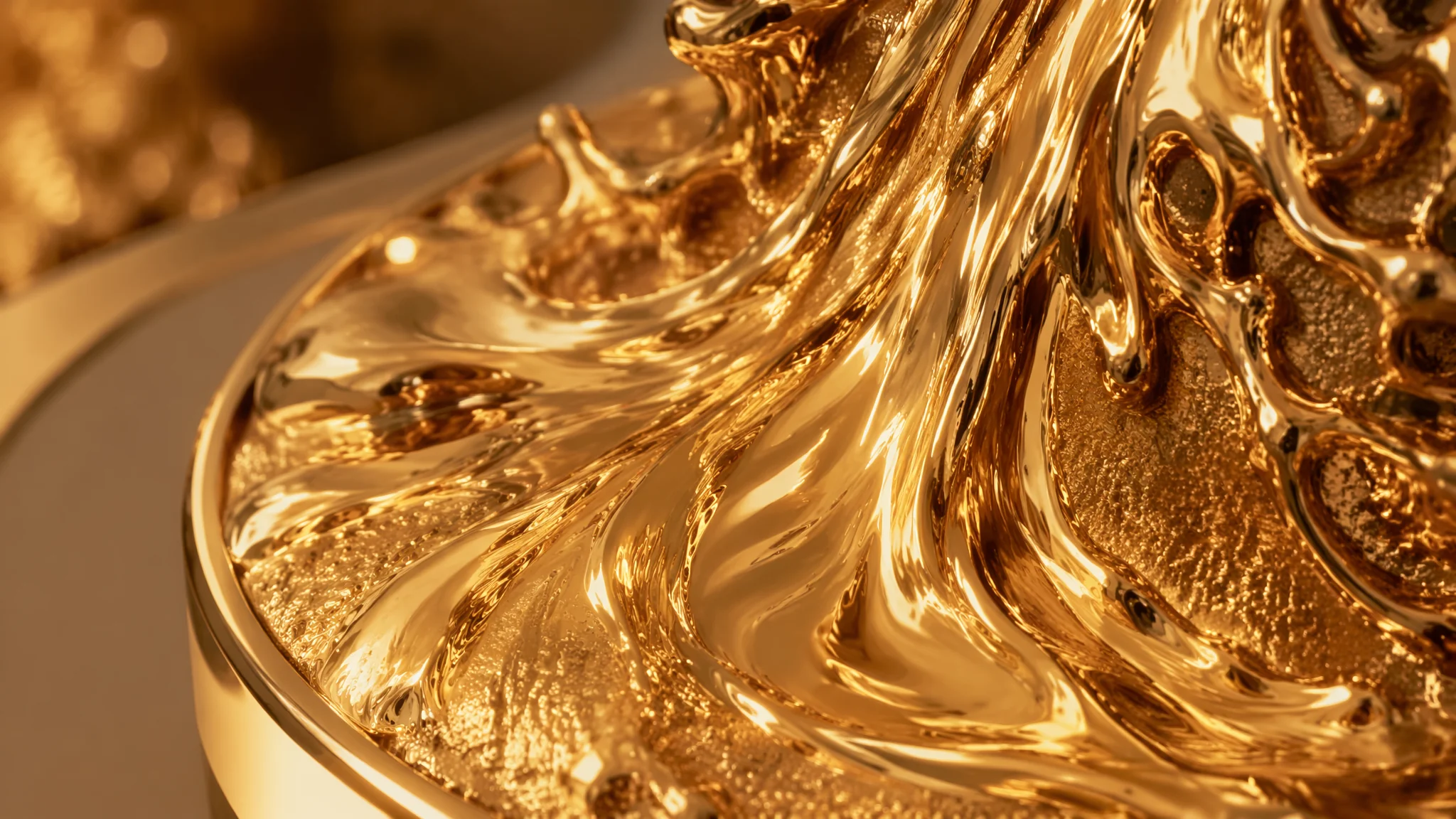
简单说:AI画黄金质感的核心不在于"金色"这个词本身——而是高光反射、环境映照、金属表面粗糙度三者之间的精确配合。你把这三件事写对了,AI就能画出能"反光"的黄金;写不对,出来的就是一块黄色塑料。
去年我接到一个珠宝品牌的AI视觉需求——生成一批黄金首饰的产品概念图。客户的原话是"要看起来摸得到那种沉甸甸的金属感"。我试了二十多种Prompt组合,终于搞清楚了AI渲染金属的逻辑:它不是"上色",而是"模拟光在金属表面的行为"。金属的光泽来自菲涅尔反射——正视面反射率低、掠射面反射率高——这个物理特性AI从训练数据里学到了,但它需要你用正确的关键词激活。关于基础的材质渲染原理,AI绘画入门教程里有一章讲材质关键词,可以和本文配合阅读。
黄金金属感的三大物理要素
黄金质感的Prompt必须覆盖三个物理维度:镜面反射(specular highlight)、环境映照(environment reflection)、表面微结构(surface roughness)——少写一个,金属感就塌。镜面反射是金属表面最亮的那个光斑——"sharp specular highlights, bright pinpoint reflections on the polished gold surface"。环境映照是金属反射周围环境的能力——"mirror-like polished gold reflecting the surrounding environment, subtle warm reflections of ambient light"。表面微结构决定光泽的类型——光滑面用"polished mirror finish, perfectly smooth gold surface",磨砂面用"brushed matte gold with fine directional grain, satin finish, subtle diffuse reflections"。三条全写,AI输出的金属感就立住了。如果只写"gold"而不写这些反射行为关键词,AI大概率给你一个"黄色的物体"而非"黄金的物体"。关于黄金的物理光学特性,可以在Refractive Index数据库查金属的折射率和反射率数据,但直接记关键词就够用了。
黄金vs玫瑰金vs青铜:三种暖金属的Prompt区分
AI对不同金属的区分非常依赖精确的色彩描述——光写"gold""rose gold""bronze"不够,必须把色相、饱和度、明度写到位。黄金(Yellow Gold):"rich warm yellow gold with a slight orange undertone, 24K pure gold luster, highly reflective polished surface"——关键词是"yellow gold with orange undertone"而非单纯的"gold"。玫瑰金(Rose Gold):"rose gold with a distinctive pinkish-copper blush, warm rosy metallic sheen, subtle peach undertone in the highlights"——关键词是"pinkish-copper blush",这个描述比"rose gold"精确得多。青铜(Bronze):"aged bronze with a dark brownish patina and hints of green oxidation in crevices, warm reddish-brown metallic base, less reflective than gold, more textured and historical looking"——青铜的关键不在金属本体而在氧化层(patina),这是青铜区别于黄金的核心视觉特征。测试时我做过一组对比:三个Prompt只有金属种类不同,其余构图完全一致——出来的图风格统一但质感差异清晰,客户一眼就能认出哪个是黄金、哪个是玫瑰金。AI绘画色调掌控教程里的色彩精确描述方法对金属色调同样适用。
珠宝首饰类黄金绘画的Prompt模板
珠宝渲染有一个额外变量——宝石和黄金的交互。黄金反射的暖光会映在钻石上,钻石折射的冷光也会落在黄金表面,这种材质间的光线交互是高级感的关键。黄金钻戒模板:"luxury gold diamond engagement ring, polished 18K yellow gold band with intricate filigree detailing, brilliant round-cut diamond in a six-prong setting, diamond catching and dispersing light into rainbow sparkles, gold surface reflecting warm ambient light, jewelry product photography, macro lens close-up, dark velvet background, professional studio lighting with softbox"。黄金项链模板:"layered gold chain necklace with varying link sizes, each link catching the light from a different angle, warm metallic glow across overlapping surfaces, fashion editorial style, model neck visible with natural skin tone contrasting the gold"。黄金手表模板:"luxury gold wristwatch, polished gold case with brushed gold bracelet strap, sapphire crystal glass with subtle blue anti-reflective coating, intricate watch face with gold hands and indices, product photography on a dark reflective surface, soft gradient lighting"。参考Tiffany & Co或Cartier官网的产品图,观察它们如何打光、如何利用暗色背景突出金属光泽,然后把观察结果转为Prompt关键词。AI电商产品渲染指南有更多产品摄影类的Prompt策略。
鎏金古风与装饰艺术中的黄金表现
古风鎏金和现代珠宝的金属逻辑完全不同——古法黄金的美感在于"不完美的光泽":磨损、包浆、岁月痕迹,而非激光切割般的完美反光。鎏金佛像:"ancient gilded Buddha statue, worn gold leaf with irregular patches revealing darker bronze underneath, centuries-old patina, warm candlelight flickering across the weathered gold surface, temple incense atmosphere"。金箔屏风:"traditional Japanese gold leaf folding screen, delicate cracks in the gold leaf creating an organic pattern, warm diffused reflection, rice paper backing visible at the edges, museum lighting"。Art Deco黄金:"1920s Art Deco gold geometric ornament, machine-age precision polished gold, champagne-colored metallic surfaces, jazz age luxury, symmetrical sunburst pattern, Great Gatsby aesthetic"。古风黄金的核心词是"worn, patina, aged, weathered gold leaf"的岁月感,现代黄金是"polished, mirror finish, pristine"的崭新感——AI对这两种质感方向的理解非常清晰,不会搞混。AI中国风绘画指南里的古风材质关键词可以和本文的金色质感词组合使用。
灯光设置对黄金渲染的决定性影响
没有好灯光,AI画的黄金就是一块黄泥。黄金渲染对灯光的需求非常苛刻——光源位置、软硬程度、色温三件事必须同时写对。我推荐三灯布光法:"three-point product lighting, key light from upper left creating a bright specular stripe on the gold surface, fill light from lower right softly illuminating the shadow side, rim light from behind separating the gold object from the dark background"。如果想突出黄金的奢华感,用暖色点光源:"warm tungsten spotlight on the gold surface, dramatic chiaroscuro lighting, the gold glowing against deep shadows"。如果想拍出黄金的冷艳感,用漫射自然光:"soft diffused natural window light, the gold appearing more muted and elegant, gentle reflections without harsh specular highlights"。灯光的描述放在Prompt后半段,让它覆盖全画面——不要只在金属材质描述里提一句光线。AI电影质感灯光教程里有更多专业的布光思路可以迁移到产品渲染中。
常见问题
为什么我写的"gold"出来的是黄色不是金色?
因为AI把"gold"优先理解为一个颜色名称(类似CSS里的gold=#FFD700)而非一种材质。区分方法是写完整的材质描述:"polished metallic gold with specular reflections, not matte yellow paint"。加"metallic"这个材质词和"specular reflection"这个光学行为词,AI才能切换到金属渲染模式。
黄金和铜的颜色很接近,AI能分清吗?
能分清,但前提是Prompt里有明确区分。黄金写"warm yellow gold with orange undertone and high specular reflectivity",铜写"reddish-brown copper with a more diffuse reflection, slightly darker and more orange than gold"。关键差异词:"yellow gold"vs"reddish-brown copper", "high specular"vs"diffuse reflection"。
如何让AI画出"磨砂金"和"镜面金"的区别?
镜面金:"mirror-polished gold, perfectly smooth reflective surface, sharp specular highlights, environment clearly visible in the reflection"。磨砂金:"brushed matte gold with fine directional grain, satin finish, soft diffuse golden glow, no sharp reflections, subtle surface texture"。两者关键词完全反向——一个强调反射一个抑制反射。
AI适合生成珠宝级别的精细黄金饰品吗?
作为概念图和灵感探索非常合适,但直接用于生产的精修图还需要后期处理。AI对极其精细的镶嵌结构、链条环节的机械连接关系偶尔会出错。建议工作流:AI出概念方向→选最佳方案→Photoshop精修细部→交付。这样效率比纯手工建模渲染高得多。
觉得有用的话分享给朋友吧。