AI金色壁纸绘画:奢华金调与富贵氛围的高端手机桌面视觉设计
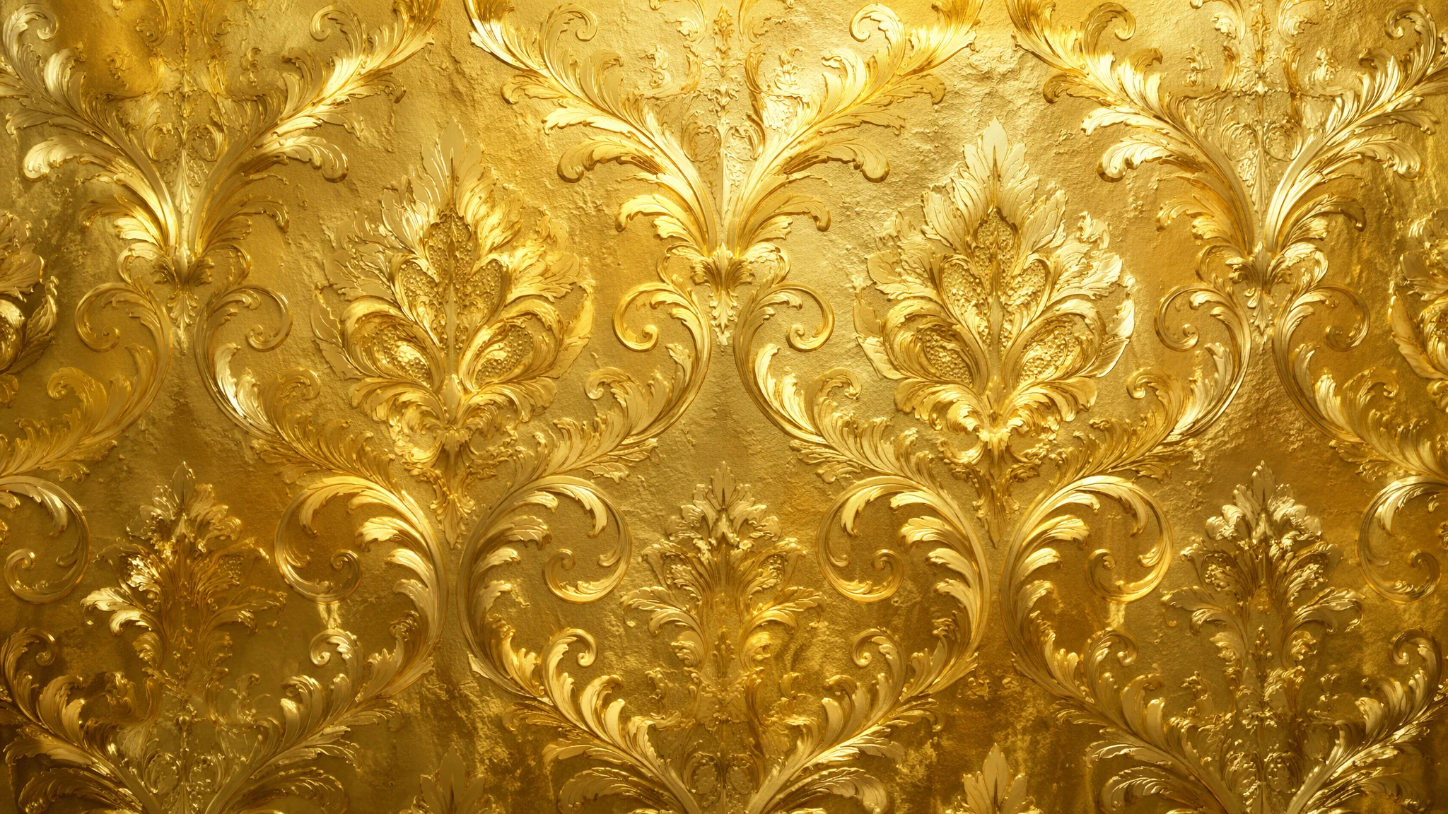
我手机壁纸每两周换一次——不是喜新厌旧,是做AI绘画的人有这个"职业病":看到新的视觉风格就手痒想试试做成壁纸。金色主题是我做过最多次也翻过最多次车的一个方向——因为金色这个东西太容易踩雷了。写"gold"AI给你出来的是廉价涂料金——那种黄得发绿、像塑料玩具上喷的金漆。真正的"高级金"是偏暖偏暗的、有金属反光层次的、在不同光线下呈现不同色调的——手机屏幕上尤其挑这个。暗了显脏、亮了刺眼、偏黄显廉价、偏白像银色——金在屏幕上的表现简直是在刀尖上跳舞。这篇把我做了三十多套金色壁纸之后积累的色号、材质和构图经验全写出来。
金在屏幕上的视觉感知和印刷品完全不同。印刷品的金色可以靠金属油墨和光线反射来实现真正的"金光闪闪"——屏幕上的金色是RGB像素发出来的光,本质上是"黄色+高亮度"的模拟。这意味着AI画金色壁纸的时候——如果你不控制亮度——金色区域会成为屏幕上最刺眼的光源,让你的图标和文字完全看不清。做金色壁纸的第一原则不是"金不金",是"金得适度"——壁纸是背景,图标是前景,金色不能抢戏。这个道理是我做了五张"美到窒息但完全没法用"的金色壁纸之后才悟出来的。
金色的色号体系——十二种金的氛围差异比你想象的大得多
"gold"不是一种颜色——它包含了从玫瑰金到古铜金至少十二种不同的色调。选错了金色色号,你要的氛围就全歪了——玫瑰金偏粉适合温柔风、香槟金偏白适合极简风、古铜金偏暗适合复古风、亮黄金偏饱和适合奢华风。玫瑰金(温柔奢华):"rose gold with a warm pinkish-copper undertone, the metal having a soft brushed finish rather than a mirror polish, the color reminiscent of sunset light on polished copper, the overall impression warm and feminine without being gaudy"。香槟金(现代极简):"champagne gold with a pale silvery undertone, the gold so subtle it reads almost as warm silver, the surface having a smooth satin sheen, the color understated and elegant suitable for minimalist design"。古铜金(复古厚重):"antique bronze gold with a deep brownish patina, the metal showing age-darkened recesses and polished highlights on the raised areas, the gold dark and heavy like an ancient artifact unearthed from centuries of burial, the impression one of old-world luxury"。亮黄金(奢华大气):"bright polished yellow gold with a warm sunny undertone, the surface mirror-smooth with sharp concentrated highlights, the gold rich and saturated like 24-karat bullion, the impression one of unapologetic opulence"。这四种金的人群年龄偏好也不同——给年轻女生做壁纸用玫瑰金、给商务人士用香槟金、给怀旧风格用古铜金、给节日主题用亮黄金。关于配色体系的深度,AI绘画色彩理论里有从单色到互补色的全套方案。
金色材质的质感密码——金箔、液态金属、磨砂金和流光金的Prompt区别
同样一个金色色号,用gold leaf(金箔)和liquid gold(液态金属)写出来的质感是两种完全不同的东西。金箔是碎的、有裂纹的、手工感的;液态金属是流动的、光滑的、未来感的。做壁纸的时候材质选对了,色号差点都能忍——材质不对,色号再准也翻车。金箔纹理:"a surface covered in hand-applied gold leaf, the gold leaf showing thin irregular cracks and overlapping edges where individual sheets meet, the texture uneven with subtle ridges and valleys catching the light differently, the overall effect one of ancient craftsmanship and artisanal luxury, small flecks of gold floating in the air or scattered at the edges"。液态金属:"flowing liquid gold with a perfectly mirror-smooth surface tension, the metal forming impossible organic curves and teardrop shapes as if suspended in zero gravity, the surface reflecting a distorted miniature world in its golden mirror, sharp caustic light patterns where the curved surface focuses light"。磨砂拉丝金:"brushed matte gold with a fine linear grain texture, the surface absorbing rather than reflecting light, the gold tone softened to a warm honey glow, the texture like the back of a luxury watch case, subtle parallel scratches adding depth without shine"。流光金(带粒子光效):"dark background with streams of golden light particles flowing like a river of stars, the particles varying in size from tiny dust motes to larger glowing orbs, the golden light trails creating spiral and wave patterns, the overall effect like liquid light flowing through darkness"。在Dribbble上搜索"gold texture"或"gold wallpaper"可以找到大量UI设计师做的金色纹理和壁纸——设计师对金色的运用比纯艺术更讲究"可用性",对做壁纸的参考价值极高。Behance搜索"gold branding"则能看到奢侈品牌如何使用金色——从色调到材质到排版,每个细节都可以逆向工程成Prompt。
壁纸构图——金色在手机屏幕上的"安全区"和"留白区"
手机壁纸不是普通的画——它需要给图标、时间、通知留出视觉空间。金色的分布应该集中在屏幕的上半部分(时间区)或下半部分(解锁滑块区)或边缘(边框装饰),屏幕中间区域(图标密集区)要用深色或素色"让路"。上半金色+下半暗色(最安全的布局):"the upper third of the image featuring rich flowing gold textures and glowing particles against a dark background, the gold gradually fading into deep near-black tones in the middle and lower portions of the image, the transition smooth and gradual creating a natural focal point at the top while leaving the lower area dark enough for icons to remain clearly visible"。中心金色圆形+四周暗化:"a central golden mandala or circular geometric pattern in burnished gold, the gold pattern glowing softly against an otherwise dark matte background, the dark borders of the image providing ample negative space for app icons, the gold pattern complex enough to be visually rewarding but compact enough to stay contained in the center"。边框金色+中心暗色:"a dark minimal background with a thin elegant gold line border tracing the edge of the screen, small gold geometric corner ornaments adding a touch of luxury without encroaching on the usable screen area, the overall design understated and practical"。构图的核心原则——金色是"点缀"不是"底色"。金色面积超过整个屏幕的30%,壁纸就废了——你的图标会像贴在金墙上一样看不清。关于壁纸类构图的更多分析,AI场景背景绘画里有从海报到壁纸的构图适配指南。
金色与其他颜色的搭配——金+黑、金+白、金+绿、金+蓝的效果差异
金色不是一个"独立色"——它需要背景色来衬托。不同底色上的金色给人的感觉完全不同:黑底金是"暗夜奢华"、白底金是"极简高级"、墨绿底金是"复古贵族"、深蓝底金是"星空神秘"。金+黑(最经典,适合OLED屏):"liquid gold flowing across a pure black void, the gold appearing to emit its own light against the absolute darkness, the contrast between the warm glowing gold and the cold depthless black creating dramatic visual tension, the black areas on an OLED screen becoming truly black and seamlessly blending with the phone bezel"。金+白(极简高级):"delicate gold leaf fragments scattered across a clean white marble-like background, the gold appearing gentle and subdued against the bright surface, the overall palette restrained and elegant, the white space providing a gallery-like setting for the gold details"。金+墨绿(复古贵族):"aged gold ornamental patterns against a deep forest green background, the combination reminiscent of old banknotes and Victorian luxury, the gold appearing warmer and richer against the cool dark green, the color pairing suggesting heritage and timeless quality"。关于配色搭配的系统方法,AI绘画色彩理论里有完整的配色轮盘方法论。
常见问题
AI画的金色总是变成"土黄色"或者"荧光黄"怎么破?
"土黄"是因为写了"gold"但没有写"metallic"——AI把金当成颜料色而不是金属色。加"metallic sheen"或"polished metal surface"立刻改善。"荧光黄"是因为亮度过高——加"warm subdued gold"或"muted golden tone"压低亮度。
金色壁纸做好后放到手机上发现太亮了刺眼怎么办?
生成时加亮度限定:"the overall image brightness kept low, the gold glow being soft and warm rather than bright and harsh, suitable for nighttime phone use without eye strain"。或者后期在手机上把壁纸亮度调低一档——简单粗暴但有效。
金色壁纸怎么避免看起来"土"或者"暴发户"?
"土金"和"高级金"的区别在三个细节:色号偏暖暗(antique gold而非bright gold)、质感有纹理(brushed而非mirror)、金色面积克制(点缀而非铺满)。一个最简单的原则——如果一张金色壁纸让你想起黄金手机壳,那就是土了。要像大牌珠宝的陈列——金是背景,不是主角。更多避坑指南参考AI绘画常见误区。
做了这么多金色壁纸我总结出一个规律:好的金色壁纸——你用了之后根本不会意识到"这是一张金色壁纸"。你只会觉得"这壁纸看着真舒服,图标也很清晰"。金在壁纸里的最高境界不是"哇好金"——是"哇好高级"。和所有设计一样——最好的设计是让你感受不到"设计"的存在。如果你做了一张金色壁纸迫不及待想给朋友炫耀——先冷静一下,放手机上用一天,看看在图标、通知和不同亮度下是不是还能保持那种"润物细无声"的高级感。能扛住一天日常使用的才是好壁纸。