AI图形设计绘画:抽象几何与品牌视觉元素的创意生成
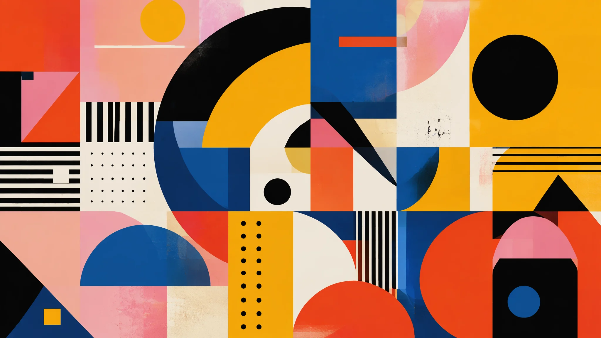
做了七年平面设计的我,第一次用AI生成LOGO雏形的时候内心是抗拒的。但只花了三个晚上我就真香了——AI在"穷举图形变体"这件事上的效率碾压任何一个人类设计师。你给它一个基础几何形,它能在五分钟内吐出两百种排列组合。设计师的工作从"创造"变成了"策展"——从两百个方案里挑出最好的那个,然后精修。
AI图形设计有一个残酷的事实:纯AI生成的图形可以直接使用的不到百分之十。但剩下那百分之九十也不是废品——它们是最好的灵感来源和方向探索工具。一个logo设计项目,传统流程要出三到五个方向给客户选,每个方向画两小时草稿。现在AI十分钟能出五十个方向,设计师把时间花在最有价值的环节——判断、筛选、深化。
几何图形的精确控制:从基础形到复杂构成的AI生成逻辑
圆、方、三角——三大基础几何形的AI关键词各有侧重。圆形靠"完美对称"得分,方形靠"稳定秩序"建立信任感,三角形靠"方向张力"制造动感。圆形变体:"perfect circle as dominant shape, concentric ring system, circular symmetry with radial elements, overlapping circles creating Venn diagram aesthetic, dot matrix forming larger circle"。方形变体:"grid-based square composition, rotated squares creating dynamic diamond pattern, nested squares with progressive scaling, isometric cube construction, square modules tessellating seamlessly"。三角形变体:"equilateral triangle centered in composition, triangle-based faceted geometric design, alternating upward and downward triangles, Penrose triangle impossible geometry, triangular grid tessellation"。有一个被严重低估的关键词是"negative space logo treatment"——让AI利用正负形关系生成图形,往往能产出让人眼前一亮的方案。AI几何抽象绘画教程里对基础几何形的视觉语言有更详细的拆解。
LOGO与图标:从概念到可交付稿的AI辅助工作流
AI做LOGO的正确姿势不是"生成完整LOGO"——而是"生成图形符号",文字部分设计师后期手动搭配。AI目前对字体设计的理解还停留在非常初级的阶段。LOGO图形提示词:"minimalist logo mark, single continuous line forming abstract icon, flat vector style, black on white background, scalable design suitable for small sizes, no text no typography"。图标系列:"set of 6 matching icons, consistent line weight and corner radius, 24px grid construction, material design principles, outlined style with occasional filled accent shapes"。行业定制:"tech startup logo mark, abstract circuit board motif simplified to geometric essence, upward trajectory arrow integrated into shape, blue gradient color scheme, forward-thinking and innovative feel"。我的LOGO工作流一般是:AI生成图形符号 → Illustrator里做路径简化 → 手动搭配字体 → 调整比例和间距 → 输出标准制图。AI负责的是"发散"环节,人的价值在"收敛"环节。Logobook是一个收录了海量LOGO设计的在线档案馆,按图形类型、行业、风格分类检索,是做AI图形设计之前积累视觉词汇的绝佳资源。
扁平化与渐变:两种主流视觉风格的AI表现力对比
扁平化风格AI表现最好——因为它本质上就是几何形+纯色,AI对这种"边界清晰、色彩单一"的图形理解最准。渐变风格难一些,关键是定义渐变的起始色、终止色和过渡方式。扁平化:"flat design, solid colors with no gradient and no shadow, bold color blocking, limited palette of 4 colors, clean vector aesthetic, Bauhaus influence"。渐变:"smooth gradient mesh, color transitioning from deep purple to vibrant orange, iridescent holographic gradient effect, gradient following curved path of shape, subtle grain texture overlay to prevent banding"。弥散渐变(新趋势):"glassmorphism effect, frosted glass with blur gradient, overlapping translucent colored shapes, soft ethereal color blending, modern UI aesthetic"。扁平风格出图成功率能到百分之八十以上,渐变风格可能只有一半——渐变的过渡区域经常出现奇怪的色带。加"16-bit gradient smoothness""no gradient banding artifacts"能缓解。AI绘画色彩理论应用指南里有关于渐变配色的深入讨论。
品牌视觉系统:从单个图形到完整VI的AI生成策略
品牌视觉不止是一个LOGO——它是图形、色彩、辅助图案、应用场景的完整系统。AI可以帮你一次性生成这个系统的各个组件,保证视觉DNA的一致性。品牌色彩板:"brand color palette of 5 colors, primary navy blue, secondary coral, accent gold, neutral warm gray, functional off-white, displayed as color swatches arranged in harmonious composition"。辅助图形:"brand pattern derived from logo motif, seamless repeating geometric pattern, scalable vector texture, brand DNA expressed through abstract shapes"。应用场景:"brand identity mockup, logo on business card and letterhead and packaging, consistent visual language across touchpoints, real-world brand application"。我的做法是写一个"母提示词"定义品牌核心视觉DNA,然后在此基础上微调生成LOGO、辅助图形、色彩板和应用场景——保证整个系列的基因统一。AI绘画商业应用场景全解析里有更多品牌设计实战案例。
海报与社交媒体图形:从AI生成的视觉资产到成品排版
AI生成的海报背景图形+人工文字排版——这是目前AI图形设计最高效的商业应用模式。AI负责视觉冲击力,设计师负责信息层级。海报背景:"bold geometric poster background, dynamic diagonal composition with energetic color contrast, large areas of negative space reserved for typography, concert poster aesthetic, screen print texture overlay"。社媒图形:"instagram post template, square format composition with central focal point, vibrant gradient background with geometric overlay elements, modern social media aesthetic"。信息图元素:"infographic graphic elements, clean data visualization icons, flow chart arrows and connectors, percentage donut charts, isometric illustration style data graphics"。有一个容易被忽略的关键词:"text-safe zone"——加上之后AI会有意识地在画面中留出适合放文字的空白区域,这对海报设计来说实用价值极高。Behance是全球最大的创意作品展示平台,搜索"graphic design poster"可以找到大量优秀的海报排版参考。
常见问题
AI图形设计常见问题集中在几何精度不足、AI生成图形的版权归属和输出格式方面。AI生成的图形为什么不够"干净"?边缘总有些模糊?
因为AI默认输出的是位图。加"crisp vector-like edges""sharp pixel-perfect boundaries""clean geometric precision"能改善。需要完全干净的矢量图形的话,还是要靠AI出参考图然后在Illustrator里手动重绘。
AI生成的LOGO能直接商用吗?
法律层面目前还存在灰色地带。建议把AI生成作为灵感起点,手动修改到"有原创性"的程度再注册。纯AI一键生成的图形在很多国家的版权局是不受保护的。具体要看各平台的用户协议。
怎么提高AI图形设计的一次性成功率?
降低复杂度。一次只让AI做一件事——要么生成一个单独的图形符号,要么生成一个色彩搭配方案,要么生成一个背景纹理。任务越单一,AI表现越好。
觉得有用的话分享给朋友吧。