AI慵懒氛围绘画:松弛感与舒适午后时光的温暖视觉表达
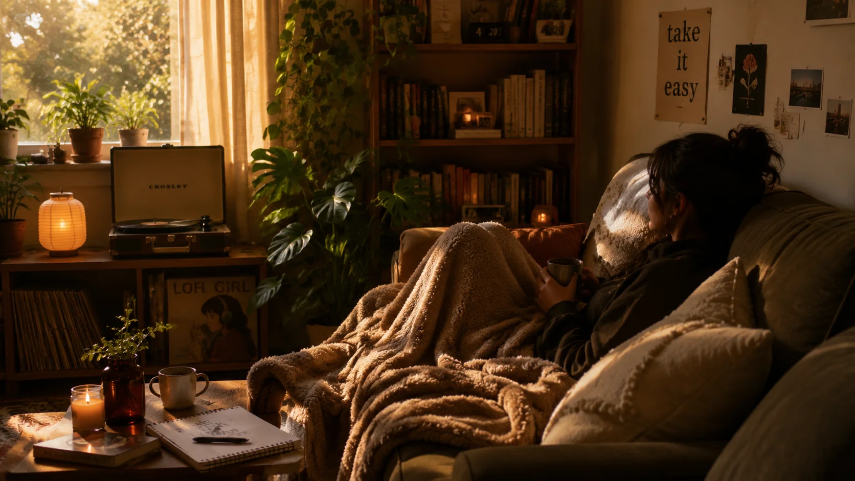
慵懒风是现在社交媒体上最吃香的视觉风格之一,但AI画慵懒画面有一个悖论:你越是用力写提示词想让它"放松",画面看起来越紧张。真正的慵懒感是靠"减法"而不是"加法"做出来的。
我周末最享受的事就是拍一张自己窝在沙发上看书的照片发小红书——那种阳光斜照、咖啡冒着热气的画面本身就很治愈。后来想用AI复刻这种氛围,结果前二十次尝试全部失败:人物表情僵硬、光线像审讯室、猫看起来像标本。痛定思痛之后我拆解了上百张高赞慵懒风照片的视觉元素,发现它们共享一套底层公式:柔光+低饱和度暖色调+生活痕迹+无目的状态。把这套公式翻译成AI提示词之后,成功率从两成飙到八成。
慵懒氛围的光影密码:自然柔光是灵魂
慵懒画面的光影就一条铁律——绝不用硬光。硬光有攻击性,柔光才有包裹感。具体到提示词里:"soft morning light streaming through sheer curtains""golden hour sun casting long gentle shadows""overcast daylight creating even diffused illumination""warm lamp glow in a dim corner""candlelight flicker on a rainy afternoon"。我测下来最好用的是"soft diffused light"这个组合——它让AI自动把对比度压下来、把高光柔化,画面立刻从"商业摄影"变成"随手拍的日常"。一个辅助技巧是在提示词里加"shallow depth of field""slight motion blur""film grain""analog photo texture"这些"不完美"指示词来削弱AI天生的超锐利画质。AI绘画光影控制技巧全解对各类光线的用法有更系统的讲解。
慵懒场景的六大经典模板
我总结了六个最不容易翻车且观众共鸣最强的慵懒场景模板,每个都有对应的关键词组。窗边阅读:"person reading a book in a window nook, oversized knit sweater, ceramic mug with steam, rain outside the window, piles of books on the floor, cat curled up nearby, warm afternoon light"。床上懒起:"tousled bed sheets in morning light, half-eaten croissant on a tray, hand reaching for coffee, wrinkled linen duvet, sunbeams across the pillow, slow morning aesthetic"。咖啡馆角落:"cozy cafe corner seat, latte art on wooden table, open journal with messy handwriting, vintage armchair, rain-streaked window, soft jazz vibe, warm amber lighting"。阳台发呆:"balcony at golden hour, person leaning on railing looking at distance, potted plants, loose white shirt blowing in breeze, city skyline blurred in background"。厨房烘焙:"flour-dusted kitchen counter, hands kneading dough, sunlight through kitchen window, herbs in small pots, rustic ceramic bowls, imperfect homemade bread"。浴室泡澡:"clawfoot bathtub by a window, bubbles and scattered flower petals, book balanced on the edge, steam rising, evening light, glass of wine on a wooden stool"。关于生活类场景的AI绘画,AI生活方式场景绘画指南有更多场景模板。
慵懒色调的精确配方:把"温暖"量化
"暖色调"三个字对AI来说太模糊,得拆成色相、饱和度、明度三个参数来写。色相控制温暖的方向——"warm amber and honey tones""terracotta and cream color palette""soft peach and dusty rose highlights"。饱和度控制色彩的浓度——"desaturated and muted colors""faded vintage color grading""low contrast pastel wash"。明度控制整体的亮度——"airy and bright with lifted shadows""matte finish with crushed blacks""slightly overexposed highlights"。一个组合示例:"warm terracotta and cream color palette, desaturated and muted tones, slightly overexposed film look, matte finish, vintage Kodak Portra color profile"。把胶片型号写进提示词(如"Kodak Portra 400""Fuji Pro 400H")也是个好用的偷懒技巧——AI训练数据里这些胶片都有强烈的风格特征。Instagram上搜"cozyvibes""slowliving""hygge"等标签,能找到海量慵懒风视觉参考。
慵懒画面中的人物姿态控制
僵硬的人会毁掉所有慵懒感——人物姿态的关键词要围绕"无目的性"和"不对称"来写。无目的性的姿态:"sprawled carelessly on the sofa""chin resting on hand staring blankly""legs draped over the armchair""curled up in a ball under a blanket""leaning against the doorframe doing nothing"。关键是不对称——对称的姿态有仪式感、有紧张感,不对称才放松。再加上"eyes half-closed""soft unfocused gaze""gentle smile playing on lips""messy bun with strands falling out"这些微表情和细节词,人物的松弛感就立住了。我做的一个对比实验:两组相同的场景描述,一组加"posing for camera"另一组加"candid unposed moment unaware of camera",后者的人物自然度高出不止一个档次。AI人物肖像绘画的系统方法对姿态控制有更深入的分析。
季节感与慵懒氛围的叠加效应
慵懒感加季节限定元素等于双倍的氛围感——秋雨、冬雪、春雨各自放大了慵懒的某个侧面。秋季慵懒:"autumn afternoon, fallen leaves outside the window, wool blanket, cinnamon and apple scent imagined, warm sepia light, hygge comfort"。冬季慵懒:"snow falling outside, fireplace glow, thick knitted socks, hot chocolate with marshmallows, cat on lap, fairy lights, cozy cabin interior"。春季慵懒:"spring drizzle, fresh green visible through window, lightweight linen clothes, vase of wildflowers, gentle breeze moving the curtains, hopeful lazy Sunday"。每个季节的慵懒都有自己的色调和道具库,把季节元素和慵懒元素叠加在提示词里,AI输出的画面层次感会翻倍。Kinfolk杂志的视觉风格是慵懒慢生活的天花板级参考,他们的用光和构图逻辑值得逐张分析。
常见问题
AI慵懒氛围绘画中常见的光线、人物姿态和色调问题,在此集中解答。为什么我写的慵懒场景看起来总像摆拍?
因为你的场景"太完美了"。真实慵懒的房间里是有褶皱的毯子、喝了一半的杯子、歪倒的书、没整理的靠垫的。在提示词里加"lived-in mess""slightly cluttered but cozy""imperfect and real"这些词,破坏掉画面的完美感,慵懒感才会出来。
慵懒风适合用什么AI绘图工具?
Midjourney对氛围和光线的理解最好,产出带天然的电影感和情绪。Stable Diffusion配合LoRA模型(如"CozyVibes"或"HomeAesthetic")也能出好效果,且可控性更强。两者配合使用——MJ定方向、SD做精细调整——是我目前最顺手的慵懒风工作流。
AI生成的慵懒画面可以直接做小红书封面吗?
可以,但建议在AI生成图的基础上做二次处理。加一些手写文字、贴纸、颗粒感滤镜,让画面不那么"AI感"。小红书的用户对"一眼AI"的内容接受度在下降,加入手工痕迹反而更受欢迎。
觉得有用的话分享给朋友吧。