AI漫画风格绘画进阶:日式分镜与网点纸效果的完整创作教程
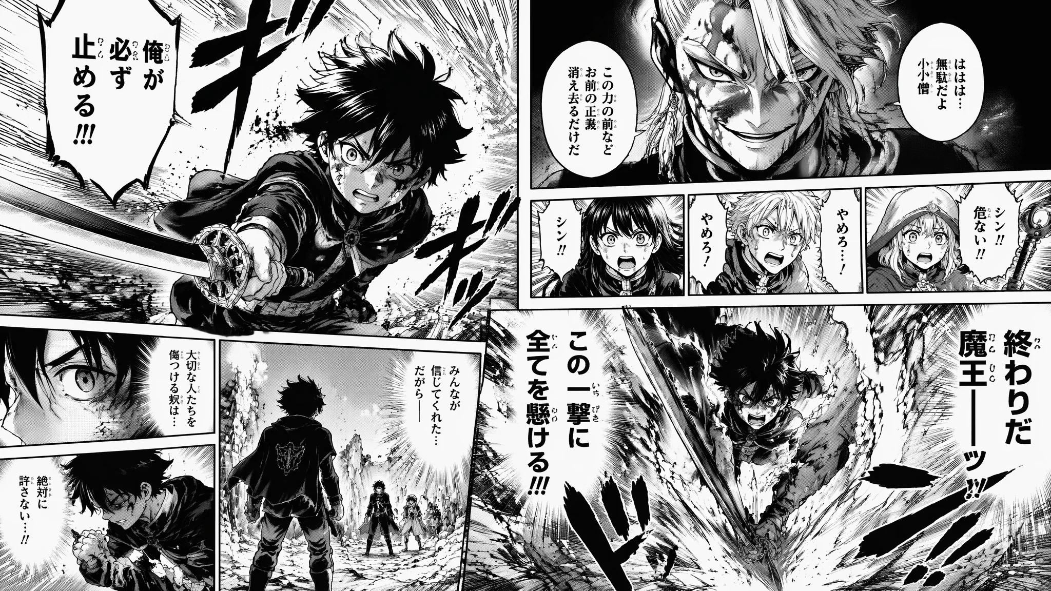
初中三年我在课本空白处画了三百多页漫画——全是模仿《周刊少年Jump》的风格。那时候我最头疼的不是人体不会画,是网点纸——进口的太贵,国产的粘性不行,刮网的时候经常把纸刮破。后来用PS贴网点觉得方便多了,但还是很麻烦。直到AI绘画出来,网点效果可以一键生成,速度线可以从提示词里往外长——我那个14岁的自己如果知道有这种东西,大概会哭。用AI画日式漫画风格,精髓不是画工,是"漫画语法"——分镜逻辑、视线引导、节奏控制、网点灰度。不懂这些语法,AI画出来的就是"插画加了个对话框",不是漫画。
日式漫画跟美式漫画的视觉体系有根本区别:日漫靠"线"——线条的粗细变化、速度线的密度和方向、网点灰度的深浅——来同时承担造型、光影、情绪三个功能。美漫靠"色"——大面积的flat color和硬阴影来区分面。所以AI画日漫,你的关键词要围绕"线"去写:线条的质感、速度线的方向、网点的疏密。我之前写过一篇漫画风格的基础入门,AI漫画风格绘画基础入门可以配合阅读,那篇偏基础概念,这篇偏进阶技法。
分镜布局:从四格到跨页的Panel构图逻辑
漫画不是一张图——是时间线上的空间排列。分镜决定了读者眼球在页面上的移动轨迹。四格漫画写"4-panel comic strip layout, vertical Japanese yonkoma style, panels arranged top to bottom, each panel has a clear punchline progression, simple clean lineart, the comic reads from right to left, comedic timing expressed through panel sizes";标准页面写"manga page layout with 5-7 panels of varying sizes, a large establishing panel at the top showing the scene, several smaller panels in the middle showing character reactions, a dramatic full-width panel at the bottom for the climax, speech bubbles integrated into the composition, the panel borders are hand-drawn irregular lines";跨页大场景写"double-page manga spread, a single panoramic image spanning two pages, the center is the focal point with action radiating outward, speed lines and impact effects fill the composition, the binding gutter runs down the middle, the artwork continues seamlessly across the fold"。分镜的核心是"视线引导"——大格放重点内容、小格放过渡信息、关键动作放在右页(翻页的悬念点)。AI对分镜排版的理解目前还不够成熟,建议分镜布局用PS或Clip Studio Paint手动搭建,AI负责填充每个格子的内容。
少年漫画风:速度线、集中线、效果字与战斗场面
少年漫的视觉语言就一个字——"动"。所有画面元素都在为"动态感"服务。速度线写"manga speed lines radiating from the center of action, the lines are parallel and dense creating a sense of explosive movement, the speed lines vary in thickness for visual rhythm, the character is frozen mid-action against the dynamic line background";集中线写"manga focus lines converging on the character's face, the lines are straight and evenly spaced radiating inward, the character is in the center spotlight, the background behind the lines is solid black or screen tone, dramatic close-up shot";战斗效果写"shonen manga battle scene, impact burst effects with jagged energy lines, action lines trailing behind fists and weapons, dust clouds and debris rendered in manga style with sketchy lines, the sound effects are drawn as stylized Japanese onomatopoeia (ドン, バキ, ズガン), high contrast black and white with screen tones"。少年漫还有一个容易被忽略但非常重要的元素——"汗珠、青筋、脸红"这些夸张的情绪符号。写"exaggerated manga emotion marks: sweat drops on forehead, visible vein mark on temple, blush lines on cheeks"可以激活这些效果。在周刊少年Jump官网上看最新连载,关注画面中的动态处理手法。
少女漫画风:花卉背景、星光眼、飘渺线条与浪漫氛围
少女漫的视觉语法跟少年漫完全相反——它不是"动",是"闪"。花卉背景写"shojo manga style, the background is filled with floating flowers, sparkles, and decorative patterns, the floral elements are drawn with delicate thin lines, the flowers cluster around the character creating a romantic frame, the overall effect is dreamy and ethereal";星光眼写"shojo manga eyes with multiple catchlights and stars reflected in the pupils, the eyes are exceptionally large and expressive with long defined eyelashes, the eye highlights create a sparkling jewel-like effect, the gaze conveys deep emotion";氛围线条写"soft wispy mood lines in the background, the lines are gentle and flowing not dynamic and sharp, the screen tone is light and airy with lots of white space, the overall line weight is uniformly thin and delicate"。少女漫还有一个专属特征——"花体对话框"(装饰性的文字气泡,边上画着小花或星星)。写"decorative speech bubbles with floral ornaments around the edges"可以加入这个元素。关于日漫不同流派的风格差异,AI日式动漫风格绘画基础里有少年漫、少女漫、青年漫的完整风格树。
网点纸技法:从平网到渐变网到刮网效果的AI还原
网点纸是日漫的灵魂——没有网点,日漫那种独特的灰度层次感就没了。平网写"manga screen tone, uniform dot pattern creating a flat gray area, the dots are evenly spaced and sized, the screen tone is used for shadows on clothing and skin, the dot density gives the illusion of different gray values";渐变网写"gradient screen tone transitioning from dense dots to sparse dots, the gradient creates a soft fade in the shadow area, the dots become smaller and more widely spaced as the gradient lightens";刮网效果写"scraped screen tone effect, the dot pattern is partially erased creating a textured edge, the scraping follows the contour of the object creating a three-dimensional shading effect, the technique looks hand-done with irregular scraping marks";叠网写"two layers of screen tone overlapping at different angles, the moire pattern created by the overlapping dots adds visual texture, the effect is used for dramatic shadows or special effects"。AI生成网点时建议写"black and white manga with halftone screen tones, no color, no grayscale gradients only dot-based halftone"。纯黑白+网点模式比灰度模式更像真正的印刷漫画。
对话框与文字排布:气泡形状、字体效果与阅读顺序
对话框在漫画里不是"容器"——它是角色表演的一部分。气泡形状写"manga speech bubbles with hand-drawn irregular oval shapes, the bubble tails point precisely to the speaking character, different bubble shapes indicate different tones: round bubbles for normal speech, spiky bubbles for shouting, dotted bubbles for whispering, cloud-like bubbles for thoughts";字体效果写"hand-drawn manga lettering, the text is in Japanese with furigana readings, the dialogue is handwritten not typed, important words are larger and bolder, the text is integrated into the artwork not overlaid";阅读顺序写"the panels and speech bubbles follow Japanese right-to-left reading direction, the panel arrangement guides the eye from top-right to bottom-left, the layout respects the traditional manga reading flow"。目前AI对对话框和文字的处理还是弱项——它画不出准确的日文字符,对话框的形状也经常走样。建议AI出图后把对话框和文字在排版软件中手动添加。
完整页面工作流:从脚本到成稿的AI辅助漫画制作流程
一页漫画的完整AI辅助流程:脚本 → 分镜草图 → AI生成各格内容 → 拼版 → 加对话框和文字 → 最终调整。脚本阶段用文字描述每格的内容和对话。分镜阶段用手绘或在Clip Studio里画出粗略的格子划分和人物位置。AI生成阶段——每个格子单独出图,用同一套风格关键词保持页面风格统一。拼版阶段把各格AI图按分镜草图放入页面模版。最后加对话框和文字。这套流程我已经走了不下五十页漫画的制作,最大的心得是:不要试图让AI一次性画整页漫画——它会把格子内容搞串,人物一致性也保不住。一页5格就出5张图,每张图用"same character, same outfit, same style"做一致性约束,手动拼版反而更快。漫画创作工具推荐Clip Studio Paint——它是目前最专业的漫画制作软件,分镜模板、网点素材库、对话框工具都是原生支持。
常见问题
AI漫画风格绘画的进阶问题集中在分镜叙事、网点质感和角色一致性上。AI怎么保持跨页的角色一致性?
这是目前AI漫画创作的最大瓶颈。折中方案:先用AI生成一张"角色标准照"(正面、全身、简单站姿),锁定种子和Prompt;然后把这张角色照作为Reference Image(MJ的--cref或SD的IP-Adapter)贴进每一格的生成中;最后手动微调明显不一致的细节(发型、服装颜色)。完全依靠AI保持一致性还不现实,但AI+手动微调可以做到八成以上的统一度。
网点纸效果总是出不来怎么办?
写在最前面:"black and white manga, screen tone halftone shading, dot pattern shadows, no color, no smooth gradients"。这四个限定词缺一个AI就可能给你灰度图或彩色图。如果SD下网点还是不够明显,用ControlNet的Tile模型配合一张真实网点纸纹理图做引导。
AI画的漫画文字为什么总是乱码?
AI目前不理解"文字"——它只是统计性地画一些看起来像文字的图形。不要在AI阶段指望文字正确。漫画的文字和对话框一律用后期软件手动添加——这是所有漫画家的标准工作流,不是AI的问题。对话框和文字的专业处理参考AI漫画文字与对话框排版技巧。
漫画的灵魂不在画面有多精细——在翻页时那一瞬间的节奏感。AI能帮你画出漂亮的画面,但分镜的呼吸节奏、对话框之间的留白、翻页悬念卡在哪个格子里——这些是漫画家的事。AI是笔,你不是。