AI小说配图绘画教程:网络文学角色场景的系统化创作教学指南
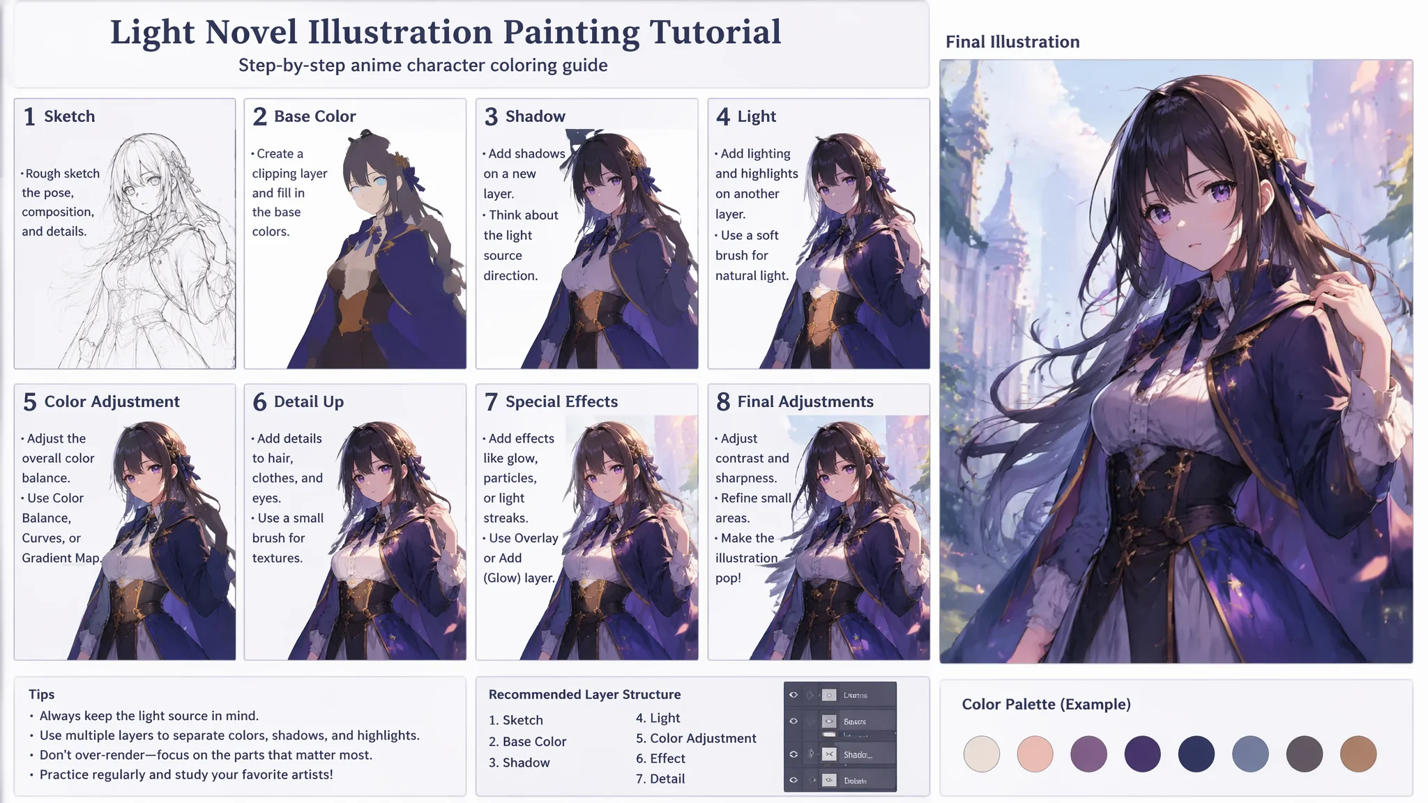
我老婆写网文——古言穿越,写了三年,大概六十万字,读者群三五百人。她一直想给小说配插图,但请插画师太贵了(一张像样的角色立绘要八百到一千二),而她自己又完全不会画画。去年她开始用AI给小说配图之后,情况完全变了——现在她每个重要章节都配一张AI插图,读者在章节评论区讨论最多的居然是"这个角色和我想象的一模一样"或者"这个场景画得比我想象的还好"。我发现AI做小说配图有一个独特的优势:作者本人最了解角色长什么样——她不需要向插画师"翻译"她脑子里的画面,她可以直接用Prompt把画面"写"出来。这篇把她这一年多摸索出来的小说配图全流程整理出来——从人设提取到场景构建到保持连载角色一致性。
从文字人设到视觉Prompt——把"他气质清冷"翻译成AI能理解的画面
网文角色的人设描述和AI需要的视觉描述之间有一道鸿沟。网文写的是"他一袭白衣胜雪,眉宇间带着拒人千里的疏离"——这是文学语言,不是视觉语言。AI需要的是:白色的什么材质?什么款式?眉毛的具体形状是什么?什么微表情传达了"疏离"?翻译的核心技巧是:每一个形容词都必须对应一个具体的视觉特征。
"白衣胜雪"的视觉翻译——"he wears a long white robe made of silk that has a subtle sheen——the fabric is not pure white but has a faint silver undertone that catches the light, the robe is made of multiple layers——the innermost layer is a matte white cotton that creates a soft base, the outer layer is a translucent silk gauze that floats slightly with his movements, the sleeves are wide and trail past his wrists"。注意:不写"white clothes"——写材质(丝绸)+层数(多层)+光泽(银白底调)+动态(纱质外层浮动)。"眉宇间疏离"的视觉翻译——"his default expression is neutral but cool——not angry, not sad, simply closed off, the key is in the eyes——his gaze is slightly averted, not meeting the viewer's eyes directly, the eyebrows are naturally straight with a very slight downward tilt at the inner corners giving a permanent hint of seriousness"。把"疏离"翻译成"目光微偏+眉间微沉"——这才是AI能执行的指令。更多角色微表情的控制技巧在AI精灵王子绘画里做了详细拆解——精灵族的高贵疏离感和古言男主的冷峻气质在Prompt写法上高度相通。
关键场景的选择——不是每一段文字都值得画
我老婆刚开始给小说配图的时候犯了一个错误:每章都画一张。结果就是画了一堆"两个人站在房间里说话"的无聊图——两个角色面对面站着,背景是模糊的室内——读者根本不想看这种图。后来她改成了"只画关键场景":推动剧情转折的那个瞬间、新角色的第一次登场、情感爆发的峰值时刻。配图的价值不在于"把文字翻译成图画"——而在于"把文字中最有视觉张力的一帧单独提取出来放大"。
高价值场景类型一:角色首次登场——"the first time the female lead sees the male lead——he is standing at the edge of a cliff at dawn, his silhouette is backlit by the rising sun, his long hair and robes are blown by the mountain wind, she can only see his outline and the way the light catches the edge of his jaw and the sword at his waist"。类型二:情感爆发点——"the moment of confrontation——she has just slapped him, his face is turned to the side from the impact, a red mark is forming on his cheek, her hand is still raised in the air frozen in the aftermath"。类型三:世界观展示——不是画人物,而是画这个世界最特别的地方——"the floating city as seen from the deck of a flying ship at sunset, thousands of lanterns are being lit across the city creating a sea of golden lights suspended in the purple dusk"。这三种类型的图读者最爱看——因为它们提供了文字之外的视觉满足感。关于场景氛围的渲染可以参考ArtStation上的概念设计作品和DeviantArt上的插画社区——这些平台上大量优秀的概念设计师已经把"一句话描述变成一幅完整场景"这件事做到了极致。
角色一致性的"固定模板法"——让男主从第一章到第一百章都长同一张脸
连载小说配图最大的技术难题:同一个角色在不同章节的配图里长得不一样。这周画的男主像肖战,下周画的像王一博——读者一眼就能看出来"这不是同一个人"。解决方案是给每个主要角色建立一个300-500字的"面部模板"——就像警察局的画像师描述嫌疑人一样,精确到骨骼结构的描述。
男主角面部模板示例:"male, Han Chinese features, age appears 24-26——old enough to have lost the softness of youth but young enough that his face is still smooth, face shape is a defined oval with a strong jaw that tapers to a slightly pointed chin——the jaw is masculine but not square or blocky, cheekbones are high and pronounced creating a sculpted look, especially visible when he turns his head to the side, the nose is straight and well-proportioned——the bridge has a subtle prominence at the midpoint, the tip is slightly upturned giving his profile a hint of approachability that contrasts with his cold demeanor, the eyebrows are naturally dark and straight, slightly thicker at the inner corners and tapering to a clean point, they sit close to the eyes which makes his gaze more intense, the eyes are phoenix-shaped——the inner corners are slightly lower than the outer corners, the upper eyelid has a subtle fold visible only when his eyes are half-closed, the iris is a very dark brown that appears almost black except when light hits it directly revealing a deep amber undertone, the mouth is well-defined with a fuller lower lip and a thinner upper lip, when at rest the corners turn down about one degree——enough to look serious but not enough to look angry, a distinctive feature——a tiny mole just below the outer corner of his left eye"。把这段模板复制粘贴到每一张配图的Prompt前面——AI就有了"这是同一个人"的锚点。
古风场景的材质库——不是"古代房间"而是"哪个朝代的什么房间"
AI对"古风"的理解非常浅——画出来的古风场景通常是各种古装剧布景的大杂烩:唐代的屏风+明代的家具+清代的窗户+玄幻剧的灯光效果。如果你不给AI一个明确的朝代和具体建筑类型——它就会给你一个大杂烩。给小说配古风图之前必须先定好三个参考系:朝代、地域、建筑类型。
汉风室内:"Han dynasty style interior——low wooden tables with bronze ritual vessels, woven bamboo mats on the floor, lacquerware in red and black with cloud-scroll patterns, a bronze oil lamp shaped like a goose with a fish in its beak, silk curtains in deep indigo hang from the ceiling beams, the walls are made of rammed earth with wooden support pillars visible, the overall color palette is warm earth tones with accents of deep red and the dark patina of ancient bronze"。唐风宫殿:"Tang dynasty palace interior——high ceilings with exposed wooden beams painted in vermilion, the walls are plastered white with remnants of faded murals showing celestial beings and lotus flowers, tall windows with latticework let in streams of golden afternoon light, a large bronze incense burner in the shape of a mythical beast emits a thin trail of fragrant smoke, polished stone floors reflect the light like a dark mirror"。宋风园林:"Song dynasty scholar's garden——a small pavilion with upturned eaves overlooks a pond of dark water, weathered Taihu rocks create a miniature mountain landscape by the water's edge, bamboo groves surround the garden creating natural walls of green, a stone table with a half-played game of Go sits under an ancient pine tree"。朝代对应的准确度直接影响画面的可信度——关于中国风视觉体系的参考可以从AI李星云绘画里的古风角色设计逻辑中获取更多细节。
常见问题
小说里玄幻魔法或者仙术特效怎么画才不像"五毛钱特效"?
玄幻特效的核心问题是"能量"的物理表现。火焰——不是橙色的一团,是"a swirling vortex of fire with internal structure——the flames are hottest at the center where they are white-blue, transitioning to golden yellow at mid-radius and deep orange-red at the edges, small embers break away from the main body and spiral upward"。冰系——不是蓝色的玻璃,是"crystalline ice forming in real-time——frost spreads across the surface it touches in fractal patterns, the ice is not perfectly clear——it contains trapped air bubbles and stress fractures that scatter light"。雷电——不是黄色的锯齿线,是"lightning that branches like a tree root system——the main bolt is intensely bright white, the branching tendrils are thinner and fade quickly, the air around the bolt ionizes creating a soft violet glow"。每种能量形式都有看得见的物理过程——写出来。
多个角色同框的时候AI为什么经常"混淆"角色的特征——怎么让AI区分两个角色?
AI在处理多角色时天然倾向于"混为一谈"——尤其是两个同性别同年龄的角色。解决方法是为每个角色分配一个"主导色彩"和"主导材质"——并在Prompt里用括号明确分界。"[Character A: the male lead in dark blue silk robes with silver embroidery] stands on the left, [Character B: the second male lead in deep red linen robes with gold trim] stands on the right"——用方括号标记每个人物的描述区块,AI更不容易混淆。另外站位要写清楚:左/右/前景/背景——位置的明确分工帮助AI把角色分配到不同的空间位置。
小说里的"丑角色"怎么画——AI总是自动美化一切?
AI的训练数据有强烈的"审美均值化"倾向——你写"ugly"它也给你画一个五官端正只是表情不好的人。画真正有特点的不美型角色需要反向Prompt:"the character is not conventionally attractive——his nose has been broken and healed crooked, one eye is slightly smaller than the other due to an old injury, his teeth are uneven and stained, his skin is pockmarked from childhood illness, but his expression is one of dignity and wisdom——he is not a monster, he is a man whose face tells the story of a difficult life"。关键在于"具体的不完美"而不是笼统的"丑"——并且要在不完美之外给这个角色一个有价值的特质(尊严、智慧、温暖),否则AI就把他画成了反派脸。