AI画蛇添足风格:过度装饰与极繁主义的实验性视觉艺术探索
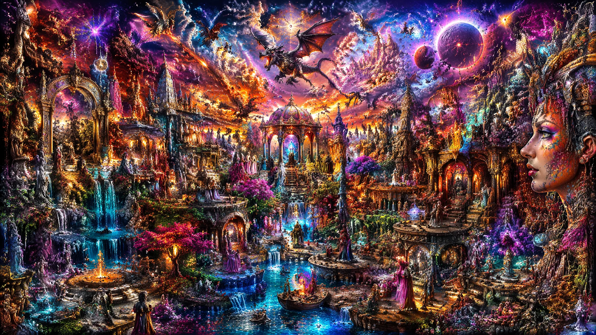
我有个做平面设计的朋友,他的作品风格是"塞满一切"——一张海报上恨不得塞进去20种字体、15种颜色、30个装饰元素。客户经常跟他说"能不能简约一点",他的回答永远是:"简约是留给无聊的人的,我卖的是视觉轰炸。"这个态度让我开始关注极繁主义(Maximalism)——一种故意"过度"的美学。在AI绘画的世界里,大家都忙着追求"干净""简洁""高级感"——很少有人反过来问:如果故意画得"过头"会发生什么?我发现一个有趣的规律:AI在极繁主义上其实有天然优势——因为它不会累。人类画师画到第50朵蕾丝花边的时候手会抖,AI不会。这篇就是一次实验性的探索——用AI故意"画蛇添足",看看能走到多远,以及怎么在"过度"中仍然保持美学上的平衡。
极繁主义的哲学——"画蛇添足"不是错误,是故意为之的美学立场
理解极繁主义的关键是区分"无意的混乱"和"有意的繁复"。一个不会画画的人画出来的混乱是前者——没有任何结构可言。一个极繁主义艺术家的作品是后者——每多一笔都是有意图的,只是"意图的数量"比极简主义多了100倍。
极繁主义宣言式Prompt:"this image is an exercise in deliberate excess——every surface is decorated, every edge is ornamented, every shadow contains additional detail, the guiding principle is 'more is more' applied with absolute conviction, there is no fear of clutter because clutter is the point, negative space is treated as a missed opportunity——fill it with pattern, fill it with texture, fill it with something beautiful or strange or both, the image should overwhelm the viewer's visual processing in a pleasurable way——like eating too much dessert, it is excessive but delicious"。参考V&A博物馆的"极繁主义"设计展——从维多利亚时代的室内装饰到当代时尚的极繁复兴。
"画蛇添足"在中文语境里是贬义——但在AI艺术里,故意画蛇添足是一种创作方法论。就像AI抽象几何绘画里的"去规则化"——有时候打破规则比遵守规则更有创造力。极繁主义和极简主义在AI绘画的优缺点中讨论过美学立场的两极分化。
层次堆叠的技法——如何在AI里构建"层层叠加"的装饰而不崩坏
AI画复杂场景最容易出现的问题:元素开始"融合"——壁纸的花纹和衣服的图案混在一起,家具的雕刻和人物的头发长在一起。这种"元素融合"是AI在处理高密度视觉信息时的常见失误。对策是"层次分离描述法"——在Prompt里明确每一层的物理深度。
层次分离Prompt:"the image is constructed in distinct depth layers that do not visually merge——background layer: the far wall covered in intricate hand-painted wallpaper featuring repeating motifs of peonies and songbirds in muted gold on a deep teal ground。mid-background layer: a monumental carved wooden bookcase filled with leather-bound books of varying sizes and colors, each shelf edge decorated with a different carved frieze。mid-foreground layer: the figure in an embroidered silk coat——the embroidery is a different pattern (dragons and clouds) from the wallpaper (peonies and birds) ensuring the two patterns do not visually merge。foreground layer: a still-life arrangement on a small table in the extreme foreground——a silver tea set, a half-eaten pastry, a vase of fresh roses, these items have the sharpest focus and highest contrast"。每一层都有一个独特的"视觉标签"(壁纸=牡丹+鸟,书柜=雕花+皮革,人物外套=龙+云)——这些标签互不重复,AI就不会把不同层的元素混在一起。
这种"层次分离"的逻辑在AI游戏美术绘画的场景概念设计中有类似的应用——游戏场景的前中后景层次同样是靠"区别化的视觉标签"来分离的。更多装饰艺术的参考可以看荷兰国立博物馆的17世纪静物画——荷兰黄金时代的"过度静物"是极繁主义的先驱。
混乱中建立秩序——三个"锚点"让极繁画面不失控
极繁主义不是"随便撒花"——每一件伟大的极繁作品背后都有一套隐秘的秩序系统。在AI Prompt里这套系统需要被明确编码:色彩锚点保证不辣眼,重复锚点建立节奏,焦点锚点给眼睛一个"家"。
色彩锚点:"amid the visual abundance a disciplined color palette holds everything together——only three colors dominate: deep burgundy, old gold, and midnight blue, every decorative element falls within this triad, there are no rogue colors, the restraint in color range makes the excess in pattern density tolerable"。重复锚点:"a single motif repeats at multiple scales throughout the composition creating hidden unity——the same acanthus leaf shape appears in the carved wooden furniture, the embroidered hem of the dress, the wrought iron candle stand, and the frame of the mirror, the repetition is not obvious at first glance but subconsciously organizes the chaos"。焦点锚点:"amid the lavish excess a single element commands the compositional hierarchy——the figure's face is the calm center of the storm, rendered with simpler cleaner modeling than the surrounding decorative frenzy, the eye always returns here no matter how far it wanders"。三锚点锁定——画面可以"乱"但不会"失控"。色彩理论参考Adobe Color的配色工具。
常见问题
AI生成的极繁画面看久了"眼累"——是AI的问题还是极繁主义本身的问题?
两者都有。极繁主义本身就挑战视觉舒适区——它就是要让你"看不过来"。但好的极繁作品和差的极繁作品的区别在于:好的让你"看不过来但还想继续看",差的让你"看不过来并且想关掉"。改善方法:引入"视觉休止符"——在全画面密度最高的区域旁边,故意留一个"呼吸点"。"amid the visual density a single smooth surface offers the eye a moment of rest——the figure's bare shoulder, rendered in smooth unadorned skin, is the only area in the entire composition without pattern or texture, this small patch of visual silence makes the surrounding abundance feel luxurious rather than exhausting"。就像音乐里的休止符——寂静让声音更有力。极繁中的"少"让"多"更有价值。
怎么避免极繁画风变成"淘宝爆款风"——高级极繁和廉价堆砌的区别在哪?
廉价极繁=高饱和度+低质感+无逻辑堆砌(花+蝴蝶+星星+钻石全往上扔)。高级极繁=受控的色彩+扎实的材质+有叙事逻辑的装饰(每一件物品都在讲故事)。高级极繁Prompt检查清单:材质是否具体?(不是"gold decorations"而是"hand-chased gilt bronze with a warm aged patina")装饰是否有来源?(不是"random patterns"而是"17th century Ottoman tile motifs adapted for a contemporary interior")是否有克制?(不是"every color of the rainbow"而是"a strict palette of three jewel tones")。回答不了这三个问题——你就是廉价堆砌。
极繁风格适合做什么类型的项目——它有什么使用场景?
极繁风格不是万能的。它最适合四类场景:时尚摄影(华丽的服装和场景需要极繁衬托)、专辑封面(音乐本身就是情感上的"极繁")、奇幻/历史题材插图(宫廷场景、魔法图书馆)、奢侈品牌视觉("多就是贵"的品牌叙事)。最不适合的场景:企业品牌设计(需要清晰易识别)、UI/UX设计(信息层级必须清晰)、极简主义建筑摄影(自相矛盾)。选风格就像穿衣服——去夜店可以极繁,去面试还是收敛点好。