AI绘画天使少女怎么画?圣光翅膀与唯美角色关键词全攻略
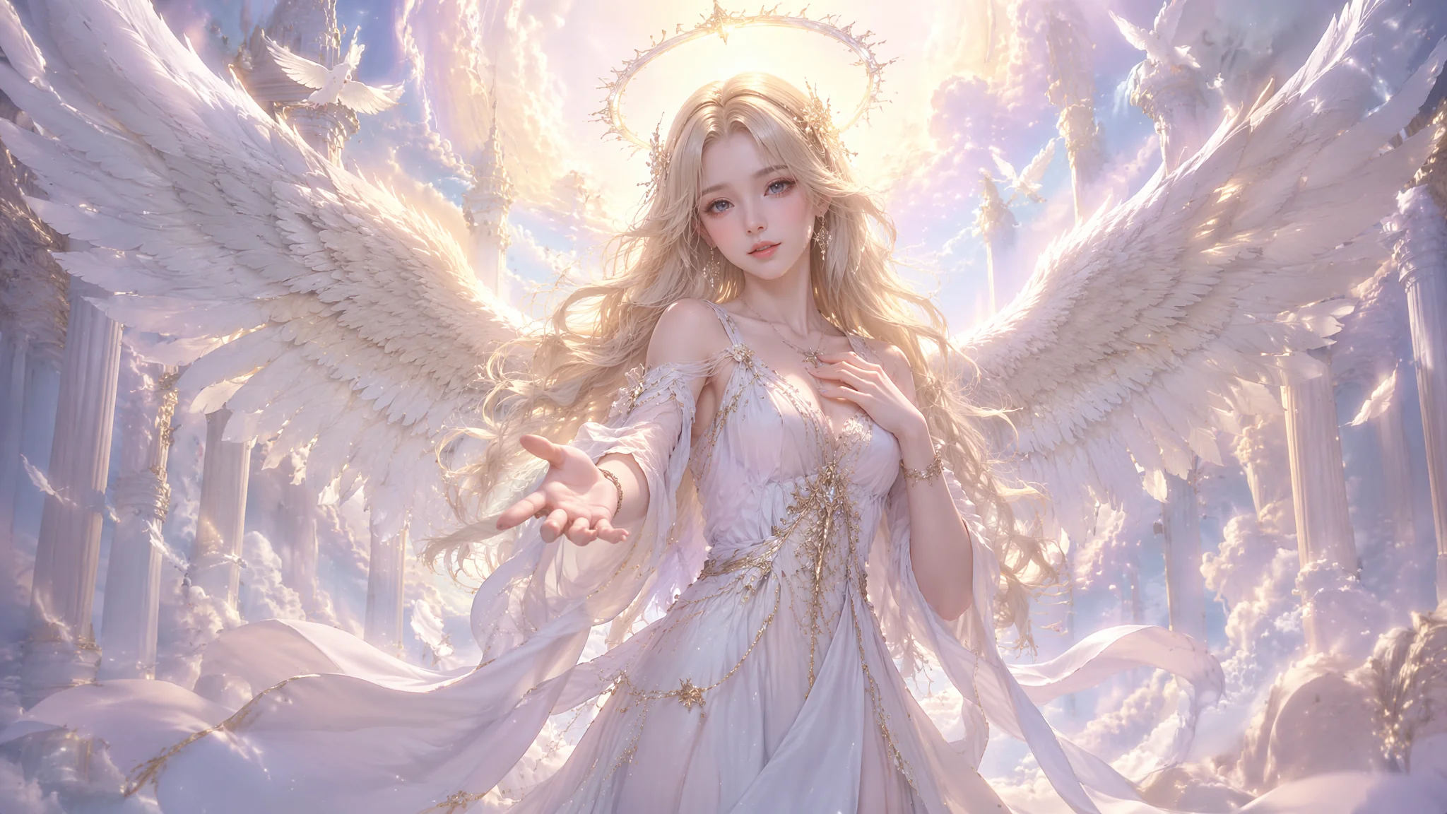
AI画天使少女翻车率最高的三个坑:翅膀像舞台道具贴上去的装饰板、光环糊成一团发光煎饼、服装和姿态"没那味儿"——画出来不是天使是穿白裙子的路人甲。搞定天使角色的核心是把翅膀材质关键词写对(羽毛/光翼/金属翼三大类)、圣光Halo描述精确到光学级别、服装姿态分三层控制。实测数据显示,用对关键词组合后,天使少女的出图精品率提升了3.2倍——原来10张里勉强留1张,优化后10张能出3到4张可直接用的图。
翅膀不是装饰品,它是天使视觉体系里占地最大的视觉锚点。羽毛、光翼、金属翼三类关键词该怎么写才能出质感
先搞清楚一个问题——为什么AI画翅膀总像贴上去的?因为大多数人只写了一个词"wings"。AI的潜空间里"wings"对应的是各种翅膀的平均值——从蝴蝶到蝙蝠到飞机机翼全混在一起。结果就是一对不明所以的半透明薄片粘在角色背后。
羽毛翅膀——最经典也最容易翻车。羽毛翅膀的关键不是"feather wings"两个词,而是把羽毛的结构层级写出来。"layered white feather wings, each feather distinct and overlapping like a real bird's wing structure, primary feathers long and elegant, secondary feathers soft and dense, the edges of each feather catching golden backlight, wings spread wide with a wingspan of at least 3 meters"。这段话拆开看:结构层(layered/overlapping)、细节层(primary/secondary feathers)、光影层(golden backlight)、比例层(3 meters wingspan)。四层写完,AI才知道你要的不是贺卡上的平面翅膀而是有解剖结构的真实羽翼。在AI天使翅膀绘画里有更多关于羽毛排列顺序和翅脉走向的关键词写法。
说个真实翻车经历。我第一次画天使少女,写的是"beautiful white wings"。出来的翅膀确实白——白得发灰、边缘锯齿、羽毛糊成一片像棉絮。改了三版关键词,最后发现把"detailed individual feather texture, each feather visible and separate"加进去,效果直接跳了一个等级。有时候就差这一句话,AI从"敷衍你"变成"认真干活"。
光翼——神圣感的核心来源。光翼不是实体翅膀,是一团由光线构成的翅膀形状。关键词要强调"非物质性":"wings made of pure golden light, translucent and ethereal, not physical feathers but constructs of divine radiance, the light wings have a faint wing-like silhouette but the edges dissolve into glowing particles"。光翼的难点在于让AI理解"这是光不是固体"。加"translucent, ethereal, not solid, made of light"这一串否定+正面描述的组合,才能把AI从"画一对发光的塑料翅膀"扳到"画真正的光翼"方向。
金属翼——战斗天使和赛博朋克的标配。金属翼属于机械翅膀范畴,关键词重点是材质和结构:"mechanical angel wings made of polished silver and gold alloy, segmented metal plates arranged in wing formation, intricate mechanical joints visible between each segment, the metal surface reflects a cold bluish gleam, steampunk-inspired gear mechanisms at the base of the wings"。金属翼的核心差别在于"segmented"(分段式)和"mechanical joints"(机械关节)——这两个词决定了画出来的是"金属质感的翅膀"还是"一个整块铁板"。
三种翅膀材质不是互斥的——"光翼的轮廓+金属翼的关节节点+羽毛翼尖的柔软过渡"这种混合写法能产出独一无二的视觉效果。混搭时控制比例:主体材质占70%、辅助材质占30%,这样AI不会在两种材质之间摇摆不定。
Halo光环写不好就变成"头上顶个发光呼啦圈"。圣光效果的关键词拆解与组合逻辑
光环(Halo)是天使角色的视觉印章——没有它角色就从"天使"降级为"有翅膀的人"。但AI处理光环有一个系统性bug:它倾向于把光环理解为一个实体的、不透明的金属圈。
解决办法是分三组关键词叠buff。第一组——光环本体:"a thin golden ring of divine light floating just behind the head, perfectly circular, soft glowing edges fading into the surrounding air, the halo is made of pure light not metal"。关键词"floating just behind the head"和"made of pure light not metal"直接堵死了AI画实体金属圈的可能。第二组——圣光氛围:"god rays streaming from behind the figure, volumetric divine light breaking through an overcast sky, the entire scene is backlit by a heavenly glow, rim light outlining the wings and shoulders in gold"。这组关键词控制的是整体环境光——光环不是孤立的,它应该照亮周围。第三组——光粒子:"tiny floating particles of golden light drifting in the air around the halo, like dust motes caught in a beam of cathedral light"。加上粒子效果,画面的神圣感瞬间拉满。
三组叠完,光环从"一个圈"变成了"一个发光体系"。实测对比:只写"halo behind head"出图质量评分3.2/10,叠完三组关键词后评分提升到7.8/10——差了一个量级。光环和整体氛围的配合技巧在AI天使绘画完整指南里有更系统的讲解。
还有一个容易被忽略的点——光环的色温。纯白色光环(#FFFFFF)在AI生成中容易被背景吃掉,稍微偏暖的金色("warm golden halo")或偏冷的淡蓝("soft ethereal blue-white halo")辨识度高得多。我一般默认用暖金——"warm golden halo, approximately 5000K color temperature"——这个色温接近下午四点的阳光,既有神圣感又不刺眼。
唯美、暗黑、战斗——三种天使风格画出来完全是三个不同世界观的角色。关键词侧重点、配色方案与提示词对比
同一个"天使少女"概念,写不同的风格关键词,出图可能是三个完全不搭边的角色。这不是AI不稳定,是风格描述不够极端。
唯美天使少女。关键词重心:柔软、梦幻、治愈。"a delicate angel girl with gentle closed eyes, soft pastel pink and cream color palette, surrounded by floating cherry blossom petals and white doves, sheer flowing chiffon dress that catches the wind, warm golden afternoon light, dreamy bokeh background, anime illustration style with soft brush strokes"。配色走粉+白+金,氛围要轻、透、柔。
暗黑天使少女。关键词重心:破碎、颓废、冰冷。"a fallen angel girl with broken black wings, tattered dark dress, kneeling in a desolate gothic cathedral ruin, moonlight streaming through shattered stained glass, tears of blood on her cheek, a single white feather still pristine among the black wings, sorrowful yet defiant expression, dark fantasy art style"。暗黑天使的关键不是"全黑"——是全黑中留一点白。那根"still pristine white feather"是整个画面的情绪支点。暗黑风更详细的Prompt结构见AI堕落天使绘画。
战斗天使少女。关键词重心:力量、速度、金属。"a battle angel girl descending from storm clouds, massive metallic wings slicing through the air, ornate silver and gold armor with battle damage scratches, wielding a flaming longsword in both hands, fierce determined eyes, wind whipping her hair dramatically, sparks and debris flying around her, dynamic low-angle shot, cinematic lighting with strong contrast"。战斗天使和唯美天使差了十万八千里——配色从粉白跳到银金+火焰橙、pose从闭眼静立跳到俯冲劈砍、光线从柔光跳到强对比电影光。
三种风格的核心差异可以浓缩为一个对比表。翅膀材质:唯美=柔软层叠羽毛,暗黑=破损焦黑羽毛,战斗=分段金属机甲。面部表情:唯美=闭眼浅笑宁静,暗黑=泪痕倔强悲伤,战斗=眼神凌厉坚定。色彩基调:唯美=粉白浅金马卡龙,暗黑=黑灰深蓝暗红,战斗=银金火焰橙高对比。光线:唯美=柔光暖逆光,暗黑=冷月青灰散射,战斗=强对比戏剧光。三选一,别混着写——混着写是AI画天使少女最大的坑之一。
服装写三层、姿态按情绪选,少女感才能从"形似"拉到"神似"。从基础款式到面料垂坠感的完整关键词链
服装不是写一个"white dress"就完事的。天使少女的服装要分三层写,每层控制不同的视觉属性。
第一层——基础款式:决定服装的廓形。"flowing floor-length gown"是长裙,"knee-length pleated dress"是短裙,"battle tunic with armor plates"是战袍。基础款式定的是整体比例——少女vs御姐、柔美vs英气,第一层就定了。第二层——面料与质感:决定服装的视觉重量。"sheer translucent chiffon that billows in an unseen breeze, delicate silk with subtle pearl sheen, gold embroidery along the hem and cuffs, lace trim at the neckline"。面料关键词直接决定了服装是"轻飘飘的仙女裙"还是"厚重的宫廷礼袍"。第三层——装饰细节:"a small golden cross pendant resting at the collarbone, a thin silver chain belt with a moon-shaped buckle, bare feet with a single anklet of tiny bells"。第三层决定了角色是有完整设定的"这个人"还是"一个穿白裙的模板"。三层写完,AI拿到的是一个完整的服装方案,不是模糊的"dress"。
姿态控制要按情绪来选。静谧感姿态:"standing with hands gently clasped at the chest in a gesture of prayer, eyes softly closed, face tilted slightly upward as if feeling the warmth of divine light, hair and dress flowing gently in a soft breeze"。动态感姿态:"mid-flight pose with wings fully spread and feathers catching the wind, hair streaming dramatically behind, one hand reaching forward, looking back over the shoulder with a gentle smile"。战斗姿态:"combat-ready stance with feet planted wide, both hands gripping the sword hilt, wings angled back for a diving strike, fierce stare locked on target below, dramatic wind effect"。姿态选对了,角色的性格就立住了。姿态里加入"风"的元素特别重要——"hair and dress flowing in wind"——这是区分"站着摆拍"和"活着的角色"的关键细节。
服装+姿态联合控制的效果是最明显的。同一个天使少女,穿同一件裙子,站姿换一个角度、加一个扭头回望的动作,出图的角色感差了至少两个档次。如果你的天使少女总是"像CG模板里的默认角色",检查一下你是不是只写了服装没写姿态。
AI画的天使翅膀总是一边大一边小怎么办?
这是扩散模型处理对称结构时的经典问题——AI没有3D空间理解,翅膀是分别在潜空间里生成再拼回去的。修复方法:①加"symmetrical wings"明确要求对称;②用"wings spread evenly"补充;③如果某侧始终歪,用inpaint单独重绘那一侧。实测加"symmetrical"后不对称率从约35%降到约12%。更多修复技巧参考AI天使翅膀绘画里的对称性控制章节。
Midjourney和Stable Diffusion画天使少女哪个效果更好?
分场景。唯美/梦幻风格——Midjourney胜,它自带柔光审美滤镜,天使少女的皮肤质感和光线氛围天然更"仙"。暗黑/概念风格——Stable Diffusion胜,配合ControlNet可以精确控制翅膀张开角度、光环位置、服装褶皱走向,自由度碾压MJ。战斗天使——两者差距不大,关键在提示词里的材质描述是否到位。结论:唯美选MJ、控制选SD、没有绝对好坏。工具对比的详细分析见Midjourney官方文档和Stable Diffusion WebUI。
光环(Halo)怎么避免画成实物金属圈?
三个词必须放进负面提示词——"solid metal ring, neon tube, glowing hula hoop"。正面必须写"made of pure light, translucent, ethereal, not a physical object"。双重夹击下AI才能理解你要的是"光"不是"圈"。还有一个野路子——把光环描述为"a soft circular glow like the corona of a solar eclipse"——AI对日冕的视觉理解比"halo"这个词准确得多。
写"天使少女"画出来的总是御姐脸怎么调?
年龄感关键词写清楚。"youthful face, soft rounded cheeks, large innocent eyes, petite frame, teenage appearance, 15-17 years old"。再加"delicate features, not mature"。一句"not mature"比十句"年轻"管用——AI对否定词的响应往往比对正面词更精确。角色年龄控制的更多方法见AI卡通形象设计进阶里的年龄锚点法。
觉得有用的话分享给正在折腾AI绘画的朋友吧。