AI绘画机甲设计指南:画出科幻机械和机器人的关键技巧
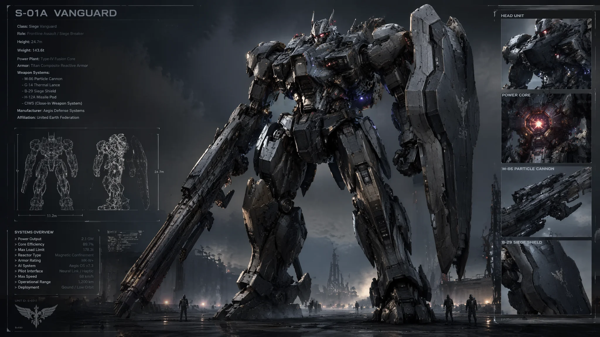
简单说:AI画机甲的核心不在"画",而在"描述结构"。你得告诉AI关节怎么连接、装甲板怎么叠、材质是钛合金还是碳钢。模糊的"画一个帅机甲"只能得到一个闪亮的废铁块。
我一个大学同学是机甲狂人,家里模型柜里塞满了MG和PG高达,光涂装工具就花了两万多。去年他试了一下用AI画机甲,气到把键盘砸了——AI生成了一个"有着六条胳膊、脚上长了轮子、头部是一个音箱"的怪物。他骂了一句:"这什么玩意儿,我能自己画的货为什么要你画?"
然后我帮他把提示词重写了一遍。加入"Gundam RX-78 style, clean mechanical joints, modular armor, bipedal humanoid mech, realistic mechanical engineering, no organic shapes"——出来的图他看了沉默了五秒,说:"行,这有点意思。"
机甲是AI绘画里最考验"结构化描述能力"的题材。人物画崩了只是丑,机甲画崩了就是一堆让人看着头晕目眩的金属垃圾。但一旦掌握了正确的提示词逻辑,AI出的机甲图可以比真人画师画的更有"设计感"——因为AI在机械细节的随机组合上有一种人类不会尝试的创造性。
三大机甲风格体系及提示词特征
机甲三大风格体系:日系(Gundam/EVA路线,人形流线V字天线)、美系(Battletech/Titanfall路线,工业军事厚重旧化)、赛博朋克/生化机甲(有机金属融合)。风格选错机甲就不对味。
日系机甲(Gundam/Evangelion路线)
这是国内观众最熟悉的机甲审美——人形比例、流线型装甲、标志性的V字天线和面甲、白色为主色调配红蓝点缀。
提示词特征词:Gundam inspired, humanoid mecha, sleek white armor with red and blue accents, V-fin head crest, angular shoulder pauldrons, beam rifle, vernier thrusters on back, clean panel lines, cel-shaded mecha illustration, dynamic standing pose
日系机甲的黄金比例:头身比大约1:7到1:8,腿长占身高55%以上。在提示词里加入"heroic proportion, long legs, small waist"可以强化这个审美特征。
经典配色公式:白色70% + 蓝色15% + 红色10% + 黄色5%。这是初代高达的配色比例,被称为"机甲设计史上最成功的配色方案之一"。你可以在提示词里写"white body armor with blue chest plate, red waist accent, yellow collar vents"。
美系机甲(Battletech/Titanfall路线)
跟日系的"超级英雄"路线不同,美系机甲走的是"工业军事"路线——厚重、粗糙、像一台会走路的坦克。
提示词特征词:industrial military mech, bulky heavy armor, weathered metal texture, exposed hydraulic pistons, utilitarian design, asymmetric shoulder mounted cannon, tread-worn feet, gritty battlefield mecha, realistic military vehicle aesthetic, dusty desert combat environment
美系机甲的重点在"旧化"。日系机甲出厂就是崭新的,美系机甲要在战火里滚过。提示词里必须加:weathered metal, battle damage, oil stains, chipped paint, dust and grime。没有旧化等于没有灵魂。
赛博朋克/生化机甲
混合了机械和有机体的风格——EVA的路线、攻壳机动队的感觉、或者《环太平洋》里的那种。
提示词特征词:bio-mechanical hybrid, organic metal fusion, glowing neural interface cables, translucent synthetic muscle fibers, eerie biomechanical design, dark cyberpunk atmosphere, neon-lit hangar background, Evangelion unit style
这个方向特别适合做概念设计。因为它的审美边界模糊——你觉得它"太怪"还是"太酷",完全看观众的主观感受。对AI来说,这种模糊边界反而是强项,因为不需要做精确的机械约束。
不同风格的AI绘画创作思路可以参考AI角色设计教程,里面有对不同设计语言的深度拆解。
机甲提示词的四层结构
机甲提示词的"四层金字塔":视觉风格→主体结构+材质→局部细节(不超过3个重点区域)→环境和光影。像搭积木一样叠上去,缺一层都不行。
经过几百次试错,我总结出了机甲提示词的"四层金字塔"结构。你在写提示词的时候就像搭积木一样叠上去。
第一层——视觉风格:Gundam style / industrial military mech / cyberpunk mech / biomechanical organism
第二层——主体结构+材质:bipedal humanoid with heavy chest armor, carbon fiber reinforced panels, polished titanium joints, matte black coating with gold accents
第三层——局部细节(不超过3个重点区域):detailed shoulder-mounted missile pod, glowing blue optical sensor array, articulated fingers with carbon joint connectors
第四层——环境和光影:standing in futuristic hangar, dramatic rim lighting, volumetric fog at floor level, metallic surface reflections, 8k render quality
一个按四层结构写出来的完整提示词:
Midjourney版:Gundam inspired humanoid mecha, sleek white armor with navy blue accents, polished titanium alloy joints, detailed chest vents with metallic sheen, articulated mechanical fingers, golden V-fin on helmet, standing in futuristic space hangar, dramatic overhead lighting creating sharp shadows, highly detailed mechanical panel lines, 8k photorealistic render --ar 16:9 --v 6.1 --style raw
Stable Diffusion版:(masterpiece, best quality), 1mecha, gundam style, humanoid robot, white and blue armor, mechanical joints, detailed panel lines, metallic reflection, glowing green optical sensor, dynamic action pose, hangar background, volumetric lighting, sharp focus, intricate mechanical details, (high quality:1.3)
Negative prompt:organic shapes, flesh, human face, messy wires, asymmetrical torso, broken parts, cartoon style, low poly, blurry details, missing limbs, extra limbs
金属材质的提示词秘籍
机甲好不好看70%看材质——同一结构和配色,材质质感不同能从"塑料玩具"变成"电影级CG"。核心技巧是写"怎么反光"而不是"什么材质"——AI对光学表现的感知比材质名称更敏感。
机甲好不好看,70%看材质。同一个模型结构和配色,材质质感不同,差距能从"塑料玩具"变成"电影级CG"。
常用金属材质词:
抛光钛合金:polished titanium alloy, mirror-like reflection, aerospace grade finish
磨砂钢:brushed steel texture, industrial matte finish, subtle grain pattern
阳极氧化铝:anodized aluminum, vibrant color coating with metallic undertone
碳纤维:carbon fiber weave pattern, lightweight composite material, visible fiber texture
战损金属:weathered battle-scarred metal, chipped paint revealing bare steel underneath, oil and grease stains
材质写的核心技巧——写"怎么反光"而不是"什么材质":AI对"材质名称"的感知不如对"光学表现"的感知敏感。与其写"titanium armor"不如写"highly polished surface with sharp specular highlights and cool blue-gray reflections"。这就像你跟画师沟通时描述"那个亮亮的像镜子一样反光的东西"比说"钛合金"更有效。
关于材质的深入探讨,可以看看我们之前写的AI产品渲染指南,里面有很多关于金属表面处理的技巧可以迁移到机甲设计上。
FAQ
Q:为什么AI老是画不出来正确的机械手?
A:机械手是人类手指难度的升级版——AI连5根手指都画不好,你还让它画"5根带关节和管线的机械手指",那不是难为它吗?两个解决方案:一是把手指简化("simple articulated claws"或"three-fingered manipulator"),二是在描述中加入"visible finger joints, segmented robotic digits",给AI更多结构信息。
Q:AI能设计出"原创机甲"吗?还是只能拼凑已有的设计?
A:AI的工作原理本质上是"拼凑+重组",但它组合出来的东西确实能达到"看起来像原创"的程度。关键看你怎么写提示词——如果你写"looks like Gundam",出来的就是Gundam变体。如果你写"mecha with design elements from organic biology, crustacean armor plates, insect-like leg joints, bioluminescent power core",出来的就是一个全新概念。
Q:机甲图放大后细节崩了怎么办?
A:正常现象。AI生成的机械细节在低分辨率下看起来不错,放大后就会露出"假细节"——那些看起来像管线的东西其实是噪点,看起来像刻线的东西其实是边缘锯齿。解决方案:用Topaz Gigapixel做AI放大(比普通放大效果好3倍),然后导入PS用手绘板描一遍关键结构和刻线——这个过程叫"过线"。开源免费替代可以用 Upscayl,对机械边缘的还原也相当不错。
觉得有用的话分享给需要的朋友吧。