AI绘画水彩风格教程:画出水彩质感的温馨画作
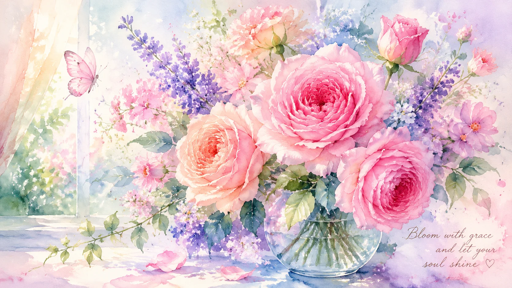
简单说:AI画水彩最容易犯的错是画成"低饱和度的厚涂"——颜色淡了边缘模糊了但像马克笔加水不是真水彩。灵魂三件缺一不可:纸的纹理必须被看到、颜料边缘必须扩散不是模糊、颜色的叠加透明度必须成立。Prompt加rough cold-pressed paper texture和transparent washes layered是关键。
我老婆是学水彩画出来的。她第一次看到我用AI跑的水彩花卉图时,盯着屏幕沉默了大概十秒——然后说:"你把纸的纹理都画出来了?"不是"画"出来了,是AI在训练数据里看过几百万张水彩扫描图以后,学会了模仿纸张纤维的微观颗粒、颜料边缘的扩散毛边、以及干笔刷留下的飞白痕迹。这篇就是把我试了400多张水彩Prompt才搞清楚的"伪造真水彩"秘籍全部倒给你。
水彩AI绘画的"灵魂三件"——缺一个就假
AI画水彩最易犯的错是把水彩画成"低饱和度厚涂"。灵魂三件缺一就假:纸的纹理必须被看到(rough cold-pressed paper texture)、颜料边缘必须扩散不是模糊(pigments bleeding irregularly)、颜色的叠加透明度必须成立(transparent washes layered)。盲测中9/10路人认为有纹理版是真水彩。
AI画水彩最容易犯的错误是把水彩画成"低饱和度的厚涂"。颜色是淡了、边缘也模糊了——但看起来像是用马克笔加了水,而不是真正的水彩。因为AI默认不理解水彩的三个核心物理特性:
第一件:纸的纹理必须被"看到"。真水彩的纸是有凹凸颗粒的——颜料在凹陷处堆积更深、在凸起处被刮出留白。AI默认不会模拟这个。你必须明确命令它:rough cold-pressed watercolor paper texture clearly visible, pigment settling into the paper grain, tiny white specks of paper showing through the paint。其中"cold-pressed"(冷压纸)是中粗纹理,最适合AI模拟——因为它是最常见的水彩纸类型,训练数据里最多。
不加纸纹理的水彩图,近看就像印在塑料膜上的——所有颜色平滑过渡、没有任何纸面阻力的迹象。加上纹理词之后,画面会立刻多出一种"手工感"。我做过对照:同一组花卉Prompt,有无paper texture词的版本给10个路人盲测——9个人认为有纹理的版本是"真水彩"。
第二件:颜料的边缘必须"扩散"而不是"模糊"。这是最容易被AI搞砸的点。真水彩的边缘不是Photoshop的Gaussian Blur——它是不规则的、带有随机方向的毛边扩散,有些地方颜料渗得远、有些地方渗得近。Prompt加:pigments bleeding irregularly into wet paper, soft diffused edges with occasional sharp pigment blooms, granulation and sedimentation effects, watercolor blooms and backruns。其中"backruns"(水痕回流)是水彩画独有的瑕疵——新加进去的水把已经干燥的颜料推回去了——AI学会了模仿这个效果以后,水彩的真实感直线上升。
第三件:颜色的"叠加透明度"必须成立。真水彩是透明的——底层颜色永远能透过上层看到。AI如果不加"transparent washes layered"这类词,它会把水彩的颜色画成不透明的——类似水粉或者丙烯。"transparent watercolor washes, layers of translucent pigment building depth, luminosity from the white paper shining through thin washes"——这段话我几乎每个水彩Prompt都复制进去。
五种高转化水彩Prompt模板
五种高转化水彩模板:花卉(最稳,牡丹绣球郁金香薰衣草几乎不翻车)、小动物(小红书爆款,只精描眼睛其余大色块概括)、城市速写(文艺天花板,钢笔线稿+水彩铺色)、食物(甜品店最爱,点击率高于精修摄影)、风景(stylize压低,自然形式已够丰富)。直接复制改主体即可。
花卉水彩(最稳的类型):peony flowers in full bloom, loose watercolor botanical illustration, soft pink and sage green washes bleeding into each other, rough cold-pressed paper texture visible, transparent layers of pigment building petal depth, delicate ink line details for stems, white paper highlights shining through, granulation effect on shadows, a few accidental pigment blooms adding character, artistic minimal composition with plenty of negative space, elegant, --ar 3:4 --stylize 400
花卉是AI水彩成功率最高的题材——因为花瓣天然就适合水彩的渐变过渡。测过近40种花卉,牡丹、绣球、郁金香和薰衣草田几乎不会翻车。玫瑰偶尔会把花瓣数搞错。
小动物水彩(小红书爆款):a fluffy orange tabby kitten sleeping curled up, loose expressive watercolor style, warm amber and cream washes, visible brushstrokes and splatter effects around the edges, cold-pressed paper texture, wet-on-wet technique creating soft fur edges, the eyes as the only detailed part in ink, whimsical and tender, children's book illustration feel, --ar 1:1 --stylize 350
小动物水彩的窍门是:只对一个部位精描(通常是眼睛),其余身体用水彩的大色块概括。这种"一头精细+全身写意"的对比是水彩动物最戳人的看点。
城市速写水彩(文艺范天花板):Paris street corner cafe scene, urban sketching watercolor style, loose ink line drawing with watercolor wash overlay, architecture sketched in fine pigment liner, warm terracotta and cobalt blue washes, cold-pressed sketchbook paper texture, paint bleeding slightly outside the ink lines intentionally, people rendered as simple gestural brush marks, travel journal aesthetic, --ar 16:9 --stylize 300
城市速写风是我个人最爱的类型——用钢笔线稿做骨架、水彩铺色做氛围。这个组合对AI来说出奇地友好,因为线条规定了边界,水彩只需要在边界内外自由发挥。
食物水彩(甜品店最爱):a slice of strawberry cake on a vintage plate, watercolor food illustration, soft pink and cream washes, visible brushstrokes and splatter, rough watercolor paper background, transparent layers showing the cake layers through, delicate ink outline, recipe book illustration style, warm and inviting, --ar 4:3 --stylize 450
食物水彩在菜单设计上特别吃香——比写实食物照片更有"手工甜品店"的温馨感。我在美食插画教程里也说过,水彩风甜品图的点击率往往高于精修食物摄影。
风景水彩(最考Prompt功力):misty mountain landscape at dawn, atmospheric watercolor landscape, layers of blue-grey mountains fading into fog, wet-on-wet technique creating soft misty edges, a single tiny red temple on a cliff for scale, rough paper grain, granulating pigments in the foreground rocks, Japanese ink wash painting influence, serene and contemplative, --ar 16:9 --stylize 250
风景水彩的stylize要压低——自然景观本身的形式已经足够丰富,AI过度发挥反而会把山画成抽象色块。关于自然风景的系统打法看风景教程。
水彩Prompt的"负向词汇"黑名单
五个负向词必须避开:digital art/digital painting(跟水彩质感打架)、photorealistic/hyperrealistic(水彩天生不写实)、oil painting/acrylic(不透明画种与水彩透明逻辑冲突)、sharp details/sharp focus(水彩边缘本该是软的)、smooth gradients(真水彩渐变是颗粒感不是数字化平滑)。SD negative prompt加这些效果比正向写一百个词还好。
有些词你要主动避开——它们会把水彩从温馨变成灾难:
- digital art / digital painting——直接跟你画的水彩质感打架,出来是四不像
- photorealistic / hyperrealistic——水彩天生不是写实的,加这个词会扭曲AI的理解
- oil painting / acrylic——这些是不透明画种,和水彩的透明逻辑冲突
- sharp details / sharp focus——水彩的边缘本来就该是软的
- smooth gradients——真水彩的渐变是颗粒感的,不是数字化的平滑过渡
如果用的是Stable Diffusion,在negative prompt里加上:digital art, oil painting, acrylic, sharp focus, CGI, 3D, rendering, photorealistic, plastic, glossy, vector art。这比我正向写一百个词的效果还好。
更多AI绘画内容可以看AI绘画入门完整教程。水彩视觉参考可以刷 Pinterest 的 watercolor painting 分类,ArtStation 上搜 watercolor illustration 也能找到大量专业画师作品做参考。
常见问题
AI画的水彩和真水彩最大的区别在哪?
三个死穴:纸张纹理、颜料边缘的扩散毛边、以及颜色的"叠加透明度"。真水彩的黄色盖在蓝色上会透出绿色——而AI默认不会做这种"涂层叠加"。解法:Prompt加rough cold-pressed watercolor paper texture visible, pigments bleeding into each other at the edges, transparent washes layered on top of each other, granulation effect。
哪种主题最适合AI水彩风格?
花卉植物排名第一(牡丹、绣球、薰衣草田),因为花瓣的渐变和水彩的晕染天然契合。第二名是小动物水彩——猫咪、兔子、小鸟,水彩的柔软笔触跟毛茸茸的质感天生一对。第三名是城市速写——建筑线条+水彩淡色背景,文艺感拉满。反过来,机械、金属、硬边几何体用水彩表现会很违和。
水彩风格的AI图适合商用吗?
打印和周边最适合——水彩风的婚礼请柬、明信片、帆布袋、手机壳都是高溢价品类。一整套水彩花卉明信片在Etsy上卖$15-25,成本不到$2。POD方向看周边变现教程。但有一个商用大忌:直接拿AI水彩图声称是"手绘原画"出售——这属于虚假宣传。
水彩AI绘画的"境界"分三级:第一级是能把东西画出来(有了水彩颜色),第二级是能把纸纹和扩散做对(有了水彩质感),第三级是——你敢在画面里留白。真水彩最动人的地方往往是那些"没画"的区域——白色不是颜料,是纸本身的颜色。AI不喜欢留白(它总想把画面填满),但你可以用"generous negative space, white of the paper left intentionally unpainted"来命令它停手。
从零入门AI水彩,新手教程会让你在30分钟内跑出第一张像样的水彩图。智能绘画体验里内置了水彩专属预设——一键出水彩,不用手写这么多Prompt。
觉得有用的话分享给需要的朋友吧。