AI纹样图案设计教程:传统花纹与现代几何的无限重复创作技法
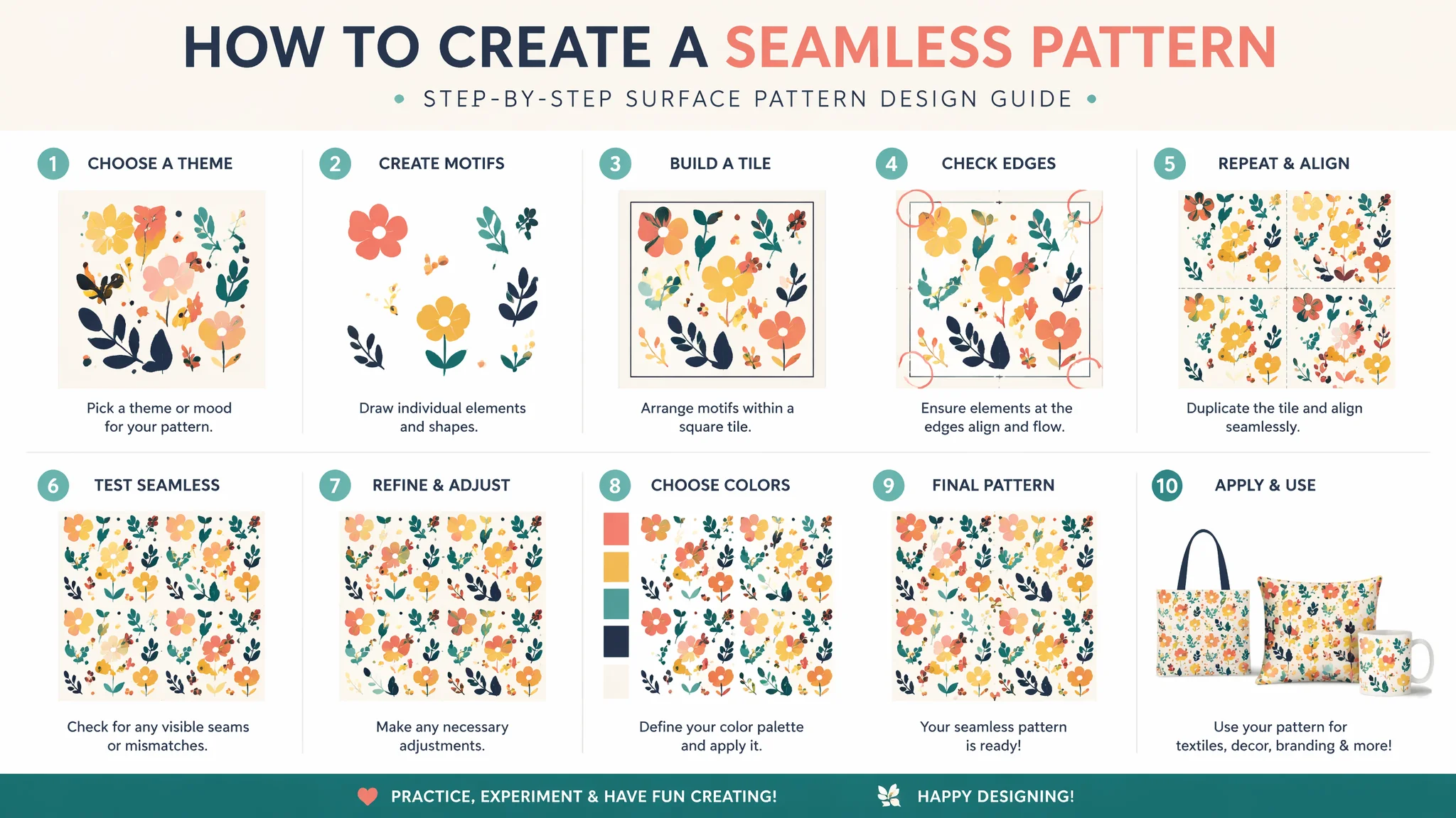
我妈退休以后迷上了做手工——布艺、刺绣、那种自己设计图案印在帆布袋上的DIY。去年过年回家她给我看她的设计稿,问我"儿子你不是搞AI的吗,能不能帮妈妈生成一些好看的花纹?"——我说当然能,然后打开Midjourney写了个"Chinese traditional floral pattern"。出来的图花团锦簇挺好看——但一拼接就露馅了:边缘接不上,花朵在接缝处被拦腰切断,像把一张花布胡乱剪碎了再拼起来。我妈看了一眼说"你这不行,左边和右边的花要对上才行"。那一刻我突然意识到——我之前对AI绘画的理解完全是"单张画"的逻辑,而纹样设计是"数学"的逻辑。一张能无缝重复的纹样,和一张好看的画,本质上是两种不同的生物。
四方连续和二方连续——别跳过这个,这是纹样设计的地基
如果你只想用AI画一张"有花纹的图"用作手机壁纸——你可以跳过这一节。但如果你想做的是能印在布料上、包装纸上的真正纹样——先花五分钟理解这两个概念。二方连续(border repeat)——图案只在一个方向上重复,通常用于花边、腰带、建筑装饰带。它的核心是"一个单元在水平或垂直方向上平移复制"——左右两边必须接上,上下不需要。四方连续(full-drop repeat/seamless pattern)——图案在两个方向上同时重复,用于大面积的面料、墙纸、包装纸。它的核心是"一个矩形单元的上下左右四个边都必须和相邻单元无缝衔接"。
AI生成"二方连续"的成功率远高于"四方连续"——因为二方连续只要求一对边的衔接,而四方连续要求两对边同时衔接。实操策略:如果最终需要四方连续纹样——先让AI生成一个二方连续的长条(左右衔接),然后在PS中把长条复制多份垂直排列,再手动处理上下衔接。这个"分两步走"的方法比直接让AI生成四方连续的成功率高不少。另一个技巧是用"half-drop repeat"的描述:"a half-drop repeat pattern——the pattern tile repeats in a brick-like offset arrangement where every other row is shifted by 50%, this creates a more dynamic and less grid-like repetition, the repeat unit is a rectangle where the left half of the top edge connects to the right half of the bottom edge"——半降重复比四方网格重复看起来更自然,不会暴露重复单元。
传统中式纹样——"缠枝莲""云纹""回纹"的Prompt还原指南
AI对"Chinese pattern"的默认理解是一堆牡丹花加龙凤——俗气得像旅游景点卖的丝巾。中国传统纹样体系极其丰富且每种都有严格的结构规则,你需要把这些规则"翻译"成AI能理解的几何描述。
缠枝莲(continuous lotus scroll)——最经典的中式植物纹样,核心是"一根藤蔓的S形运动轨迹"。"a traditional Chinese continuous lotus scroll pattern, the composition is built on a single continuous undulating vine that moves in a regular sine-wave rhythm across the pattern field, at each crest of the wave a full lotus flower blooms——the petals are layered and open, rendered in a stylized flat manner typical of Ming dynasty porcelain decoration, at each trough a smaller bud or a curling leaf emerges, secondary tendrils spiral off the main vine in counter-curves, all elements are connected——there are no floating or disconnected motifs, the line weight is consistent throughout, the style is linear and graphic like a woodblock print"。关键词:"sine-wave rhythm, all elements are connected, Ming dynasty porcelain"。
云纹(cloud motif)——中式云纹不是气象学上的云,是高度风格化的螺旋形符号。"traditional Chinese auspicious cloud pattern (xiangyun), the clouds are rendered as clusters of concentric spiral curves——each cloud is composed of a central spiral that unfurls outward into comma-shaped whorls, the spirals all rotate in the same direction creating a sense of upward motion, the clouds are arranged in a staggered repeat with smaller cloud clusters filling the gaps between larger ones, the style is graphic and stylized——not realistic atmospheric clouds but symbolic spirals, the line work is clean and precise like carved jade"。注意写"not realistic atmospheric clouds but symbolic spirals"——这句话把AI从"画天空"纠正到"画符号"。
回纹(meander/key fret pattern)——最经典的几何纹样,核心是"一条不间断的直线以直角反复折返"。"a classical Greek key or Chinese meander pattern, a single continuous line folds back on itself in right-angle turns forming a repeating geometric border, the line is of uniform thickness, all turns are exactly 90 degrees, the spacing between parallel segments is equal, the pattern reads as an unbroken band——the line never crosses itself, rendered in a flat graphic style with no shading or depth"。关于中式纹样的更多文化背景,可以查看AI古风绘画和中国文化网的传统纹样数据库。
现代几何纹样——用数学公式写Prompt
现代几何纹样比传统纹样更适合AI——因为几何纹样的"规则"本身就是数学的,而AI擅长处理"可量化的规律"。最有效的做法是用"几何构成描述"而非"风格描述"来写Prompt。
六边形密铺纹样:"a seamless geometric pattern composed of regular hexagons in a honeycomb arrangement, each hexagon is internally subdivided into six equilateral triangles that alternate between two colors——creating a three-dimensional cube illusion, the hexagons share edges perfectly with no gaps, the color scheme is minimalist: off-white and terracotta, the overall effect is a clean Scandinavian modern textile design"。圆形交错纹样:"overlapping circles pattern, identical circles arranged on a grid where each circle intersects with its four neighbors, the overlapping lens-shaped areas are filled with contrasting colors creating a rhythmic optical effect, the circles have a fine outline and the overlapping zones have flat color fills, the composition is mathematically precise——every circle has the same radius and the spacing between circle centers equals the radius"。条纹渐变纹样:"parallel vertical stripes of varying widths, the stripe widths follow a mathematical progression——narrow, medium, wide, medium, narrow——creating a rhythmic pulse across the pattern, the color palette transitions gradually from deep navy on the left to pale sky blue on the right across each repeat unit, the edges between stripes are crisp with no blur or gradient bleeding"。
在这些几何Prompt中——"mathematically precise""equal radius""regular"这些词比任何艺术风格描述都更有效,因为它们告诉AI"这个图不是感性的,是理性的"。更多几何风格设计的思路在AI抽象几何绘画中有系统分析。现代设计参考可以看Patternbank的全球纹样趋势。
纺织品和产品表面的实际应用——从屏幕到实物
AI生成的纹样在屏幕上看起来很好——但印到布料上往往发现两个问题:颜色偏差和比例失调。屏幕是RGB发光色,布料是CMYK反射色——同样的图案色差可能让你怀疑人生。我的实操建议:AI生成纹样时就用sRGB色彩空间但尽量选择"对印刷友好"的颜色——避免荧光色和极度饱和的颜色,优先选择你实际见过的纺织品颜色。生成后先在普通A4纸上打印出来看看——如果打印效果你都接受,那印在布上只会更好。
图案比例是另一个坑:AI在1024x1024的画布上生成了一张纹样——你要把它印在150cm宽的布料卷上,需要横向拼接十几个重复单元。如果单个重复单元的尺寸太大(比如一朵花就占了整个画布宽度的一半)——印出来每朵花都有75cm宽,视觉上会非常奇怪。黄金法则是:AI生成纹样时,始终让单个重复单元包含至少2到4个完整的重复周期——不要一个单元=一朵花,而要一个单元=一朵花+半朵花+叶子+空白(下一个循环的花会接上)。这样的纹样印在实物上比例才合理。关于从数字到实物的色彩管理,在AI产品绘画软件对比中有更完整的讨论。
常见问题
AI生成的纹样颜色太多太乱——怎么控制成两三个颜色?
AI默认喜欢用六到八种颜色——因为它觉得"丰富=好看"。限色策略:在Prompt里直接写"a limited palette of only X colors——and name them"。"a pattern using only three colors: deep indigo blue background, warm cream white for the main motifs, and terracotta orange for accent details, no other colors appear in the design, the color blocks are flat with no gradients or shading"。给颜色"分配角色"(背景色、主色、强调色)和"禁止渐变"——AI就会严格遵守限色。
想要"做旧""复古"的纹样质感——不是像Photoshop加了个滤镜那种假做旧?
AI的"做旧"默认是"降低饱和度+叠加噪点"——看起来很假。真正的复古纹样质感来自"不完美的印刷痕迹"。Prompt写法:"the pattern is printed in the style of traditional woodblock or screen printing——there is a slight misregistration between color layers creating thin gaps and overlaps at the edges of motifs, the ink coverage is slightly uneven——some areas are more saturated and others slightly faded as if the printing block or screen had inconsistent pressure, the overall texture has the slight graininess of pigment on absorbent paper, the imperfections are subtle and organic——not a digital filter but the authentic wear of a hand-printing process"。关键词是"misregistration"(套色不准)和"authentic wear of a hand-printing process"——这些细节让做旧看起来真实而非滤镜效果。
AI纹样能直接用于商业用途吗——版权有没有问题?
法律上灰色地带很大。目前的主流观点:你通过大量Prompt创作和后期修改生成的独特纹样——享有版权。但如果你用的是一个"参考了某知名品牌经典格纹"的Prompt生成的类似纹样——可能构成侵权。实操安全原则:一,不要把知名品牌的标志性纹样(如Burberry格纹、LV老花)用作Prompt参考。二,对AI生成的结果做足够多的人工修改(重新配色、调整构成、添加原创元素)——修改越多,版权越稳固。三,保留你的Prompt和修改过程记录——万一有纠纷,这些是"原创创作过程"的证据。不是法律建议——具体商业使用建议咨询知识产权律师。