AI红色主题绘画:热情奔放的暖色调与东方红色的视觉应用
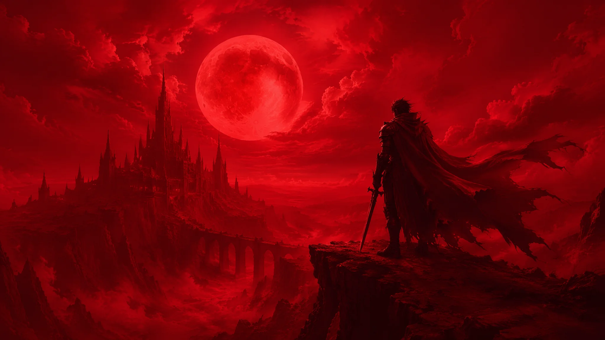
红色是AI绘画里最容易被滥用的颜色——大面积纯红会让画面像西红柿炒鸡蛋,但用得好的红色是整个画面里最勾魂的视觉锚点。我花了大量时间去研究"怎么让红色有层次感而不是一团火",关键不在红色本身,而在它和周围颜色的关系。
去年年底帮一个中式婚礼品牌做视觉升级,客户的要求就一句话:"我们要红,但要高级的红,不是婚庆公司那种红。"这句话点醒了我——红色有太多种了,电脑屏幕上#FF0000的红色和故宫宫墙上被岁月打磨过的朱砂红,是两种完全不同的颜色。AI对红色的理解默认是最"暴力"的那种——纯饱和、高明度、满屏铺。你要做的就是用关键词和参数把AI从"红色警报"拉回到"红色美学"的轨道上来。
红色的心理学与AI的情绪映射
红色在不同文化、不同语境下触发的情绪完全不同——AI不知道这些,它会一视同仁地输出"红"。你得明确告诉它你要的是哪种红、带什么情绪。东方红的文化语义是喜庆、吉祥、权威——"Chinese wedding red, auspicious celebration color, the red of lanterns and couplets, warm and inviting rather than aggressive"。在提示词里加文化锚定词能帮AI把红色从"危险信号"调到"文化符号"。西方红则更多关联危险、激情、爱情——"passionate crimson, romantic rose red, the red of Valentine's Day"。自然界的红色——秋叶、夕阳、玫瑰、血液——各有不同的色调和饱和度。我常用的策略是:不直接写"red",而写"the red of autumn maple leaves""the vermillion of a torii gate""the crimson of a ripe pomegranate",用具体参照物来锁定红色的精确色调。关于色彩的文化语义,AI绘画色彩理论应用指南里有非常系统的跨文化色彩分析。
六种东方红色的精确配方
东方红色不是一种颜色——我梳理了六种最有代表性的东方红,每种都有精确的AI提示词写法。朱砂红:"cinnabar red, the color of Chinese seal paste, slightly orange undertone, mineral pigment texture, used in traditional Chinese painting and calligraphy seals"。故宫红:"Forbidden City wall red, deep and muted with centuries of weathering, slightly faded and uneven, matte finish, the red of imperial China layered with history"。胭脂红:"rouge red, the blush of a Chinese opera performer's cheek, soft and diffused, pinkish-red with a powdery finish, delicate and feminine"。对联红:"Chinese New Year couplet paper red, vibrant and celebratory, slightly glossy, the red of spring festival decorations, paired with gold calligraphy"。漆器红:"Chinese carved lacquer red, deep lustrous layers, glossy and rich, the red of Ming dynasty lacquerware, three-dimensional and luxurious"。辣椒红:"Sichuan chili red, the dried pepper color with a slight brown undertone, rustic and spicy, the red of Chinese kitchen and street food culture"。每个红色词我都配合对应的材质词使用——"cinnabar red + mineral pigment texture"和"cinnabar red + glossy plastic"出来的是完全不同的两个颜色。关于材质与色彩的交互作用,W3Schools色彩教程虽然是面向网页设计的,但其中关于颜色理论和搭配的基础知识对AI绘画配色同样适用。
红色在画面中的比例控制法则
红色在画面中的占比决定了画面的情绪强度——10%是点缀、30%是主题色、50%是主色调、80%以上就是视觉暴力了。10%策略(红为点缀):画面以中性色或冷色为主调,红色只出现在关键视觉锚点——"a single red lantern in a misty grey landscape""one red lotus bloom in a pond of green leaves"。这种用法让红色的情感浓度被无限放大,比满屏红更有力量。30%策略(红为主题色):红色作为最重要的色彩元素但仍有大量其他颜色平衡——"a bride in red qipao standing before a jade green background"。50%策略(红为主色调):红色成为画面的主导,典型如红色背景的贺岁海报或红色舞台——需要靠材质光影(如丝绒、灯笼纸、漆面)来制造红色内部的变化层次,否则就是一片平涂。关于画面色彩配比的更多技巧,AI绘画视觉权重与画面平衡里有系统的量化方法。
红色人物与红色场景的专项技巧
红色人物最难处理的是肤色与红色的关系——红衣会把肤色反光染红,AI经常把这个反光画得过重导致人物像喝了酒。解决方案是在提示词里控制反光强度——"subtle warm reflection from red clothing on skin, natural skin tone preserved, only the slightest blush of reflected red on the cheeks and shoulders"。红色场景(如婚房、宫殿、红色舞台)则要注意红色内部的层次——"layers of different red tones creating depth, from deep burgundy shadows to bright vermillion highlights, the variety within red rather than one flat color"。我帮那个中式婚礼品牌做视觉时最大的突破就是:让客户理解了"红色的丰富性"——同一个画面里可以有八种不同的红色在对话,而不是一种红色在嘶吼。AI人物肖像绘画的系统方法对人物肤色与服装颜色的交互有专门的章节。
红色与其他颜色的高级搭配方案
红配绿赛狗屁——这话只说对了一半。红配墨绿、红配松石绿、红配橄榄绿,每一种都高级得要命。问题不在"红配绿"这个组合,而在具体的色调匹配。红配墨绿:"vermilion red with deep forest green, vintage Christmas aesthetic elevated, rich and sophisticated, gold accents tying them together"。红配金色:"Chinese red with antique gold, imperial and luxurious, the gold toning down the aggression of the red, metallic sheen adds dimension"。红配灰蓝:"brick red with dusty blue-gray, modern and architectural, Bauhaus color theory, warm red balanced by cool intellectual blue"。红配黑色:"crimson with matte black, dramatic and high-fashion, editorial photography aesthetic, the black absorbing the excess energy of the red"。红配奶白:"Chinese red with creamy ivory white, clean and traditional yet fresh, the red pops against the neutral canvas without overwhelming"。红色配色的终极法则是:永远不要让红色和另一个同样饱和的颜色直接对接——中间一定需要一个中性色(白、灰、黑、金、米)来过渡。ColorHunt是一个配色灵感网站,上面有海量经过社区投票验证的高级配色方案,对AI绘画配色非常有参考价值。
常见问题
AI红色主题绘画中关于色调控制、文化准确性和画面层次感的常见问题。为什么AI画的红色总是过于刺眼?
因为AI默认调用的是纯饱和的#FF0000附近的红色。解决方法是在提示词里用"muted""deep""dusty""weathered""vintage""faded"等词来降低红色的饱和度和明度。同时配合材质词——"matte""velvet""mineral pigment""aged lacquer"——让红色有质感层次,而不是一块发光的红色色块。
中国红和西方圣诞红在AI绘画中有什么区别?
中国红偏暖、偏橙、偏厚重——"warm vermillion red, slightly orange undertone";圣诞红偏冷、偏蓝底、偏明亮——"cool bright crimson, slightly blue undertone, associated with holly berries"。在提示词里写清楚文化标签("Chinese New Year red"vs"Christmas red")是最快的区分方法。
如何用AI画出一张"高级感"的红色海报?
秘诀是:降低红色的面积占比、提升红色的材质质感、加入冷色或中性色作为平衡。一张高级的红色海报往往是80%留白(或深色)+15%红色主体+5%金色或白色文字区域。红的越少,越高级——这在视觉设计里几乎是一条定律。
觉得有用的话分享给朋友吧。