AI绘画渲染教程进阶:光影质感与后期精修的完整技术指南
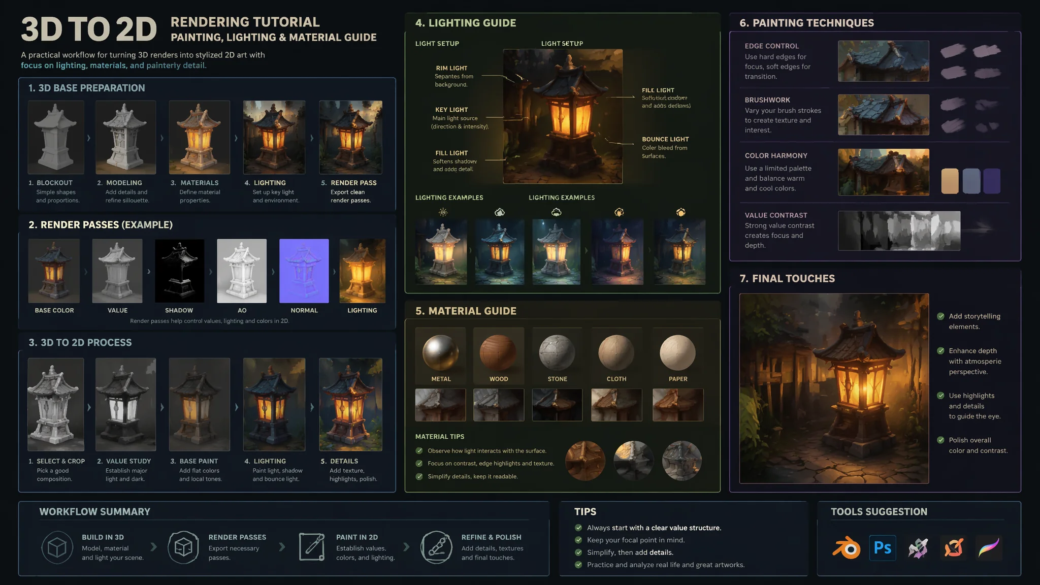
我本科是学工业设计的——在学校里系统学过3D渲染:V-Ray、Keyshot、Arnold都摸过。所以当我开始用AI绘画之后,特别在意一件事:AI生成的图能不能达到"渲染级"的质感。渲染级和普通AI图的区别在哪?一句话:渲染级的光在物理上是"自洽"的——光源方向、阴影硬度、反射强度、环境光遮蔽——所有这些在渲染器里必须设置正确才能出图。AI没有"物理引擎"——但你可以通过在Prompt里模拟渲染参数的描述逻辑,让AI的输出接近渲染级品质。这篇不是基础教程——适合已经会用AI出图但想把画面质感再提升一个档次的进阶创作者。
环境光遮蔽(AO)——画面"扎实感"的来源
如果只能教一个渲染概念给AI绘画用户,我不选"全局光照"——选"环境光遮蔽"(Ambient Occlusion)。AO是渲染中一个微妙的暗角效果:在物体与物体接触的缝隙处、在衣物的褶皱深处、在墙角与地面的交界处——会生成一层柔和的暗影。没有AO的画面物体看起来像"漂浮"在场景中;有AO的画面物体"扎根"在场景里。这就是为什么有些AI图看起来"飘"——因为缺AO。
AO的Prompt表达——"ambient occlusion is visible in the scene——the crevices and contact points between objects have subtle soft darkening, where the character's feet meet the ground there is a gentle shadow that anchors them to the surface, the folds of clothing have deeper shadows in the creases where fabric meets fabric, the corners of the room have a subtle vignette of darkness, this shadowing is not harsh or black——it is a soft gradient of darkening that adds dimensional solidity"。关键短语:"contact shadows"(接触阴影)、"crevice darkening"(缝隙暗化)、"grounded and anchored"(扎根感)。
AO和普通阴影的区别——普通阴影是光线被遮挡产生的"投射阴影"(cast shadow)——有明显的形状和方向。AO是环境散射光被遮挡产生的"闭塞阴影"——没有明确方向、柔和、只在缝隙处出现。在Prompt里写清楚这两种阴影的区别能让AI更准确地渲染:在AI阴影渲染教程中有更详细的阴影类型拆解。AO概念参考了Blender渲染文档中关于环境光遮蔽的技术说明和Substance 3D的PBR材质指南。
PBR材质的Prompt化描述——金属、粗糙度、反射率
PBR(Physically Based Rendering)是3D渲染的标准材质系统。它的核心逻辑是:任何材质由几个物理属性定义——金属度(metallic)、粗糙度(roughness)、反射率(reflectance)、以及表面法线(normal)。把这套逻辑翻译成Prompt,能显著提升AI对材质表现的一致性和真实感。
PBR属性在Prompt中的表达——金属度:不是写"metal"或"shiny",而是写清楚"metallic surface——the reflection is tinted by the color of the metal itself, gold reflects golden light, copper reflects reddish light, the reflections are sharp where the surface is polished and blurry where it is brushed or oxidized"。粗糙度:"surface roughness controls how the light scatters——a polished surface has sharp clear reflections like a mirror, a matte surface scatters light in all directions creating a soft diffuse appearance, the roughness varies across the surface——edges and worn areas are slightly more polished from handling"。
材质的PBR化Prompt模板——"the armor is made of weathered steel——high metallic with medium roughness, the surface shows directional scratches from use and darker patina in the recesses where rust has begun to form, the reflections are sharp on the raised polished areas and diffuse on the rough oxidized areas, the material reads as physically heavy and cold"。对于非金属材质(dielectric)——"the ceramic vase has zero metallic and low roughness——the surface is glossy with sharp specular highlights that are white (not tinted by the object color), there is a subtle subsurface scattering at the edges where light penetrates slightly, the material feels hard and brittle"。更多材质系统的Prompt技巧见AI PBR材质绘画。
景深与运动模糊——"摄影感"的两大法宝
AI生成图和渲染图最像"CG"的地方通常是两点:景深太均匀(全图一样清晰)和完全没有运动模糊。真实摄影有光圈、有焦平面、有快门速度——这些物理限制产生的"不完美"恰恰是画面看起来"真实"的关键。
浅景深——"shot with a large aperture f/1.4 lens——the depth of field is extremely shallow, only the subject's eyes are in sharp focus, the tip of the nose and the ears are already slightly soft, the background dissolves into creamy bokeh with circular highlights from distant light sources, the transition from sharp to blurred is smooth and optical——not digital"。关键:指明焦距位置("eyes are in sharp focus")以及焦外模糊渐变的层级("tip of the nose already soft")。
运动模糊——"motion blur on the moving elements——the character's hand is in motion creating a directional blur trail, the background shows slight panning blur indicating camera movement tracking the subject, the face remains sharp because the camera is locked on the eyes, the blur is continuous and directional——not a Photoshop filter"。运动模糊最容易被AI搞成"鬼影"(多个残影叠加)——需要在Prompt里强调"continuous and directional"来纠正。
镜头光学特性——"shot on a 85mm f/1.4 prime lens——the focal length creates a slight compression of facial features that is flattering for portraits, the lens has subtle barrel distortion at the edges and a gentle vignette, there is a small amount of chromatic aberration visible as purple fringing on high-contrast edges"。这些镜头特性细节是"拍出来的"和"画出来的"的核心区别。更全面的摄影质感模拟见AI摄影感模拟绘画。
后期精修——从"AI出图"到"最终成品"的桥梁
我的工作流:AI出图占70%,后期精修占30%。这30%不是"修修补补"——是把一张"不错的AI图"变成一张"可以交付的专业作品"的关键步骤。后期不改变画面的内容——只在光影、色彩、质感三个维度做精细化调整。
光影重塑——在Photoshop中新建一个50%灰度的叠加图层,用白色画笔提亮高光区域(颧骨、鼻梁、眼睛反光),用黑色画笔压暗AO区域(发根、衣领内侧、眼窝深处)。这一步骤模拟的是3D渲染中的"relighting"——对局部光照做精细修正而不影响整体。色彩分级——用曲线工具分别调整RGB通道:R通道拉高光暖色(皮肤+头发高光)、B通道压低暗部冷色(阴影冷蓝)、G通道微调中间调偏暖或偏冷。质感增强——新建一个图层填充50%灰→添加噪点(2-3%)→混合模式改为"叠加"→透明度降到15-20%。这个微弱噪点层模拟相机传感器的物理噪点和胶片颗粒——消除AI图独有的"过于完美"感。完整后期流程我整理在AI后期精修流程中。
常见问题
AI渲染出来的金属看起来像灰色塑料——怎么让金属"像金属"?
金属和塑料在视觉上的核心区别:金属的反射是有颜色的(金反射金色、铜反射铜色),非金属的反射是白色的。AI经常把金属画成"灰色的反光物体"——既不是金属也不是塑料。修复Prompt:"the metal surface reflects its own color——gold surfaces have golden-tinted reflections, silver surfaces have silver-white reflections, the reflections are not generic white highlights but contain the color and tonality of the surrounding environment, the metallic surface also shows Fresnel effect——at glancing angles the surface becomes more reflective"。加上"Fresnel effect"这个词能触发AI对"边缘高反射率"的理解。
如何让AI图"有景深但不假"——不像贴了一层高斯模糊?
AI的默认"blurry background"经常是套了一层均匀的高斯模糊——完全没有光学逻辑。真实镜头的景深有四个特征:(1)焦外高光变成光圈形状(圆形或多边形);(2)焦外高光边缘亮中间暗("甜甜圈"效应);(3)前景模糊和背景模糊的光学特性不同;(4)从清晰到模糊的过渡是渐变的且有方向性。Prompt中写:"optical bokeh——not Gaussian blur, the out-of-focus highlights form circular shapes that reflect the lens aperture, each bokeh circle has a brighter edge and darker center, the transition from sharp to blurred is graduated and follows the depth of the scene, foreground elements that are closer than the focal plane are blurred differently from background elements"。
AI图后期精修最重要的一步是什么——如果只做一步应该做什么?
只做一步的话——在Photoshop里加一个"Camera Raw滤镜"图层,做三件事:(1)纹理+15(增强皮肤和布料的中频细节);(2)清晰度+10(增强中对比度让画面更"实");(3)去雾-5(在暗部加一层极薄的雾气让阴影不死黑)。这三步加起来不超过30秒,但能让90%的AI图从"还可以"变成"挺像那么回事"。如果画面发灰——在Camera Raw里把"白色"往右拉一点、把"黑色"往左拉一点——扩展动态范围。这个技巧我已经验证过几百张图了——屡试不爽。