AI伤感头像绘画:忧郁氛围与心事重重的情绪化社交媒体头像创作
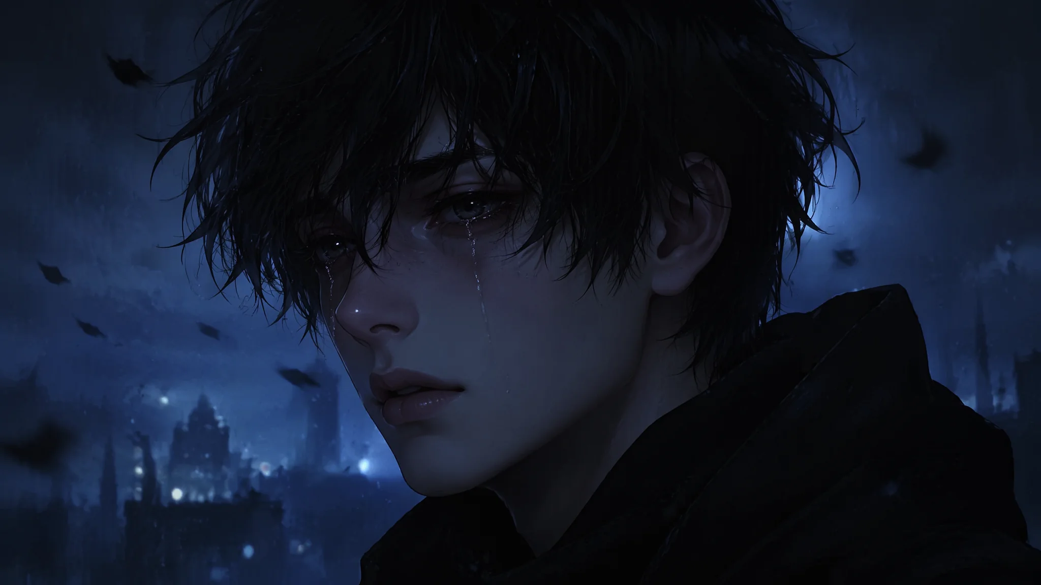
我在小红书上刷到过一个账号,头像是个女生坐在窗边看雨,侧脸,光线暗到快看不见表情——但就是那张头像让我忍不住点进去翻了她所有笔记。什么感觉呢?不是"漂亮",是"有故事"。后来我自己拿AI试做伤感氛围头像,第一批图出来——女生在哭但哭得像拍MV,眼泪是钻石形状的,背景还有滤镜光斑——假到不行。我才发现,AI画伤感跟画美是两套完全不同的逻辑。AI天然倾向于"美化一切",但伤感的本质是"不完美才动人"。你得跟AI的审美惯性对着干,才能画出那种让人看了心里咯噔一下的头像。
情绪头像和普通美女头像的本质区别——不在于"人"而在于"不在场"
普通AI头像的思路是"让这个人看起来更好看";伤感头像的思路是"让这个人看起来在承受着什么"。一个是加法逻辑,一个是减法逻辑——把那些让人"分心"的美全部去掉,只留一个情绪核心。减法从这几个维度入手:去掉笑容("no smile, no teeth visible, lips slightly parted in a neutral or melancholic expression");去掉精致妆容("minimal or no makeup, natural skin texture with slight imperfections visible");去掉直视镜头的自信感("the subject looks away from the camera, gaze is distant and unfocused, lost in thought");去掉明亮光源("moody low-key lighting, shadows dominate the frame, only a sliver of dim light catching one side of the face")。这几个减法做完,画面自然就沉淀下来了。和AI美少女绘画教程里追求的美感是反着来的——那边的目标是"让人想多看一眼",这边的目标是"让人不敢多看"。
四种经典伤感场景——每个都是情绪的容器
人不是突然就伤感的——伤感需要一个"容器"来装。AI画画的时候你不能只说"sad girl",得给她一个场景,一个她在里面待着的空间。第一种:雨窗。"a young woman sitting by a rain-streaked window, the window is fogged with condensation, her fingertips have drawn a small meaningless shape in the fog, outside the window city lights are blurred by rain into soft glowing dots, her reflection is faintly visible in the glass, the overall mood is quiet and introspective"。窗外的模糊和窗内的清晰形成对比——她被困在里面了。第二种:深夜房间。"a dimly lit bedroom at 3 AM, the only light source is the blue glow of a phone screen reflecting on a face, the person is sitting on the edge of an unmade bed holding the phone but not looking at it, tangled blankets and scattered tissues on the nightstand, the room feels heavy with sleeplessness"。第三种:空旷街头。"a lone figure standing on a pedestrian bridge at dusk, the city stretches below with countless windows lit but none of them hers, the figure is small in the frame dwarfed by the urban landscape, a train passes in the background creating a motion blur"。空间叙事在AI光影绘画教程里有详细的场景情绪构建方法。第四种:破碎感。"a close-up portrait where the face is partially obscured by a cracked mirror reflection, half the face visible through the shattered glass is calm, the reflected half is distorted, the cracks form a branching pattern like frozen lightning"。Unsplash上搜"melancholy portrait"能找到很多自然光情绪参考。
低饱和调色——伤感的颜色密码
AI默认出图的色彩饱和度都很高——蓝天是钴蓝、草地是翠绿、皮肤是蜜桃色——因为训练数据里的"好图"大多数饱和度偏高。但伤感头像需要的是"褪色感"——像旧照片、像回忆、像洗了太多遍的T恤。降饱和有三层递进。基础层:全局降饱和。"desaturated color palette, muted tones, the entire image has a slight grey wash, colors are subdued and understated"。中间层:特定色相偏移。暖色调(皮肤、木制品)往灰棕色偏,冷色调(天空、阴影)往蓝灰色偏。"skin tones lean towards pale grey-beige rather than warm peach, the deep shadows have a slight blue-grey tint, the overall color temperature is cool"。高级层:褪色做旧。"the image looks like a faded photograph from years ago, slightly yellowed at the edges, the contrast is reduced giving a flat nostalgic feel, the blacks are not pure black but a dark charcoal grey"。配色思路参考ColorHunt上的"vintage"和"moody"色板——找那些低饱和度的配色组合。
眼神和肢体——伤感的无声台词
每个人都知道哭是伤感的——但最好的伤感头像,主人公一滴眼泪都没掉。情绪的最高级是不说,不说比说了更有力。目光处理:"the gaze is slightly downward and to the side, not meeting the camera, the eyes appear unfocused as if looking at something inside herself rather than the physical world, there is a glassy quality to the eyes suggesting tears might form but haven't yet"。嘴唇处理:"lips are slightly parted as if about to speak but the words never come, the corners of the mouth have the faintest downward tilt——not a frown, just the absence of a smile"。手部处理:"one hand rests on her own shoulder in a self-comforting gesture, the fingers are loosely curled not gripping, suggesting resignation rather than fear"。肢体语言比面部表情更诚实——AI往往会过度夸张面部情绪(大滴眼泪、夸张皱眉),但手和肩膀这些"配角部位"反而更真实地传达了情绪。人物微表情的控制在AI表情绘画教程里有完整的情绪分级。
常见问题
AI把"伤感"画成"哭得很假"怎么纠正?
三个否定Prompt立马见效:"no theatrical crying, no visible tear streaks running down the face, no dramatic weeping expression"。正面引导用微妙的替代词:眼泪用"a faint glisten in the lower lash line"代替"tears streaming",表情用"a quiet weight behind the eyes"代替"sad face"。把夸张词全换成轻声词——AI对形容词的情绪强度很敏感。
伤感头像的色调偏蓝好还是偏棕好?
取决于你要的"伤感类型"。蓝灰色调适合"孤独型"伤感——深夜、独处、冷清的都市感。棕黄色调适合"怀旧型"伤感——回忆、失去、时光流逝。新手建议从棕黄系入手——更容易控制,蓝色调稍微过一点就变成恐怖片配色。
怎么让AI画出一个"看着像有故事的人"而不只是"sad face"?
关键是在Prompt里给人物一个"不是现在发生的"背景故事——也就是画面之外的事情。"a woman who just received news she didn't want to hear but is trying to hold it together"——比"sad woman"有效十倍。AI会从"trying to hold it together"这个矛盾里抓到情绪张力——表面的平静和内心的波动之间的缝隙,就是"有故事"的来源。
生成的头像用作个人社交头像有什么版权或隐私风险?
AI生成的纯虚构人物头像,版权归生成者(各平台政策略有差异,Midjourney付费用户拥有完整商用权)。隐私方面:只要不是以真实人脸为参考图生成的,就不涉及他人肖像权。如果想更放心,用AI动漫风格绘画教程里的二次元风格——风格化程度越高,肖像争议越小。
除了人物主体,背景里的小物件能不能也传递伤感?
完全可以,而且这个方法更高级——不靠人的表情,靠环境里的暗示。窗台上一个没吃完的苹果、桌上倒扣的相框、地上散落的信件、半开的行李箱——这些物件在说"这里发生过什么"。Prompt里加一两个这样的物件:"on the nightstand a half-empty glass of water and an unworn watch, the watch has stopped at a specific time, these small details hint at a story without explaining it"。物件叙事比表情叙事更耐看,也比较不容易被AI画崩。
好的伤感头像,看的人会不自觉地想问"你怎么了"——但永远不会真的问出口。因为这张头像已经替那个人说了所有说不出口的话。AI帮你画的不只是一张图——是你心里那个没被看见过的角落。
收藏起来,等哪天心情下雨了,翻出来画一张属于自己的头像。