AI科技背景绘画进阶:HUD界面与未来科技感的视觉元素创作
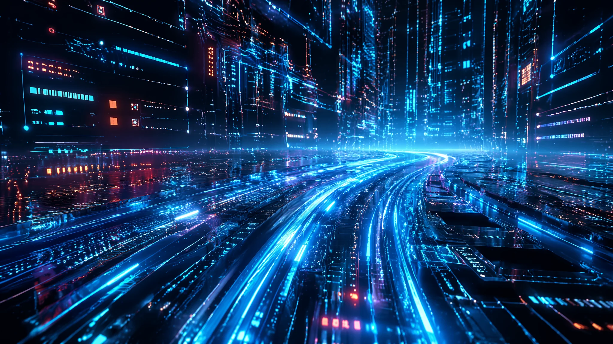
做过科技背景的都知道一个扎心的事实——AI对"科技感"的理解停留在2012年。你写"futuristic tech background",它给你一张深蓝底加几条发光的蓝色线条,上面浮几个半透明六边形,再加一串随机数字。像十年前的手机预装壁纸。真正的科技感不是"把蓝光堆上去就完事"——HUD界面的信息密度、数据流的运动节奏、电路纹理的结构逻辑,每一项都有它的视觉语法。这篇把科技背景的视觉元素拆开揉碎了讲。
去年接了一个科幻短片的视觉概念设计,导演要一组"黑客帝国加攻壳机动队"风格的科技背景——不是那种花里胡哨的纯装饰,而是看起来像"真的有信息系统在运转"的那种。我一开始直接上"cyberpunk UI background, data streams, neon green",AI甩出来的全是千篇一律的发光乱码。改了十几版都不对。
后来我干了一件事——把科技背景拆成了三层:底层是物理材质(金属面板、碳纤维、纳米网格),中层是信息架构(HUD界面、数据面板、扫描框),顶层是动态粒子(数据流、光点、全息投影的噪点)。每一层单独写Prompt,然后把三层叠起来。出来的效果立刻就从"蓝光壁纸"变成了"有信息系统在运转的科技场景"。这个分层逻辑救了我那个项目,也成了我后来所有科技类画面的底层方法论。
HUD界面——科技感的第一视觉锚点
HUD(Head-Up Display)是科技背景里信息密度最高的视觉元素。但AI画的HUD有个通病——信息全是假的,看起来像界面但其实什么都读不懂。好的HUD Prompt要让AI画出"可读的假信息"——观众扫一眼觉得有逻辑,细看也不需要是真的。
四个HUD风格的Prompt方向。
军事战术HUD。"military tactical HUD overlay, green monochrome interface with targeting reticles, range finders, altitude and heading indicators, threat assessment panels, the data is arranged in a functional grid layout, cockpit glass reflection with slight glare, night vision green phosphor glow, the interface looks operational not decorative"。军事HUD的核心是绿色单色+功能网格——每个元素都有"战术用途"。
生物监测HUD。"biometric monitoring HUD with vitals display, heart rate waveform, brain activity scans, DNA helix visualization, body temperature heat map overlay, medical-grade interface design with clean white and soft blue color scheme, translucent panels layered over the subject"。生物HUD要走医疗级设计路线——干净的白色+淡蓝,数据可视化要有心电图那种"生命信号"的感觉。
赛博都市数据面板。"cyberpunk city data dashboard, neon orange and cyan holographic panels floating in urban air, population density heat maps, traffic flow vectors, surveillance camera feeds, corporate advertisements in Japanese and English, the interface is cluttered and commercial not military, Blade Runner 2049 aesthetic"。赛博面板的关键是"商业的而非军事的"——广告、监控、统计数据混在一起,信息过载本身就是风格。
太空舰船操作界面。"spaceship bridge control interface, deep space blue-toned holographic displays, star charts with plotted course vectors, engine status gauges, radiation level monitors, clean NASA-inspired UI design, the screens are arranged in a commanding panoramic layout"。太空舰船界面 = NASA风格的极简功能主义 + 深空蓝调。更多科幻UI的视觉逻辑可以参考 NASA任务控制中心的真实界面布局——那种"每一个按钮都有生死攸关的用途"的克制感,比任何虚构设计都更有说服力。
数据流与粒子系统——让画面"活"起来
静态的科技背景再精致也是一张壁纸。真正让画面有"系统在运转"感觉的,是那些流动的数据粒子。AI画数据流的默认行为是随机散布光点——你得告诉它数据的"运动方向"和"密度规律"。
数据流Prompt的核心三要素:方向、速度、密度。
"flowing data streams of luminous particles moving along predetermined circuit paths, the particles accelerate at junctions and decelerate in open areas, some data packets are brighter and larger suggesting priority traffic, the flow has directionality——from bottom to top or left to right, not random scatter, the particles leave subtle motion trails creating a sense of high-speed data transfer, fiber optic cable aesthetic"。关键写法——"not random scatter"否定掉AI的默认行为,"accelerate at junctions and decelerate in open areas"给速度变化建立规律。
粒子密度的控制还有一个技巧——分"主干流"和"支流"。主干流粗、亮、快,支流细、暗、慢。Prompt写成:"a main data trunk line of dense bright particles flowing vertically, with thinner fainter branch streams feeding into it at regular intervals, the structure resembles a digital river system"。
关于数据流的光效渲染,可以和 AI科幻绘画 里的霓虹光叠加技法配合使用。
电路纹理与纳米网格——科技背景的"皮肤"
HUD和数据流是动态层,但科技背景还需要一个"底子"——那些细密的电路纹理和纳米网格构成了科技感的"皮肤"。AI画电路纹理的习惯是把线路画成"树状分支"——看起来很自然但不够科技。真正的电路设计遵循曼哈顿布线规则:线路以直角转弯,平行走线,交叉处有明确的层级关系。
电路纹理Prompt:"printed circuit board macro shot, precise 45-degree and 90-degree trace routing on dark substrate, gold-plated contact pads arranged in regular grids, tiny surface-mount components visible, the traces follow Manhattan routing rules not organic branching, microscopic detail, the board has multiple clearly defined layers of copper traces visible through translucent substrate"。
"Manhattan routing"这个词对AI来说是一个强信号——它会让AI把"有机树状分支"切换为"规则直角走线"。科技感的本质不是"复杂",是"规则"。规则越明确,科技感越强。
纳米网格是另一个被严重低估的科技纹理:"carbon nanotube mesh surface, hexagonal lattice structure at microscopic scale, the surface transitions from matte black to iridescent blue when light hits at an angle, the mesh pattern is perfectly regular creating a moire effect at certain viewing distances, advanced material science aesthetic not sci-fi decoration"。纳米网格的美感来自"材料科学"而非"科幻装饰"——现实中的纳米材料质感比虚构的科幻材质更有未来感。相关材质渲染技巧见 AI抽象几何绘画。
色彩——别让蓝光毁了你的科技感
科技背景最容易犯的错——全程蓝光。深蓝底加亮蓝线条,再加点青色高光。不是说蓝色不好,而是"只有蓝色"让画面失去层次。真正高级的科技配色是"冷暖对冲"——大面积冷色底 + 小面积暖色信息高亮。
四组科技配色方案:
经典绿屏终端:"phosphor green on true black, amber warning indicators for critical alerts, the green has a slight CRT monitor bloom effect at high brightness areas, retro-future terminal aesthetic"。绿屏终端 = 怀旧未来感,不是老土。
深空蓝+暖橙:"deep space navy blue background with soft warm orange data highlights, the contrast between cold ambient and warm information creates depth, the orange elements appear to float forward from the blue depth"。
白底极简科技:"clean white background with precise thin black UI lines and a single accent color of electric cyan for interactive elements, Apple design language, the interface looks like a premium product not a sci-fi movie prop"。这个配色让科技感从"电影道具"变成"高端产品"。
全息彩虹:"holographic iridescent interface on dark translucent glass, the colors shift from cyan to magenta to gold depending on viewing angle, prismatic light dispersion on the glass edges"。适合做品牌级别的视觉概念。
色彩心理学在科技领域的应用,可参考 Interaction Design Foundation 对UI色彩可用性的研究。
常见问题
为什么我的科技背景总像2012年的手机壁纸?
AI的"futuristic tech"训练数据存在时间偏差。三条解决:一,不用"futuristic"这个词——它在AI那里等于"2005年人类想象的未来";二,用具体参考年份或风格("NASA 2025 mission control UI / Neuralink brain interface visualization / quantum computing dashboard");三,加材质约束("matte anodized aluminum bezel / edge-to-edge glass / zero bezel OLED display")。这三条能让画面跳出现代预设。
HUD信息太假怎么办?怎么让信息看起来"有用"?
给AI一个"使用场景"而不是"画面描述"。不要写"a HUD with numbers",写"a HUD showing the real-time orbital trajectory of a lunar lander with velocity delta-V readouts and fuel remaining indicators"。场景越具体,AI生成的信息排版越有逻辑。
科技背景能直接商用吗?做游戏UI/视频素材要注意什么?
纯科技背景(电路、数据流、抽象HUD)版权风险极低。但三条注意:不使用具体品牌UI(iOS/Windows的界面元素);不包含真实地图或卫星影像;做商用素材建议加"generic sci-fi UI, no copyrighted interface elements"的否定约束。游戏开发中的美术资产规范可参考 AI 3D模型生成与游戏设计。
数据流的"速度感"怎么写Prompt?
两个技巧:一是用摄影语言——"long exposure light trails of data particles, motion blur on fast-moving streams, sharp focus on stationary UI elements";二是加速度变化——"data packets accelerate through narrow channels and burst into open processing nodes, the speed varies creating a rhythmic visual tempo"。速度变化比恒定速度更有生命力。
科技感的本质不是"看起来很未来"——是"看起来在运转"。一块真正的电路板比任何科幻概念图都更有科技感,因为它的每一根走线都在执行一个真实的功能。AI能给你无限的光效和纹理,但"这条数据流要去哪里""这个HUD面板在监控什么"——这些"为什么"只有你能给。把功能和逻辑写进Prompt,你的科技背景就不再是一张会发光的蓝纸。
觉得有用的话分享给做科幻视觉的朋友吧。