AI科技元素绘画进阶:电路纹理与数字界面的视觉组件创作指南
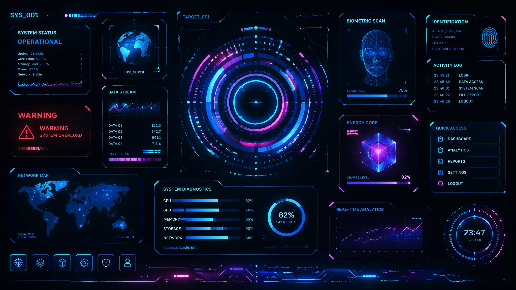
AI画科技元素有一个通用模板:蓝色+发光+六边形网格+几条随机曲线。这个模板用一次还行——用三次你就发现所有"科技感"画面都在互相抄袭。真正的科技视觉设计是有工程逻辑的——电路板上的走线不是随便弯的(有45度转角规则和最短路径原则),HUD界面的数据是有信息层级的(不是乱闪的数字),全息投影的光学原理决定了它的半透明度和边缘色散。AI不懂这些——但你可以用prompt逼它懂。
第一次认真研究科技元素prompt是因为一个赛博朋克主题的委托。客户说"科技感不够,太假了"。我仔细看我生成的图——电路线从芯片引脚出来,走了两厘米就断了,变成了装饰性的花纹。真正的PCB走线每一根都必须连通两个焊盘——断线=废板。AI画电路就像小孩画迷宫——它不理解"连通"这个概念。那一刻我意识到:让AI画科技元素的关键不是写"科技感"——是写工程约束。
电路板纹理——从装饰花纹到工程级PCB
AI默认的"电路板"是一堆随机排布的蓝绿色线条加金色焊盘——你可以叫它"电路板风格装饰"但不能叫"电路板"。真正的PCB走线有严格的几何规则:45度转角(不是90度,不是圆角),统一线宽(信号线通常0.15-0.3mm),平行走线等间距(差分对的两根线必须等长等距),过孔(via)是从一层穿到另一层的圆孔——不是实心金点。写入prompt——"printed circuit board traces with precise 45-degree angle routing, uniform trace width, differential pair traces running parallel with equal spacing, through-hole vias connecting different layers, solder pads at component mounting points"。当你把这些工程约束写进去——AI画的电路板从"装饰花纹"变成了"看起来能通电的东西"。
关于基础科技视觉元素的更多入门知识,可参考 AI科技感绘画指南 中的初级科技元素构建技巧。
HUD和数字界面——信息层级决定"真假科幻"
AI画HUD(Head-Up Display)最大的问题是所有信息一个层级——目标锁定框和心跳监测波和弹药计数和导航罗盘全部同等亮度同样大小堆在画面上,像Word文档里把所有文字都加粗。真正的HUD设计有三级信息层级:一级信息(威胁警告、锁定指示)最亮最大最靠中心,二级信息(导航、速度、高度)在一级外围,三级信息(通讯频道、系统状态)最小最边缘半透明。prompt写法——"futuristic HUD interface with clear information hierarchy: primary threat indicators bold and centrally positioned in red, secondary navigation data in cyan at the periphery, tertiary system status readouts subtly translucent at the corners, depth of field blur on background elements"。加上"DoF blur on background elements"这句——AI会把近处(高优先)的信息画清晰,远处(低优先)的画模糊——这就是信息层级的视觉表达。
| 信息层级 | 内容类型 | 视觉特征 | prompt描述 |
|---|---|---|---|
| 一级(威胁/核心) | 锁定框、警报 | 红色/橙色、粗线、居中 | bold red threat indicators centrally positioned |
| 二级(导航) | 罗盘、速度、高度 | 青色/蓝色、中粗、外围 | cyan navigation data at mid-periphery |
| 三级(状态) | 系统状态、通讯 | 半透明、细线、边角 | translucent system status at corners |
全息投影——光学物理决定"真假全息"
AI画的"全息投影"九成是一个发蓝光的半透明3D模型浮在空中——没有色散、没有边缘衰减、没有扫描线。真的全息投影(至少科幻电影里那种)有三个光学特征:色散(chromatic aberration at the edges——边缘有RGB三色分离的彩虹纹,因为不同波长的光衍射角度不同),扫描线(horizontal scanlines from volumetric display refresh——体积显示逐层刷新留下的横纹),以及边缘光衰减(light falloff towards the edges——投影边缘的亮度比中心低)。prompt写法——"holographic projection with chromatic aberration at the edges, visible horizontal volumetric scanlines, light falloff from center to edge, semi-transparent with 40% opacity, subtle flicker and interference patterns"。加上"flicker"和"interference"——全息的灵魂是"不稳定"——完美的全息=视频截图,不是全息。
六种科技视觉组件的精准prompt速查
一、纳米碳管纹理(carbon nanotube forest texture)——"hexagonal carbon lattice structure, microscopic scale, dark grey with subtle iridescent sheen, aligned vertically like a forest of tubes"。二、量子计算机内核(quantum computing core)——"suspended cryogenic chamber with gold-plated copper wiring, intricate nested chandelier structure descending in tiers, surrounded by liquid helium cooling tubes, ultra-clean laboratory environment"。三、数据流(data stream)——"flowing streams of binary code and geometric symbols, organized in structured lanes like a highway, not chaotic scattered particles, depth of field creates vanishing point effect"。四、能量核心(energy core)——"contained plasma sphere with magnetic confinement rings, inner blue-white glow transitioning to cooler orange at containment boundary, electromagnetic field lines visible"。五、生物机械接口(biomechanical interface)——"organic synthetic fusion, carbon fiber muscles interlaced with metallic exoskeleton, hydraulic actuators alongside organic sinew, medical-grade titanium connections"。六、数字粒子场(digital particle field)——"volumetric point cloud forming a geometric structure, each particle a distinct luminous voxel, not a fog but discrete points in 3D space"。
关于科技主题的更多视觉表现手法,推荐阅读 AI芯片科技绘画 中对微观科技组件的处理方法。
常见问题
AI画的科技元素颜色永远是蓝色+青色,怎么换色系?
因为训练数据里"科技/科幻"标签下的图片90%是蓝青色——从《黑客帝国》到《阿凡达》到钢铁侠的HUD。换色系要明确写"warm-toned sci-fi interface: amber and gold holograms, orange plasma glow, red LED indicators, retro-futuristic 1970s sci-fi aesthetic"——用年代风格锚定色系。或者"green phosphor monochrome display, 1980s CRT terminal aesthetic"——老式单色显示器的绿色。核心逻辑:不写颜色只写"科技"=默认蓝青色。——给你的科技元素一个具体的年代或流派标签,颜色就跟着变了。
画大数据/人工智能的可视化图形,AI有什么特别的prompt技巧?
不要写"big data visualization"——AI会给你一堆饼图和柱状图。写"abstract data sculpture, flowing information streams visualized as luminous particle rivers converging into a central processing node, neural network topology map with glowing synaptic connections between nodes"——用"data sculpture"和"topology map"这两个概念把数据从图表变成空间艺术。还有一个小技巧参考 AI渲染技法 中的抽象概念具象化思路。
科幻场景里的"能量盾"或"力场"怎么画才不像肥皂泡?
肥皂泡=均匀的七彩薄膜。能量盾=局部受力点最亮,向外快速衰减。prompt——"energy shield with hexagonal tessellation pattern, brightest at the point of impact with concentric ripple propagation, the shield material has a glass-like refractive quality but with structural grid lines visible at the edges"。三个关键词——hexagonal tessellation(六边形镶嵌,参考了物理学中力场最小能量面),concentric ripple(同心波纹,受力反馈),refractive with grid lines(折射但有结构——纯折射=玻璃,加结构线=科技产物)。
翻了一本PCB设计手册之后我明白了——好的科技视觉不是"看起来高科技",而是"看起来像是有工程师在背后设计过"。AI能帮你画出漂亮的蓝光线条,但让那些线条"有理由存在"——是你要做的事。
这篇如果让你的科技画面从"蓝光乱闪"升级到"工程级视觉",分享给在搞科幻创作的朋友吧。