AI白色背景绘画技巧:纯净简洁风格与产品展示的视觉创作方法
2025年春天我帮一家淘宝饰品店做AI产品图——需求看起来简单到可笑:"白色背景,干净,高级感"。我以为半小时能搞定。结果第一轮出的图全部不能用:白的发蓝(色温偏了)、白的发灰(像没洗干净的墙)、或者白的"太假"(看起来像贴在白纸上的剪纸)。最后我花了两天才摸清楚——"白色背景"这简单的四个字是AI绘画里最复杂的Prompt挑战之一。真的纯白色(RGB 255-255-255)和"看起来很白"(各种微妙色偏的白)之间的差异,决定了你的图是"电商级产品图"还是"朋友圈随手拍"。这篇总结了我从那之后做过的所有白底图项目——电商产品、极简人像、留白插画——不同场景下白背景的完全不同的实现方法。
"白"的十二种变化——从纯白到奶油白的精确控制
AI对"white"这个词的理解极其模糊——它的训练数据里"白色背景"可能是摄影棚的无缝纸(纯白偏冷)、可能是白色墙壁(带纹理的暖白)、可能是雪地(冷色调的高亮白)、可能是过曝的天空(带渐变的白)。所以你不能只说"white background"——你需要精确指定你想要的"白"属于哪个体系。纯白(#FFFFFF)——"a pure bright white background at RGB 255 255 255, the background has zero color cast——no blue no yellow no gray, it is a perfectly neutral perfectly clean white, like a fresh sheet of high-quality matte photo paper"。暖白/奶油白——"a warm creamy white background——RGB approximately 252 250 245, the white has a subtle hint of warmth like vanilla or ivory, this soft white feels cozy and elegant rather than clinical and sterile"。
冷白/冰雪白——"a cool crisp white background——RGB approximately 248 250 252, the white has a barely perceptible blue undertone that makes it feel fresh clean and modern, like fresh snow under a clear sky or a minimalist Scandinavian interior"。摄影棚白——"a seamless studio backdrop in bright white, the paper has the subtlest hint of texture——not perfectly flat but smooth to the eye, the white is bright but not blown out——there is still subtle tonal variation that indicates a curved infinity cove"。纸白——"the background is a sheet of high-quality art paper in warm white, the paper has a subtle laid texture visible in raking light, the paper white has a natural warmth with a slightly cream undertone"。不同"白"的色彩参数可以参考Pantone色卡中的白色系列和CMYK白色配方。
电商产品白底图——看似简单,实则最考"Prompt功底"
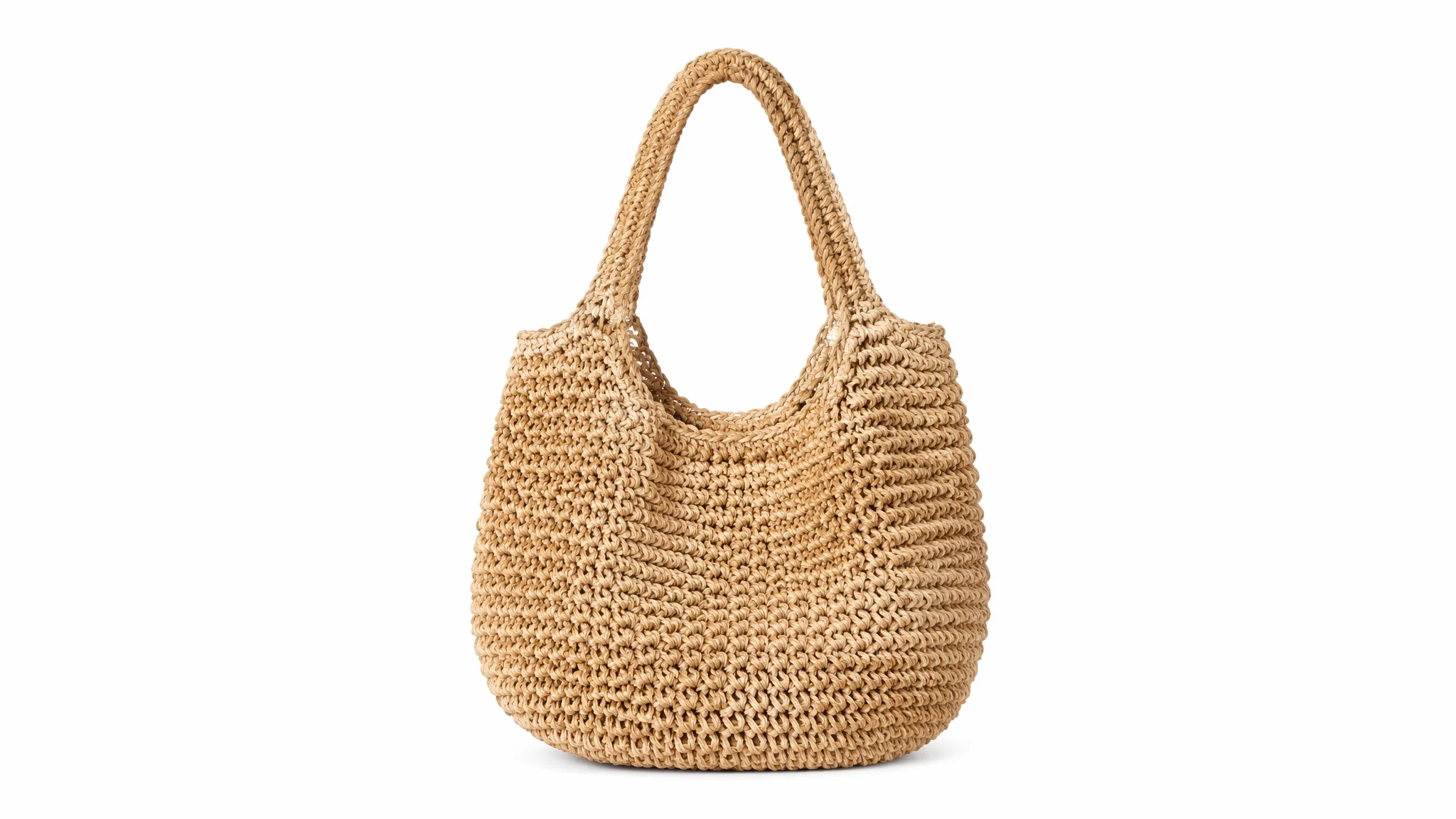
电商白底图的"简单"是一种错觉——它把画面中的所有叙事元素都剥离掉了,只剩下产品和光。这意味着任何微小的缺陷都会被放大:背景不够白、产品边缘有锯齿、阴影不自然——在白底图上这些瑕疵无处可藏。标准的电商白底图Prompt模板:"product photography, [产品名称] on a pure white seamless background, studio lighting with a large softbox directly overhead creating soft even illumination, a second light from the front-left fills in any shadows, the background is perfectly white RGB 255 255 255——a true seamless infinity cove with no visible horizon line, the product is sharply focused from front to back, the shadow beneath the product is subtle and natural——a soft contact shadow that just anchors the product without drawing attention, 85mm lens, f/11 for deep depth of field, high resolution commercial photography"。
产品白底图最常出问题的三个细节:一,产品边缘的"光晕效应"——AI在白色背景上生成浅色产品时,产品边缘会出现一圈模糊的灰色过渡带。"fix the edge halo——the product has a crisp clean edge where it meets the white background, there is no blur no fringing and no gray transition zone at the boundary"。二,地面和背景的接缝线——AI有时会在白底图中生成一条可见的地平线(地板和背景墙的交界),这会破坏"无限白空间"的视觉。"a seamless infinity cove——the background curves smoothly from the vertical wall into the horizontal floor with no visible corner or seam, the transition is completely invisible"。三,产品阴影的颜色和方向——白底图的阴影应该是"中性灰+柔边",不能是黑色硬边。"the product casts a very subtle neutral gray shadow directly beneath it——soft and feathered with no hard edges, the shadow extends about 5-10% beyond the product's footprint"。更多电商白底图技巧可以参考亚马逊产品图标准的技术规格——它们对白底图的要求是行业里最严格的。
极简人像——用白色背景让"人"成为唯一的焦点
白色背景的人像最考验的是"人物和背景的分离感"——如果人物边缘融进了白色背景,整张图就毁了。黑色头发的人在白背景前最容易分离(天然的高对比度),金色/白色头发或穿浅色衣服的人最容易和白背景融为一体。解决分离感的核心工具是"轮廓光"——"a subtle rim light positioned behind and slightly above the subject, this rim light creates a thin bright highlight along the edge of the hair and shoulders, the highlight acts as a visual separator between the subject and the white background——even where the subject's tones approach white, the rim light at the very edge ensures the subject never blends into the background"。
极简白背景人像的Prompt模板:"minimalist portrait on a pure white background——the background is a featureless white void that puts 100% of the focus on the subject, the lighting is a classic two-light setup——a large softbox from the front for even facial illumination and a subtle rim light from behind for edge separation, the subject's expression is calm and direct, the composition is centered with generous negative space around the subject, the overall aesthetic is clean modern and editorial——like a high-fashion beauty campaign, shot on a 85mm lens at f/2.8 for slight background compression"。关于极简人像的更多技巧在AI极简人像指南和AI影棚人像布光中有扩展分析。
留白插画——东方美学中的"白"不是空的
日本和中国的传统美学中,"留白"不是"没画东西"——而是一种主动的、有意义的空间。南宋画家马远的"一角山水"——画面中大部分是空的,只有一角有山峰和孤舟——这个"空"不是空白,是"无即是有"的美学表达。用AI来创作这种留白插画时,最大的挑战是让AI理解"空"不是"没做完"而是"有意为之"。Prompt写法:"ink wash painting in the style of Song Dynasty literati painting——a single branch of plum blossoms enters the frame from the upper right corner, the blossoms are rendered with a few economical brushstrokes, the rest of the composition is intentionally left blank——vast empty space that represents not absence but presence, the unpainted areas are as important as the painted ones, the silk or paper texture of the blank areas is subtly visible, a red seal stamp (chop) anchors the lower left corner"。
现代留白插画风——"minimalist line art illustration on a soft cream paper background——a single continuous line draws the contour of a face or figure, the line has variable thickness suggesting pressure and speed of the drawing hand, 80% of the composition is empty space, the emptiness creates a sense of calm and invites the viewer to complete the image in their imagination"。日式侘寂风——"wabi-sabi style composition on an off-white textured paper background, a single small object——perhaps a weathered ceramic cup or a fallen leaf——sits off-center, surrounded by vast empty space, the emptiness has a tactile quality——not sterile white but a warm textured negative space that carries its own quiet presence, the mood is serene solitude"。留白美学在AI绘画中的更多探索见AI水墨绘画和AI负空间设计。
白背景常见错误及修正——从"不够白"到"太白"的平衡
白背景问题的两端——"不够白"和"太白"。不够白通常表现为灰色调、暖色调偏移或者背景纹理干扰。解决方法前面讨论过了——增加白度的精确描述、使用负向Prompt排除灰色和纹理。但另一端的"太白"问题更容易被忽视——当背景是RGB 255-255-255的纯白时,画面失去了所有空间感,主体像飘在真空中。"太白"的表现是:没有地面感、没有空间感、主体像被剪刀剪下来贴在白纸上。修正方法:引入极其微弱的空间暗示——"a very subtle and barely perceptible tonal variation in the background——the lower third of the background is approximately 2-3% darker than the upper portion, this creates the subtlest hint of a ground plane without breaking the white background aesthetic, the variation is so subtle that most viewers would not consciously notice it but their brain registers the spatial information"。
另外两个常见的白背景陷阱:一,白色背景上出现不想要的"光晕"——"avoid any vignetting or edge darkening——the white background must be uniformly white from corner to corner, no gradual darkening toward the edges"。二,主体的"白边"——当主体颜色偏亮时AI有时会在主体周围生成一圈白色描边来"帮助分离",这个描边在浅色背景上不可见但在深色显示器上很明显。"the subject has a natural clean edge with no artificial white fringe or outline——the edge transitions directly from the subject's natural color to the background white"。对于需要在不同媒介上使用的白底图(线上+印刷),更多技术细节见AI商业修图。
常见问题
AI生成的"白色背景"经常带纹理——像布纹或纸纹——怎么让它完全平滑?
AI的训练数据中大量"白色背景"图是在有纹理的表面拍摄的——白墙有油漆纹理、白布有织物纹理、白纸有纤维纹理。AI学到的不是"白色=平滑"而是"白色背景=可能有纹理"。消除纹理的方法:Prompt中加入"seamless smooth pure white background with zero texture——the background is a mathematical white void, no grain no paper texture no fabric weave no wall surface, the white is as smooth as a vector fill"。负向Prompt:"textured background, paper texture, fabric background, wall texture, grain, noise in background"。如果用SD,降低CFG scale到5-7可以减少AI对训练数据中纹理的"记忆"强度。
白色背景上想让物体有"漂浮感"——但又不希望它看起来像没重力?
漂浮感的本质是"物体在地面上的投影消失"。完全无投影=物体与空间的关系被切断=漂浮。如果你想精准控制漂浮的程度:轻微漂浮(物体离地1-2厘米)——"the shadow beneath the object is very slightly detached——there is a tiny 1-2mm gap between the object and the soft shadow below it, the gap suggests the object is barely hovering above the surface"。明显漂浮(物体离地10-20厘米)——"the object floats in mid-air——there is a soft shadow on the ground plane about 15cm below, the shadow is larger and softer than the object indicating distance from the surface, the object itself casts no shadow because it is not touching any surface"。无重力漂浮——完全无投影+物体在空中——"the object appears to float in an infinite white void with no up or down, there are no shadows anywhere, the object has no spatial relationship to anything——it exists in a weightless dimensional space"。通过控制阴影的"存在/消失/距离"三个状态来精确调节漂浮感的程度。
白色背景看久了"刺眼"——怎么让白背景"柔和"但不"发灰"?
刺眼的白=RGB值过高+冷色温。柔和但不灰=降低白度但不引入灰色调。具体方法:一,降低明度——从RGB(255,255,255)降到RGB(248,248,248)——只降了2.7%的亮度,视觉上仍然是"白"的但不再刺眼。Prompt:"a soft white background——approximately 2-3% below pure white, clean and bright but easy on the eyes, the white feels like the page of a well-printed art book"。二,微调色温——加极其微弱的暖色调(如RGB 252,250,248)让白带有乳白质感——"an off-white background with the tiniest hint of warmth——not cream, not beige, still perceptually white but with a comfortable slightly organic quality"。三,引入环境因素——"the white background has a very subtle and diffuse gradient from slightly brighter at the top (near a light source outside the frame) to slightly softer at the bottom, this gentle atmospheric gradient prevents the white from feeling like a flat sterile void"。