AI儿童绘画风格:童趣插画与绘本风格的生成全攻略
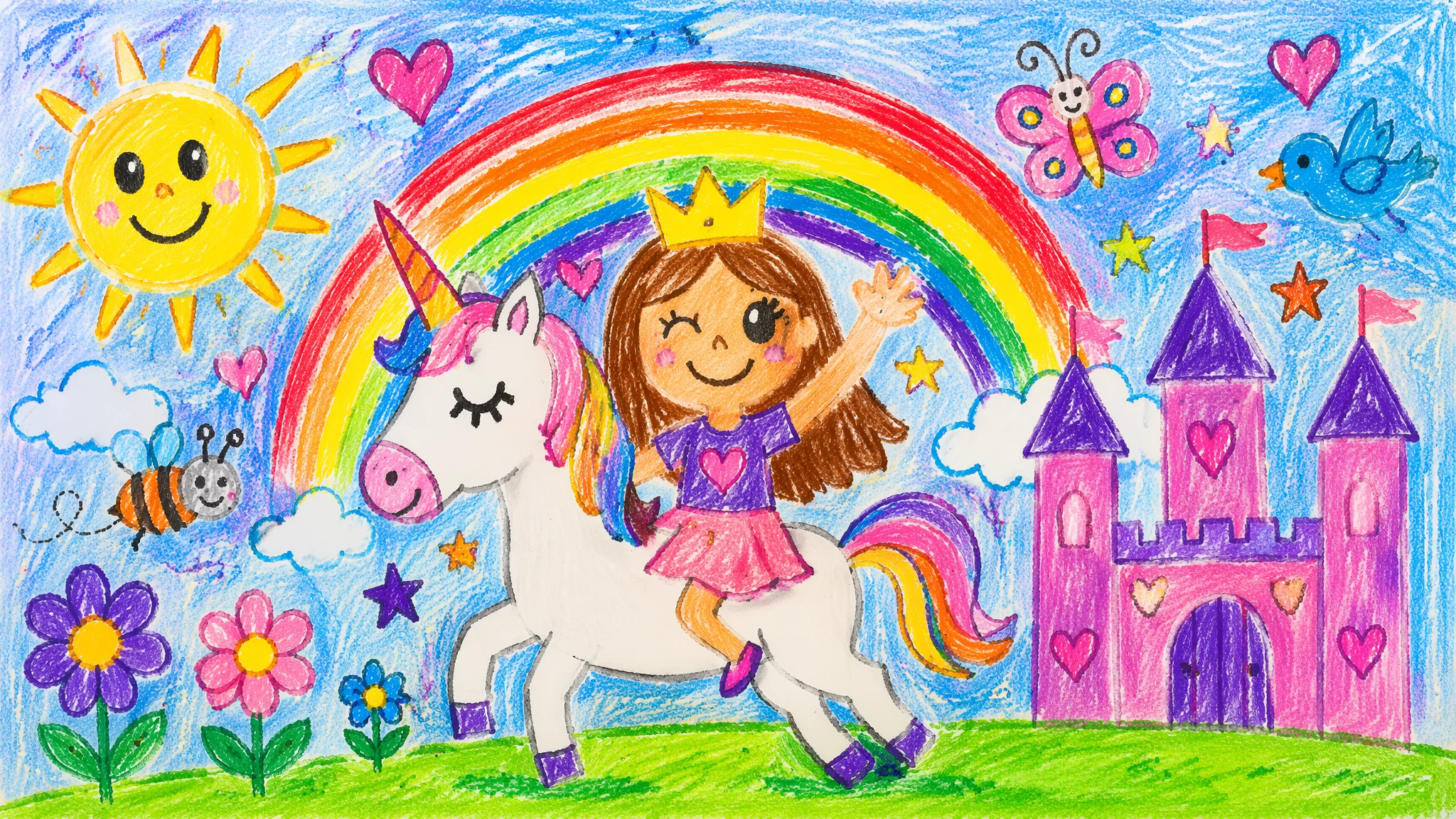
简单说:AI画儿童风格的难点不是"可爱"——是"拙"。真正的儿童画质感来自不均匀的线条、涂出边界的色块、比例失衡的人物——这些"不完美"才是童趣的灵魂。AI默认画得太完美、太光滑、太对称了,你需要刻意引导它"画差一点"——加粗线条、降饱和度、写"imperfect""naive""hand-drawn charm"——才能去掉那股"AI塑料味"。
帮一个做儿童教育App的朋友画素材的时候,我第一次深刻体会到AI画"儿童风格"有多拧巴。需求是"像五岁小孩画的太阳系"——我写"child's drawing of solar system, crayon style",出来的图是一个超级精美的、配色讲究的、构图完美的"成人模仿儿童画"。朋友说:"好看是好看,但一看就不是小孩画的——太对了。"我琢磨了半天,把提示词改成"solar system drawn by a real 5-year-old, crooked uneven crayon lines, sun with a smiley face and messy rays going in random directions, planets are different sizes with no regard for actual scale, coloring outside the lines, scribbled stars in the corner, genuine kindergarten art, not an adult pretending to be a child"——出来的图终于像那么回事了。
"拙"的三个维度:线、色、形
儿童画的"拙"从三个地方来:线条是抖的(wiggly uneven hand-drawn line)、涂色是出界的(coloring outside the lines with messy strokes)、形状是失衡的(头大身小、太阳有脸、花朵比房子还大)。这三个维度都要有意引导AI"退化",才能对抗它"画太完美"的默认倾向。线条的"拙":写"scribbly loose linework""unsteady hand-drawn outlines""sketchy imperfect strokes""lines that overlap and don't quite connect""the pen has a mind of its own quality"。关键是用"unsteady""imperfect""loose"这些词对抗AI默认的"crisp""clean""precise"。涂色的"拙":写"colored with crayons, visible waxy texture and uneven pressure""watercolor that bleeds slightly outside the pencil lines""marker strokes all going in different directions, some gaps left white""the coloring is enthusiastic but inaccurate, hues spilling over edges"。核心是描述涂色工具(crayon/watercolor/marker)的物理特性——蜡笔的蜡质纹理、水彩的渗色、马克笔的方向性笔触——而不是只说"colored"。形状的"拙":写"people with oversized heads and tiny stick bodies""houses smaller than the flowers in the foreground""sun drawn as a circle with spiky rays in the corner of the page""trees that look like green lollipops on brown rectangles""animals with the wrong number of legs, drawn from pure imagination"。这些形状描述直接来自真实儿童画的视觉特征。关于"可爱"与"拙"的平衡,AI可爱风格绘画教程里有更多相关讨论。
四种儿童插画风格体系
蜡笔涂鸦、水彩童话、拼贴质感、数字扁平——四种儿童风格各有专属关键词,但"毛边感"是共同的核心。蜡笔涂鸦风(Crayon Scribble):这是最接近"真实儿童画"的风格——写"kindergarten crayon drawing on manila paper, waxy texture visible in the scribbles, a happy family drawn with circles and lines, sun smiling in the corner, grass as a green zigzag line at the bottom, the paper slightly crumpled, genuine 5-year-old art project"。关键:纸质(manila paper/construction paper)和物理痕迹(crumpled/folded/tape marks)。水彩童话风(Watercolor Storybook):这是儿童绘本最常见的风格——写"soft watercolor children's book illustration, gentle washes of color with visible paper texture, ink outlines that are loose and expressive not precise, a little bear walking through a forest of tall simple trees, Beatrix Potter meets contemporary picture book, warm and gentle palette"。关键:水彩的渗色感(bleeding edges/soft washes)和墨水线稿的松动感(loose ink outlines)。拼贴质感风(Collage Texture):写"Eric Carle inspired children's illustration, painted tissue paper collage texture, visible brushstrokes on each cut-out piece, a hungry caterpillar made of layered green textured circles, white background with intentional gaps between paper pieces, handmade imperfect charm"。关键:纸片之间的缝隙(gaps between pieces)和笔触纹理(visible brushstrokes on each piece)。数字扁平风(Flat Vector Kids):这是教育App和现代绘本最常用的风格——写"modern flat vector children's illustration, simple rounded geometric shapes, bold cheerful colors, diverse group of kids playing, clean design but with a playful hand-drawn quality, suitable for educational app, minimalist friendly style"。关键区别:虽然"数字"但要保留"手绘感"——"playful hand-drawn quality"这个短语是连接数字精度和儿童温暖的桥梁。更多绘本创作技巧在AI儿童绘本创作全流程里有深度展开。
儿童插画的人物比例密码
儿童插画的人物有一套不成文的比例规则:头占身体的三分之一到二分之一、眼睛占脸的二分之一、手脚简化成圆或椭圆、脖子几乎不存在。这些比例写对了,人物自动带上童趣感。具体比例词:头部——"oversized head, about half the total body height""large round head on a tiny body""head-to-body ratio of 1:2 to 1:3, not realistic proportions"。眼睛——"huge expressive eyes taking up half the face""simple dot eyes or large circles with a single highlight""eyes slightly uneven, one bigger than the other for extra charm"。身体——"tiny pear-shaped body""stick limbs attached to a round torso""no neck, the head sits directly on the shoulders""hands are simple circles, no individual fingers"。这些比例特征和AI插画风格绘画指南中的角色设计方法是相通的。几个经典的儿童插画人物参考可以在提示词里直接用:Moomin(圆滚滚没有嘴巴的河马精灵)、Miffy(极简线条+叉叉嘴的兔子)、Little Mole(简单的圆点眼睛+铲子)、Paddington(熊+粗呢大衣+帽子)。用一个知名角色作为风格参照,比抽象地描述"cute children's book character"效果准确得多。如果你要做完整的儿童绘本,AI书籍插画绘制教程提供了从角色设定到分镜的完整工作流。
儿童画媒材的物理质感关键词
单纯写"children's drawing style"不够——你得指定"用什么东西画的"。蜡笔、水彩、彩色铅笔、手指画颜料——每种媒材的物理质感完全不同,AI对它们的响应也完全不同。蜡笔:"waxy crayon strokes with visible texture""crayon pressure varies, some areas heavily saturated, others light and scratchy""crayon on rough construction paper, the paper tooth visible through the color"。彩色铅笔:"colored pencil with visible directional strokes""layered pencil shading with the white of the paper still showing through""Prismacolor soft core blending effect"。水彩:"watercolor bleeding slightly beyond pencil outlines""wet-on-wet technique with colors blooming into each other""granulating watercolor pigment settling into the paper texture"。手指画:"finger painting with thick globs of tempera paint""swirling finger marks visible in the paint""messy joyful smears of primary colors, the child's hand prints visible at the edge"。丙烯/水粉:"gouache with flat opaque blocks of color""matte poster paint finish""visible brush marks in thick paint"。选对媒材词,相当于选对了一张儿童画的"物质基础"。关于各种绘画媒介的AI表现,WetCanvas论坛上传统画家对不同媒材的讨论虽然不涉及AI,但对理解媒材的物理特性非常有帮助——理解原理才能写好提示词。对儿童插画经典作品感兴趣的读者,Illustration History网站的儿童绘本专题收录了从十九世纪至今的经典儿童插画作品与风格流派分析,是研究儿童绘画风格演变的重要参考。
常见问题
为什么AI画的"儿童画"看起来还是太精美?
因为你对抗得不够。AI默认审美是"精美、光滑、对称"。要突破这个默认,你需要在下提示词的时候专门加"破坏性"关键词——"slightly crooked""intentionally imperfect""not polished""rough around the edges""like a drawing found on a fridge, not in a gallery"。把这些做成常用后缀,每次出图都带上。
儿童风格但又要能商用,画面太粗糙了客户不接受怎么办?
走"精致的拙"路线——画面有明显的儿童画特征(圆脑袋、大眼、简化的肢体),但整体构图和配色是专业的。关键词是"professional children's book illustration"而非"child's drawing"——前者是成人用专业能力创作的儿童风格,后者是模拟真实儿童的画。这是两个完全不同的方向。
怎么让AI画的小孩不像"缩小的成年人"?
这是AI的一个系统性偏见——它把所有人类都画成成年人的比例,只是缩放尺寸。对抗方法:在提示词里明确写"toddler proportions: head is 1/3 of total height, chubby cheeks, short limbs, round belly, flat feet, no defined jawline or neck""this is a child, not a small adult"——最后那句否定句在很多模型里非常有效。
觉得有用的话分享给朋友吧。