AI绘画插画教程:从商业插画到原创绘本的完整设计Prompt方法论
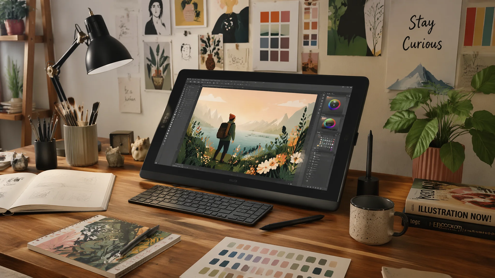
插画是AI绘画里最成熟的商业应用领域——因为插画本身就是从创意到视觉的翻译过程——恰好是AI最核心的能力。对企业而言——以前请插画师画一张定制配图要几百到几千元+一周时间——现在AI配图成本趋近于零+几分钟。这不是"AI替代插画师"——是"把插画的受众从只有预算的大品牌扩展到了每一个做内容的人"。
插画是 AI 绘画里最成熟的商业应用领域。插画本身就是“创意 → 视觉”的翻译过程,正好是 AI 最擅长的事。对企业来说,以前一张定制插画配图几百到几千元 + 一周时间,现在 AI 出图成本趋近于零 + 几分钟。真正的价值不是替代插画师,而是把“能用上插画”的门槛降到每一个做内容的人都够得着。
四条主要方向:商业 SaaS 插画(扁平/等距)、编辑观点插画(概念先行)、绘本叙事插画(故事连续)、装饰艺术插画(个人 IP/艺术家风)。每种对应完全不同的 Prompt 结构和输出比例,很难混着写。AI矢量绘画教程可以补齐扁平插画的技法侧。
四类插画Prompt模板
商业 SaaS 插画。“modern corporate illustration for a tech startup website, flat vector style with isometric elements, diverse team collaborating around floating UI screens, brand palette of muted navy and coral orange, stylized geometric figures, conveying innovation and teamwork without being cheesy, minimal shadows, clean composition”。“brand palette + isometric + flat vector”是 SaaS 插画三件套。
编辑观点插画。“editorial illustration for a magazine article about climate change, a melting clock shaped like Earth dripping into a pair of cupped hands, conceptual and symbolic rather than literal, limited color palette with single accent color for impact, sophisticated painterly texture”。编辑插画要“先想概念,再想画面”,Prompt 要写清隐喻。
绘本叙事插画。“children's book spread illustration, a little fox discovering a hidden library inside an ancient oak tree, warm magical glow from tiny lamps on branches, miniature bookshelves carved into the wood, pure wonder in the fox's expression, painterly watercolor storybook style”。绘本重点是“世界观 + 角色一致”,做系列图要锁 seed。
装饰艺术插画。“decorative art nouveau illustration, elegant flowing linework with organic floral motifs, muted jewel tone palette, stylized female figure surrounded by botanical elements, Alphonse Mucha inspired composition, high detail lineart”。适合海报、装饰画、艺术卡片。
插画风格控制的三个变量
线条。是否要 outline,粗细如何:“clean vector outline, uniform 2px line weight”或“no outline, painterly edges”或“variable brush stroke lineart, hand-drawn quality”。色块处理。flat(纯色块)、cel shaded(硬边阴影)、painterly(水彩过渡)、gradient(现代平面渐变)。纹理。加“grain texture / paper texture / halftone / clean digital”,纹理决定“手作感”与“数字感”的比例。
不同用途构图与输出
网站配图:横 16:9 或 4:3 + 干净背景 + 大留白,加“web illustration hero image, plenty of negative space for headline”。App 图标:正方形 1:1 + 单一主体 + 强轮廓,加“app icon composition, single subject, iconic silhouette”。绘本跨页:横 2:1 + 大场景 + 角色偏一侧,加“children's book double-page spread, 2:1 aspect ratio, character on the left, world on the right”。文章配图:3:4 或 4:5 + 概念隐喻主体 + 单一色调,加“editorial article accompaniment, single conceptual metaphor”。
常见问题
AI画的商业插画“千图一面”怎么改?
加“brand-specific color palette”并给出具体色号;再加“distinctive character design—character has X特征”让人物不通用;最后加纹理“subtle paper grain texture, imperfect hand-drawn quality”。这三步能让你的商业插画立刻脱离“通用素材站”的味道。
绘本插画怎么让主角在多页之间保持一致?
三个方法:一是锁 seed;二是完全一致的角色描述(发色、发型、服装、五官特征全写死);三是先做一张“角色设计稿”,再用 img2img 或 IP-Adapter/角色参考图输入到后续每一页。第三种最稳。
编辑插画怎么想“隐喻”这一步?
写文章观点的“核心冲突”和“画面比喻”两栏。观点是“气候变化正在被时间消耗”,比喻可以是“融化的时钟”“往下漏的沙”“正在被撕的地图”。Prompt 里只写比喻本身,不写观点。AI 只处理视觉。
AI 插画商用(做企业官网/App/杂志)有版权风险吗?
技术上可以商用,注意几点:用授权明确的工具(Midjourney 付费/Firefly/本地 SD);不复刻具体插画师的独特风格(如“in the style of [知名插画师]”容易踩风格版权红线);保留 Prompt + 生成 log 作为版权证据。AI绘画软件全评测里有工具授权的对比。
插画是“用一张图说完一千个字”。AI 能帮你画出那张图,但那一千个字,是你写的。选风格、定隐喻、定色板——那才是插画师真正的工作。
觉得有用的话分享给做插画的朋友吧。