AI绘画色彩教程:从配色原理到高级色感的Prompt调色技巧大全
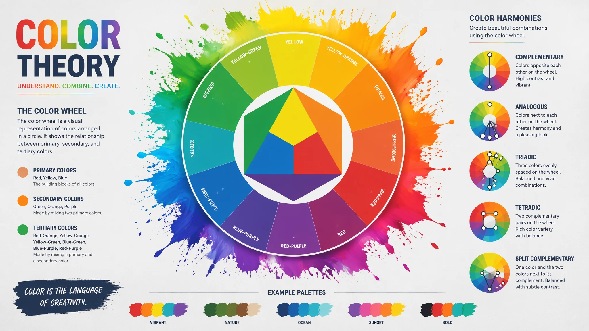
色彩是AI绘画里最被低估的控制维度。大多数人只控制"画面里画什么"——不控制"画面里是什么颜色"。但颜色对画面的情绪影响——有时候比题材本身更大。同一张构图——用"暖金色调"是温馨怀旧,用"青蓝色调"是冷峻疏离,用"高饱和色"是视觉轰炸——颜色决定了观众在看见"画了什么"之前就已经产生的感受。
色彩是 AI 绘画里最被低估的控制维度。大多数人只控制“画面里画什么”,不控制“画面里是什么颜色”。但颜色对情绪的影响,有时候比题材本身更大:同一张构图用暖金调是温馨怀旧,用青蓝调是冷峻疏离,用高饱和霓虹是视觉轰炸。观众在看清“画了什么”之前,颜色已经先把情绪定了。
五套 AI 绘画里最好用的“成品色系”:莫兰迪灰调(高级感)、霓虹冲突(赛博/潮流)、暖金复古(怀旧)、冷蓝月光(孤寂)、互补色三角(冲击力)。想同时理解光线控制,可以叠着AI暗黑系绘画看,那篇讲光比,本篇讲色调。
五套色调Prompt模板
莫兰迪灰调。“Morandi muted color palette, desaturated dusty tones—sage green, dusty rose, pale ochre, muted slate blue—the colors are soft and sophisticated, everything looks like it's been gently faded by time, cinematic film grain, low saturation grading”。适合家居、静物、极简人像。
霓虹冲突。“neon color palette, electric cyan clashing with hot magenta, acid green against deep purple, intentionally jarring energetic contrast, cyberpunk vaporwave aesthetic, artificial light sources, wet reflective streets”。适合赛博/潮牌/夜店。
暖金复古。“warm vintage golden color palette, amber and sepia tones like an old photograph, late afternoon light through dusty curtains, brass and copper accents, everything glows with nostalgic warmth, film grain and slight vignetting”。适合怀旧、回忆、婚礼、家庭。
冷蓝月光。“cool moonlight color palette, monochromatic silvers and deep navy blues, the only warmth comes from a single distant window glowing amber, cold blue dominates, isolation and stillness, long exposure night atmosphere”。适合孤独题材、夜景、悬疑。
互补色冲突。“teal and orange complementary color grading, cinematic Hollywood color scheme, cool blue shadows and warm orange highlights, high contrast between the two, wide color separation between shadow and highlight”。适合电影海报、汽车广告、动作大片。
控制颜色的四种精准写法
用具体色卡词。“sage green”“burnt sienna”“Klein blue”“terracotta”比 “green / red / blue” 精准数倍。用色卡号。Prompt 里可以写 “Pantone 18-1663 Fiery Red”,Midjourney 和 SD 都能吃这套。用色温数值。“2700K warm tungsten”比 “warm light” 更稳。用色关系词。互补(complementary)、类似(analogous)、单色(monochromatic)、三角(triadic)——这些设计术语 AI 都懂。四种一起用,颜色可控性提升一大截。
四步“调色”流程
做视觉设计时,我一般按“主色→辅色→点缀色→背景色”四步来写:主色:画面里最主要的颜色(60%);辅色:搭配色(30%);点缀色:一小块视觉焦点(10%);背景色:与主色形成关系。Prompt 例:“color scheme: 60% muted terracotta, 30% cream white, 10% pop of deep teal, background soft warm grey”。这套写法比“色系词”更能锁死画面。
常见问题
AI画的画面颜色总是杂乱,怎么控制成统一色调?
加“limited color palette, only three main colors”并列出具体色名。再加“color grading applied globally, unified color mood”。这两条一加,AI 会主动把画面拉入你指定色域。
怎么让AI稳定输出电影感的“青橙”色调?
Prompt 加 “teal and orange complementary grading, cool blue shadows, warm orange highlights, Hollywood cinema color scheme, high dynamic range”。这一整套是电影调色师最常用的通式,AI 极其擅长模仿。
莫兰迪色出图很容易灰蒙蒙没层次怎么办?
问题在于全画面饱和度太低。改法:允许一个色块有高饱和度作为焦点——比如“Morandi palette overall, with a single small accent of high saturation coral red as focal point”。有一个亮点,画面就不灰了。
色调 Prompt 会不会和光线 Prompt 冲突?
不会。它们互补:色调控制颜色,光线控制光比和方向。同时写“golden hour warm light + teal and orange complementary grading”,AI 会同时执行光线和调色。冲突只发生在你写了矛盾指令,比如“cold moonlight + warm sunset”,这时候 AI 会随机选一个。
颜色不是让画面好看,是还没看到画面内容之前,你的情绪就已经被它带到了指定的地点。选一套色调,AI 就替你把观众带过去。
觉得有用的话分享给在学配色的朋友吧。