AI美食绘画进阶:高端餐饮摄影级摆盘艺术与食欲感渲染技法
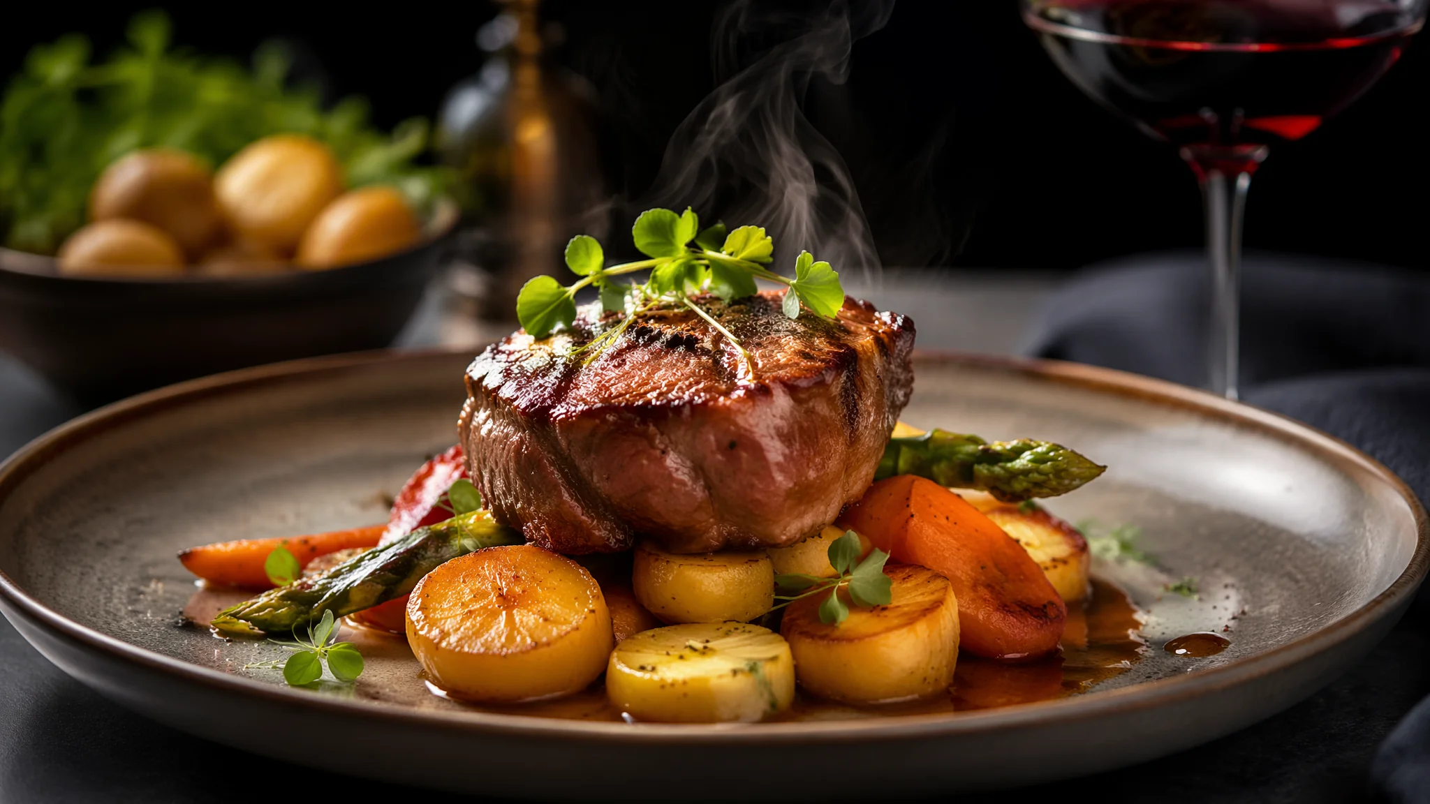
简单说:AI美食绘画分两个段位——「看起来能吃」和「看起来想吃」。基础篇教会了你画出一盘菜,进阶篇要解决的是:怎么让观众盯着这张AI美食图咽口水。食欲感不是画得「像」,是画得「诱人」——油光、蒸汽、酱汁的流淌感、食材断面的纹理——这些才是让味蕾产生联觉反应的视觉触发器。
给一家高端餐厅做菜单视觉设计的时候,AI第一版出来的牛排图——肉是灰色的、表面干燥、配菜耷拉着——看着像放了三天的剩菜。我跑去翻了一百多张米其林餐厅的官方宣传照,总结出了一套「食欲感视觉公式」。第二版出来的牛排——表面焦褐、切开是完美的粉红色、肉汁在切口处微微渗出、旁边酱汁的光泽像镜面——主厨看了说「比我们自己拍的还好」。差距不在AI模型,在提示词里有没有写「食欲感」的物理参数。
食材光泽——食欲感的「第一触点」
「food photography, the meat surface has a glossy sheen from its natural juices and a light brushing of oil, the glaze on the roasted vegetables catches the light with a mirror-like reflection, the sauce drizzled on the plate has a velvety smooth surface with tiny bubbles that catch specular highlights」。
食物光泽分三种:油脂光泽(meat juices/oil glaze)、酱汁光泽(sauce sheen/glaze reflection)、水分光泽(moisture on fresh herbs/steam condensation)。每种光泽的物理特征不同——油脂是高亮小面积反光,酱汁是大面积柔光反光,水分是细密微小的珠光。写「specular highlights on the moist surface of the food」能统一提升光泽层次。
酱汁的「流淌感」是进阶关键——「the sauce is drizzled in an organic flowing pattern, not a perfect circle but a natural artistic drizzle with varying thickness, the edges of the sauce pool catch the light differently than the center」。酱汁不是一滩——是有厚薄变化、有边缘反光差异的三维流体。更多食材质感的处理技巧见AI烧烤美食绘画。
蒸汽和温度——「热」是可以被看到的
「wisps of steam rising from the hot food, the steam is thin and translucent, catching the backlight and glowing softly, some steam curls upward in a delicate dance while some dissipates into the ambient air, the steam conveys the temperature of the dish more than any color ever could」。
蒸汽的物理特性:半透明(translucent)、逆光可见(backlit visible)、有运动轨迹(curling/dancing upward)、浓度不均(有些地方浓有些地方淡)。写「wispy steam tendrils, barely visible against the dark background, illuminated by a warm directional light from the side」——侧光照蒸汽是美食摄影的黄金打光法。
温度暗示不仅靠蒸汽——「a pat of butter melting slowly on top of the hot steak, the butter is half-melted with a glossy pool forming around it, the slight sizzle is almost audible from the glistening surface of the meat」。半融化的黄油比蒸汽更能传达「这块牛排是刚出锅的」。热食的蒸汽和冷食的冷凝水珠在AI奶茶饮品绘画里有对应的物理逻辑。
摆盘——从「放上去」到「设计过」
「fine dining plating with negative space intentionally left on the plate, the food is positioned off-center following the rule of thirds, height is built into the plating with components stacked or leaned, microgreens and edible flowers placed with tweezers-like precision, the plate itself is a matte ceramic canvas that contrasts with the glossy food」。
高端摆盘的三条铁律:留白(negative space on plate)、高度(vertical stacking)、对比(matte plate vs glossy food)。普通AI美食图会把食物堆在盘子正中间填满整个画面——这是食堂打饭的摆法。米其林摆盘是「盘子70%是空的,食物只在黄金分割线上占据30%」。
摆盘细节:「edible flower petals scattered with intentional asymmetry, microgreens placed as a delicate garnish at the apex of the composition, a single perfect herb leaf floating on the sauce pool as a focal point」。每一个装饰元素的位置都要用「intentional/asymmetric/deliberate」来强调——告诉AI这不是随机撒的。更多商业产品摆盘逻辑见AI绘画商业产品图。
色彩——食欲感是有「色盘」的
食欲感最强的颜色组合:焦褐(Maillard reaction brown)+ 鲜红(rare meat pink)+ 翠绿(fresh herb green)+ 金黄(golden crust)+ 奶白(cream white)。五种颜色在同一个画面里出现时,人的大脑会自动触发「这很好吃」的判断。原理是:焦褐=美拉德反应=蛋白质+热=有营养;翠绿=新鲜蔬菜=维生素;鲜红=半熟肉=嫩。
色彩控制提示:「rich warm color palette dominated by golden browns and deep reds, bright green herb accents pop against the warm tones, the cream-colored sauce provides a neutral rest area for the eye, the overall color temperature is warm and inviting like candlelight on a dinner table」。盘子本身的颜色选择也关键——深色哑光盘子能让食物的颜色「跳」出来。色彩搭配理论参考AI色彩绘画。
光影——米其林级打光公式
「overhead soft diffused light from a large window, slight side fill from a warm reflector panel at 45 degrees, the light wraps around the food gently revealing every texture without harsh shadows, the background falls off into a soft dark blur, the lighting style is editorial food photography for a luxury restaurant menu」。
美食摄影的光线黄金公式:大窗柔光(顶光或侧顶光)+ 暖色反光板补光(45度侧面)+ 深色背景虚化。不要用闪光灯——硬光会让食物看起来油光满面而非诱人油亮。反光板在食物暗面补一点暖光——这个暖光让食物的暗面不是死黑而是「温暖的阴影」。
后期在Adobe Photoshop里微调食物的饱和度+8%、暖色调+5%、清晰度+10%,在Midjourney的Vary Region功能里也能做类似的局部调色。这三步调完,AI美食图从「能看」变「想吃」。后期调色的基础逻辑参考AI调色编辑。
饮品与甜点——被忽视的AI美食子赛道
AI美食绘画里,饮品的流量潜力经常被低估。一杯冒泡的冰拿铁比一盘牛排更容易在小红书上获得点赞——因为饮品的「场景感」比正餐更强。
冰饮——「iced latte in a clear glass, condensation beads running down the outside of the glass, ice cubes clinking together with a subtle submerged splash effect, a layer of espresso slowly mixing into the milk creating a marbled gradient effect, condensation ring on the wooden table beneath the glass」。冰饮的灵魂是「冷凝水珠」——玻璃杯外面的小水珠和杯底的冷凝水圈,这两个细节决定了冰饮的「冰感」。没有冷凝水=这杯饮料看起来是温的。
甜点——「a slice of chocolate lava cake on a white plate, the molten chocolate center oozing out from the cut, a dusting of powdered sugar on top with a few stray specks on the plate, a scoop of vanilla ice cream melting slightly beside the warm cake creating a temperature contrast, fresh mint leaf garnish」。熔岩蛋糕的切开瞬间是甜点AI绘画的「决定性瞬间」——巧克力岩浆流出来的那一刻,食欲感达到顶峰。温度对比(热蛋糕+冷冰淇淋)也是甜点摄影的经典手法。更多饮品类AI绘画的细节技巧参考AI奶茶饮品绘画里的液体质感处理。
美食AI绘画的商业应用路径
餐厅菜单设计——"overhead flat lay of a complete meal on a rustic wooden table, the dishes are arranged in a magazine editorial style with intentional negative space, the lighting is soft and diffused from above, each dish is labeled with an elegant font overlay space"。菜单设计的核心是「flat lay俯拍」+「留白给文字」。AI生成的美食图必须预留设计空间——不能把食物填满整个画面。
外卖平台商品图——「product photography style, a single dish centered on a clean white background, bright even lighting with no harsh shadows, the food is the hero with no distracting props, commercial food photography for delivery app menu」。外卖图的重点是「干干净净」——白底、均匀光线、食物居中、无杂物。不要用米其林摆盘——外卖用户要看清「这是什么菜、有多大份量」。不同商业场景的美食AI绘画策略完全不同——菜单要氛围感,外卖要信息清晰度。商业应用的完整体系参考AI绘画商业产品图和Adobe Photoshop的后期合成教程。
美食AI绘画的风格跨界——当食物遇到艺术流派
不一定所有美食图都要走写实摄影路线。用艺术风格画美食——印象派、浮世绘、波普艺术——反而能在美食类内容里脱颖而出。
印象派美食——「Impressionist oil painting of a French dinner table, the brushstrokes are loose and expressive, the food is suggested through dabs of warm color rather than precise rendering, the scene captures the feeling of a warm Parisian bistro more than the exact details of the food, Monet style」。印象派美食画的不是「这道菜长什么样」,是「吃这道菜时的感觉」——这是美食AI绘画里非常独特的表达角度。浮世绘美食——「Japanese ukiyo-e style illustration of a bowl of ramen, flat colors with bold outlines, the steam is rendered as elegant curling lines, traditional Japanese woodblock print aesthetic, Hiroshige inspired」。浮世绘风格的拉面——用平面色块和粗轮廓线来表现食物,出来的效果意外地有食欲感。风格跨界的更多可能性在AI油画风格绘画和AI动漫风格绘画里有系统探索。
常见问题
AI画的食物总是看着「假」,像塑料道具?
缺少「不完美感」。完美的食物=塑料。真实食物有不规则的焦痕、酱汁滴落的不对称、芝麻分布的不均匀。加「slight imperfections that make the food look real: uneven browning on the crust, a tiny drip of sauce on the plate rim, sesame seeds scattered organically not uniformly」。
怎么画半熟牛排的粉红切面?
写「the steak sliced open to reveal a perfect medium-rare interior, the gradient from the seared brown crust to the pink center is gradual and natural, the cut surface is moist with tiny beads of juice forming on the meat fibers, not dry not raw」。关键是「gradient」——从焦褐到粉红的过渡是渐变的,不是一刀切的同心圆。
中餐和西餐在AI绘画上需要不同的提示词吗?
需要。中餐写「Chinese cuisine, wok hei visible as a faint smoky haze over the dish, glossy sauce coating each ingredient with a translucent sheen, chopsticks in the frame, ceramic bowl with traditional pattern」。镬气(wok hei)是中餐特有的视觉符号。西餐写「Western fine dining」那一套。餐具、摆盘逻辑和酱汁处理方式完全不同。
觉得有用的话分享给做美食内容的朋友吧。