AI展厅展馆绘画:艺术画廊与商业展览空间的室内视觉设计
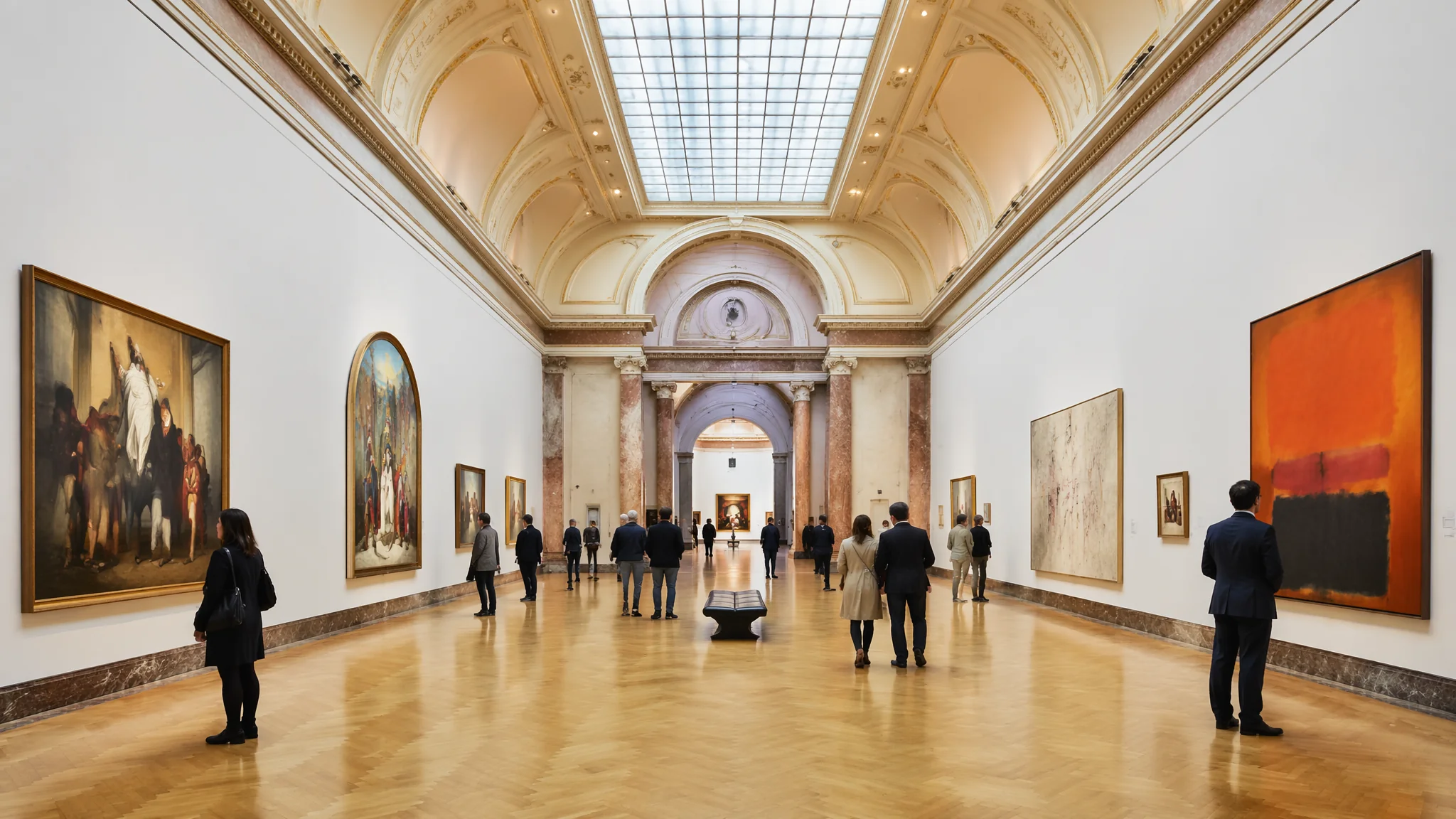
前年我帮一个做独立艺术空间的朋友用AI做展厅设计方案。他的预算只够租一个80平米的白盒子空间,请不起室内设计师——问我能不能用AI把展厅效果图画出来,拿着图去找赞助商。我花了一个周末跑了60多张不同灯光和布局的展厅效果图。他最后选了其中一张——一束光从天花板打在墙面正中央,周围全是暗的,像舞台上只有追光灯照亮了独唱者。他用那张图说服了一个本地地产商免费提供了场地。地产商后来跟他说:"那张效果图让我觉得——这个空间不租给你做展览就是在浪费。"AI画的展厅空间,核心不只是"好看"——是"让看的人觉得这个地方适合发生一些重要的事"。
白立方美学——美术馆空间的经典视觉逻辑
白立方(White Cube)是现代美术馆的标准空间范式——白色墙面、抛光混凝土地面、自然光+轨道射灯——所有设计元素服务于一个目的:让艺术品成为空间里唯一的主角。AI画白立方展厅的关键词不是"white room"——而是"neutral gallery space that disappears so the art can speak"。"a pristine white cube gallery space, the walls are pure matte white with no texture or ornamentation——the walls must disappear visually, polished concrete floor with a subtle grey tone that grounds the space, minimalist black track lighting system on the ceiling with adjustable spotlights, the room is spacious with high ceilings and no columns obstructing sightlines, the only color in the room comes from the artworks on display"。白立方的精髓在于"消失"——墙壁、地板、天花板都不应该被注意到。
白立方最容易翻车的地方:AI会把"白色空间"理解成"单调、无聊、像毛坯房"。纠正方法是加入"光"的质量描述和"比例感":"the white walls are illuminated by soft diffused natural light from a clerestory window, the light creates a subtle warm-to-cool gradient across the wall surface giving the white dimension and life, the proportions follow the golden ratio——the wall height is approximately 1.6 times the viewing distance"。白色不是"没有颜色"——白色是所有环境光的总和。写清楚光的温度和方向,白色就有了层次。关于空间设计中的光线运用,AI室内设计绘画里的光线分层方法可以直接迁移到展厅空间。ArchDaily有全球最优秀的画廊和美术馆建筑设计案例,Dezeen的展览设计专栏有大量国际级展厅的视觉参考。
四种展厅视觉风格——从极简到沉浸式
极简白立方。"a minimalist contemporary art gallery, pure white walls with a single large-scale abstract painting as the focal point, the painting is illuminated by a precisely aimed spotlight creating a perfect circle of light, a lone visitor stands at the optimal viewing distance with their back to the camera, the space is silent and meditative, the proportions are cathedral-like——tall narrow space that draws the eye upward"。这种风格适合当代艺术、摄影展、个人回顾展。
工业风展厅。"a converted warehouse exhibition space, exposed brick walls painted white, visible steel beam ceiling with suspended track lighting, polished concrete floors with visible aggregate, large industrial windows letting in natural northern light, the space feels raw and authentic, the artworks are displayed on movable partition walls creating a flow through the space"。工业风保留了建筑的历史痕迹——砖墙的纹理、钢梁的铆钉、水泥地面的色差——这些"不完美"反而让艺术品更有冲击力。
沉浸式数字展厅。 "an immersive digital art exhibition space, floor-to-ceiling LED panels display flowing abstract visuals that wrap around the entire room, the boundary between wall-floor-ceiling dissolves into a continuous projection surface, visitors are silhouettes against the luminous environment, interactive light particles respond to movement, the atmosphere is futuristic and dreamlike, like being inside a living painting"。沉浸式展厅的关键:墙不再是墙——是整个环境的投影载体。
东方美学展厅。"a Chinese aesthetic exhibition hall, warm wood lattice screens divide the space into intimate viewing alcoves, soft rice paper lanterns provide diffused warm lighting, the floor is polished dark wood reflecting the lanterns like a still pond, each artwork is displayed with generous empty space around it honoring the principle of 'less is more', the mood is contemplative and poetic, like walking through a Song dynasty scholar's studio"。东方展厅的精髓——隔断(不是开阔大空间,是曲径通幽)和留白(艺术品周围有大面积的"呼吸空间")。关于东方空间美学,AI中国风动漫角色绘画中提到的宋代审美可以延伸到空间设计。
展陈布局——挂画高度、动线和观众的"视觉剧本"
标准挂画高度:画面中心离地面约145-150厘米——这是人类平均视线高度。在Prompt里写:"the artworks are hung at the standard museum height of 145cm from the floor to the center of each piece, creating a consistent horizon line for the viewer's eye"。这个细节AI通常不会自动处理——它会把画框随机"贴"在墙上。动线设计是展厅布局的灵魂:"the exhibition space has a clear circular flow path, the visitor enters from the left frame and naturally progresses clockwise through the space, each artwork is positioned to be discovered sequentially——you cannot see all pieces at once, the space reveals itself gradually as you walk through"。好的展厅动线像一个"视觉剧本"——导演(策展人)控制观众在什么时候看到什么。
还有一个容易被忽视的细节:观众在展厅里的"尺度感"。一张展厅效果图如果没有人物——你不知道空间到底多大。"a visitor is included for scale——a single figure standing in front of a large painting, the figure is small relative to the artwork and the space, making the gallery feel grand and the art feel significant"。人的尺度是空间的锚点——没有人的展厅图看起来像一个微缩模型。更多空间的尺度设计可以参考AI室内效果图渲染中的空间比例控制。
常见问题
AI画的展厅看起来像"售楼处样板间"而不是美术馆,怎么纠正?
售楼处样板间=暖色调+软装+生活化装饰。美术馆=冷白或中性色调+极简家具(如果有的话)+零生活化装饰。纠正Prompt加:"not a residential or commercial showroom, no comfortable furniture, no potted plants for decoration, no home-like elements——this is a pure art viewing space, the only furniture is a minimal black leather bench for contemplation, the space feels institutional but not cold"。美术馆的"冷"是克制的冷——不是拒人千里,是让人安静。
想让展厅的窗外有城市天际线或自然景观——怎么控制窗外的内容?
窗外内容用独立描述句:"visible through a floor-to-ceiling window is a misty mountain landscape with layers of receding peaks in Chinese ink wash style——the view is an extension of the gallery's aesthetic, nature as curated art"。窗外景色不是"背景"——是展厅视觉体验的一部分。把它和展厅内的艺术主题关联起来——如果是当代艺术展,窗外可以是现代都市天际线。如果是水墨画展,窗外可以是云雾山林。
商业展厅(车展、手机发布会展厅)和艺术画廊在Prompt上的核心区别是什么?
商业展厅=产品是主角+灯光更戏剧化+空间更开阔+品牌色介入。艺术画廊=艺术品是主角+灯光更克制+空间更内敛+色彩来自艺术品本身。商业展厅Prompt加:"the space is designed to showcase a product launch, dramatic theatrical lighting with color-changing LED strips along the floor, the branding color is integrated subtly into the environmental graphics, the mood is exciting and aspirational"。艺术画廊则相反:"the lighting serves the art, not the architecture, the space is humble and quiet"。两种空间的服务对象不同——Prompt的核心逻辑就不同。
朋友最后在那个80平米的白盒子里办了第一场展览。开幕那天我去了——真实的展厅和AI效果图有差异(预算限制砍掉了最贵的那组射灯),但空间的整体气质对了。有个来看展的女孩在最大那张画前面站了十分钟——就是那张AI效果图里被一束孤光照亮的墙面位置。真实展厅的那束光没那么完美,但那个女孩说了一句让我觉得所有AI效果图都值得了的话:"站在这里感觉世界安静下来了。"那就是好的展厅空间应该做的事——不是"被看到",是让进入空间的人"感受到自己"。