AI花朵素材绘画:花卉图案与植物纹理的设计资源视觉创作指南
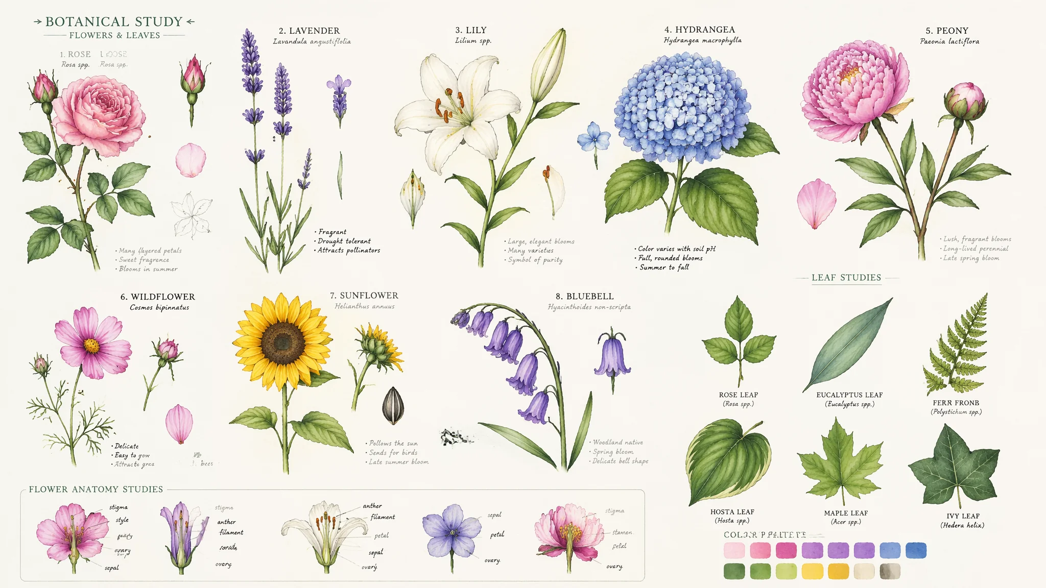
前年帮朋友做一个小众服装品牌的印花设计,预算只够请一个插画师画三张图——但我们需要的是一整个系列的12个印花图案。朋友准备放弃的时候,我拿AI试着生成了几组花卉图案:玫瑰、牡丹、雏菊、樱花……一个小时折腾下来,出了四十多张能用的素材,风格从水彩到版画到极简线条全覆盖。最后那批AI出的花稿打版印出来,效果比预期的好——布料上的玫瑰花瓣边缘有轻微的颜色晕染,像真正的水彩渗进纤维里,反而多了一种手作的温度。从那以后我就把AI花卉素材当效率工具用了——但前提是你得知道怎么"驯服"它。这篇把我踩过的坑和总结出来的打法全部写出来。
花卉素材的三大应用场景——不是所有花都适合所有用途
第一次用AI生花的人最容易犯的错:不分用途,上来就写"一朵漂亮的玫瑰"。然后出来的图用在手机壁纸上还行,印在布上发现构图不对、边缘不连续、颜色在CMYK里全偏色。用途决定Prompt——花在布料上、在包装上、在数字屏幕上的要求完全不同。
纺织印花用花(布料、丝巾、床品):核心要求是可平铺+色彩在CMYK色域内。"a seamless repeating pattern of small wildflowers, the flowers are spaced evenly with generous negative space between them, the pattern density is medium——enough flowers to be interesting but not so dense that it becomes noise, the color palette is limited to four or five muted earthy tones that work well in CMYK printing, the style is a flat vector illustration with clean shapes that read clearly at fabric scale"。包装设计用花(化妆品盒、香水瓶、茶叶罐):核心是"一朵精雕细琢的主花"+"留白"。"a single exquisite peony as the focal point of the composition, rendered in a detailed vintage botanical engraving style, the peony occupies the center with generous margins of white space around it, the linework is fine and precise like an 18th century copper plate etching, the overall composition is elegant and premium——suitable for high-end cosmetic packaging"。数字屏幕用花(网站背景、APP启动页、社交媒体):核心是高分辨率+鲜艳色彩。"a lush digital illustration of cherry blossoms in full bloom, vibrant pink gradient background, the flowers are rendered in a modern flat-vector style with subtle gradients, the composition is optimized for a vertical 9:16 aspect ratio, the overall vibe is fresh and Instagram-worthy"。根据不同用途选取不同花型,更多设计素材思路见AI绿色头像绘画中的自然元素运用技巧。
花种选择——玫瑰、牡丹、樱花、雏菊各有什么Prompt要点
不同花在AI的训练数据里"理解程度"不一样。玫瑰和向日葵AI画得最好(训练数据多),兰花和芍药相对容易翻车(数据少+形态复杂)。选花种时要考虑AI对它的"熟悉程度"——如果选了冷门花,就要在Prompt里补更多的形态描述。
玫瑰——AI最强项:"a classic garden rose in full bloom, the petals are densely packed in a spiral formation——each petal overlaps the next in a Fibonacci-like pattern, the outer petals are fully opened and slightly curled at the edges while the inner petals remain tightly furled, the color is a deep crimson with darker shading at the base of each petal, soft natural light reveals the velvety texture of the petals"。牡丹——重点写层数和蓬松感:"a lush peony with countless layers of ruffled petals, the flower is massive——easily the size of a dinner plate, the petals transition from deep magenta at the center to pale pink at the outer edges, the bloom is so heavy with petals that the stem would bend under its weight, the overall impression is opulent and romantic"。樱花——重点写轻盈感和数量(樱花的美在于"一群"而非"一朵"):"a cluster of delicate cherry blossoms on a branch, each flower has five simple petals with a slight notch at the tip, the petals are so thin they are nearly translucent——light passes through them creating a soft glow, the color is the palest pink fading to white at the petal edges, a few petals are falling——suspended in mid-air"。雏菊——重点写"野生感":"a scattering of wild daisies in a meadow, the daisies have simple white petals radiating from bright yellow centers, the flowers are at different stages——some fully open, some still buds, some past their prime with a few petals missing, the stems are slightly crooked——these are not perfect florist daisies but real wild ones"。花种参考资料可以参考英国皇家园艺学会RHS的植物图鉴和邱园的植物数据库。
花卉材质的纹理表现——花瓣的"质感"是素材高级感的关键
同一朵花,Prompt加不加纹理描述,出图差距巨大。"a red rose"出来的就是"红色色块拼成的花"——没有花瓣的丝绒感、没有叶脉、没有露珠。纹理是花卉素材的"质感放大器"——它决定了这张素材是"能用"还是"好看得想摸一下"。
花瓣纹理关键词:玫瑰花瓣的丝绒质地——"the petals have a velvety texture, they look soft to the touch, light catches the microscopic fibers on the petal surface creating a subtle sheen, the texture is like fine velvet or suede"。花瓣的透光感——"backlit petals, the sunlight passes through the thinner outer petals revealing the delicate vein structure within, the petal edges glow with a soft rim light, the effect is ethereal and luminous"。花瓣上的水珠——"morning dew drops scattered on the petals, each drop is a tiny lens magnifying the petal texture beneath it, the drops catch and refract the light into tiny rainbows, the dew adds freshness and life to the flower"。叶片纹理——"the leaves have visible veins radiating from the central midrib, the leaf surface is slightly glossy with a subtle waxy sheen, the edges of the leaves have fine serrations, the undersides of the leaves are a paler matte green"。这些纹理的进阶细节和整体画面质感的关系见AI调整与精修绘画中的后期质感增强技巧。
花卉配色——从单色系到撞色系的Prompt控制
AI对花卉配色有一个默认倾向:鲜艳、饱和、五彩斑斓。这适合儿童绘本,但不适合高级时装印花或品牌包装。配色控制需要明确告诉AI"你不可以用哪些颜色"而不是只说"你要用哪些颜色"。
单色系——优雅克制:"a monochromatic floral pattern, all flowers and leaves are rendered in shades of deep blue——from navy to powder blue, no other colors appear in the composition, the variation comes from value not hue, the effect is sophisticated and modern like Wedgwood jasperware"。双色撞色——活力冲击:"a two-color floral design using only coral orange and sage green, the coral flowers pop against the muted sage background, the limited palette creates a bold contemporary look, the two colors are complementary and balanced——neither overwhelms the other"。复古褪色系——岁月感:"a faded vintage floral pattern, the colors are muted and dusty like an old textile that has been washed a hundred times, dusty rose, sage green, faded mustard yellow——all the colors have been knocked back by 30%, the overall palette feels like something found in a grandmother's linen closet"。配色灵感可以在AI抽象几何绘画中的色块搭配逻辑里找到更多参考。
常见问题
AI把花画得"太完美"怎么办——每一朵都一模一样像塑料花?
这是"完美对称"的AI默认偏差。自然界的花每一朵都不一样——同一枝上的玫瑰有的全开有的半开有的已经谢了。修正Prompt:"the flowers are at various stages of bloom——some are tight buds just starting to unfurl, some are at peak bloom with all petals open, one or two are past their prime with a few petals already fallen leaving the center visible, a couple of petals have brown spots or torn edges——these imperfections make the arrangement feel alive and real"。加"imperfections"这个词能让AI放弃"完美对称"的默认模式。
生成的花卉图案颜色太跳——怎么让整体协调?
颜色协调的核心是限制色板——不是限制颜色数量,而是限制颜色的饱和度和明度范围。Prompt写法:"the entire pattern uses a controlled color palette where all colors share the same level of saturation——roughly 40-60% saturation, no color is fully saturated, the overall palette feels harmonious because every color has been softened by the same amount of grey, like looking at flowers through a light mist"。用"同饱和度级别"来约束所有颜色——这是色彩和谐的通用法则。
AI花朵素材能直接导出矢量格式吗——印前需要什么处理?
大多数AI绘画工具输出的是栅格图(PNG/JPG),不能直接用作矢量。但你可以要求AI生成"像是矢量图"的风格——"vector-style flat illustration, clean sharp edges, solid color fills with no gradients, the design looks like it was created in Adobe Illustrator"。拿到这张栅格图后,用Vectorizer或Illustrator的描摹功能转成真正的矢量。更多印前流程见AI绘画APP设计中的设计资产工作流。