AI键盘乐器绘画:钢琴琴键与电子琴的细节质感视觉创作
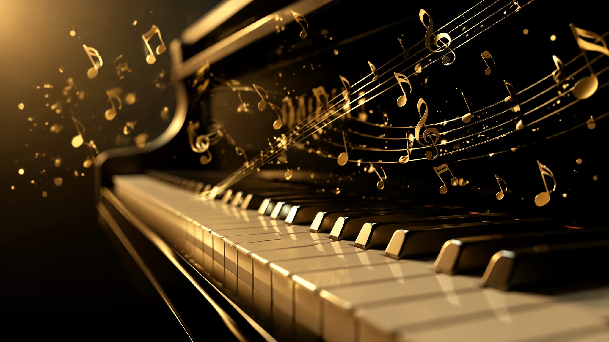
简单说:AI画键盘乐器最坑的不是琴键数量——是透视。88个键在二维平面上的透视缩短关系,AI经常把黑键画成随机的黑条、白键忽宽忽窄,八度间距完全错乱。我以前弹了八年钢琴,第一眼看到AI生成的"钢琴"就笑喷了——有的琴键像楼梯一样从高到低排列,有的黑键全部挤在左边。画好键盘乐器不需要你懂五线谱,但需要你懂键盘的几何逻辑。
我是从小学电子琴的,雅马哈KB-200那个型号,琴键是那种偏软的塑料质感,按下去有"咔哒"一声。后来换了卡西欧的电子钢琴,键感重了很多。这些触觉记忆在我用AI生成键盘图片的时候意外地有用——因为我清楚地知道琴键的宽高比、黑键的排列规律(2-3-2-3分组)、以及琴键边缘那条几乎看不出来但又确实存在的倒角。AI不懂这些。你写"piano keyboard close up",它给你一堆看起来像琴键的长方形排列,但每一处的比例都可能不一样。解决问题的核心方法:把"键盘"拆成几个独立的几何参数写进Prompt。每组两个白键加一个黑键的宽度是恒定的,黑键比白键短大约一半,黑键高于白键约10mm——这些数值翻译成描述性语言塞进Prompt,效果天差地别。
三角钢琴与立式钢琴——两种完全不同的视觉策略
三角钢琴的魅力在掀开的琴盖和琴弦的金属反光,立式钢琴的灵魂在木质面板的纹理和温润的居家氛围——选择哪个方向,Prompt的写法完全不同。三角钢琴(Grand Piano)的核心关键词:"concert grand piano in elegant concert hall, polished black lacquer finish reflecting soft spotlight, the lid propped open revealing the intricate golden harp and copper-wound bass strings, perspective from slightly above looking down at the keyboard, the strings create a beautiful geometric pattern across the soundboard"。琴弦是三角钢琴最有视觉冲击力的元素——交叉排列的铜丝在灯光下像一座金属织成的桥。但AI画琴弦经常画出一些不知所云的乱线,需要在Prompt里强调"cross-strung pattern, bass strings crossing over tenor strings diagonally, each string clearly separated and taut"。立式钢琴(Upright Piano)则是另一套词汇:"upright piano against a warm-lit living room wall, walnut wood grain with subtle matte varnish, the front panel closed showing the clean vertical lines, a stack of sheet music on top, cozy domestic atmosphere"。我自己用MJ生成过不少钢琴图,发现写"polished ebony finish reflecting ambient light"比"black piano"出来的质感高级三个档次。材质词是键盘乐器绘画的命门——AI材质质感绘画技法里对金属、木材和漆面的关键词处理讲得非常透彻。
电子合成器与MIDI键盘——科技感的视觉密码
电子键盘的视觉核心不在琴键本身,而在旋钮、推子、LED屏幕和彩色打击垫——这些元素构成了"电子音乐设备"的视觉身份。画合成器工作站(Synthesizer Workstation)的关键词:"professional music production synthesizer workstation, array of knobs and sliders illuminated by subtle blue LED backlighting, colorful drum pads arranged in a grid on the right side, pitch bend and modulation wheels on the left, the LCD screen displaying a waveform, cables and patch cords connecting to external modules, dim studio lighting with monitor speakers in the background"。MIDI键盘更简洁:"compact MIDI controller keyboard with 25 semi-weighted keys, 8 backlit drum pads, 8 assignable knobs, USB cable connected to a laptop running DAW software on screen, minimal desk setup"。很多人画电子琴上去就写"synthesizer"一个词,然后骂AI画得像儿童玩具——那是因为Prompt里缺少"品牌级"的细节参照。多看看Roland、Korg、Native Instruments的产品图,把设计语言的关键特征提炼出来写进Prompt,效果立竿见影。在Sweetwater乐器电商的产品页面上能看到海量高清键盘设备图,研究实物细节的绝佳参考。
手部与键盘的交互——最难画也最出彩
键盘上有手在弹——这是让画面"活"起来的关键,也是AI翻车的重灾区。AI画手本来就弱,画弹琴的手更是灾难:手指穿模进琴键、六根手指、手型像在拍键盘而不是弹。我的解决办法是:不要求AI画完整的手,而是画"暗示性的手部动作"。比如只画手背和手腕的轮廓、手指在琴键上按下但不过度强调指关节细节:"hands of a pianist playing, viewed from behind the keyboard, the fingers are just barely visible pressing down on specific keys, soft motion blur on the hands suggesting gentle movement, focus is on the keyboard itself rather than the hands"。另一个策略是用景深把手指虚化:"shallow depth of field, the hands are slightly out of focus while the piano keys are razor sharp"。这样就绕过了AI画手差的问题,同时保留了"有人在弹"的氛围感。关于人物与乐器交互的更多技巧,AI人物绘画基础技法中的人体比例控制方法同样适用于手部。
音乐氛围的光影与色调方案
键盘乐器的氛围感70%靠光影——爵士酒吧的暖黄射灯、古典音乐厅的水晶吊灯、卧室深夜练习的台灯光,每种光线说一个不同的故事。爵士钢琴场景我用:"smoky jazz club, a grand piano under a single warm spotlight, the rest of the room fading into deep shadow, cigarette smoke catching the light creating visible beams, whiskey glass on the piano reflecting amber tones"。古典音乐会:"grand concert hall with ornate golden balconies, crystal chandeliers casting warm glow, the piano center stage bathed in soft theatrical lighting, the audience in respectful darkness"。深夜练习:"bedroom at 2am, only a small desk lamp illuminating the keyboard, cool blue moonlight through the window mixing with warm lamp light, headphones plugged into the digital piano, intimate and quiet atmosphere"。三组光影方案各有用处,选哪个看你想传达什么情绪。关于光影的进阶技巧,AI逆光剪影绘画技法对灯光方向和氛围渲染的处理值得借鉴。
黑白琴键的质感渲染——材质是王道
白键不是纯白、黑键不是纯黑——象牙白键有细微的纹理和泛黄的岁月感,黑键(乌木或塑料)有微妙的哑光反射。写白键的Prompt:"ivory white piano keys with subtle natural grain texture, slight warm off-white tone rather than pure white, the front edge of each key showing a gentle bevel catching light"。黑键:"ebony black sharp keys with matte finish, slightly raised above the white keys, the top surface catching just a hint of specular highlight, revealing the subtle wood grain beneath the black stain"。还有一个小技巧:在键盘上添加微弱的反射——"the polished key surface reflecting faint silhouettes of the pianist's hands hovering above"——这种细节能让画面瞬间提升两个档次。我对比过加了材质描述和不加的同一组Prompt,前者的琴键像真琴,后者像纸板模型。在Steinway & Sons官网的产品展示页可以看到顶级钢琴的材质细节照片,每个反光和纹理角度都值得研究。关于AI绘画中的材质模拟,AI纹理细节绘画也有不少可以迁移的技巧。
常见问题
AI画的钢琴琴键数量总是不对怎么办?
别指望Prompt能精确控制琴键数量。解决方法:后期裁剪——生成一张琴键区域较大的图,然后在PS或Canva里裁掉多余的键,只保留看起来正确的部分。或者用"partial keyboard view, only the middle register of the piano showing"来限定可见范围。
怎样让AI画的键盘有演奏的动态感?
在Prompt中加入"motion blur on the pianist's hands""a few pages of sheet music caught mid-flutter as if just turned""a slight vibration visible on the strings"。动态元素不需要很多,两三个就够了——它们共同制造"音乐正在发生"的错觉。
电子琴和传统钢琴在Prompt写法上最大区别是什么?
材质。传统钢琴的核心材质词是:polished lacquer, ivory, ebony, copper strings, felt hammers。电子琴的核心材质词是:matte plastic, rubber pads, LED backlight, LCD screen, aluminum knobs。把材质词写对,乐器属性瞬间清晰。
键盘是音乐的画笔,AI是你的乐谱纸——把结构搭好,它会帮你奏出好看的画面。