AI标志Logo设计绘画:品牌标识与商业符号的创意视觉生成指南
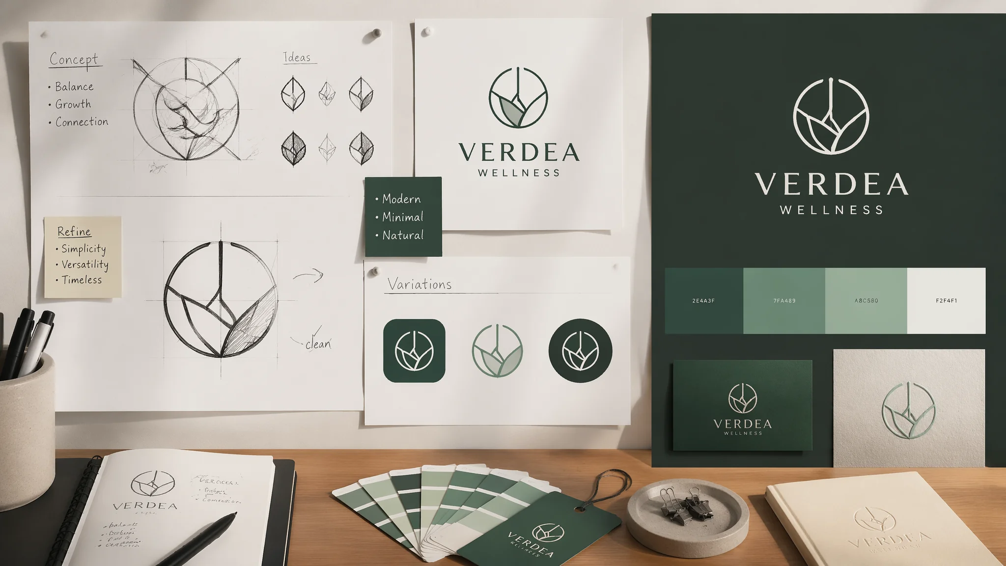
去年帮朋友的咖啡店设计Logo——他预算有限(3000块),请不起设计师,于是让我试试AI。我用Midjourney跑了一下午,出了大约80个方案——其中大概有10个是"不错"的,3个是"可以用"的。但真正让我学到东西的不是那些好看的图——而是那些"看起来好看但不能用"的失败案例:渐变太多没办法做单色丝印、细节太密缩小到App图标尺寸就糊成一团、图形里混了莫名其妙的文字残影。从那天起我总结了一个AI Logo设计的铁律:AI给你的是"视觉灵感"而不是"交付物"——你必须在AI的创意基础上走完"减法流程"才能得到真正的Logo。这篇就是把这个减法逻辑写清楚。
Logo设计的"减法公式"——从复杂到极简的三层过滤
AI生成Logo的天然倾向是"加东西"——多加一条线、多一个色块、多一个装饰元素。因为AI在训练数据里看到的Logo设计很多都是复杂的企业徽章式风格(emblem style)。但真正的好Logo无一例外是"减"出来的——Paul Rand为IBM设计的logo是八条横线,Nike是一个勾,Apple是一个被咬了一口的苹果。每一轮"减法"都让Logo更接近它的本质。
第一轮减法——去掉所有渐变和阴影:"start with a flat monochrome version of the design——remove all gradients drop shadows bevels and three-dimensional effects,the logo should be a pure silhouette that works in 100% black on a white background,if the design loses its meaning without gradients it is not a good logo——start over"。第二轮减法——缩小到1cm×1cm测试:"reduce the logo to approximately 1cm in size——at this scale any fine lines thinner than 1pt disappear any small text becomes illegible any intricate internal details merge into a blob,the logo should still be recognizable as the same design at this tiny size,elements that disappear should be removed——they don't contribute to the core identity"。第三轮减法——去掉一个颜色:"reduce the color palette by one——if the logo currently uses 3 colors can it work with 2?if 2 colors can it work with just 1?,a truly strong logo works in pure black and white——color is a enhancement not a crutch"。
在Prompt里直接嵌入"减法思维"比事后修改更高效:"design a logo that follows the principle of reduction——start with the most minimal form that still communicates the brand idea,use only 2 flat colors maximum,no gradients shadows or 3D effects,the design must be recognizable at 1cm size,the silhouette alone should convey the brand concept"。关于极简设计思维,AI抽象几何绘画中有类似的"从具象到抽象"的简化逻辑。
Logo的六大风格类型——帮AI找到"审美坐标系"
不指定Logo风格=让AI随机选一个风格=90%概率选到"不知所云的抽象漩涡"。你必须在Prompt第一行就明确风格类型。以下六种覆盖了商业Logo 95%的需求场景。
一、极简线条风(科技/时尚/生活方式品牌首选):"a minimalist line-art logo——the design is formed by a single continuous line or a few clean geometric strokes,the line weight is uniform and thin approximately 2-3pt,there is no fill——the design relies entirely on the purity of the line,white space is as important as the drawn elements,the overall feeling is refined modern and premium——suitable for a high-end fashion minimalist tech or wellness brand"。二、几何图形风(金融/地产/B2B企业首选):"a geometric logo composed of basic shapes——circles squares triangles or hexagons arranged in a precise mathematical composition,the shapes overlap intersect or align on a strict grid,the design conveys stability order and reliability——suitable for finance real estate or enterprise brands,the geometry should feel intentional and calculated not random"。
三、负空间Logo——最聪明的设计也是最难调的一种。Prompt写法:"a negative space logo where the brand symbol is formed by the empty space between two solid shapes——the viewer discovers the hidden image in the gap,the two solid shapes should be simple and meaningful on their own,the negative space shape should be instantly recognizable once seen,the design rewards a second look——at first glance it is a simple shape at second glance the hidden symbol emerges"。经典案例:FedEx的箭头(E和x之间)、Amazon的微笑箭头(A到Z)。四、徽章式Logo(精酿啤酒/大学/户外品牌首选):"a badge or emblem-style logo——the design is contained within a circular shield or crest-shaped boundary,the brand name wraps around the top or bottom following the curve of the container,a central icon or monogram sits in the middle,the style is traditional and authoritative with a slight vintage feel——suitable for craft breweries universities sports teams and heritage brands"。
五、字体Logo(Wordmark)——纯文字设计:"a wordmark logo where the brand name itself is the logo——the typography is custom or distinctive enough to serve as the primary brand identifier,each letterform has been modified or crafted to create a unique visual signature——perhaps the 'A' has no crossbar or the 'O' is a perfect circle that becomes a period,the letter spacing and proportions are carefully considered"。六、吉祥物Logo(运动/食品/儿童品牌首选):"a mascot logo featuring a stylized character——the character is simplified to logo-friendly forms with bold outlines and flat colors,the expression and pose convey the brand personality——friendly aggressive playful or wise,the character should work as a silhouette and should be reproducible in embroidery or printing"。六种风格的切换关键在于AI像素体素风格等不同视觉语言的选择逻辑。
色彩系统——不是"好看的颜色"是"有策略的颜色"
AI默认给你的配色是"随机好看"——它在色轮上选几个和谐的色相。但品牌Logo的颜色不是"好看"就行的——颜色在品牌战略里有明确的含义和心理暗示:蓝色=信任和专业(银行/科技/医疗)、红色=能量和激情(食品/运动/娱乐)、绿色=自然和健康(有机/环保/农业)、黑色=奢华和权威(时尚/汽车/高端服务)。你需要告诉AI为什么选这个颜色。
单色Logo——最经典的品牌选择:"a single-color logo in deep navy blue——pantone 280C or similar,the monochrome approach conveys confidence and restraint,the brand is established enough that it does not need multiple colors to be recognized,the single color also ensures maximum versatility——the logo works on any background from white to dark"。双色Logo——80%的商业Logo属于这一类:"a two-color logo using deep forest green(pantone 3435C)as the primary and warm gold(pantone 871C)as the accent,the green communicates growth sustainability and groundedness,the gold adds a touch of premium quality and warmth,the two colors have a 60/40 ratio——green is dominant gold is accent"。
三色Logo——需要非常谨慎使用:"a three-color logo designed for a children's brand——primary red(pantone 186C)for energy and fun,secondary yellow(pantone 123C)for optimism and warmth,tertiary sky blue(pantone 299C)for balance and trust,the three colors are primary colors in their brightest most playful form,they are used in distinct non-overlapping areas to maintain clarity"。颜色心理学的系统知识可以参考Pantone色彩研究所的年度色彩报告和Coolors的配色生成工具。
从AI生成到可交付物——四步落地流程
AI画的Logo无论多好看,只要还是"一张PNG"就不能直接交给客户。必须走完这四个步骤。第一步:选方向。从AI生成的50-100个方案中选出3-5个方向给客户看——注意这时的图要有足够的留白和展示空间。第二步:矢量重建。把客户选中的AI方案用Illustrator或Figma手工重绘为矢量路径——这一步不仅是技术需要(可缩放),更是"创作介入"的法律需要(商标注册要求)。第三步:标准化。确定Logo的标准色值(CMYK+PMS+RGB+HEX四套)、最小使用尺寸、安全距离、禁止使用方式——生成一份一页纸的Logo使用规范。第四步:Mockup延展。把Logo放到实际应用场景中展示——名片、官网顶栏、包装盒、员工T恤、店招——让客户看到Logo"活着"的样子。
矢量重建是其中最容易被忽视但最重要的一步。AI生成的Logo图形看似简洁,但放大到800%你会发现:直线不是直的——有微小的锯齿抖动;曲线不是平滑的——贝塞尔曲线上的锚点数量不对;对称不是真对称——左右镜像后能看到偏差。这些在100%尺寸下肉眼看不见的瑕疵,在打印店招或大幅户外广告时会原形毕露。矢量重建不只是"描一遍"——是在重建过程中修正AI的结构误差。对AI作品进行后期精修的完整流程,AI调整优化绘画中有更细致的说明。
常见问题
AI生成的Logo里出现了莫名其妙的字母残影——怎么避免?
这是AI绘画工具在处理"logo"这个概念时的通病——很多训练数据里的Logo都带有文字,所以AI"学会"了"Logo=图形+文字"。解决办法:在Prompt中明确禁止文字——"no text no letters no typography no words or characters of any kind——this is a pure symbol mark with no written language elements"。如果你的Logo本身需要文字(wordmark类型),则反过来写:"pure typographic logo with no icon or symbol——the design is exclusively composed of letterforms"。把图形和文字彻底分开——不要让AI在同一张图里同时处理两者。
客户说"这个Logo太普通了"——如何用AI在同一个方向快速出大量变体?
"普通"通常是"缺乏独特细节"的意思——不是方向错了,是执行太泛了。变体策略:保持核心概念不变,改变四个变量。一、比例——"same concept but with the icon larger relative to the text"或"same concept but with wider letter spacing"。二、线条粗细——"same concept but with bolder lines——increase stroke weight by 50%"或"same concept as a hairline version——ultra-thin 0.5pt lines"。三、圆角vs直角——"same concept but with fully rounded corners——pill-shaped"或"same concept but with sharp geometric corners——brutalist"。四、正负反转——"same concept but inverted——white logo on a solid black circular background"。四个变量每个取2-3个值,交叉组合即可产生36-81个变体——客户总能从中找到一个"不普通"的。
AI设计的Logo怎么判断是不是"撞车"了现有品牌?
这是一个真实的法律风险。目前没有完美的自动化检测方案,但有三道防线。第一道:Google图片搜索——把AI生成的Logo截图上传到Google图片搜索,看有没有高度相似的已知品牌Logo出现。第二道:商标数据库检索——在美国用USPTO的TESS系统,在中国用商标局的商标查询系统,检索相似图形。第三道:视觉常识检查——如果AI生成的Logo是一个"被咬了一口的圆形水果"——不管它有多不像苹果,请放弃这个方向。一个实用的原则:如果你的Logo可以用一句话描述("一个红色圆形里面有个白色鸟"),而且这句话恰好能描述另一个知名品牌——那就要重新设计。