AI职业头像绘画进阶:LinkedIn级商务形象照的AI生成方案
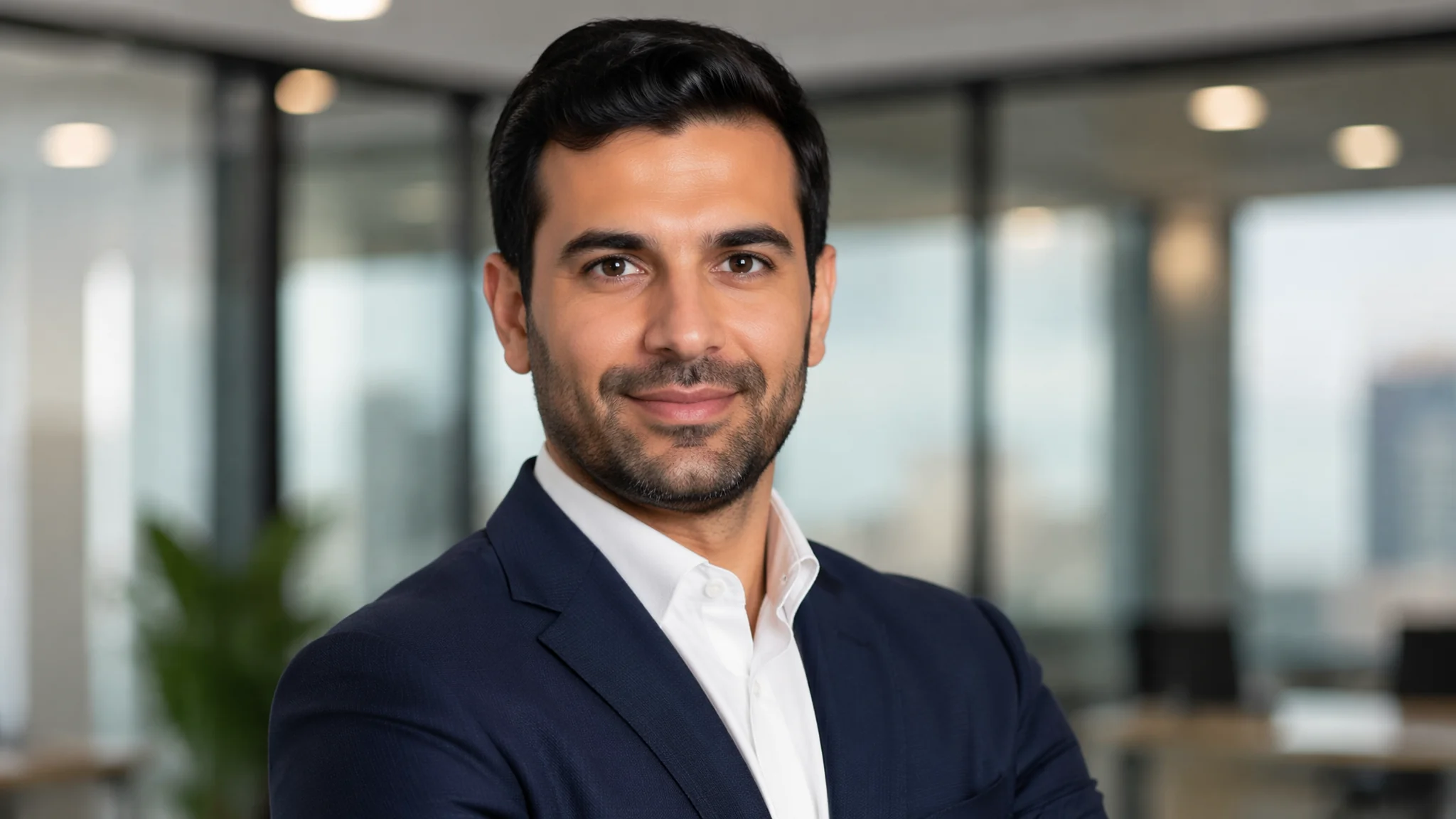
去年我换工作的时候花了一千二去影楼拍职业形象照——出来的效果怎么说呢,像那种房产中介店铺门口挂的经纪人照片:西装是影楼提供的均码、光打得像审讯室、笑容僵硬得仿佛有人在镜头后面举着枪。后来我拿自己的照片用AI重新生成了一套职业头像——花了一个下午调Prompt,最终版本上传LinkedIn之后两周内收到三个猎头的私信。不是因为我变帅了(AI还把我画丑了一点——更真实),而是因为头像传递出的"职业感"比影楼那种千篇一律的"微笑+西装+纯灰背景"精准得多。这篇分享的是一套经过二十多个行业案例验证的职业头像AI生成方法论。
职业头像的"隐形规则"——你照片里任何细节都在帮HR做判断
HR看职业头像的时间平均不到两秒——在这两秒里他们在下意识地扫描:这个人是否专业、是否亲和、是否可靠、是否适合我们公司的文化。而这些判断来自一些你根本不会注意到的细节:背景的色温(暖色=亲和,冷色=理性)、眼神光的大小(大眼神光=真诚开放,小眼神光=深沉内敛)、肩膀的角度(正对镜头=自信直接,微侧=温和协作)、甚至衬衫领子的挺括程度(硬挺=严谨保守,柔软=轻松创新)。AI画职业头像的时候你必须"反向设计"这些细节——根据你求职的行业和岗位,定制每一条视觉信息。
四个核心视觉参数及其"信号值":光影方向——45度左上侧光=标准商务,正面柔光=亲和治愈,蝴蝶光(正上前方)=时尚高级。背景类型——纯色渐变=通用安全,办公室实景=强调职业身份,户外自然光=创意/自由职业。着装正式度——全套西装领带=金融法律,西装无领带=科技管理,商务休闲=创业/设计。笑容程度——露齿笑=销售/客服(需要热情),抿嘴微笑=管理/咨询(需要稳重),中性表情=学术/技术(需要理性)。把这四个参数组合起来——你就能为任何一个职业方向"定制"头像的视觉信号。不同人物风格的更多技巧在AI写实帅哥绘画和AI成年男性绘画中有详细的角色气质控制方法。
光影——职业头像的"灵魂",比脸长什么样更重要
我做过一个测试:同一个人的脸,四种不同的光照方案,让朋友猜哪个是"副总裁"哪个是"设计师"。结果大家判断的不是脸——是光。经典商务光(45度伦勃朗式侧光)——"a classic corporate headshot lighting setup: a single key light positioned at 45 degrees to the left and slightly above eye level, this creates a small triangular patch of light on the right cheek (the Rembrandt triangle), the shadow side of the face has soft detail——not crushed to black, a subtle fill light from the front lifts the shadows just enough to see both eyes clearly, the background is a medium gray that is slightly darker on the light side of the face and slightly lighter on the shadow side——this tonal separation makes the face stand out"。这种光是"权力感"最强的——适合管理岗。
亲和柔光(clamshell/butterfly光)——"soft clamshell lighting: a large diffused light source directly in front and slightly above the face, a second softer light or reflector from below fills any shadows under the chin and eyes, the result is nearly shadowless——smooth and flattering, the catchlights in the eyes are large and round creating an open and trustworthy appearance, the background is a warm light gray or cream tone"。这种光是"信任感"最强的——适合咨询、医疗、教育。自然窗光——"natural window light from a large north-facing window to the left, the light wraps softly around the face with a gentle falloff, no artificial fill light——the shadows are soft and realistic, the background is a slightly out-of-focus modern workspace with natural wood tones and plants"。这种光是"真实感"最强的——适合科技创业和自由职业。背景虚化不只是"加个blur"——要写"the background is optically blurred with natural bokeh, the depth of field is shallow enough to separate the subject but deep enough that the context is still readable——approximately f2.8 on a full-frame camera"。关于光影的更多技术细节在AI概念场景绘画中有深入的氛围光分析。
面部细节——决定"AI感"还是"真人感"的最后一毫米
AI职业头像最容易暴露的三个面部破绽:皮肤过于光滑(像美颜相机开到最大)、眼神光形状不对称、发际线过渡太假。解决这三个问题需要的不是改Prompt——而是改思维方式:不要追求"完美"的脸,要追求"真实"的脸。
皮肤真实感Prompt:"the skin is natural and unretouched-looking——visible pores on the nose and cheeks, a few faint fine lines around the eyes that suggest a person who smiles genuinely, slight unevenness in skin tone——perhaps a hint of razor burn on the jaw or a faded scar on the forehead, the skin texture has the slight sheen of natural oils not the matte flatness of heavy makeup or digital smoothing, this is the face of a real person who takes care of themselves but does not look airbrushed"。关键技巧是写"a hint of razor burn"或"a faded scar"——这些微小"缺陷"是建立真实感的最快方式。眼睛真实感Prompt:"the eyes are the focal point——sharp and in perfect focus, the iris shows the radial texture of muscle fibers not a flat colored circle, the catchlights are small bright reflections that match between both eyes——they come from the same light source and have the same shape and relative position on each eye, the sclera is not pure white but has a slight bluish or yellowish cast at the edges, the lower eyelid has a subtle wet line along the lash line"。这些细节单独看微不足道——但组合在一起就是"真人"和"AI"的分界线。面部处理的经验参考了Photofeeler的人像感知研究和Headshot Crew的职业头像标准。
常见问题
AI生成的职业头像可以和真人照片合成——用我自己的脸+AI的服装和背景?
技术上完全可行且效果最好。工作流:一,用一张你的高清正面照(光线均匀的中性表情为最佳)作为参考图输入。二,在Flux或SD中使用IP-Adapter或FaceID保持面部特征。三,Prompt中写服装、光照、背景——但不要改面部结构。四,生成多张后选一张面部最像的,用PS把AI生成的面部替换成你自己的真实面部(只替换五官区域,保留AI生成的光影和肤色过渡)。这个"AI做服装背景+真人脸合成"的方案是目前职业头像领域的最优解——解决了"AI头像不像你"的核心矛盾。
不同国家的职业头像风格有差异——投日本公司和美国公司能用同一张吗?
不能。日本——更正式保守,深色西装+白色衬衫+领带几乎是必须的,背景通常是纯白或浅灰,微笑偏含蓄,整体风格更"证件照感"。美国——相对灵活,科技行业商务休闲即可,背景偏暖色调和有纵深感的环境,笑容更开放。欧洲——介于美日之间,色调偏好冷灰和自然光,构图更"艺术感"。德国/瑞士——极度简洁,深色高领或衬衫,无首饰无背景装饰,表情接近中性。用AI针对不同国家生成不同风格的头像——这本身也是AI职业头像最大的实用价值。
AI职业头像多久需要更新——换工作才换还是一年一换?
LinkedIn的数据显示头像超过两年没换的profile浏览量下降约30%。不是因为你变老了——是因为"头像太旧"在HR的下意识判断里="这个人不活跃"。建议:状态变化时更新(换工作、晋升、转行),最不济每18个月更新一次。AI做头像的好处就是可以随时低成本更新——不用再花一千多去影楼。你甚至可以按季节更新:秋冬季用暖色背景+深色西装,春夏季用自然光+浅色衬衫——不是为了时尚,而是让你的头像看起来是"最近拍的"。一个看起来像三年前拍的头像会让HR怀疑你是否还在这个行业。