AI紫色主题绘画:神秘高贵与梦幻氛围的紫色调视觉设计指南
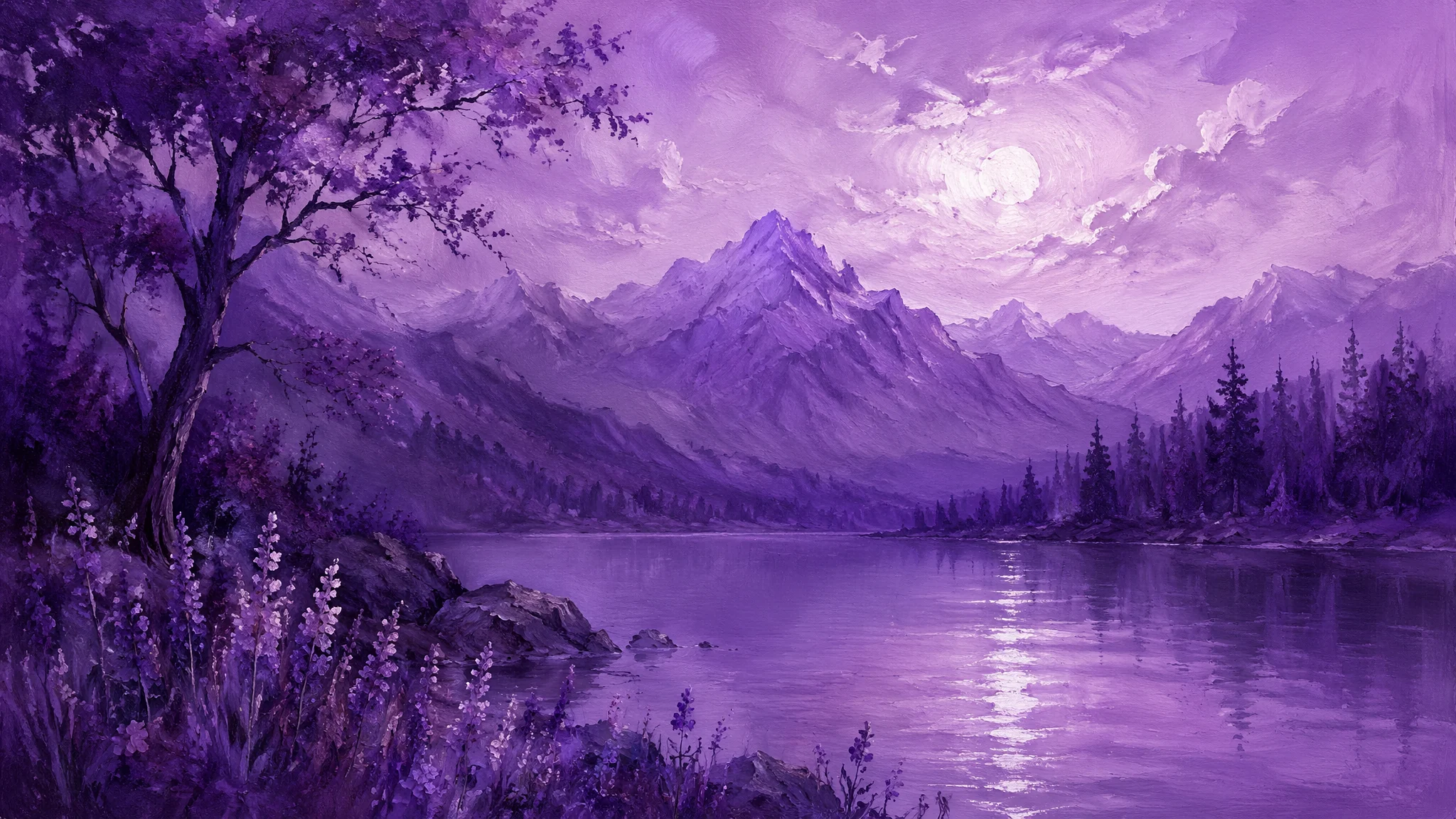
我做AI绘画三年,画过各种颜色主题——红色激情、蓝色冷静、绿色自然——但紫色是所有颜色里最让我着迷也最让我头疼的。着迷是因为紫色自带"不真实感":自然界里纯正的紫色极其罕见,所以大面积紫色出现在画面里的时候,观众的第一反应永远是"这不是现实世界"——那种梦幻感是其他颜色给不了的。头疼是因为AI对紫色的理解极其不稳定。
紫色在AI绘画里是一个"高方差"颜色——你写"purple",AI给你的结果可能在薰衣草淡紫和霓虹荧光紫之间随机游走。更麻烦的是,不同模型对"purple"的默认理解完全不同:SD 1.5系列偏向暗沉的紫褐色,SDXL偏向明亮的紫罗兰色,Midjourney则倾向于一种"Instagram滤镜紫"——好看但不真实。控制紫色的第一步,是理解紫色不是"一种颜色",而是一个从红紫到蓝紫的连续光谱。
这篇攻略是我用AI画了上千张紫色主题图之后的方法论总结。如果你对AI色彩控制还不太熟,建议先看AI色彩理论实战指南建立色彩基础认知。然后回来,我们专门攻克紫色这个"最不听话的颜色"。
紫色的光谱控制:从薰衣草到深紫罗兰的精确写法
"purple"是AI绘画里最模糊的颜色词——它的色相范围横跨了红紫色到蓝紫色,波长覆盖约380-450纳米,中间至少有七八种完全不同的"紫色"。如果你不精确指定,AI会在整个紫色光谱里随机采样。我画了半年紫色主题才建立起一个精确的颜色词汇表。薰衣草紫——"soft lavender purple with cool silvery undertones, pale and ethereal like twilight mist, RGB roughly 180-140-210 range"。丁香紫——"lilac purple with subtle pinkish warmth, delicate and romantic like spring blossoms, slightly more saturated than lavender"。紫罗兰——"vivid violet purple at the cooler end of purple spectrum, rich and intense with slight blue undertones, the color of deep velvet"。葡萄紫——"deep grape purple with warm reddish undertones, saturated and juicy like ripe Concord grapes, almost crossing into burgundy territory"。暗夜紫——"dark midnight purple so deep it borders on black, just enough purple to read as color rather than absence of light, mysterious and regal"。霓虹紫——"electric neon purple with magenta bias, almost glowing against dark backgrounds, cyberpunk accent color"。
这些细致区分是有代价的——很多细致的颜色词AI不一定认识。所以我养成了一个习惯:在用"lilac""violet""lavender"这些词的同时,加一个技术性补充描述——"purple with [warm/cool] undertones, saturation level [delicate/moderate/intense], brightness level [pale/medium/deep]"——这样即使AI不认识"lilac",也能从技术描述中推断出我要的是哪种紫。这招让我的紫色控制成功率从不到50%提升到了85%以上。根据维基百科紫色词条,"purple"在历史上是最昂贵的颜料之一——从地中海骨螺提取的"泰尔紫"(Tyrian purple)曾是罗马皇帝专属色。色彩心理学的研究也提供了支撑:维基百科色彩心理学指出紫色在全球文化中普遍关联"高贵、神秘、灵性"——这些心理暗示在AI绘画中直接转化为画面的情绪力量。紫色自带的"高贵"和"稀缺"基因在AI绘画里依然有效:一张大面积紫色的图天然比红黄蓝绿的图更有"高级感"。
紫色的黄金搭档:跟什么颜色搭配最出效果
单紫色画面容易沉闷——紫色的魅力在对比中才能完全释放。紫+金是我最常用的组合——"deep purple background with intricate gold filigree patterns, golden light catching the edges of purple drapery, Byzantine mosaic color scheme, regal and sacred atmosphere"。紫+金能唤起拜占庭艺术和宗教绘画的联想——紫色的神圣感配上金色的光芒,画面天然带着仪式感。
紫+绿是另一个强组合——"purple wisteria flowers cascading over lush green foliage, complementary color tension between warm purple blooms and cool green leaves, garden atmosphere with dappled sunlight"。紫和绿在色轮上是"近似互补色"——不是正对(正对是黄色),所以对比有张力但不刺眼。这个组合在花卉类AI绘画里是王者配色。
紫+银/白——"pale lavender and soft silver grey in a minimalist composition, the cool elegance of purple paired with neutral silver, modern sophisticated palette, serene and clean"。适合极简风格和现代设计方向。紫+黑——"dark gothic purple against deep black, barely-there purple highlights emerging from shadows, moody and dramatic, vampire aesthetic"。适合暗黑风和神秘氛围。紫+橙(夕阳配色)——"purple twilight sky transitioning to warm orange at the horizon, the brief moment when day becomes night, gradient from deep violet through magenta to golden orange"。这种天空渐变是最好的紫色场景之一——AI对这种自然色彩过渡的处理通常很漂亮。
配色的prompt结构我总结了一个公式:主色(60%面积)+辅色(30%)+点缀色(10%)。明写在prompt里:"color composition: 60% deep violet purple, 30% warm gold accents, 10% cream white highlights"。AI对百分比没有精确理解能力,但这个结构能帮AI判断主次关系的方向。想深入学习色彩搭配体系,AI色彩理论实战指南有完整的配色方法论。
紫色场景库:五个经过验证的紫色主题创作方向
紫色花海——薰衣草田是紫色花卉的终极主题。"endless lavender fields stretching to the horizon at golden hour in Provence, rows of purple lavender plants creating leading lines into the distance, a lone stone farmhouse with terracotta roof tiles, warm sunset light casting long shadows across the field, the purple intensified by the golden light, bees hovering over the lavender spikes"。薰衣草之外:紫藤长廊(wisteria tunnel)、紫丁香花丛(lilac bushes)、紫色郁金香花田。
紫色星空——银河的紫色星云是宇宙最壮观的紫色。"a purple nebula in deep space, swirling violet and magenta cosmic dust illuminated by distant stars, the center of the nebula glows with intense purple light while the edges fade into the black void of space, countless tiny stars scattered throughout, sense of infinite scale and cosmic wonder"。紫色星空的prompt里"nebula"和"cosmic dust"是核心词——它们触发AI画出紫色在空间中弥散的渐变效果。
紫色都市夜景——赛博朋克风格的紫色城市。"a futuristic city at night bathed in purple neon light, towering skyscrapers with holographic purple advertisements, rain-soaked streets reflecting the violet glow, the entire scene washed in a purple color grade, cinematic Blade Runner aesthetic"。把"purple color grade"放在prompt后半段,告诉AI全局色彩倾向——这个技巧比在每个物体上单独加"purple"高效得多。
紫色室内设计——适合做壁纸和氛围图的紫色空间。"a cozy minimalist bedroom with purple accents, lavender colored bed linens and throw pillows against cream walls, a vase of fresh purple tulips on the nightstand, soft diffused morning light through sheer curtains, the purple elements are subtle and sophisticated rather than overwhelming"。紫色在室内设计中的关键原则是"克制"——"subtle and sophisticated rather than overwhelming"这句话能有效防止AI把整个房间涂成紫色。
紫色抽象艺术——放开手脚让AI自由发挥。"abstract fluid art with swirling purple paint, the colors dynamically mixing from deep violet to soft lavender to pure white, alcohol ink technique with organic flowing patterns, metallic gold veining throughout the purple swirls, high-end gallery wall art"。抽象方向对AI来说最自由——没有具象约束,紫色可以纯粹作为"色彩本身"成为画面的全部内容。
紫色氛围控制:光线、季节、时间的联动
紫色在不同光线条件下的表现差异巨大。黄昏时的紫色是温暖而短暂的——"twilight purple sky, the last warm light of sunset mixing with the cool purple of approaching night, the purple has a transient fleeting quality, golden undertones still visible at the horizon"。深夜时的紫色是寒冷而永恒的——"midnight purple atmosphere, cool and deep, no warmth remaining, the purple of deep space and absolute silence"。清晨的紫色是清新而充满希望的——"dawn purple sky, the first light of day tinting the retreating night purple with hints of rose and gold, the purple is delicate and optimistic"。
季节也会影响紫色的调性。春天紫——"spring purple in blooming lilacs and wisteria, fresh delicate purple with new green leaves, the color of renewal"。秋天紫——"autumn purple in ripening grapes and twilight that comes earlier each evening, deeper warmer purple with russet undertones, the color of harvest and transition"。冬天紫——"winter purple in the long shadows of snow at dusk, pale lavender tint in the snow itself reflecting the purple twilight sky, cold crystalline purple"。把季节信息写进prompt,能帮AI判断应该用哪种"紫"。AI风景绘画教程里有更多关于季节色彩变化的技巧。
常见问题
AI画紫色为什么总是偏蓝或者偏红?
因为紫色在AI的色彩空间中处于一个尴尬的中间位置——它不是"原色"而是"混合色",AI必须通过平衡红和蓝两个通道来合成紫色。当prompt信息不足时,AI会随机偏向红端(magenta/pink)或蓝端(indigo/blue)。解决方案:把你的目标紫色精确描述为"purple balanced precisely between red and blue, neither too magenta nor too indigo, true violet at the center of the purple spectrum"。如果还偏,在负面prompt里加"magenta, pink-purple, blue-purple, indigo shift"——把你不想要的两个极端都否定掉,逼迫AI走中间路线。
紫色主题会不会让画面看起来很"阴间"?
取决于你怎么用。大面积暗紫色+黑色+冷光源确实容易"阴间"。但大面积薰衣草紫+自然光+绿色搭配就是田园浪漫。关键控制两个变量:明度(亮度)和饱和度。亮紫+低饱和=温柔梦幻(适合壁纸、少女风)。暗紫+高饱和=神秘奢华(适合概念艺术、暗黑风)。亮紫+高饱和=活力张扬(适合霓虹风、潮流设计)。暗紫+低饱和=沉静高级(适合极简、性冷淡风)。把明度和饱和度写进prompt里能精确控制"阴间指数"。比如你怕"阴间",加"bright and airy atmosphere, uplifting and serene mood, not dark or gloomy"。
画紫色花卉时花的颜色和背景融在一起怎么办?
这是紫色花卉最常见的翻车——紫色花和紫色背景或绿色背景混成一片,丧失了主体轮廓。解决方案:在花的边缘加"rim light"——"soft rim light along the edges of the purple petals separating them from the background, subtle backlighting creates a luminous outline around each flower cluster"。边缘光在花和背景之间建了一道"光墙",画面前后层次立刻出来了。再加"shallow depth of field keeping the main flowers in sharp focus while the background purple bushes soften into bokeh"——景深模糊也能做主体分离。这两个技巧在AI真实感绘画提升指南里有更详细的拆解。
有什么适合紫色主题的LoRA或模型推荐?
通用写实模型(Juggernaut XL、Realistic Vision)对紫色花卉和自然场景表现不错。但如果你追求极致紫色氛围感,推荐两个方向:一是专门训练的"紫色美学"LoRA——在Civitai上搜"purple"或"violet"关键词能找到一些社区训练的紫色主题LoRA,它们在紫色色调的稳定性上明显优于通用模型。二是用Midjourney的"mood"参数——MJ对氛围和色彩的理解天然比SD更"艺术化",同样的紫色prompt在MJ里出来的图更有"感觉"。我的紫色工作流:在MJ里跑方向(确定紫色调性和氛围),在SD里做精细控制(确定具体画面元素和构图)。两种工具互补着用,紫色从"不可控"变成了"最可控"。关于工具的深入对比看AI绘画软件全评测。
紫色是所有颜色里离日常生活最远、离想象力最近的颜色。它不像是眼睛看到的颜色,更像是大脑想象出来的颜色。每次在AI的调色盘里调出一种"刚刚好的紫",我都觉得像是在调配一种魔术——多一点红太暖,多一点蓝太冷,那个恰好的点就是紫色魔力的开关。
转发给同样沉迷紫色的朋友,一起探寻紫色的无限可能。