AI红衣男角色绘画:热烈红色服装与激情气质的男性角色视觉创作
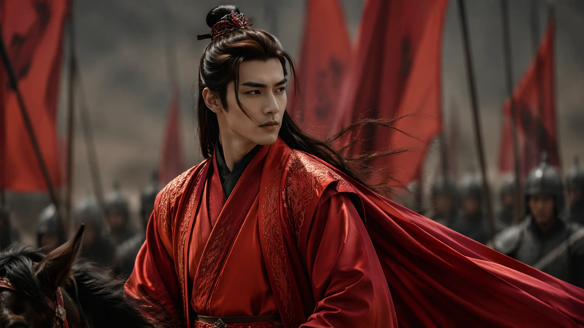
一个很有意思的现象——在AI绘画社区里搜"红色服装角色",出来的95%都是女性。红色似乎被默认为"女性专属色"——红裙、红唇、红衣女郎。但翻翻艺术史和影视经典:红披风的超人、红大衣的福尔摩斯(卷福版)、红袍的奇异博士、红衣的张国荣在《霸王别姬》——红色在男性身上可以帅到炸裂。问题在于,AI对"man in red"的理解非常贫乏——不是圣诞老人就是红衣主教。这篇把我折腾红衣男角色的四个月经验全写出来。
去年给一个做古风音乐MV的团队做AI概念图——主角是个穿红衣的男性侠客。我兴致勃勃地写了"handsome man in flowing red robes"丢给AI。出来的结果要么是"穿红裙子的女人"(AI看到red robes直接触发女装数据)、要么是"穿得像新郎官的尴尬男人"——大红色的袍子上居然还绣着金色的囍字,AI擅自给角色安排了一场婚礼。那一刻我意识到:要让AI理解"红衣男性",你需要从头到尾定义"红在哪、怎么红、什么质感的红"——一个"red"字不够用。后来我专门做了一个对照实验:同样的Prompt只换红色色号(crimson vs vermilion vs burgundy vs scarlet),出来的男性角色气质从文雅学者一路偏到嗜血战士——红色的色号本身就携带着人格信息。这个发现让我把研究重点从"红色配什么款式的衣服"转向了"不同色号的红对应什么气质的男性角色"。
五种红衣男性气质路线——每种红的视觉语法完全不同
朱红侠客——暖调朱砂红+飘逸绸缎+动态张力。酒红绅士——冷调勃艮第红+精纺羊毛+静态优雅。猩红战士——饱和血红+磨损皮革+力量压迫。粉红少年——低饱和玫瑰粉+柔软棉麻+温柔清爽。暗红反派——接近黑色的深红+哑光丝绒+危险隐忍。朱红侠客写法:"a wandering swordsman in flowing vermilion silk robes, the fabric catching the wind and rippling like flames, the red is a warm cinnabar tone with golden undertones that glow in the sunset light, the robe secured with a wide black leather belt, the movement of the fabric conveying speed and lethal grace"。酒红绅士写法:"a man in a perfectly tailored burgundy wool overcoat, the red so deep it reads almost as black in shadow, paired with a charcoal turtleneck underneath, the fabric texture showing the fine nap of expensive wool, the posture upright and controlled, the overall impression one of understated power"。猩红战士写法:"a battle-worn warrior in scarred crimson leather armor, the red darkened in places by dirt and old bloodstains, the leather cracked and weathered, the color a visceral scarlet that speaks of violence survived rather than elegance chosen"。关于角色设计更多思路,AI角色设计教程里有从性格到服装的完整映射体系。
红色面料的AI质感密码——丝绸、皮革、棉麻在红色系下的Prompt写法
同一件红色衣服——用silk、leather和cotton写出来的质感和气质完全不同。丝绸的红是流动的光泽、皮革的红是哑光的沉淀、棉麻的红是朴素的生命力。红色丝绸:"crimson silk fabric with a subtle lustrous sheen, the highlights catching the light as pearlescent pink-white reflections, the folds forming smooth liquid-like curves rather than sharp creases, the fabric so fine it moves like water"。红色皮革:"oxblood leather with a matte finish, the surface showing natural grain texture and subtle variations in the deep red tone, the edges burnished to a darker mahogany, the leather heavy and structured holding its shape like armor"。红色棉麻:"brick-red cotton-linen blend with a soft natural texture, the fabric absorbing light rather than reflecting it, gentle wrinkled texture at the elbows and collar suggesting comfortable wear, the red muted and earthy like sun-baked clay"。质感决定了角色的社会阶层和性格——丝绸的流动感适合贵族和艺术家,皮革的结构感适合战士和叛逆者,棉麻的自然感适合平民和隐士。关于服装材质渲染的更多技巧,AI服装时尚绘画里有从面料反光率到褶皱物理的完整说明。
红与黑的配比——红衣男角色最常见的配色陷阱
红衣配黑色内搭或下装是经典组合——但黑的比例超过60%的时候,红色就从"主角"变成"点缀"了。我做过一个实验:同一组Prompt只改变"red and black"的比例描述。"full crimson red with subtle black accents"→视觉重心是红色,人物有强烈的存在感。"black outfit with red trim and details"→视觉重心是黑色,红色只是边缘配色,人物显得沉稳但少了冲击力。我的建议:如果想要"红衣主角"的视觉效果,红色面积至少占服装的50%以上。Red-to-black ratio approximately 7:3是最平衡的比例——红色主导但不刺眼、黑色辅助但不会被淹没。这个7:3比例不是拍脑袋想出来的,是我做了大概三十组对比图之后找出的最优解——8:2的时候红色有点飘、6:4的时候红色和黑色开始互相打架。在Behance上搜"red character design"可以找到大量专业角色设计师的配色方案——看他们怎么处理红黑比例对角色性格的影响。另一个参考平台是ArtStation的character design频道——按popular排序能看到全球收藏量最高的红色系角色设计作品。
光线对红色的影响——暖光、冷光和自然光下的红色差别巨大
红色是最受光线影响的颜色之一——暖光下偏橙、冷光下偏紫、自然光下最接近"正红"。选错了光线等于选错了红色。暖光(日落/烛光):"the crimson fabric illuminated by warm golden sunset light, the red taking on orange-amber undertones, the highlights almost gold"。这种情况下的红色看起来热烈而浪漫,适合侠客和情人角色。冷光(月光/荧光灯):"the scarlet fabric under cold blue moonlight, the red shifting toward deep burgundy with purple shadows, the warmth drained from the color leaving it mysterious and melancholic"。冷光下的红色有一种压抑的张力——适合反派和内敛型角色。自然光(阴天柔光):"the vermilion garment in soft overcast daylight, the red appearing as its truest hue without warm or cool bias, every fold and texture visible in the even diffused illumination"。自然光最适合展示服装的细节和质感。同一个红衣角色在三种光线下看起来像三个完全不同的人——所以如果你画面里红色的感觉不对,先检查光线设定而不是急着换色号。关于光线与色彩的互动,AI绘画色彩理论应用指南里有更科学的配色逻辑。
常见问题
为什么AI画红衣男性总是偏向女性化?
训练数据偏差——"red clothing"在AI数据集中与女性形象的关联远多于男性。解决方案是加明确的男性化特征描述:"masculine jawline, broad shoulders, flat chest, male physique"——把性别锚定写在Prompt里而不是依赖衣服。
红色画出来太刺眼——像荧光红而不是优雅的深红怎么办?
用准确的色号描述代替笼统的red:crimson(深红)、vermilion(朱红)、burgundy(酒红)、oxblood(牛血红)、brick red(砖红)。每个色号都有不同的明度和饱和度,crimson和burgundy是最不容易翻出荧光红的两个色号。
想要中国风红衣男角色怎么写?
关键组合:朱砂红色号(cinnabar red)+飞鱼服或圆领袍形制+金线刺绣+束发冠。具体写法参考AI男汉服绘画里的古风男性服装体系。
红衣男角色的最大障碍不是Prompt技术,是心理预设——我们会下意识觉得"红色不适合男的"所以不敢往那个方向写。推翻这个预设之后你会发现,红色在男性身上的表现力完全不输女性——只是需要换一种写法。朱红的侠客、酒红的绅士、猩红的战士——每一种红都在讲一个完全不同的人格故事。我后来把红衣男角色的Prompt整理成了一套色号-气质-面料的三角映射表,发现规律之后出片率从最初的两成提到了七成。做这件事的过程也让我对男性角色设计有了一个全新的理解:服装颜色不是装饰,是角色性格的视觉外化。