AI静态静物绘画:光影质感与构图美学的经典艺术形式探索
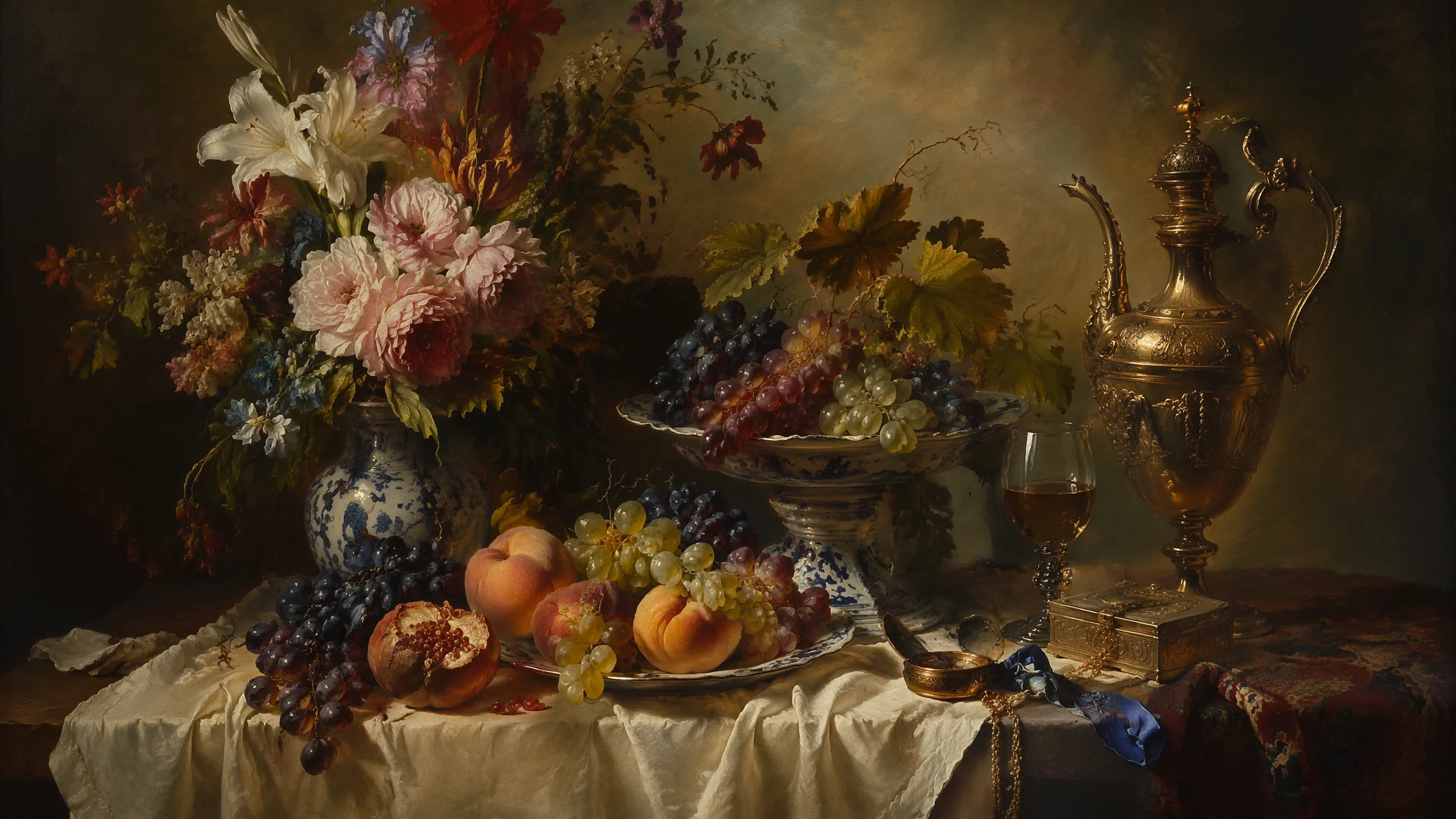
我家厨房窗台上常年摆着一只铜壶、一个青柠檬和一块深蓝桌布。不是装饰——是我的"AI静物测试三件套"。每次换新模型版本或者调新参数,我都先用这个固定组合跑一组静物图。铜壶测金属反光、柠檬测有机材质、蓝布测织物纹理——三样东西如果都过关了,这个版本的渲染能力就是及格的。
静物画被认为是绘画的"入门课",但搞AI静物创作两年多,我反而觉得它是最考验功力的门类。人物画可以靠表情和故事性遮丑,风景画可以靠气势蒙混过关。静物画不行——就那么几样东西摆在那里,光影不准、质感不对、构图松散,一眼就暴露。
静物材质库:玻璃、金属、陶瓷、织物的差异化关键词
玻璃看折射和焦散、金属看反射和高光形状、陶瓷看漫反射和釉面裂纹、织物看纤维走向和褶皱逻辑——四种材质各有各的视觉指纹,提示词得分别下药。玻璃:"clear glass vessel with visible refraction distorting background behind it, specular highlights in precise geometric shapes on curved surface, subtle green tint at thick edges, caustic light patterns cast on table surface"。金属:"polished brass pitcher with distorted reflection of surrounding objects, warm metallic luster with visible tarnish at edges, specular highlight sharply defined in elongated window shape, subtle oxidation patina in crevices"。陶瓷:"matte ceramic vase with slight eggshell texture, soft diffuse highlight wrapping around curved form, hairline crackle in glaze visible on close inspection, warm cream white with subtle celadon undertone"。织物:"linen tablecloth with visible weave texture, natural fold creases radiating from central object weight, soft diffused shadow absorption in fabric valleys, slightly frayed edge adding authenticity"。我跑对比测试的时候发现:AI最擅长的是玻璃(折射规律比较固定),最差的是织物(褶皱的力学逻辑经常乱来)。AI材质质感渲染完全指南里有更完整的材质关键词库。
经典静物布光:北窗光、侧光与顶光的三种叙事气质
北窗光是荷兰小画派的灵魂——柔和的漫射光从左侧斜上方45度照入,影子被拉长但边缘模糊,物体的轮廓被光温柔地勾勒出来。北窗光:"soft diffused north-facing window light from upper left, gentle shadow gradation without harsh edges, cool daylight color temperature, 17th century Dutch still life lighting quality, subtle dust motes visible in light beam"。侧光:"dramatic side lighting creating strong chiaroscuro, half of composition in deep shadow half brightly illuminated, theatrical spotlight effect, Caravaggio-inspired tenebrism"。顶光:"overhead skylight illumination, soft shadows directly beneath objects, museum gallery lighting quality, even light distribution with subtle vignette at edges"。三种光里北窗光最安全——荷兰画派验证了几百年,怎么画都不会难看。侧光最大胆,适合想做出戏剧张力的场景。顶光最挑剔——物体形状稍微不准,顶光就会把缺陷放大。荷兰国立博物馆的线上馆藏里有维米尔和伦勃朗时代最经典的静物画高清扫描,研究一下大师怎么用光,比看任何教程都有用。
构图五式:三角、对角、S形、居中、散点的选择逻辑
三角构图最稳——三个物体分别占据顶角、左底角和右底角,视线在三角形内部循环流动,永远不会跑出画面。三角构图:"triangular composition, three main objects forming stable pyramid shape, tallest element at apex center, two supporting elements at base corners, visual weight balanced across triangle"。对角构图:"diagonal composition, objects arranged along line from bottom left to top right, dynamic tension created by slanted arrangement, falling petal or leaf emphasizing diagonal movement"。S形构图:"S-curve composition, objects arranged in gentle winding line through frame, leading eye from foreground through middle ground to background, rhythmic spacing between elements"。居中构图:"centralized composition, single dominant object placed at exact center, symmetrical arrangement of supporting elements, formal and ceremonial aesthetic, icon-like presentation"。散点构图:"scattered composition, objects seemingly casually arranged but carefully balanced, Japanese wabi-sabi aesthetic, negative space as important as positive space"。选哪种构图取决于你想讲什么故事——三角构图讲"稳定与和谐",对角构图讲"运动与变化",散点构图讲"日常与随意"。AI绘画构图技巧与视觉引导里有更详尽的构图理论体系。
花卉静物的特殊挑战:花瓣透明度和枯萎边缘
鲜花静物最大的技术难点是花瓣的半透明质感——光穿透花瓣时产生的"逆光肉色"效果,AI做十次有八次会搞成不透明的塑料片。花瓣质感:"flower petals with translucent quality when backlit, delicate veins visible within petal structure, soft velvet-like surface texture, edges slightly translucent catching rim light"。不同花种:"peony with densely layered ruffled petals, center deepening to rich crimson, outer petals fading to pale pink, one petal naturally detached on table surface"、"wilting rose with browning petal edges, drooping stem losing structural integrity, vanitas symbolism of transience and mortality"。水珠细节:"morning dew droplets on flower petals, each droplet acting as tiny lens magnifying petal texture beneath, light refraction creating micro-rainbows within some droplets"。做花卉静物的时候我有一个"必加词":"botanical illustration accuracy"——加上之后AI会认真对待花瓣数量、叶脉走向和雄蕊雌蕊的结构,不会随便糊一朵"看起来像花的东西"。AI花卉植物绘画与自然美学里有更深入的花卉关键词指南。
水果与食物:从荷兰画派的柠檬皮到现代美食摄影
柠檬皮是静物画的试金石——螺旋削下的柠檬皮在桌面上投下的细长阴影,同时考验了材质、光影和构图三重能力。水果:"citrus fruit with textured dimpled peel, cross-section revealing translucent juice vesicles, single droplet of juice catching light on cutting board, scattered zest adding color accent"。食物质感:"freshly baked bread with crackling crust catching light, flour dust settling on dark wooden surface, steam wisp curling upward indicating warmth, butter pat melting into porous crumb"。一个实用技巧:在水果静物里加入"已开始腐烂"的元素(一颗有斑点的苹果、一片发黄的叶子),画面立刻从"产品摄影"升级为"有哲学意味的静物画"。荷兰静物画里这叫"vanitas"——万物皆朽的象征。英国国家美术馆的荷兰静物画馆藏是研究vanitas传统的最佳线上资源。
常见问题
AI静物绘画常见问题集中在材质质感虚假、光影不统一和构图缺乏张力方面。AI生成的静物画质感为什么像塑料?
因为提示词里没有材质差异化——所有物体都用了同一个默认渲染。给每个物体单独标注材质关键词(glass/metal/ceramic/fabric),并且加上"material-specific surface texture"和"physically accurate material rendering"。材质差异是静物画的灵魂。
怎么让AI静物画的光影更自然?
指定光源方向、类型和数量——"single light source from upper left at 45 degrees"比"nice lighting"效果好一百倍。不要用"studio lighting"(太人工),用"natural window light"或"daylight"。
静物构图容易呆板怎么办?
加入一个"破坏对称"的元素:一片落下的花瓣、一把歪放的勺子、一块掀起的桌布角。完美对称是静物画的敌人,微小的不对称才是活力所在。
觉得有用的话分享给朋友吧。