AI竹子绘画教程:清雅竹节与水墨东方意境的系统创作教学
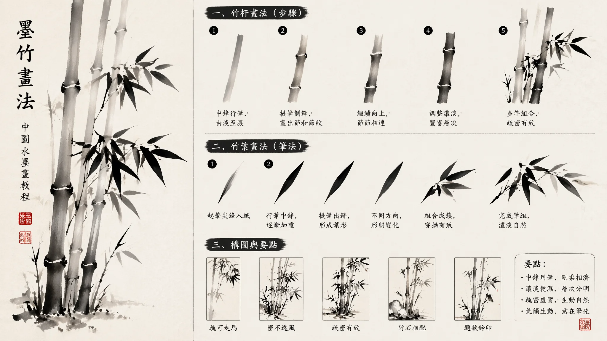
我第一回用AI画竹子,Prompt写的是"Chinese ink bamboo painting"。出来的图让我愣了一下——竹竿像塑料管,竹叶像绿色三角形饼干,分布均匀得像用尺子量过的。一个从小画了七八年国画竹子的朋友看了一眼,说:"你这不是竹子,是'竹子的概念'。AI不懂竹子怎么长的,你得教它。"这之后我花了两个周末对照着芥子园画谱里的竹谱,把每一笔的起承转合翻译成AI能听懂的语言,出来的竹子总算有了"风骨"。这篇就是我当时整理的那套"竹子Prompt词典"。
竹竿——从节间比例到竿身质感的结构化Prompt
竹竿的结构不是一根绿色棍子——它是一节一节拉长的锥形管。AI画不好竹竿的根源在于:它不知道"节"的存在意味着什么。竹子的每一节之间不是直上直下的——是有轻微收分的。每两节之间,下部略粗、往上渐细,到下一节再微扩回来。竹竿的基础Prompt:"a bamboo stalk showing clear segmented joints, each segment is slightly wider at the bottom and tapers gently toward the top, the surface of each segment has a subtle waxy sheen with faint longitudinal striations, the nodes are slightly raised with a thin whitish ring where each section meets the next"。竹竿的节间比例也很关键——天然竹子的节间是下短上长:"the lower segments are shorter and closer together, the middle segments are the longest, the upper segments become shorter again as they approach the tip"。如果你画的是竹竿群——别排成等距。"three bamboo stalks of different thicknesses, the thickest stalk leans slightly to the left, the middle stalk rises almost straight, the thinnest curves gently rightward, they cross each other at different heights creating natural visual rhythm"。中国画构图的基础在AI国画入门指南里有完整的留白与布局体系。
竹叶——从"个"字穿插法到AI的叶片分布逻辑
中国传统画竹有句口诀叫"个"字穿插法——三片竹叶组成一个"个"字形,多个"个"字叠在一起组成一簇。这个规则AI完全不懂——它画竹叶的方式是"在竹枝周围随机撒绿色长条"。要让AI理解竹叶的组织结构,不能只说"bamboo leaves",要描述叶片的簇形规律:"bamboo leaves grow in small clusters of three to five leaves per group, each cluster forms a fan-like shape radiating from a single attachment point, the leaves are long narrow lanceolate with pointed tips and smooth edges, the clusters are arranged alternately along thin twigs, some clusters overlap creating depth"。不同角度下竹叶的表现也不同——正面看是披针形,侧面看是一条细线:"leaves viewed from the front appear as elongated ovals with pointed tips, leaves viewed from the side appear as thin curved lines, the mix of angles creates the classic layered depth of ink bamboo painting"。水墨的浓淡和笔触细节在AI水墨画教程中有更系统的工具与技法介绍。叶子的自然生长规律可以参考维基百科竹子条目里的植物学形态描述。
风竹与雪竹——让静态的竹"动起来"
画竹子最忌讳的就是"死"——每片叶子都工工整整、每根竿都笔直向上。天然状态下的竹子很少是完全静止的,风一吹就活过来了。风竹的Prompt关键在方向一致性:"wind-blown bamboo, all leaves are swept toward one direction by a strong breeze, the bamboo stalks bend slightly under the wind pressure, the leaves look like green brushstrokes streaming in the wind, a few falling leaves are caught mid-air spinning in the gust, the wind is invisible but its effect is vivid on every part of the plant"。雪竹要的是"负重感"和色彩对比:"snow-covered bamboo, heavy wet snow accumulates on the leaves causing some stalks to bend downward, the contrast between the dark green bamboo and the pure white snow creates a stark beauty, a few leaves have shaken off their snow revealing the dark green beneath, the background is a soft grey winter sky"。动感竹子的姿态设计可以和AI自然风景绘画教程里的动态自然元素表现方法结合看——风雨云都是同源的动态语言。
水墨渲染——浓淡干湿的五色层次
墨分五色——干、湿、浓、淡、焦。写意墨竹的灵魂不在"绿",在"黑"。用单一墨色通过水分变化分出五六个层次,AI默认是不会这么干的——AI脑子里竹子=绿色。要让AI画水墨竹子,第一步是去色:"black ink on rice paper, monochrome, no green colors in the image, the bamboo is rendered entirely in varying shades of black ink from deep jet black to pale misty grey"。第二步是写水分层次:"the ink varies from dry brushstrokes with visible scratchy paper texture showing through, to wet washes where the ink bleeds softly into the paper creating blurred edges, the darkest strokes are for the foreground leaves, middle grey for the stalks, palest ink for the distant background bamboo"。第三步是指定纸的质感:"traditional Chinese xuan paper with its characteristic absorbency, the ink has slightly bled at the edges of the strokes creating a soft halo effect, the paper texture is subtly visible"。笔触控制可以翻大都会博物馆的中国书画在线藏品——看元代吴镇和清代郑板桥的墨竹真迹,对着原作写Prompt比对着二次创作靠谱一万倍。
常见问题
AI总是把竹叶画得又多又密像塑料假竹子怎么办?
AI的天然倾向是"多就是好"——叶子越多越密越觉得真实。解法:用数量限制。"sparse composition with intentionally limited leaves, no more than seven or eight visible leaf clusters total, large areas of empty space around the bamboo, the emptiness is as important as the bamboo itself"。还可以加"each individual leaf is deliberate and placed with purpose, not randomly scattered"——让AI把每片叶子当独立笔画对待。
竹节的白色环圈AI老是画不出来或画成了裂纹怎么办?
竹节处的白色环叫"箨环"——是竹箨脱落后留下的痕迹。AI不认识这个东西,所以要么不画,要么画成奇怪的东西。给精确描述:"at each bamboo joint there is a distinct ring with three visible parts——the lower ring is a slightly raised ridge where the segment ends, the middle band is pale whitish-tan in color and slightly rough in texture, the upper ring marks the start of the next segment——these joint rings are a defining characteristic of bamboo"。三个部分的精确描述让AI知道它不是"画一道线",而是画一个"三层结构"。
怎么让AI画的新笋和成竹区分开来?
新笋(竹笋)和成竹是两种完全不同的视觉:"young bamboo shoot emerging from the ground, wrapped in overlapping dark brown protective sheaths with lighter brown veins, the tip is pointed and slightly curved, dewy moisture visible on the surface, growing beside the mature green bamboo stalks which tower above it"。颜色区分(褐vs绿)、形态区分(笋包裹vs竹伸展)、体积区分(小vs大)三重对比同时用。
AI水墨竹子能直接商用印T恤或做Logo吗?
完全可以——水墨竹子是传统公共文化元素,不受版权保护。如果用Midjourney付费版生成,平台授予完整商用许可。做Logo的话建议输出后转矢量——AI的墨色渐变在单色丝印上会丢失层次。转矢量的方法在AI Logo设计教程里有流程说明。
画竹子背景怎么处理才不抢主体?
竹子的背景最简单的做法是大量留白——这是国画的传统。"the background is mostly blank rice paper white, with perhaps a faint wash of pale grey mist suggesting distant bamboo groves, the mist is so subtle it barely registers——just enough to give depth without competing with the foreground stalks"。如果想加月亮——只要一个淡黄的圆,不加细节。"a pale full moon floating in the upper right background, rendered as a simple circle of soft ivory white with no crater details, the moon is a compositional anchor not a subject"。背景越少,竹子越有力量。
画竹子这件事,老祖宗用毛笔练了上千年才总结出"眼中之竹、胸中之竹、手中之竹"的三重境界。AI省掉了前三十年练笔的功夫,但不等于省掉了"眼中"观察和"胸中"理解。你得多看真竹子——下一阵雨去公园里站一会儿,看看竹叶怎么挂水珠的、风怎么从竹枝间穿过去的。看完了再回来写Prompt,AI画出来的才不是"竹子的照片",是"你对竹子的理解"。最后送你一个四字心法:少即是多。竹子的每一片叶子都该有它的理由,多一片嫌密,少一片嫌疏——那个恰好的分寸,Prompt帮不了你,得靠你自己的眼睛去判断。
转给还在跟AI竹子死磕的朋友,一起少走三十年弯路。