AI圣诞节日绘画:温馨冬季与红绿配色的节庆视觉创作指南
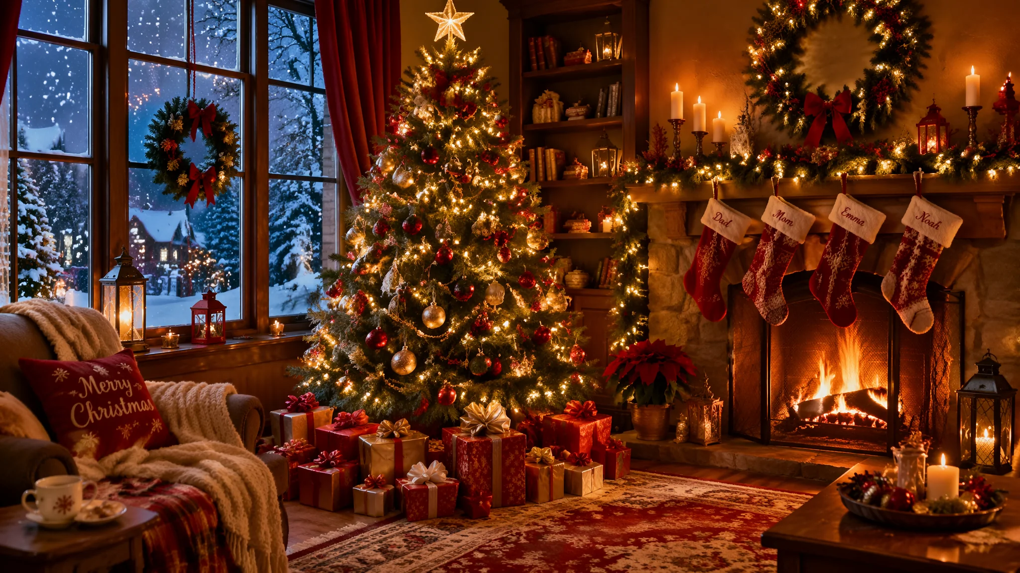
圣诞节是我每年AI创作量最大的时节——不是因为崇洋媚外,而是因为圣诞的视觉元素太丰富了:雪花、麋鹿、圣诞树、礼物盒、壁炉、姜饼人、红绿配色、暖黄灯光……随便组合都是治愈系爆款。每年11月到12月,圣诞主题的商用需求多到接不过来。
前年圣诞节我帮一个跨境电商客户做了一套圣诞促销海报——24张不同风格的圣诞场景配产品图。客户要求三天交稿,传统插画师报价两万起步,周期至少两周。我用AI两天出了六十张备选,客户选了24张,收了四千块。从那以后,圣诞节成了我每年固定的"创收季"。这篇文章把我三年积累的圣诞主题Prompt全盘托出,从经典红绿到北欧极简,从写实摄影到卡通插画,你能想到的圣诞风格这里都有。
经典圣诞红绿配色的AI关键词配方与视觉节奏
经典圣诞配色就两个颜色——圣诞红(#C41E3A 深红偏暗)和圣诞绿(#228B22 森林绿),搭配金色(#FFD700)、白色(雪花)、暖黄(灯光)作为辅助色。这套配色AI理解得极其精准,因为训练数据里圣诞图片太多了。经典圣诞场景的Prompt示例:cozy Christmas living room, decorated pine tree with red and gold ornaments, twinkling warm fairy lights, red stockings hanging on fireplace mantel, wrapped presents under tree in red and green paper, snow visible through frosted window, roaring fire in hearth, traditional Christmas card aesthetic, warm and nostalgic atmosphere, 8K photography。圣诞树特写:beautifully decorated Christmas tree closeup, red baubles and golden stars, candy canes hanging from branches, twinkling warm white lights creating bokeh effect, pine needle texture, shallow depth of field, festive holiday mood, magazine cover quality。餐桌布置:Christmas dinner table setting, red tablecloth with green napkins, golden candle holders, centerpiece of pine branches and red berries, plates with gingerbread cookies, warm candlelight atmosphere, food photography style, festive gathering vibe。经典红绿配色虽然传统但有它的道理——红和绿在色轮上是对比色(互补色),天然有视觉张力。关于色彩原理的更多分析,AI几何抽象绘画中关于色彩对视觉平衡的影响逻辑在圣诞配色里同样成立。
圣诞风格的四大变体:从传统到现代的审美进化
经典红绿不是圣诞的唯一解法——北欧极简圣诞(白+木色)、复古维多利亚圣诞(深红+金+黑)、甜美粉彩圣诞(粉红+薄荷绿+白)、乡村田园圣诞(粗麻布+松果+红格子)——每种变体对应完全不同的关键词配方。北欧极简圣诞:Scandinavian minimalist Christmas, white and light wood tones, simple geometric ornaments, sparse elegant pine branches, white candles, cozy neutral hygge atmosphere, clean modern holiday aesthetic, soft winter daylight through windows。复古维多利亚圣诞:Victorian era Christmas, deep burgundy and gold, ornate decorations, carolers in period clothing, gas lamp lit snowy street, horse drawn carriage, Charles Dickens aesthetic, nostalgic antique Christmas card style。甜美粉彩圣诞:pastel Christmas aesthetic, soft pink and mint green, cotton candy colored ornaments, cute kawaii Christmas decorations, fluffy fake snow, macaron tower as centerpiece, dreamy whimsical holiday, Instagram trendy Christmas style。乡村田园圣诞:rustic farmhouse Christmas, burlap stockings, pinecone garland, red plaid ribbons, wooden handmade ornaments, mason jar candles, cozy country kitchen atmosphere, simple authentic charm。这四种变体风格我分别在商业项目里用过——北欧极简适合高端品牌海报,复古维多利亚适合文艺类的文创产品,甜美粉彩适合年轻女性的小红书内容,乡村田园适合农产品和手作品牌的宣传。在Pinterest圣诞灵感板上搜索对应风格关键词能看到海量参考,是每年圣诞季开始前我必刷的灵感来源。
圣诞角色的AI创作:圣诞老人、雪人、麋鹿的个性刻画
圣诞角色有三宝——圣诞老人的慈祥感、雪人的呆萌感、麋鹿的灵动感。每个角色的Prompt重点完全不同。圣诞老人重点在"真实可信":realistic Santa Claus, kindly old man with genuine warm smile, twinkling blue eyes behind round spectacles, fluffy white beard with slight frost, red velvet suit with white fur trim, holding a sack of wrapped gifts, snow falling gently, Norman Rockwell painting style, heartwarming portrait photography。注意"Norman Rockwell"这个风格锚定——他是美国最著名的圣诞题材插画家,用他的名字作风格词,AI会自动对齐那种"温暖、怀旧、有故事感"的调性。雪人重点在"材质与表情":adorable snowman in winter landscape, freshly rolled snow texture, carrot nose slightly crooked, twig arms, knitted red scarf wrapped around neck, top hat slightly tilted, cheerful expression, children playing around in background, magical winter wonderland atmosphere, children's book illustration style。麋鹿重点在"优雅与神秘":majestic reindeer in snowy forest, frost on antlers, breath visible in cold air, moonlight filtering through pine trees, magical winter creature, Nordic wildlife photography, subtle golden glow suggesting Christmas magic, National Geographic quality。关于角色绘画的通用框架,AI动画风格绘画里的人物塑造方法论完全适用。想看看顶级圣诞视觉设计长什么样?可口可乐圣诞广告档案里记录了近百年的圣诞视觉史——从1931年可口可乐塑造的现代圣诞老人形象到如今,每一年的广告都是圣诞美学的教科书级案例。
圣诞商用素材的高效批量生产流程
圣诞季的商品需求集中在五类——社媒海报、电商促销横幅、产品场景图、圣诞贺卡、手机壁纸。每类有标准尺寸和风格偏好,提前准备好模板可以批量复制。社媒海报(Instagram/Facebook):方形构图1:1,大标题留白区域,品牌色融入圣诞配色。电商横幅(淘宝/亚马逊):宽幅3:1或16:9,左文右图布局,产品与圣诞元素融合。产品场景图:product placed in Christmas setting, [产品名称] surrounded by pine branches and fairy lights, festive holiday product photography, warm cozy atmosphere, commercial advertising quality, 8K。圣诞贺卡:竖版3:4,唯美治愈风,beautiful hand-painted style Christmas card, [元素描述], blank space for text, warm heartfelt greeting atmosphere, premium card design quality。手机壁纸:竖版9:16,简约风格(因为壁纸上有很多App图标不能太花),minimalist Christmas phone wallpaper, subtle festive elements, dark mode friendly version, clean aesthetic, not too busy composition。每年11月我花两个周末跑完一整套圣诞素材库(约200张),然后整个12月都能从库里挑图交付,效率极高。需要高分辨率输出的场景记得先用AI绘画放大高清技巧里的流程处理。另外,AI卧室绘画里关于温暖室内空间的营造技巧在圣诞室内场景中可以直接套用。
常见问题
AI圣诞节日绘画的常见问题集中在红绿配色失衡、雪景质感虚假和圣诞老人形象诡异三方面,逐一说明如下。为什么红绿配色在AI里经常显得俗气?
因为AI对"red and green"的默认理解经常是纯红+纯绿,放在一起确实刺眼。解决方案是降低饱和度:圣诞红用"deep burgundy red""cranberry red""dark crimson"替代"red";圣诞绿用"forest green""pine green""sage green""hunter green"替代"green"。饱和度压下来之后,经典红绿立刻从"地摊货"升级到"高端感"。
AI生成的雪为什么总是像塑料泡沫?
雪的质感需要多层关键词配合:powdery snow texture, crystalline snowflakes, soft snowdrift with wind ripples, freshly fallen snow catching light, realistic snow material。同时要加环境信息让雪有"来处"——snow gently falling from grey winter sky, snow accumulating on tree branches, footprints in fresh snow。雪不是孤立存在的白色块,而是和整个环境互动的。
圣诞老人AI经常画成恐怖片怎么办?
这是个经典问题——AI画人脸特写时表情容易扭曲。解决思路:第一,加"kindly expression""warm genuine smile""twinkling eyes""grandfatherly face"等表情锚定词;第二,缩小脸部占比,用中景或全身景别降低脸部细节压力;第三,用"Norman Rockwell""Thomas Kinkade""Coca-Cola Christmas advertisement style"等风格词让AI参考成熟的艺术风格而非自己乱编。
觉得有用的话分享给朋友吧。