AI冰淇淋绘画教程:从蛋筒到圣代的完整甜品视觉创作教学
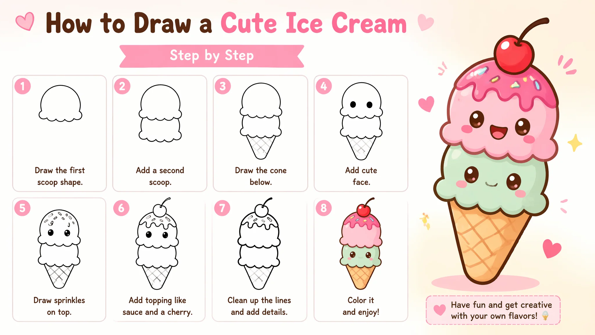
去年夏天我在一家手工冰淇淋店打工了两个月——不是因为我缺钱,是因为我真的太爱吃冰淇淋了(而且员工每天可以免费吃两个球)。那两个月的经历让我对冰淇淋的"视觉语言"有了一种近乎神经质的敏感:一个完美的冰淇淋球表面应该是哑光的——带有一层薄薄的"霜"而不是湿漉漉的反光;球体的底部和蛋筒接触的地方应该有微小的融化痕迹——不是淌下来,而是冰淇淋和蛋筒之间有一圈微微湿润的接触线;蛋筒的华夫格纹理在顶部应该是最清晰的——越靠近尖底越模糊(因为烤制时模具的压力分布不均匀)。这些细节在吃冰淇淋的时候没人会注意到——但如果你画冰淇淋的时候缺了这些细节,观众一眼就能看出"这是假的"。用AI画冰淇淋的时候我发现AI犯了所有初学者会犯的错误:球体太完美像乒乓球、颜色太鲜艳像橡皮泥、蛋筒的纹理均匀得像3D模型。这篇就把我在冰淇淋店"卧底"两个月学到的甜品视觉知识全部转化成Prompt技巧。
蛋筒的华夫格纹理——不是"格子花纹",而是"烤焦的凹凸面"
AI画蛋筒最常见的错误是把华夫格纹理画成"印在平面上的格子线条"——像桌布花纹一样浮在表面。真正的华夫格蛋筒纹理是"凹凸的":凹下去的是烤制时模具压出的菱形格子槽(颜色更深、接近焦色)、凸起来的是格子之间的"脊"(颜色更浅、有明显的烤制焦黄色)。这个凹凸关系是蛋筒"脆"感的来源。
蛋筒纹理Prompt:"the waffle cone has a deeply embossed grid pattern——this is not a printed design but a three-dimensional texture, the pattern consists of diamond-shaped indentations approximately 1 centimeter across arranged in diagonal rows, each indentation is darker——a deep golden brown where the waffle batter was pressed thin against the hot iron and caramelized more intensely, the raised ridges between the indentations are lighter——a warm tan color with small darker spots where the batter bubbled slightly during baking, the texture is crisp and rigid——the cone holds its shape perfectly, a few tiny crumbs of waffle have flaked off from the rim where the cone was handled"。脆皮的细微质感:"when the cone is viewed up close the surface has a matte finish with microscopic pores visible——evidence of the steam escaping during baking, the very tip of the cone is the darkest part——almost a dark caramel brown because it received the most direct heat from the cone iron"。关于食物纹理的更多讨论在AI沐兮风格绘画中织物的质感描述逻辑——凹凸、光泽、颜色变化三个维度同时写,材质感就会立起来。
冰淇淋球的"融化状态"——真实感的灵魂在于"不完美"
刚从-18°C冰柜拿出来的冰淇淋球是完美的、坚硬的、表面有霜的——但拍照之前它已经在室温下待了3分钟。这3分钟的融化过程在视觉上有四个关键表现:表面霜层消失变为湿润光泽、球体边缘变圆、底部微微铺开接触蛋筒的更大面积、可能有一滴正在向下流淌。
融化中的冰淇淋Prompt:"the ice cream scoop has been at room temperature for about 3 minutes——it is in the most photogenic stage of melting, the initial frost layer has melted away revealing a satiny surface that is slightly glossy but not wet, the once-sharp edges of the scoop have softened and rounded——the scoop is still clearly a sphere but its contours are gentler now, where the ice cream meets the waffle cone a small skirt of melted cream has spread about 3 millimeters down the cone's inner rim——this creates a soft creamy seal, a single drip is beginning to form on the left side of the scoop——it has not yet fallen, it hangs as a small teardrop of cream suspended by surface tension, the drip catches a bright specular highlight that makes it look wet and imminent"。食欲感的关键在AI冰元素魔法绘画中提到的"冻结与融化的过渡"逻辑完全相通——只不过一个发生在冰淇淋上,一个发生在魔法冰晶上。
不同口味冰淇淋的颜色控制——用食物类比替代色码
AI对抽象颜色名称("天蓝""玫瑰粉")的理解远不如对"食物的颜色"的理解准确——因为训练数据里有大量标注过的食物图像,AI能精准匹配"草莓奶昔的颜色"是什么样。所以写冰淇淋颜色时不要写色码——写味觉联想。
六种经典口味颜色Prompt。巧克力:"chocolate ice cream——a rich warm medium-brown with reddish undertones, the color of melted dark chocolate with a touch of cream, the surface has a dense matte opacity that suggests high cocoa butter content"。芒果:"mango ice cream——a warm golden-yellow that is brighter than egg yolk but softer than a traffic sign, the color of ripe Alphonso mango flesh pureed with cream, tiny darker orange fibers are visible where the mango pulp was not completely strained"。奥利奥饼干碎:"cookies and cream——a pale grey-white base with irregular chunks of dark chocolate cookie scattered throughout, the cookie pieces have rough jagged edges where they were crushed, some cookie crumbs have tinted the surrounding cream a light grey"。更多色彩控制在Instagram的美食摄影账号上有大量参考——食物摄影师对色彩的敏感度比画师更高,因为他们追求的是"看起来好吃"而不是"看起来好看"。
圣代杯的层次构建——玻璃+冰淇淋+酱料+奶油的叠层叙事
圣代(sundae)的视觉魅力来自"分层"——通过透明的玻璃杯可以看到每一层的内容。AI画圣代最容易把层与层之间的边界画成"水平直线"——但真实的圣代层之间是起伏的、不规则的、有"侵入"的。
圣代分层Prompt:"a parfait glass filled with a carefully composed ice cream sundae——the layering is visible through the transparent glass wall, the bottom layer is warm fudge brownie chunks in irregular shapes with visible chocolate chips, above this a thick layer of vanilla ice cream has been spooned in——it has settled unevenly with some areas thicker than others, a ribbon of hot fudge sauce was drizzled over the vanilla layer——the sauce has seeped into the crevices between the ice cream and the glass wall creating dark wavy lines visible from the outside, another layer of strawberry ice cream follows——the pink contrasts sharply with the dark fudge, the top of the sundae is crowned with a generous swirl of whipped cream——the cream holds its shape in soft peaks with a dusting of rainbow sprinkles on top, a single maraschino cherry with stem is placed precisely at the apex"。玻璃材质的描述逻辑在AI冰元素魔法绘画中冰晶的透明折射处理中也用到了——透明物体不写"透明"写"通过它能看到什么"。
常见问题
怎么让AI画的冰淇淋"看起来好吃"——食欲感和美感是一回事吗?
食欲感和美感不是一回事——很多很美的食物摄影其实让人毫无食欲(比如过于冷色调的、过曝的、食材被过度摆弄的)。食欲感的Prompt核心:暖色调+光泽+纹理细节。"food photography style with appetizing presentation——warm natural daylight from a nearby window, the light direction is 45 degrees from left creating appealing highlights on the glossy ice cream surface, the color temperature is slightly warm (around 4500K) to enhance the golden tones of the cone and the creamy warmth of the ice cream, a shallow depth of field keeps the sundae in sharp focus while the background softens into a warm bokeh, the image should make the viewer want to reach into the screen and take a bite"。
冰淇淋上的配料(坚果碎、巧克力酱、糖针)怎么画才像"撒上去的"而不是"贴上去的"?
配料"撒"和"贴"的区别在于重力和嵌入。"撒上去"的坚果碎:"chopped almonds are scattered across the top of the ice cream——they are not floating on the surface, some have partially sunk into the softened cream creating small craters around each nut, the nuts are oriented randomly——some flat, some on edge, some half-buried, no two nuts have the same angle"。巧克力酱的"淋":"the chocolate sauce was drizzled in a zigzag pattern from a spoon——the drizzle lines are inconsistent in thickness, wider where the spoon was moving slowly and thinner where it moved quickly, the sauce has cooled slightly on contact with the cold ice cream forming a slightly thickened skin on its surface"。
多个冰淇淋球叠在一起怎么画——怎么让每个球之间的边界清晰而不糊成一团?
叠球的关键是"接触面"的处理。两个球接触的地方不是一条线——是一个"融合区"。Prompt:"two scoops of ice cream stacked on a cone——the bottom scoop is larger and slightly compressed from the weight of the top scoop, the top scoop rests in a shallow depression it has created in the bottom scoop, where the two scoops meet there is a visible seam——a thin line of melted cream has formed in the crevice between them, the bottom scoop is chocolate and the top scoop is vanilla——the contrast between the dark and light colors at the seam makes the separation clear even where they touch"。