AI绘画IP形象设计:品牌吉祥物与原创角色的完整开发创作流程
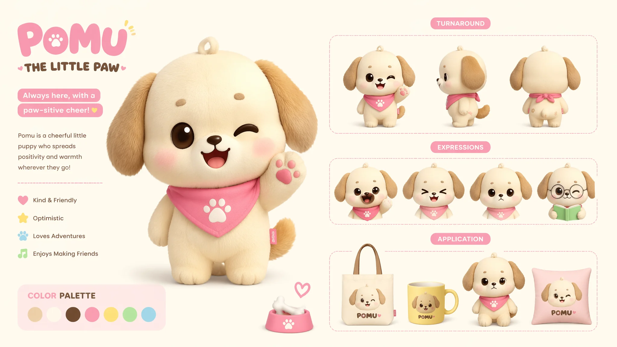
去年帮一个朋友的小咖啡馆做IP形象——一只叫"豆包"的柴犬咖啡师。第一版AI生成出来,朋友看了一眼说"好可爱,但我明天再生成一次还是这只狗吗?"我说不确定——每次生成的长相都不一样。那一刻我突然意识到AI做IP设计最大的痛点:不是"能不能画出一只好看的角色",而是"能不能画出一只每次生成都长得一样的角色"。传统插画师的IP设计流程——角色设定、三视图、表情包、动作延展、应用场景——这套流程建立在"同一个角色"的基础上。但AI的每一次生成都是独立的随机事件,它天然地不保证一致性。这篇就把我在"豆包"项目上反复撞墙后总结的"角色圣经法"完整拆出来——从世界观到三视图到表情延展到商业落地的全链路。
角色圣经——AI时代IP设计的核心文档
用AI做IP设计的最大挑战不是创意,是"一致性"。你第一次生成了一只可爱的柴犬咖啡师,第二次想要它换个姿势——结果出来了一条哈士奇。为什么?因为AI没有记忆。每次生成都是一次全新的"从噪声中降噪"的过程——它不记得上一次画了什么。解决方案是一份"角色圣经"(Character Bible)——一份固定不变的、高度结构化的角色描述文档,每一次Prompt都以这份文档开头。角色圣经的五个核心模块:几何结构——"the character is built from a simple geometric foundation: the head is a large circle (40% of total body height), the body is a smaller rounded rectangle, the ears are two sharp triangles on top of the head pointing slightly outward, the snout is a smaller oval centered on the lower half of the face, the limbs are short rounded cylinders approximately 1/3 the thickness of the body, the tail is a curved thick crescent that curls upward"。
色彩常数——"the character's fixed color palette: primary body fur is warm golden tan HEX #D4956B, the belly chest and lower face are cream white HEX #FFF8E7, the nose and inner ears are soft pink-brown HEX #C4956B, the eyes are dark chocolate brown HEX #3C1F0E with a small white catchlight dot, the tongue when visible is bubblegum pink HEX #FF9E9E, the paw pads match the nose color"。标志性特征——"the character has a single distinctive feature that must appear in every image: a small coffee bean-shaped patch of darker brown fur on the left side of the forehead above the eye, no other markings on the face"。比例常数——"head-to-body height ratio is 1:2.5 (chibi proportion), the eyes are 1/3 the width of the head and spaced one eye-width apart, the snout is 1/2 the width of the head, the ears are 1/2 the height of the head"。每次都把这些信息一字不改地放在Prompt的最前面——这是保证AI画出"同一只狗"的唯一方法。关于角色设计的标准化流程见AI角色概念设计中的系统构建方法。
三视图——让AI理解"正侧背"的Prompt策略
传统IP设计交付必须包含三视图(正面、侧面、背面)。但AI对"三视图"这个概念的理解极其不稳定——它经常把三个角度画成三个不同的角色,或者把侧面画成"正面身体+侧面头"的诡异组合。三视图的正确做法是:每个角度单独生成,但每次都引用同一份角色圣经。正面视图——"character turnaround sheet: front view, the character faces the viewer directly, perfectly symmetrical, both triangular ears visible at the top of the head, both eyes visible——large circles with small white catchlights, the coffee bean marking centered on the left forehead, arms at sides with paw pads facing forward, short legs with feet pointing forward, standing on a neutral ground plane, clean linework on white background, technical reference sheet style, no shading, flat colors"。
侧面视图——"character turnaround sheet: side profile view of the SAME character, showing the silhouette from the left side, the head shape is slightly oval from this angle, only the left ear is fully visible——the right ear is partially hidden behind it, the snout protrudes forward from the face, the coffee bean marking on the left temple should be visible from this angle, one eye visible——the almond shape is seen from the side, the body is a rounded bean shape in profile, the tail curls upward behind the body, the left arm and leg are in front, clean linework on white background, technical reference sheet style"。背面视图——"character turnaround sheet: back view of the SAME character, the back of the head shows the two triangular ears from behind, no facial features visible, the back of the neck connects to the rounded body, the tail is visible curling upward from the back, the coffee bean marking is NOT visible from this angle, arms and legs seen from behind, clean linework on white background"。
每个视图的Prompt都要以角色圣经开头——这样才能最大限度地保证三个视图画的是同一个角色。关于多角度一致性的更多技巧参看AI调整精修绘画中的迭代精修方法。
表情包延展——固定角色+变量表情的系统方法
IP角色的表情包(喜怒哀乐惊讶害羞)是延展设计中最常用也最容易翻车的部分——表情一变,角色的长相也跟着变。正确做法是"角色本体锁死+表情变量叠加"——角色圣经(几何结构+色彩常数+标志特征+比例常数)永远放在Prompt最前面,然后只改变面部肌肉配置。六种基础表情的Prompt:开心——"the character is expressing pure joy: the eyes curve upward into happy arcs with the pupils hidden or reduced to small dots, the mouth is open in a wide grin showing a small pink tongue, the cheeks are lifted and have visible round blush marks, the ears are perked up and slightly forward"。
愤怒——"the character is expressing anger: the eyebrows are pulled sharply downward and inward creating a deep furrow between them, the eyes are narrowed to intense slits with the pupils constricted, the mouth is a jagged downward curve showing gritted teeth or a sharp fang, a small cartoon anger vein symbol is visible on the temple"。悲伤——"the character is expressing sadness: the inner ends of the eyebrows are pulled upward into an inverted V shape creating a 'puppy dog' expression, large teardrops are welling at the corners of the eyes or are actively streaming down, the lower lip is pushed out in a trembling pout, the ears are drooping downward and the body posture is slumped"。惊讶——"the character is expressing shock: both eyebrows are raised high creating horizontal lines on the forehead, the eyes are wide open with tiny constricted pupils, the mouth is open in a round O shape, small action lines radiate from around the head indicating sudden movement, the ears are standing straight up"。
害羞——"the character is feeling shy and bashful: the eyes are looking down and slightly to the side avoiding direct contact, the cheeks are flushed with a deep pink blush, the mouth is a small wavy line or a nervous smile, one paw is rubbing the back of the head in an embarrassed gesture, the body is slightly turned away"。平静——"the character is calm and content: the eyes are relaxed half-circles or gentle curves, the mouth is a small simple smile, the expression is gentle and peaceful, the posture is relaxed, the ears are in their neutral position"。六种表情共享同一份角色圣经——这是保证"豆包"哭的时候和笑的时候是同一只狗的唯一方法。关于角色表情的系统控制可以参考AI哭泣女性绘画和AI明媚少女绘画中的面部肌肉控制理论。
从插画到Logo——IP形象的商业落地测试
一张好看的AI插画不等于一个好用的IP形象。两者的区别在于:插画负责"好看",IP形象负责"在任何条件下都能被识别"。一个合格的商业IP形象必须通过三个测试。剪影测试——"fill the character with solid black so that only the silhouette is visible, the silhouette must be a distinctive and recognizable shape that cannot be confused with other characters, the key identifying features (the triangular ears, the curled tail, the proportions of the chibi body) must read clearly in pure silhouette"。单色测试——"reduce the character to a single flat color with no gradients shading or highlights——this is how it will appear when printed on a receipt on packaging or embroidered on a cap, all key features must remain legible in monochrome"。
缩放测试——"the character should remain recognizable when reduced to 1 centimeter in height——about the size it would appear on a business card or a mobile app icon, the eyes nose and distinctive features must be bold and simple enough to remain visible at tiny sizes, delicate details will disappear"。如果你的角色通过了这三个测试——剪影独特、单色可用、缩小到1厘米还能认出来——它就是一个"能用的IP形象"。过不了的说明设计过于复杂,需要简化。关于设计简化的原则可以参考Logo Design Love的标志设计案例和Brand New的品牌形象评审——它们展示了专业IP设计从创意到落地的完整思考链。
IP形象的场景应用——从贴纸到店招的视觉延展
一个IP形象的价值不在于"一张画的有多好看",而在于"能被放进多少个不同的场景"。延展场景的Prompt策略——核心还是角色圣经锁死形象,然后改变场景和动作。咖啡杯贴纸——"the character is designed as a circular sticker on a takeaway coffee cup, the character is contained within a circular border, the illustration style is simplified and bold——suitable for sticker printing, the character is holding a small coffee cup in its paws, white background inside the sticker circle, the overall design is self-contained and works as a standalone sticker"。店招——"the character is integrated into a cafe storefront sign, the character is holding a welcome gesture with one paw raised, the illustration style is clean and graphic——suitable for signage, the background is transparent or the color of the sign, the character is accompanied by the cafe name in a friendly rounded typeface below"。社交媒体头像——"the character as a circular social media avatar, only the head and shoulders are visible, the background is the brand's accent color (warm cream), the character is winking and smiling, the image is optimized for a small circular crop at 200x200 pixels"。
周边产品——"the character printed on a tote bag, the character is positioned in the center of the canvas tote, the fabric texture of the bag is subtly visible beneath the print, the illustration is a single-color screen print style in dark brown on natural canvas, the character is in a playful pose——mid-jump with a coffee bean in its mouth"。每一个延展场景都是"角色圣经+场景描述"的组合——角色本身不变,变的是它所在的环境和它做的事。关于角色在不同场景中的一致表现可以参考AI护士角色绘画中不同科室环境的角色适配方法。
常见问题
AI画的IP角色为什么每次都不一样——怎么在多次生成中保持同一个角色的视觉一致性?
建立"角色圣经"——一份固定的角色描述文档包含:几何结构(头部圆形占40%体高)、色彩常数(精确色值)、标志性特征(左额上的咖啡豆斑)、比例常数(头身比1:2.5)。每次生成都把这份圣经原封不动放在Prompt最前面。这是AI不记得上一次画了什么的情况下保证一致性的唯一方法。
IP角色的三视图(正面、侧面、背面)怎么用AI稳定生成——保持结构一致性的Prompt策略?
每个视角单独生成,每次都以角色圣经开头。正面——"front view, symmetrical, both eyes visible, arms at sides"。侧面——"side profile from left, snout protrudes, one eye visible, tail behind body"。背面——"back view, no facial features, ears from behind, tail curling up"。不要试图让AI一次生成三视图——分三次生成,每次独立锁定角色圣经。
表情包延展怎么做——从一个基础角色生成喜怒哀乐惊讶害羞六种表情的Prompt?
角色圣经锁死本体,只变面部肌肉:开心——"eyes curved upward arcs, wide grin with tongue"。愤怒——"eyebrows sharply down, narrowed eyes, jagged mouth"。悲伤——"inner eyebrows up inverted V, teardrops, trembling pout"。惊讶——"eyebrows high, eyes wide tiny pupils, round open mouth"。害羞——"eyes looking down, deep blush, wavy mouth"。每次Prompt=角色圣经+其中一个表情描述。
品牌吉祥物的商业落地——从"好看的插画"到"能用的Logo"中间少了什么?
三个测试:剪影测试(纯黑后还能被识别)、单色测试(无渐变无阴影仍可读)、缩放测试(缩小到1厘米高还能看清关键特征)。通过的=可用的IP形象。通不过的=需要简化。插画负责好看,IP形象负责在任何条件下都能被识别。