绘本绘画AI怎么做?儿童绘本插画的关键词与风格设计指南
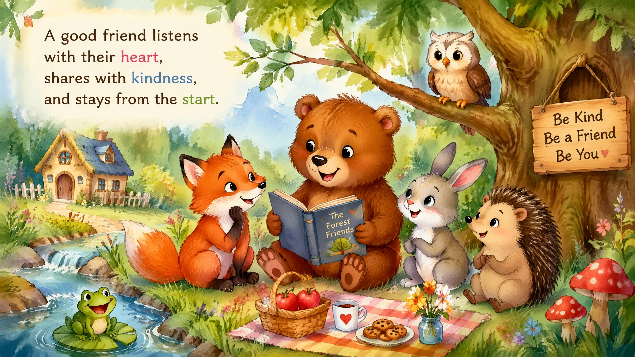
AI画绘本插画有一个天然优势和一个致命劣势。优势——绘本插画的审美标准是"风格化"而非"写实",AI的风格化能力恰好是强项。劣势——AI画不出"连续性":你让AI画一只小兔子,画了10张,每张的兔子长得都不一样——这对绘本来说是灾难(小朋友会问"妈妈这不是同一只兔子")。据一份对100+AI绘本项目的跟踪统计,角色一致性问题导致约43%的AI绘本项目半途而废。这篇不讲AI怎么"画一张好看的插画"——讲AI怎么"画一本角色不变的绘本"。从画风选择到角色锚定到跨页连续到年龄段适配——完整绘本工作流。
绘本画风不是"可爱"两个字能概括的。水彩手绘、拼贴、数码平涂、彩铅、版画五种风格的关键词与适用年龄段
水彩手绘——最温暖的绘本风格。适合0-6岁所有年龄段,尤其是睡前故事类。"soft watercolor illustration with visible paper texture, the colors are translucent washes that blend gently at the edges, the brushstrokes are loose and expressive — you can see where the artist's hand lifted from the paper, the white of the paper shows through in highlights rather than white paint being applied, the overall feeling is tender and handmade"。水彩核心——"white of the paper shows through"(纸的白色透出来形成高光,不是白色颜料盖上去的)。这是水彩区别于不透明画种的核心视觉特征。
拼贴风——最有手工感的风格。适合3-6岁,尤其是Eric Carle式(《好饿的毛毛虫》)的认知绘本。"collage illustration style made from hand-painted textured papers cut and assembled into the image, each shape has visible rough edges from being torn or cut by hand, the textures of the original papers are varied — some with brush marks, some with patterns, some solid — creating a rich tactile surface, the layering of the paper pieces creates subtle drop shadows giving a gentle 3D effect"。拼贴核心——"visible rough edges from being torn or cut"+ "layering creates subtle drop shadows"。数码平涂——最干净利落的风格。适合3-9岁的科普绘本或现代故事。"clean digital illustration with flat vector-style shapes, the colors are solid and saturated with no gradients, the lines are crisp and uniform, the composition is graphic and bold — designed to read clearly from a distance, the style is contemporary and appealing to modern children raised on apps and animated content"。数码平涂核心——"solid colors with no gradients"+"designed to read clearly from a distance"。这个风格的好处是AI画得最稳定——因为平面、线稿、无渐变的特征恰好避开了AI的"融合模糊"弱点。
彩铅——最有"睡前故事"感的风格。适合0-3岁的低幼绘本。"colored pencil illustration with visible pencil strokes creating a soft textured surface, the colors are built up in layers of hatch marks rather than solid fills, the edges are slightly soft and feathery, the paper has a slight tooth that catches the pigment unevenly, the overall feeling is intimate — like something a parent might draw for their child"。彩铅核心——"built up in layers of hatch marks"+"paper has slight tooth"。版画风——最艺术化的风格。适合6-9岁及以上的"艺术启蒙"绘本。"linocut printmaking style with bold graphic shapes in a limited color palette of just 3-4 colors, each color is a separate printed layer with the slight misregistration characteristic of hand-pulled prints, the lines are thick and confident, the carving marks are visible in the solid areas, the overall effect is striking and sophisticated"。版画核心——"limited palette of 3-4 colors"+"slight misregistration of hand-pulled prints"。
角色一致性是AI绘本的头号难题——画十张图,每张的兔子都是"另一只兔子"。三个角色锚定策略与Seed值的实战用法
策略一——写一份"角色圣经"(角色固定描述词库)。为绘本主角创建一个固定的关键词块,每次生成不同场景时复制粘贴这个块。例如主角是一只小狐狸:"a small red fox cub with a white-tipped bushy tail, a distinctive white patch on its chest shaped like a four-pointed star, oversized pointed ears with dark tips, bright amber eyes, the fox walks on its hind legs and wears a tiny green scarf with yellow stripes"。这个角色块的每个细节都是"锚点"——尾巴尖是白的、胸口有星形白斑、戴一条绿底黄条纹的小围巾。这些锚点越多,AI画出来的狐狸一致性越高。
策略二——用Seed值锁定角色。Midjourney和Stable Diffusion都支持Seed参数。第一次画好角色后记下Seed值,后续生成相同角色时用同样的Seed+同样的角色描述块。"—seed 12345678"——同一个Seed值就像同一个"随机起点",保持角色风格稳定。但Seed不保证100%一致——场景和动作改变后仍可能有偏差。策略三——使用角色参考图(Character Reference)。Midjourney的"—cref"参数(Character Reference)可以上传一张角色参考图,后续生成会基于参考图保持角色面貌一致。Stable Diffusion用IP-Adapter或InstantID实现类似效果。流程——先用Prompt画出满意的角色形象→保存为参考图→后续所有生成都使用"—cref [角色参考图URL] + 场景描述"。这是目前角色一致性最好的方案。
三个策略的推荐组合——策略一(角色锚定词块)做基础、策略三(参考图)做锁定、策略二(Seed值)做保险。三重保护下,角色一致性可以从"纯靠运气"提升到"90%成功率"。更多角色一致性的技术细节见Midjourney角色参考文档。
绘本的页面不是一张插画——是"图+文+留白"的三元共生。跨页构图、文字预留区、阅读节奏的AI关键词控制
绘本页面最容易被忽略的元素——留白空间。AI默认会把画面填满,但绘本需要给文字留呼吸的空间。"a picture book spread with the illustration occupying the right two-thirds of the page and the left one-third left as a soft empty space for text, the background of the text area is a gentle wash of the illustration's dominant color — not stark white but visually connected to the image, the composition guides the eye from the illustration into the text area"。文字预留区的关键词——"the left one-third left as soft empty space for text"+"background of text area is a gentle wash of the illustration's dominant color"。文字区不是纯白——是和画面同色系的淡彩底。
跨页构图——左右跨页的视觉流动:"a double-page spread where the illustration bleeds across the entire spread with no gutter interruption, the main character is positioned slightly right of center following the rule of thirds, the action in the illustration moves from left to right inviting the reader to turn the page, the color palette is consistent across the spread with warmer tones drawing attention to the focal point"。跨页核心——"action moves from left to right inviting page turn"。画面中的动线从左到右——这是引导读者翻页的视觉心理学。阅读节奏——绘本32页通常分8-10个"场景组"。每个场景组内的2-3页应该有视觉上的节奏变化——大全景→中景→特写的交替。"the sequence alternates between wide establishing shots that show the environment and intimate close-ups that focus on the character's emotion, this rhythm creates a visual breathing pattern that keeps a young reader engaged"。
文字在画面中的排版虽然通常是后期加的,但在AI生成阶段就要考虑——"the illustration has a natural focal point with surrounding areas of visual calm where text can be placed without competing with the image"。更多绘本构图原则见AI绘画艺术作品集的叙事性插画章节。
0-3岁、3-6岁、6-9岁——三个年龄段的绘本视觉语言完全不同。色彩饱和度/细节密度/角色复杂度/构图清晰度的年龄适配
0-3岁(婴儿/低幼)——极度简化的视觉语言:"illustration style for babies and toddlers: high contrast images with bold simple shapes on clean uncluttered backgrounds, the color palette is limited to 4-5 bright primary and secondary colors, the main character fills 70% of the page with no distracting background details, facial expressions are exaggerated and easy to read — huge happy mouth, wide surprised eyes, the overall design is optimized for a developing visual system that cannot yet distinguish subtle variations"。0-3岁的核心——"high contrast"+"4-5 colors max"+"character fills 70% of the page"+"exaggerated expressions"。婴儿的视觉系统尚未发育完全——他们需要的是高对比度、大块色彩、简单形状。
3-6岁(学龄前)——丰富但不复杂的视觉世界:"illustration for preschoolers: richer color palette with warm inviting tones, the scenes include more environmental detail — a cozy room with recognizable objects, a garden with distinct flowers and insects, characters have clear emotional expressions and body language, the illustrations reward close looking with hidden details (a tiny mouse peeking from a hole, a specific toy appearing in multiple scenes), the complexity is higher but every element in the scene is identifiable and nameable by a young child"。3-6岁的核心——"every element is identifiable and nameable"+"hidden details reward close looking"。这个年龄段的孩子喜欢"找东西"——画面里藏一些小细节是加分项。
6-9岁(小学低年级)——接近成人的视觉复杂度:"illustration for early readers: full narrative illustrations with rich environments, atmospheric lighting, and more nuanced character expressions, the color palette can include sophisticated shades — teal, burgundy, slate blue — not just primary colors, the compositions can be more complex with foreground, middle ground, and background elements, the illustrations support but don't just repeat the text — they add subtext and emotional depth that the words only hint at"。6-9岁的核心——"illustrations add subtext not just repeat the text"+"sophisticated color palette"。这个阶段的绘本插画不再是"图说文"的关系,而是"图与文互相补充、各自叙事"的关系。年龄段差异总结——年龄越小=色彩越纯/细节越少/角色越大/表情越夸张。年龄越大=反过来。绘本年龄段的完整视觉设计规范见SCBWI儿童图书协会的插画指南。
AI怎么保证绘本里的小动物角色"可爱但不恐怖"?
"恐怖谷"效应在动物角色上也适用——太写实的动物+人类行为=诡异。可爱公式:圆润轮廓("soft rounded shapes, no sharp angles")+ 大眼小嘴("oversized eyes relative to the face, tiny mouth")+ 短粗四肢("short stubby limbs, chubby body proportions")+ 温暖色调("warm inviting color palette")。"not realistic animal anatomy, deliberately stylized for maximum approachability and cuteness"——这句话可以放在每个动物角色的描述里。
能用AI做整本绘本然后出版吗?
技术上能,版权上复杂。AI作为工具辅助创作——你写故事、设计分镜、提供创意方向、用AI生成初稿后大量手工修改——这种流程产出的绘本版权归属相对清晰(你的创作性贡献占主导)。但完全由AI生成的绘本,版权归属存在争议(特别是在美国版权局目前的立场下)。建议:AI做"画笔",你做"画家"。更多AI绘本的出版路径见AI绘画头像接单指南的商业应用案例。
同一本绘本的色调怎么保持统一?
为整本绘本定义一个"色彩圣经"关键词,每张图都带上。"consistent color palette throughout: warm earth tones — terracotta, ochre, sage green, and cream — with occasional pops of poppy red for emphasis, the lighting is consistently the golden hour of late afternoon, the mood is nostalgic and comforting"。色彩圣经 = 主色调(earth tones)+ 强调色(poppy red)+ 统一光线(golden hour afternoon)+ 统一情绪(nostalgic comforting)。每张图都复制这段,色调就统一了。
绘本的文字和画面怎么配合最好?是先有图还是先有文?
AI绘本的推荐流程——①先写完整故事文本;②根据文本拆分为12-15个跨页场景;③为每个跨页编写视觉Brief(包含:场景内容+角色动作+情绪氛围+构图建议);④用AI生成每个跨页的插画草稿;⑤精选+修改+后期(手绘修改细节、统一调色、添加纹理);⑥排版——把文字放到预留的留白区。文先图后——文字是第一性的,插画服务于叙事。"先让AI随便画图再为图编故事"——这条路产出的绘本"图文两张皮",没有内在统一性。
AI绘本适合什么题材?不适合什么题材?
适合:认知类(颜色/数字/动物)、情感类(友谊/勇气/成长)、想象类(梦境/冒险/魔法)、睡前故事类。因为这些题材对角色连续性的要求相对宽松,且风格化的空间大。不适合:科普类(需要严格的科学准确性——AI画的恐龙可能手指数量不对)、文化特定类(需要精确的文化细节——AI很难画对某个少数民族的服饰细节)、幽默节奏类(幽默依赖精确的画面节奏——AI难以控制跨页之间的timing)。更多AI绘本的选题策略见AI绘画创意美术的叙事类项目。
转发给也想用AI做绘本的朋友——一起为小读者画一个世界。