AI向日葵绘画:梵高风格与金色花田的阳光灿烂视觉创作
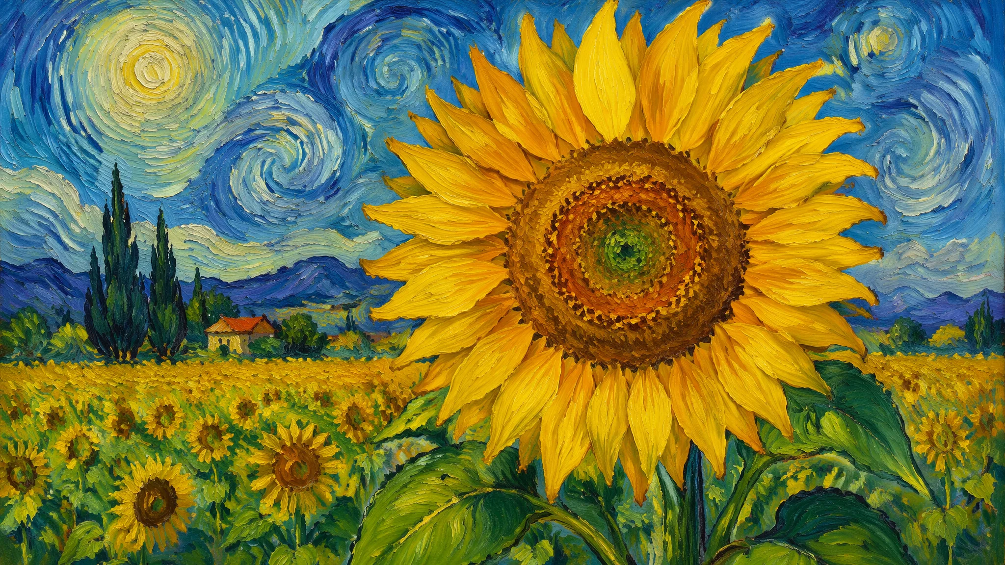
向日葵是AI绘画里最"懂事"的花——你写"sunflower",AI几乎从不翻车。但要把向日葵画出梵高那种直击灵魂的生命力,光写个花名远远不够。
前年夏天去了趟荷兰,专门跑到梵高博物馆看那幅《向日葵》的真迹。站在画前面大概一米的地方,你能看到每一笔颜料堆积的厚度——那种几乎要从画布上跳出来的黄色,屏幕上看一百次也感受不到。回来后我用AI试着复现那种感觉,跑了大概三十多轮,发现关键词的精确度直接决定了画面有没有"梵高味"——不是颜色像就行,笔触的节奏、颜料的厚重感、背景和主体的情绪关系,每一样都要写到位。
梵高风格向日葵——不是写了"Van Gogh"就完事了
光写"Van Gogh style sunflower"AI给你的只是黄色的花——真正的梵高味需要把笔触、配色、构图三个维度都写到。笔触用"thick impasto brushstrokes, visible swirling paint texture, energetic palette knife application, oil paint with pronounced physical relief"。配色用"chrome yellow, cadmium yellow, ochre, and hints of turquoise blue background, warm sunflower yellow contrasting with cool complementary tones"。构图用定位——"sunflowers in a simple terracotta vase, placed on a wooden table against a turquoise wall, some blooms facing forward while others droop, asymmetrical natural arrangement, a few fallen petals on the table surface"。把这三层描述叠在一起,AI才能真正理解你要的不是"一张有向日葵的画",而是"一张有梵高灵魂的向日葵"。静物绘画的更多技法,AI静物绘画创作指南里有从古典到现代的完整拆解。
金色花田——向日葵最壮观的打开方式
向日葵花田是AI风景画里最出片的主题之一——大面积的黄色和天空的蓝色天然形成最强烈的互补色对比。花田全景用"vast sunflower field stretching to the horizon, endless rows of bright yellow blooms all facing the sun, dramatic cloudy sky above, golden hour warm light bathing the entire field"。人物入画用"a person walking through a sunflower field, the flowers towering above head height, path winding through the golden blooms, sense of wonder and scale"。航拍视角用"aerial view of a sunflower field, geometric patterns of planted rows, patchwork of yellow and green against brown earth, agricultural landscape photography"。特写+花田用"close-up of a single sunflower in sharp focus, with an endless blurred field of sunflowers stretching into the background, shallow depth of field"。花田画的关键是"尺度感"——你需要一个参照物(人、树、房子、远山)来让观众感受到花田有多大。没有参照物的花田图看起来就像一块黄布。AI风景绘画大全里有更多自然景观的构图思路。
向日葵的特写艺术——花瓣纹理和花蕊细节
向日葵的特写魅力在于它的几何美感——你以为它是乱长的,其实它的种子排列遵循斐波那契螺旋,是大自然最精密的数学设计之一。超级特写用"extreme macro photography of a sunflower center, intricate spiral pattern of seeds forming Fibonacci sequence, tiny individual florets visible, hyper-detailed texture, warm golden and dark brown tones"。花瓣特写用"macro close-up of sunflower petals, translucent golden-yellow texture, veins visible when backlit by sunlight, soft romantic atmosphere"。蜜蜂与花用"a bee collecting pollen on a sunflower, macro detail of the bee's fuzzy body covered in yellow pollen grains, dynamic moment frozen in time"。超写实花卉特写的关键是"macro photography"这个锚定词——加上它,AI会自动切换到一个完全不同的细节级别。对自然微观世界的AI绘画感兴趣,英国皇家植物园邱园的植物影像资料库是顶级参考,每张植物特写都能直接转化为提示词灵感。
向日葵的情感色彩——从快乐到忧伤的调色板
向日葵不等于明亮快乐——你可以用色调和光影让它表达截然不同的情绪。明媚温暖用"warm golden yellow palette, bright summer sunshine, cheerful and uplifting atmosphere, clear blue sky, vibrant and energetic mood"。忧郁怀旧用"muted ochre and faded yellow, overcast afternoon light, nostalgic film photography look, sunflowers slightly wilting, bittersweet late summer feeling"。浪漫黄昏用"sunset backlighting the sunflower field, warm orange and pink sky, golden petals glowing with rim light, romantic and dreamy atmosphere"。暗调艺术用"dark moody background, single sunflower dramatically lit by a narrow beam of light, chiaroscuro, fine art photography style"。色彩就是情绪——同样的向日葵,换一套调色板和光线描述,传递的情感可以天差地别。色彩理论在AI绘画色彩理论应用指南里有系统讲解。
向日葵的文化符号——从乌克兰国花到当代艺术
向日葵在不同文化里承载着完全不同的象征意义——把这些文化符号叠加到画面上,作品就有了超越视觉的深度。乌克兰民族象征方向用"sunflowers as a symbol of Ukrainian identity, field under a vast blue sky like the national flag, resilient and proud atmosphere, folk art influences in the composition"。普罗旺斯田园用"sunflowers in the Provence countryside, French rural charm, lavender fields in the distance, old stone farmhouse, impressionist painting style"。当代艺术用"contemporary art interpretation of sunflowers, abstract expressionist approach, deconstructed floral forms, bold unconventional color choices, gallery wall presentation"。这些文化符号让向日葵画从"好看的花"升级为"有意义的花"。艺术风格探索方面,《Tate泰特美术馆》的在线馆藏里有大量以向日葵为母题的现当代艺术作品,对拓展风格视野非常有帮助。
常见问题
AI向日葵绘画的常见疑问集中在风格模仿、细节表现和场景搭配上。AI画的梵高风格向日葵跟原作差距大吗?
说实话,差距不小。AI能模仿梵高的视觉特征——黄色调、厚涂笔触、旋涡状的线条——但它模仿不了梵高创作时的情绪强度和生命体验。AI的梵高像是"外观像",不是"灵魂像"。但作为装饰画或灵感素材,AI的梵高风向日葵已经足够惊艳了。
向日葵花田图为什么经常看起来假?
主要是两个原因:花的大小和密度缺乏自然变化。真的花田里有高有矮、有密有疏、有的朝向略有偏差。AI生成的花田往往太均匀——每朵花一样大、一样高、一样朝向。在提示词里加"natural variation in flower heights and angles, some sunflowers taller than others, organic irregularity"能改善不少。
如何让向日葵图的黄色不刺眼?
纯黄色大面积使用确实容易产生视觉疲劳。解决方案是在黄色中混入暖橙或浅棕——用"warm golden yellow""honey-toned yellow""ochre and amber"替代"bright yellow""pure yellow"。另外在画面中安排一些冷色(蓝、绿、紫)作为视觉"休息点"也很重要。
向日葵适合搭配什么其他花卉?
薰衣草(紫色互补对比)、白色雏菊(清爽点缀)、红色罂粟(戏剧性冲突)都是经典搭配。不同花卉的组合构图可以参考花艺设计的基本原则——高低错落、色彩呼应、疏密有致。
觉得有用的话分享给朋友吧。