AI人物插画绘画进阶:从草图到成品的人物插图系统化创作教程
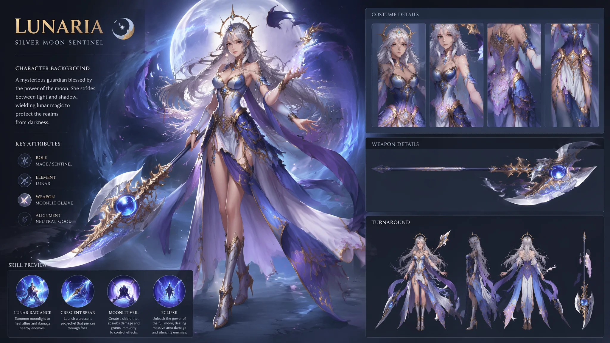
我做AI人物插画接单快一年了——从最开始的"帮朋友画个头像"到现在每个月有十几个固定客户。这一年里我踩过的坑比画过的图还多。早期最大的问题是"风格不稳定"——同一个brief今天出厚涂明天出平涂,客户说"我就要上周那张的风格"但我根本不记得上周用了什么Prompt。后来我被迫建立了一套工作流——从接到brief到交付成品,每一步都有固定的Prompt模板和质量控制节点。有了工作流之后效率提升了三倍——因为不用每次从零开始试。上一期AI人物插画绘画我讲了基础入门——风格选择、构图原则、配色基础。这一期进阶篇我把接单一年来积累的完整生产流程全部公开:从风格定位、线稿与上色分离、系列感保持、到商业交付的尺寸管理。
AI人物插画的完整工作流——从Brief到交付的六个节点
AI插画接单最大的效率黑洞不是生成慢——而是来回修改。客户说"感觉不对"但说不清楚哪里不对。建立标准化工作流的目的就是在生成第一张图之前就和客户对齐所有变量。节点一:风格定位——从客户的参考图提取风格关键词。如果客户发了三张参考图,你要提取它们的共同特征:"这三个参考的共性是什么?线稿风格(有粗线/无线/细线)、上色方式(平涂/厚涂/水彩)、色板(暖色调/冷色调/高饱和/低饱和)、构图(全身/半身/特写)、完成度(草图感/精细完稿)"。把这些维度做成一个checklist让客户勾选——比你问他"你喜欢什么风格"有效得多。节点二:角色设计Brief——如果人物是定制的,需要确认:性别、年龄段、发型发色、体型、服装风格、标志性配饰、表情倾向。节点三:Prompt框架搭建——用标准模板:"[画风描述] + [角色特征] + [动作/姿态] + [场景/背景] + [光线/色调] + [技术参数(比例、画质)]"。节点四:快速验证——用低分辨率(或fast模式)跑4-8张变体,让客户选方向。节点五:精细化——选定方向后用高分辨率+细节增强,跑2-3张精细版。节点六:后期调整——用inpaint修局部问题,用upscale提升分辨率。这一套流程的最大价值是"让客户在前期参与决策"——不要在跑完50张图之后才给客户看第一版。项目管理的思路参考AI角色设计教程的商业流程部分。
线稿与上色的分离控制——让AI像人类插画师一样分层工作
专业插画师的工作流程是"草图→线稿→底色→阴影→高光"——层层叠加。AI如果能模拟这个流程,每一层都可以独立调整。纯线稿生成(Layer 1):"black and white line art only——crisp clean ink lines on a pure white background, varying line weights with thicker outlines on the silhouette and thinner lines for internal details, the linework is complete and readable as a standalone piece, the style is professional manga or comic book inking"。线稿的风格控制可以很细——"thin delicate lines like a fashion illustration" vs "thick bold lines like a graphic novel" vs "sketchy loose lines like a concept art rough"。纯底色层(Layer 2):把线稿喂给img2img——"color blocking layer for the line art——fill each enclosed area with a single flat color, no gradients, no shading, the colors are clean and solid like a paint-by-number, the line art stays completely sharp overlaying the colors"。阴影层(Layer 3):在上一步基础上——"add cel-shading shadows to the flat color layer——hard-edged shadow shapes in a slightly darker hue on the shadow side of the figure, cast shadows on the ground, the shading follows a consistent light direction from upper right"。高光层(Layer 4):"add rim lighting and specular highlights——a thin bright edge light on the left side of the figure from a secondary light source, small white highlight dots on the eyes and metallic surfaces"。这四层分离之后,你可以独立调整每一层——线稿太粗?重新生成线稿层。配色不满意?只改底色层。阴影方向反了?重做阴影层。这种分层思路让AI插画从"一次成型"变成了"可迭代可修改"的生产工具。关于分层的更技术性细节参考AI绘画调整与细化技巧。
五大商业插画风格的标准Prompt模板——接单直接套用
我把接单中最常遇到的五种插画风格做成了"开箱即用"的Prompt模板——每个模板都经过至少50张图的测试。现代扁平风(适合App引导页、网页插图):"modern flat vector illustration style——bold minimal shapes with no outlines, limited color palette of 5-7 colors, geometric simplification of forms, the character has exaggerated proportions with a small body and large head, ample negative space, the overall look is clean and contemporary like a tech company's brand illustration"。儿童绘本风(适合童书、早教产品):"children's book illustration style——soft watercolor textures with gentle pencil outlines, warm and cozy color palette of pastels, the character has a cute round face with oversized sparkling eyes, the world around them is slightly whimsical with talking animals and magical elements, the atmosphere is safe and nurturing"。时尚插画风(适合时装品牌、杂志):"fashion illustration style——elongated elegant figure proportions, loose gestural ink lines, watercolor washes in the clothing areas bleeding slightly outside the lines, the face is minimal with just a suggestion of features, the focus is on the clothing silhouette and the attitude, the style is like a high-end fashion magazine editorial spread"。游戏原画风(适合游戏角色卡、宣传图):"game character splash art style——fully rendered digital painting with dramatic cinematic lighting, the character is in a dynamic action pose, highly detailed armor and weapon design, particle effects and motion blur, epic fantasy background, the style is like League of Legends or Genshin Impact official art"。日系轻小说风(适合轻小说封面、同人插画):"light novel illustration style——anime-inspired art with soft cel-shading and gentle gradients, the character has large expressive eyes and detailed hair with individual strand highlights, colorful but not over-saturated, decorative background elements like floating petals or light orbs, the style is like a popular light novel cover illustration"。每个模板在使用时只需要替换"[角色特征]"和"[场景]"两个变量——风格框架保持不动。风格化插画的更多探索参考AI书籍插画绘画和AI小说插画绘画。商业插画趋势观察可以去Behance的Illustration频道——看看2026年主流商业插画风格在往哪个方向走。
商业交付的尺寸与格式管理——避免"做完不能用"的尴尬
AI生成的图默认分辨率通常不够印刷,而且比例是1:1或16:9——商业项目需要的是各种定制尺寸。尺寸管理从Prompt阶段就要开始。常见商业尺寸对照——网页横幅:1920x600("a wide horizontal panoramic composition, 32:10 aspect ratio for web banner")。社交媒体帖:1080x1080("a square composition, 1:1 aspect ratio for social media post")。手机壁纸:1080x1920("a vertical portrait composition, 9:16 aspect ratio for smartphone wallpaper")。A4印刷品:2480x3508(需要up scale——"high resolution suitable for A4 print at 300dpi")。书籍封面:6x9英寸比例——"a vertical book cover composition with space at the top for the title and at the bottom for the author name, the main visual occupies the center"。在Prompt中写入宽高比——Midjourney用"--ar 9:16",Stable Diffusion直接在分辨率参数里设置。后期处理:AI生成的图通常需要进upscale工具(如Topaz Gigapixel或Upscale.media)提升到可印刷分辨率。格式输出:客户交付用PNG(透明背景时)或高质量JPG,自己存档用PNG保存原始无损版本。交付时要给客户三个版本——原图、轻度锐化版(适合屏幕显示)、印刷优化版(CMYK转换后的版本)。商业流程细节参考AI绘画新手入门中关于交付标准的部分。
常见问题
客户给的参考图风格和我的AI模型能出的风格不匹配怎么办?
先做"风格翻译"而不是"风格复制"。分析参考图的视觉基因(线型、色板、笔触、质感),找到最接近的AI可生成的风格关键词。然后向客户说明:"AI可以做到类似8成效果——线稿风格和配色可以匹配,但笔触的随机性会有所不同。这个方向可以吗?"——设定合理预期比承诺完美复制更重要。
同一角色在不同插画里怎么保持脸的一致性——客户要一个角色的系列插图?
角色一致性是AI插画最难的问题。解决方案:第一张生成满意后,用这张图作为seed图(Midjourney用--seed参数,SD用img2img)。然后用一个固定的角色描述串:"same character as before——[详细面部描述+固定发型发色+固定眼型]。后续每张图只改变动作和场景,面部描述完全不动。参考AI人物面部设计与表情塑造的角色一致性技巧。
AI人物插画商用需要额外授权吗——不同平台的规则有什么不同?
Midjourney:付费用户拥有所生成图像的商用权利(但无法主张版权)。Stable Diffusion:开源模型,生成的图像可以商用,但要注意使用的checkpoint/model是否有特殊许可限制。DALL-E:商用需要看OpenAI的具体条款,通常允许。任何情况下,如果你的插画中包含了可辨识的真实人物特征,需要额外注意肖像权问题。加"generic face, not a real person"降低风险。